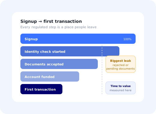
There is a specific kind of pain that only fintech product teams know. The signup page converts beautifully. The marketing is working. And then somewhere between "create account" and "money actually moved", more than half the people who wanted your product are gone, not because they changed their minds, but because a verification step asked something they could not answer at that moment, on that device, with that document.
Fintech onboarding is the discipline of closing that gap without pretending the regulation is optional. You do not get to remove the identity check. You do get to decide when it appears, how it is explained, what the user can do while it runs, and what happens when it fails. Those four decisions routinely account for a bigger conversion swing than anything on the acquisition side of the business.
This guide walks through the whole thing: what fintech onboarding actually covers, the five-stage funnel from signup to first transaction, where the drop-off concentrates, an eight-step design method, the patterns that make identity verification survivable, how business-account onboarding multiplies the problem, and the handful of metrics worth reporting.
Key Takeaways
- The finish line is the first transaction, not the created account. An approved account that never moves money is a cost, not a customer.
- Most KYC drop-off is a UX failure, not a compliance failure. Rejected documents, silent pending states and unexplained fields are all fixable without touching policy.
- Sequence effort behind value. Ask for what the law requires to open the account, and nothing else, until the user has seen something worth verifying for.
- Design the waiting state deliberately. Pending review is a screen your users will see; treat it as a product surface, not an error.
- Business accounts are a multi-stakeholder rollout. Several people must act, so the flow has to be resumable, delegable and visible.
- Measure stage by stage. One headline conversion number hides the single stage that is actually costing you the quarter.
What Is Fintech Onboarding?
Fintech onboarding: definition
Fintech onboarding is the end-to-end process of taking a new customer from signup to their first genuine financial action (a funded account, a first payment, a first trade, a first invoice) while satisfying the identity, sanctions and risk obligations that apply to the product. It spans account creation, identity verification (KYC), screening and risk scoring, funding or connection of an external account, and the guidance that gets someone to actually use the thing they just opened.
What makes it structurally different from ordinary user onboarding is that part of the flow is not yours. A verification provider decides whether a passport photo is legible. A screening list decides whether a name needs manual review. A bank partner decides how long a transfer takes to settle. You are designing an experience around decisions made by systems you do not own, some of which take hours and occasionally say no.
That has one enormous design consequence, and most teams learn it the expensive way: in fintech, the waiting and the rejection are part of the product. A flow that only works when every check passes instantly is not a flow, it is a happy path with a cliff on either side.
The line worth drawing: compliance decides what must be collected and verified. Product decides when, how, and what the user sees while it happens. Almost every conversion win in fintech onboarding lives in the second half of that sentence, which is why "we can't change it, it's regulatory" is usually wrong.
The Five-Stage Fintech Onboarding Funnel
Every regulated product, from a consumer wallet to a treasury platform, has some version of the same five stages. Naming them separately matters, because each one fails for a different reason and each one needs a different fix.
Two things about this funnel are worth internalising. First, stage 5 is the actual finish line. A verified, funded account that has never transacted is an expense: you paid an acquisition cost and a verification fee for a row in a database. Second, the stages between 2 and 4 are where the flow stops being under your control, and, unsurprisingly, that is where most of the loss sits.
| Stage | Why people leave here | What actually fixes it |
|---|---|---|
| 1. Account created | Too many fields, unclear value, no idea what happens next. | A short form, and a visible map of the remaining steps. See signup flow best practices. |
| 2. Identity submitted | Effort arrives before value; sensitive data requested with no explanation; desktop user has no camera. | Delay everything non-mandatory, explain each field inline, offer a clean phone handoff. |
| 3. Verification passed | Blurred or cropped documents rejected; pending review with no communication; no path to appeal. | Guided capture, specific rejection reasons, a designed pending state, proactive re-engagement. |
| 4. Account funded | Funding options unclear, limits surprising, settlement time not stated up front. | State the timing before they commit; offer the lowest-friction funding route first. |
| 5. First transaction | Nobody showed them what to do with a funded account. | An in-app checklist and a contextual walkthrough of the core action. |
If you have never broken your own numbers down this way, do that before reading another word of advice, including the rest of this guide. Teams are consistently wrong about which stage is bleeding, and the fix for stage 2 makes stage 4 no better at all. The onboarding funnel guide covers the analysis method in more depth.
Why KYC Kills Conversion (and What Is Really Going Wrong)
"KYC drop-off" is usually reported as a single number, which makes it look like an immovable cost of doing business. Break it apart and it turns into four separate, ordinary product problems.
The user is asked for a government ID before they have seen anything that justifies handing one over. Trust has to be earned before it can be spent.
A document is rejected, or a review is pending, and the interface says nothing useful. The user assumes the product is broken and leaves.
A desktop signup demands a photo of a passport and a selfie, with no clean way to continue on a phone and come back.
The fourth cause is the quietest and the most damaging: unexplained collection. Date of birth, national identifier, employment status, source of funds: each one is legitimate, and each one, presented as a bare label on a form, reads as surveillance. One sentence of context per sensitive field, written in plain language at the point of asking, is among the cheapest conversion improvements available to a fintech team. It is also the one most often skipped, because it feels like copywriting rather than product work.
The trap: treating verification as a black box owned by a vendor. Your provider reports pass rates, but the reason a document failed (glare, crop, expired, wrong document type) is the most actionable data in your funnel. If those reasons are not surfaced in your own analytics and shown back to the user in specific language, you are guessing at the biggest leak in the business.
How to Design a Fintech Onboarding Flow: 8 Steps
The order matters: several of these steps are cheap only if the previous one has been done.
- Separate what is legally required from what is merely wanted
- Let people see the product before they are fully verified
- Explain every sensitive field where it is asked
- Make document capture guided rather than hopeful
- Design the pending state as a real screen
- Make rejection recoverable and specific
- Route the first transaction, do not just enable it
- Instrument every stage, including the vendor's reasons
1. Separate what is legally required from what is merely wanted
Open your account-opening form and mark every field as required to open the account under regulation, required later for a specific feature, or wanted by another team. In practice the third category is always larger than anyone expects: marketing attribution, company size, a job title for segmentation. Everything that is not in the first category leaves the flow and gets collected later, in context, using progressive profiling. This single exercise usually removes a third of the fields.
2. Let people see the product before they are fully verified
Where your regulator and your risk appetite allow it, give the unverified user a real but financially inert account: dashboards visible, settings configurable, data sources connectable, money movement blocked. A user who has already connected an account or configured a rule has a reason to push through verification. A user staring at a wall has only willpower. Surface the outstanding requirement as a persistent banner or an onboarding checklist rather than a modal that cannot be dismissed. Confirm the exact limits with compliance before you build it; the boundary differs by licence and market.
3. Explain every sensitive field where it is asked
Not in a linked privacy policy: in one sentence, next to the input, at the moment of asking. "We're required to check this against the national register. It's never shown to other users." The explanation should say who requires it, what happens to it, and who can see it. Where a field is genuinely optional, say so and say what it unlocks. This is the highest-yield copy work in the entire flow, and it is exactly the kind of change that should not need a release cycle.
4. Make document capture guided rather than hopeful
Most first-attempt failures are avoidable: glare, a cropped corner, an expired document, the back of a card when the front was needed. Show a worked example of a good capture before the camera opens, keep an on-screen frame with live feedback, and name the accepted document types explicitly for the user's country rather than listing every type you support globally. Every percentage point of first-attempt pass rate is a percentage point of funnel that costs nothing further to acquire.
5. Design the pending state as a real screen
"Under review" is not an error and should not look like one. Tell the user what is happening, give an honest maximum duration, say how they will be notified, and give them something useful to do in the meantime: invite a teammate, connect a bank feed, read the two-minute explainer of the core workflow. The worst version of this screen is a spinner; the second worst is a duration you cannot honour. If a check normally clears in minutes but occasionally takes a day, say both.
6. Make rejection recoverable and specific
"Verification failed" tells a user nothing except that they should try a competitor. "The photo of your ID was too dark to read. Here's how to retake it" recovers most of them. Map every vendor rejection code to a specific, human message and an obvious next action, and keep a route to a human for the cases where automated capture genuinely cannot work. Users who resubmit successfully after a clear message are among the most loyal cohorts a fintech has, because the product treated a bad moment well.
7. Route the first transaction, do not just enable it
Approval is not activation. The moment an account is usable, the product should point at exactly one next action (send the first payment, place the first order, issue the first invoice) with a short contextual product tour that walks through it on real screens. This is where fintech teams most often stop, having spent all their design energy on verification, and it is where the revenue is.
8. Instrument every stage, including the vendor's reasons
Emit an event at every transition (started, submitted, passed, pending, rejected with reason, funded, first transaction) and store the rejection reasons alongside your own funnel. Without that, you can see that stage 3 is bad but never why, and you will spend a quarter redesigning a form when the real problem was that one country's ID card was failing capture nine times in ten.
Patterns That Make Verification Survivable
-
A visible step map from the first screen
Three or four named steps with the current one highlighted. Uncertainty about how much is left is a bigger dropout driver than the length itself; the psychology is covered in the onboarding progress bar guide.
-
Clean desktop-to-phone handoff
A QR code or a one-tap link that moves only the capture step to the phone and returns the user to the same desktop session, already progressed. Never restart the flow on the second device.
-
Contextual help on the hard screens
Answer the three questions people actually ask (why do you need this, is it safe, what if I don't have that document) where they ask them, not in a help centre in another tab. See in-app support.
-
Resume nudges for unfinished verification
People abandon halfway for entirely innocent reasons: a meeting, a missing document at the office. A targeted message on return, plus one honest email, recovers a meaningful share of them.
-
Country-aware document lists
Show the documents accepted for the user's detected country, in that country's vocabulary. A global list of eleven document types is a comprehension problem dressed as thoroughness.
✓ Do
- Show the whole path before asking for the first sensitive field.
- Give one plain-language reason per regulated question.
- Let unverified users explore something real and inert.
- Name the exact rejection reason and the fix.
- Measure through to first transaction, not to approval.
✗ Don't
- Collect marketing data inside the account-opening flow.
- Show a spinner where a status explanation belongs.
- Promise a verification time you cannot honour.
- Force a desktop user to restart on their phone.
- Report a single conversion number to the board.
B2B and Business-Account Onboarding
Verifying a company is not verifying a person with more paperwork; it is a different shape of problem. You need registration documents, proof of address, the identity of every beneficial owner above a threshold, often a declaration of expected volumes, and sometimes a signature from someone who has never logged in. That means several humans must act, and most of them are not the person who signed up.
Three design requirements follow directly, and a flow missing any of them will stall:
- Resumable. The person collecting documents will leave and come back over days. State must survive, and returning must land them on the next outstanding item, not at step one.
- Delegable. The admin should be able to send a director their own secure link to complete their identity check, without sharing an account or emailing a passport scan.
- Visible. One screen showing every requirement, who owns it, and what is still outstanding. Without it, the admin becomes a project manager chasing colleagues with no information.
In other words, business-account onboarding is a rollout, not a form: the same coordination problem described in the enterprise onboarding playbook, with a regulator attached. Treat the primary admin as a user who needs help driving other people, and give them the status view they would otherwise rebuild in a spreadsheet.
The Metrics Worth Reporting
| Metric | What it tells you | What to do when it moves |
|---|---|---|
| Stage-by-stage conversion | Which of the five stages is actually losing people. | Fix only the worst stage; ignore the rest this quarter. |
| Time to first transaction | Your real time to value, in hours or days. | Attack the longest waiting state, not the shortest form. |
| First-attempt KYC pass rate | The quality of your capture experience, not the strictness of policy. | Improve guidance and examples before changing providers. |
| Resubmission rate + reasons | Exactly which document, country or instruction is failing. | Rewrite the instruction for the top reason; re-measure in a week. |
| Abandonment during pending | Whether your waiting experience holds people. | Add status detail and a useful parallel action. |
| Support tickets per 100 signups | Onboarding confusion translated into cost. | Answer the top ticket reason in-product, at the screen that causes it. |
Two of these deserve special defence in a board meeting. First-attempt pass rate is frequently blamed on end users and is almost always a design number. And time to first transaction is the one metric that connects onboarding work to revenue in a way a CFO accepts without a translation layer. The broader set is covered in user onboarding metrics.
Shipping the Guidance Layer Without a Release Cycle
Here is the practical difficulty in fintech: the verification integration lives in a heavily reviewed, slowly released part of the codebase, and the layer that decides most of the conversion is copy, timing and targeting. Waiting on a release train to reword a sentence that is costing you signups every day is an unforced error.
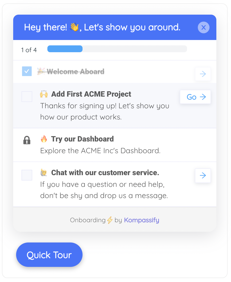
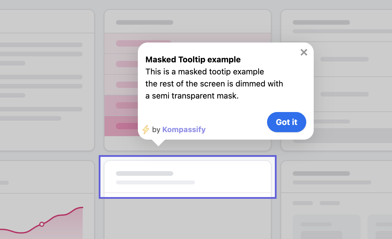
That guidance layer sits on top of your existing screens, and it is exactly what a no-code adoption platform is for. With Kompassify you can add tooltips explaining a regulated field, run a walkthrough of the first transaction, keep a checklist visible until verification completes, and segment everything by verification status so a verified customer never sees a KYC reminder. Because the content is decoupled from the release, you can change the wording on the morning you spot the drop-off and read the result the same week. Kompassify is GDPR compliant and EU-hosted, which for a European fintech is usually the first question asked, not the last.
Fix the Step That Is Costing You Customers
Kompassify lets you explain regulated fields, guide document capture, keep a verification checklist visible and walk users to their first transaction, on your existing screens, with no code and no release cycle. GDPR compliant, EU-hosted, and free for under 100 monthly active users.
Start for Free →Frequently Asked Questions
What is fintech onboarding?
Fintech onboarding is the process of taking a new customer from signup to their first real financial action, a funded account, a first payment, a first trade, a first invoice, while satisfying the identity, sanctions and risk checks that financial regulation requires. It is different from ordinary SaaS onboarding in one structural way: part of the flow is not under your control. A verification provider, a bank partner or a compliance rule decides whether the user may continue, and sometimes that decision takes hours. Good fintech onboarding is therefore as much about handling waiting and rejection gracefully as it is about teaching the product.
Why do users drop off during fintech onboarding?
Four causes account for most of it. First, effort arriving before value: users are asked for a passport photo before they have seen anything worth verifying for. Second, silent failure: a document is rejected or a check is pending and nobody tells the user what to do next. Third, device mismatch: desktop signups that require a phone camera with no clean handoff. Fourth, unexplained data collection: date of birth, national ID and source of funds requested with no reason given, which reads as intrusive rather than regulatory. All four are friction problems, not compliance problems.
How can you reduce KYC drop-off without breaking compliance?
You cannot remove the checks, but you can change when they happen, how they are explained, and what the user does while they wait. Move everything that is not legally required to open an account out of the account-opening flow and collect it later with progressive profiling. Let users explore a read-only or sandboxed version of the product while verification runs in the background. Explain each field in one sentence at the point of asking ("we need this to verify your identity with the register, it is not shown to anyone") and give document capture explicit, visual instructions. None of that weakens the check; it only stops the check from being the reason people leave.
What is a good conversion rate for fintech onboarding?
Rates vary so widely by product, market and regulatory regime that a single benchmark is misleading: a consumer wallet with a selfie check and a business account requiring company documents and beneficial-owner declarations are not comparable. The useful discipline is to measure your own stage-by-stage conversion (signup to KYC started, KYC started to submitted, submitted to approved, approved to funded, funded to first transaction) and treat the worst-performing stage as the only number that matters this quarter. Teams that track a single headline conversion number almost always hide their real problem inside it.
How is B2B fintech onboarding different from consumer onboarding?
A business account verifies an entity, not a person, so the flow multiplies: company registration documents, proof of address, the identity of every beneficial owner above a threshold, and often a declaration of expected transaction volume. That means several humans must act, frequently people who are not the person who signed up. The design consequence is that a B2B fintech flow must be resumable, delegable and visible: one person should be able to start it, invite a colleague to complete their part, and see at any moment what is still outstanding. Treat it as a multi-stakeholder rollout rather than a form.
Which metrics should a fintech track for onboarding?
Track five: stage-by-stage funnel conversion from signup to first transaction; time to first transaction as the product's real time-to-value; KYC pass rate on first attempt, which measures the quality of your capture UX rather than the strictness of your policy; the resubmission rate and the reason breakdown behind it; and abandonment during pending states, which tells you whether your waiting experience is holding people. Support-ticket volume per hundred signups is a useful sixth, because it converts onboarding confusion into a cost number your finance team already understands.
Should users see the product before they are verified?
Wherever your regulator and risk appetite permit it, yes. A user who has seen their dashboard, connected a data source or configured something they care about has a reason to finish a verification step; a user staring at a blocking form has only inertia. The usual compromise is a fully browsable but financially inert account, no funding, no outbound money movement, no sensitive data, with the verification requirement surfaced as a persistent banner or checklist rather than as a wall. Confirm the specific limits with your compliance team before building it.
Can you improve fintech onboarding without engineering releases?
Much of it, yes. The verification integration itself is engineering work, but the layer that decides most of the conversion, explanations at the point of asking, a progress checklist, contextual help on document capture, a status banner during pending review, and a nudge that brings people back to an unfinished step, is guidance on top of your existing screens. With a no-code platform like Kompassify you can build and target that layer yourself, segment it by verification status, and change the wording the same day you see the drop-off. Kompassify is GDPR compliant and EU-hosted, free for under 100 monthly active users, with paid plans from $129/month.