Somebody puts a heatmap on the screen in a meeting and the conversation changes. Everyone has an opinion, everyone is confident, and within four minutes a decision has been made about a button. This happens because a heatmap looks like evidence in a way a funnel chart never does: it is a picture of the actual page, with actual behaviour painted on top.
It is evidence. It is also, more often than anyone admits, evidence of something other than what the room concluded. The map was built from six hundred sessions. It merged phones and desktops. The screenshot underneath it shows a version of the page that half those visitors never saw.
This guide covers what heatmaps actually measure, the four different instruments hiding behind one word, the questions they answer well, the five traps that produce confidently wrong conclusions, and how to get from a hot spot to a shipped change.
Key Takeaways
- Four instruments, one word. Click, scroll, move and attention maps measure different things; only the first two are reliable enough to act on alone.
- Clicks on non-clickable things are the best signal a heatmap produces, an unambiguous design finding.
- A heatmap renders with any sample size. Check the count before you interpret the picture.
- Never merge device classes. One map across two layouts is a picture of neither.
- Heatmaps show where, not why. Pair with analytics to size the problem and replay to understand it.
- Write your hypothesis before you open the map, because a picture is unusually good at confirming what you already thought.
What Is a Heatmap?
Heatmap: definition
A heatmap is a visualisation that overlays aggregated user behaviour onto a picture of a page, using colour intensity to show where that behaviour concentrated. Warm colours mark high activity, cool colours low. It is an aggregate view: no individual session is visible in it, which is both its strength and the source of most of its failure modes.
Colour scales vary between tools, and they are not standardised: a scale that is relative to the page's own maximum will make a quiet page look busy, and a fixed scale will make a busy page look saturated everywhere. Before comparing two heatmaps, check whether their scales are comparable. Surprisingly often they are not.
The Four Types of Heatmap
Where people pressed, including on things that are not interactive. The most directly actionable of the four, and the one that finds false affordances.
How far down the page the audience got. Tells you where your readership thins and whether anything below a point is worth maintaining.
Where the cursor travelled. A weak proxy for attention on desktop, and entirely meaningless on touch devices. Treat as a hint, never as a finding.
Where visible time was actually spent, weighting for what was on screen and for how long. Usually the most informative for long content pages.
The distinction matters because teams routinely draw a Type 1 conclusion from a Type 3 map. "The cursor spent a lot of time here, so people are interested in this" is not a finding; cursors rest where the hand happens to leave them, and a substantial share of desktop users park the pointer somewhere neutral while reading.
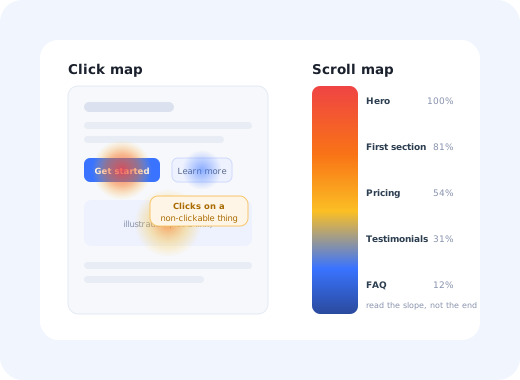
Here is what a scroll map is really telling you, expressed as the number underneath the picture:
A scroll map is a survival curve for attention. The interesting question is not where it ends but where it drops fastest.
Read the slope, not the endpoint. A gentle decline means people are working through the page; a cliff between two adjacent sections means something at that boundary is telling readers they are finished: a visual break that looks like a footer, a section that answers the question they came with, or a wall of text.
What Heatmaps Are Good At, and What They Are Not
✅ Genuinely good at
- Finding clicks on things that are not clickable
- Showing where a page loses its audience vertically
- Spotting rage clicks and repeated presses
- Comparing the same page across device classes
- Making a behavioural finding legible to people who don't read funnels
- Deciding what to cut from a long page
❌ Not the right tool for
- Explaining why anything happened
- Measuring whether a change worked
- Anything on a highly dynamic or personalised page
- Small-sample pages or niche flows
- Attention on touch devices (there is no cursor)
- Settling an argument about a colour
That last item is not a joke. Heatmaps are used more often to win internal arguments than to find anything, because their persuasiveness is disproportionate to their precision. The discipline that prevents this is stated below.
The Five Traps
A single map covering phones, tablets and desktops averages three layouts into a picture of none of them. The same element is above the fold on one and three screens down on another. Always segment by device class first; it is the single most common cause of a heatmap finding that does not reproduce.
A heatmap built from ninety sessions renders exactly as vividly as one built from ninety thousand. There is no visual cue for uncertainty. Before interpreting, find the session count; if the tool does not show it prominently, treat that as a reason for suspicion rather than convenience.
The screenshot underneath the data is one rendering of the page. If content is personalised, A/B tested, sorted differently per user or loaded asynchronously, the coordinates where people clicked do not correspond to what the picture shows. On heavily dynamic pages the map can be actively misleading rather than merely imprecise.
There is no fold. There is a distribution of viewport heights, and it is wide. Scroll maps are useful precisely because they replace the fold with that distribution, so do not then collapse it back into a single line and start arguing about what belongs above it.
The countermeasure is simple and almost nobody does it: write down what you expect to see before you open the map. Two sentences. Then look. The value of the exercise is entirely in the cases where you were wrong, and those are exactly the cases a post-hoc reading would have smoothed over.
How to Run a Heatmap Study in 6 Steps
- Start from a quantified problem, not from curiosity
- Write the hypothesis down first
- Segment before you look
- Check the sample count
- Read clicks, then scroll, then everything else
- Convert the finding into one testable change
1. Start from a quantified problem, not from curiosity
"Let's put heatmaps on everything and see what turns up" produces an enormous amount of looking and very few decisions. Start where your analytics already tell you something is wrong (a step with a bad conversion rate, a page with high exits) and use the heatmap to find out where on that page the problem lives.
2. Write the hypothesis down first
"I expect most clicks to be on the primary CTA and few below the pricing table." Two sentences, recorded before you look. This is the whole defence against trap five and it costs thirty seconds.
3. Segment before you look
Device class always. Then, if volume allows, new versus returning users: their behaviour on the same page is often so different that the merged map describes neither. New users are the ones who matter for first-time experience questions, and they are usually the minority in the aggregate.
4. Check the sample count
Find the number, write it next to your notes, and if it is small, say so out loud when you present the finding. A stated sample size is what stops a weak signal from being quoted as fact six weeks later by someone who was not in the room.
5. Read clicks, then scroll, then everything else
Clicks first, and specifically clicks on things that should not receive any. Those are unambiguous. Then the scroll map for where attention drops. Move and attention maps last, as supporting colour rather than as evidence.
6. Convert the finding into one testable change
"People are clicking the illustration next to the integration list, so they expect it to open something" becomes either a link or a change of styling. One change, then a measurement. A heatmap cannot tell you whether the change worked; only a controlled comparison can, which is what A/B testing is for.
Heatmaps, Analytics and Session Replay
These three tools are routinely presented as alternatives and are in fact a sequence. Each answers a question the others cannot:
| Tool | Question it answers | Scale | Use it to |
|---|---|---|---|
| Product analytics | What happened, and how often? | All users | Find and size the problem |
| Heatmap | Where on the page did it happen? | Aggregate, per page | Locate it |
| Session replay | How did it happen, for this person? | One session | Understand the mechanism |
| Usability test | Why did they do that? | A handful of people | Get the reason, out loud |
Run them in that order and each step narrows the next. Run them in isolation and you get the classic pattern of a team with three behavioural tools and no decisions: analytics that show a drop nobody has located, heatmaps nobody has connected to a metric, and a replay library that functions as entertainment. The session replay guide covers the workflow from a quantified drop-off to a shipped fix in more detail, and the usability testing guide covers the last row.
Using Heatmaps on Onboarding Flows
Onboarding screens are unusually good heatmap subjects, because they are seen by a well-defined population doing a well-defined task. Four things to look for specifically:
- Clicks on the explanation, not the control People pressing the descriptive text next to a setting almost always means the text sounds like the action. Either make it one, or rewrite it.
- Heat on "skip" and "later" A hot skip link on a step you consider essential is the flow telling you the step is in the wrong place, not that users are lazy.
- Scroll cliffs inside a setup page If half the audience never reaches the field that completes setup, the fix is layout, not copywriting. This is a common and very cheap win.
- Rage clicks on a disabled control A button disabled until a condition is met, with the condition not explained, produces a distinctive cluster. The fix is a sentence, not a redesign, and it is exactly the kind of friction that never appears in a bug report.
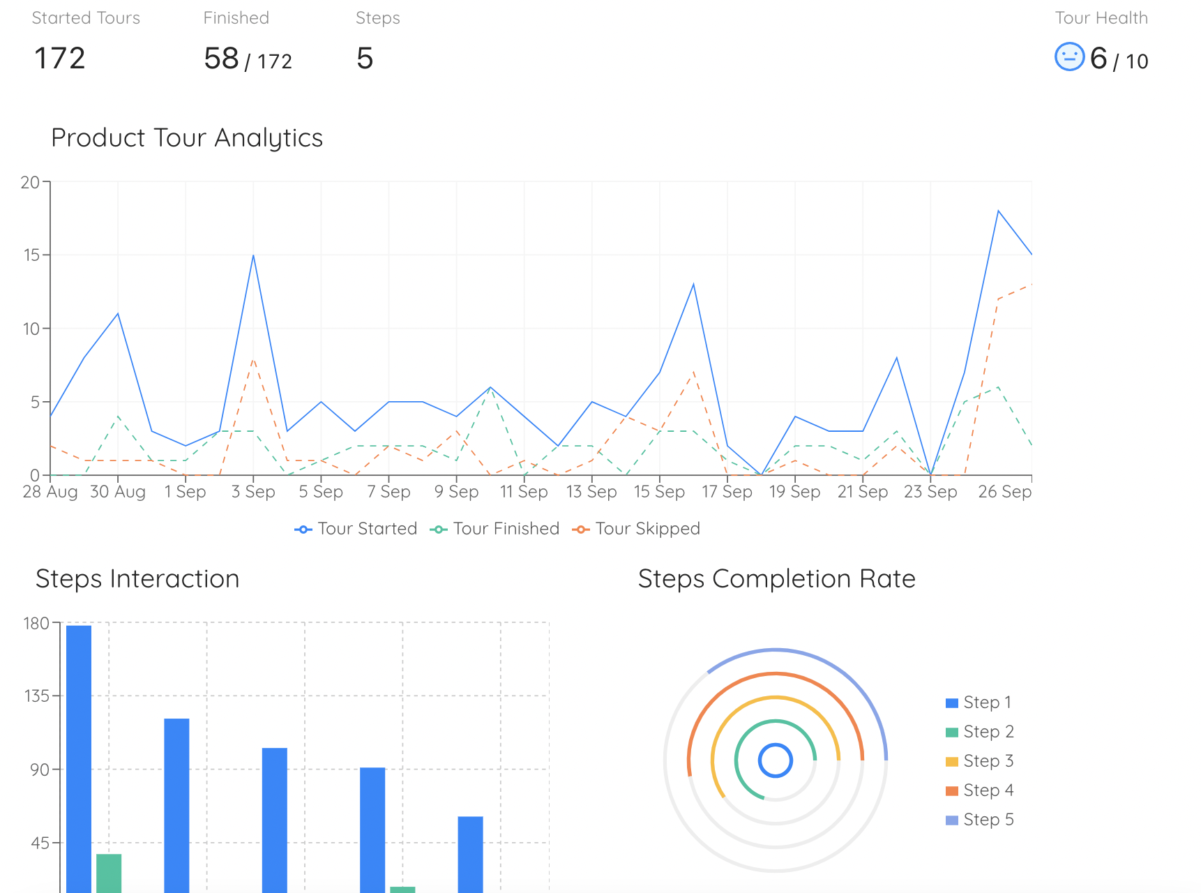
Analytics size the drop-off first; the heatmap then shows where on the screen it is happening.
Heatmaps: Do vs. Don't
✅ Do
- Segment by device class before interpreting anything
- Write your hypothesis down before opening the map
- Quote the sample size whenever you quote the finding
- Start from a problem your analytics already sized
- Prioritise clicks on non-interactive elements
- Read the slope of the scroll curve, not its end
- Follow up with replay or a usability test for the why
- Turn each finding into one testable change
❌ Don't
- Treat a move map as an attention map
- Compare maps built on different colour scales
- Run heatmaps on heavily personalised pages
- Argue about the fold
- Use a heatmap to prove a change worked
- Instrument every page and hope
- Present a map without its date range
- Record sensitive fields; mask them, always
Privacy note: click and movement capture runs on the same infrastructure as session recording, and the same obligations apply. Mask input fields by default, exclude payment and authentication screens entirely, and make sure your capture is covered by your privacy notice and consent mechanism before you switch it on, not after.
Acting on What the Heatmap Shows
A finding that does not become a change is a slide. Some fixes are genuine design work and need a release. A surprising number are guidance, and guidance can be built on top of the screen you already have, which also makes it a fast way to test whether your reading of the map was right before anyone writes code.
With Kompassify, the common heatmap findings map onto changes you can ship the same week:
- Rage clicks on a disabled or unclear control A tooltip saying what the control does, or what condition unlocks it.
- A step people visibly skip A short guided walkthrough that puts the step in context, or moves the moment at which it is asked.
- An action nobody scrolls far enough to find A persistent checklist that surfaces it independently of where it sits on the page.
- A guidance flow you then measure Step-level analytics on the flow you just built, which is the controlled measurement the heatmap could never give you.
Kompassify is no-code, GDPR compliant and EU-hosted, free for under 100 monthly active users, with paid plans from $129/month.
Turn Hot Spots Into Shipped Changes
Test your reading of the heatmap this week: add a tooltip, a walkthrough or a checklist on top of the screen, then measure whether behaviour actually moved.
Start FreeFrequently Asked Questions
What is a heatmap?
A heatmap is a visualisation that overlays aggregated user behaviour onto a picture of a page, using colour intensity to show where behaviour concentrated. Warm colours mark high activity and cool colours low. The word covers four distinct instruments that measure different things: click and tap maps, scroll maps, mouse-movement maps and attention maps, and treating them as one tool is the most common reason teams draw confident conclusions from them that turn out to be wrong.
What are the different types of heatmap?
Four. A click or tap map shows where people pressed, including on things that are not clickable, which is how you find false affordances. A scroll map shows how far down the page people got, and where the audience thins out. A move map shows where the cursor travelled, which is a weak and much-overrated proxy for attention on desktop and meaningless on touch devices. An attention or engagement map shows where visible time was spent, which is usually the most informative of the four for content pages. Each answers a different question, and only the first two are reliable enough to act on alone.
What are heatmaps good for?
They are excellent at three things: revealing clicks on elements that are not interactive, which almost always signals a design expectation you have not met; showing where a page loses its audience vertically, which tells you whether content below a certain point is worth maintaining at all; and making a behavioural finding legible to people who do not read funnel charts, which is an underrated political function. They are not good at explaining why anything happened, and they cannot tell you whether a change improved anything. That requires a controlled comparison.
How much traffic do you need for a reliable heatmap?
Enough that a single unusual session cannot change the picture: as a rough working floor, a few thousand recorded page views per device class before you treat a pattern as real, and considerably more before you act on a subtle difference. The failure mode is subtle: a heatmap always renders, however little data is behind it, so a map built from ninety sessions looks exactly as authoritative as one built from ninety thousand. Always check the underlying sample count before interpreting, and never compare two maps built on very different sample sizes.
Why can heatmaps be misleading?
Five reasons recur. Aggregating desktop and mobile into one map averages two different layouts into a picture of neither. Dynamic and personalised content means the screenshot underneath the data does not match what many users actually saw. Small samples render just as confidently as large ones. The idea of a single fold is a fiction across the range of real screen sizes. And because a heatmap is a picture, it is unusually easy to see in it whatever you already believed, which is why you should write down what you expect to find before you open one.
How do heatmaps differ from session replay and product analytics?
They answer three different questions about the same behaviour. Product analytics tells you what happened and how often, at scale, and is the only one of the three that can quantify a problem. A heatmap tells you where on the page it happened, in aggregate. Session replay shows you how it happened for one person, in sequence. The productive order is almost always analytics to find and size the problem, heatmap to locate it on the page, replay to understand the mechanism, then a fix and a controlled measurement.
What are rage clicks?
A rage click is a rapid burst of repeated clicks in the same small area, usually because something looked interactive and did not respond, or responded too slowly to feel like it had. On a click map they appear as an intense hot spot in a place where nothing should be receiving clicks at all. They are one of the highest-value signals available from behavioural data because the diagnosis is almost always unambiguous: either the element should do something and does not, or it should not look like it does.
What do you do after a heatmap shows a problem?
Turn it into a change and measure whether the change worked. Some fixes are design work and need a release. Many are guidance: a tooltip explaining what a control does, a short walkthrough for a step people are visibly skipping, a checklist that surfaces the action nobody is finding. Guidance changes of that kind can be built on top of existing screens with a no-code platform such as Kompassify and adjusted the same week, which makes them a fast way to test whether your reading of the heatmap was right before committing engineering time. Kompassify is GDPR compliant and EU-hosted, free for under 100 monthly active users, with paid plans from $129/month.