A new user signs up, gets past the welcome modal, and lands in your product for the first time. The tour is done. Now what? If your answer is "they'll figure it out," you're losing most of them before they ever reach their first moment of value.
That's the gap an onboarding checklist is built to fill. Not to replace the product tour — but to carry the user through the activation phase that comes after it. A well-designed checklist gives users a short list of things to do, a visible sense of progress, and a reason to come back the next day.
The problem is that most onboarding checklists are either too long, buried somewhere users can't find, or full of tasks that feel like work rather than value. Great ones are rare — which is exactly why we put this gallery together.
Below you'll find real examples of onboarding checklists in action, broken down by design pattern, with notes on what works, what to watch out for, and how to replicate each style using Kompassify without touching your codebase.
Key Takeaways
- Checklists bridge the gap between tour and activation. The product tour shows users what to do. The checklist gives them a structured path to actually do it — on their own, at their own pace.
- 4 to 7 tasks is the sweet spot. Fewer and it feels trivial. More and completion rates fall sharply. Each task should take under 2 minutes to complete.
- The progress bar does more work than the task list. A visual indicator showing "3 of 5 steps done" creates a completion drive that a plain list cannot. Always include one.
- Auto-checking tasks removes friction and creates delight. When a user completes a task and the checklist updates automatically — without them having to click "Mark as done" — the experience feels intelligent and rewarding.
- Placement matters as much as content. A checklist buried in a settings page will be ignored. A collapsible widget anchored to the bottom corner of the screen stays accessible without blocking the UI.
- Reward completion, not just task ticking. A milestone reward — a discount, an unlocked feature, a confetti moment — at the end of the checklist turns activation into an event users remember.
What Is a User Onboarding Checklist?
A user onboarding checklist is an in-app widget that presents new users with a short list of tasks to complete during their first sessions. Each task represents a key activation step — connecting an integration, creating a first project, inviting a teammate, completing a profile — and is visually marked as done once the user completes it.
Unlike a product tour, which guides users sequentially through a scripted flow, a checklist is self-directed. Users choose what to do next, move at their own pace, and return to incomplete tasks across multiple sessions. That flexibility makes checklists particularly effective for complex SaaS products where activation requires more than one visit.
Most high-performing onboarding checklists share a handful of common ingredients: a short task list (4 to 7 items), a progress bar or percentage counter, auto-completion tracking, a collapsible container that stays accessible without blocking the UI, and a milestone reward or encouraging message when the user reaches 100%. The examples below show how different products combine these ingredients — and what you can learn from each approach.
Built with Kompassify: All the checklist examples in this gallery were created using Kompassify's no-code onboarding checklist builder. No developer time required — you can design, launch, and iterate on every one of these patterns from the Kompassify dashboard.
User Onboarding Checklist Examples
Each example below is a real checklist design pattern used in SaaS onboarding. We've broken down the layout, the design decisions at play, and the key lesson you can take away from each one.
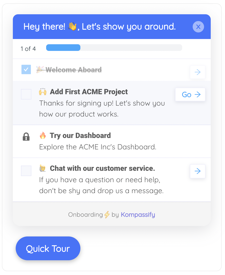
This is the most widely used onboarding checklist pattern in SaaS: a compact floating widget anchored to the bottom-right corner of the screen. It stays visible across every page of the product without blocking any UI element, and it collapses with a single click when users need more screen space.
The design decision to lead with a progress bar — rather than the task list — is deliberate. Users see "40%" before they read a single task. That number creates an immediate sense of accomplishment for the tasks already completed and a mild but effective pull to push the number higher. This is the same psychological mechanism behind LinkedIn's profile completion bar: partial progress is more motivating than a blank slate.
Notice that each task row includes a right-pointing chevron. This signals that clicking a task doesn't just mark it as done — it takes the user directly to the relevant part of the product. The checklist becomes a navigation shortcut as much as a task list, which dramatically reduces the friction of activation.
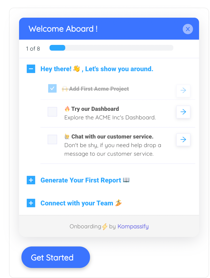
The multi-checklist pattern solves a problem that single checklists can't: what happens when your product has more than one activation phase. Rather than forcing all tasks into a single list — which quickly exceeds the 4–7 item ceiling — this widget groups them into named accordion sections, each collapsible independently.
The global "1 of 8" counter at the top keeps users anchored to an overall progress view, even as individual sections open and close. A user who has completed the first section and collapsed it still sees the total count advancing — the full journey remains visible without every task taking up screen space simultaneously.
The collapsed sections act as a preview of what's coming. Seeing "Generate Your First Report 📚" and "Connect with your Team 🎉" before completing the current section raises curiosity and provides a mental map of the onboarding path ahead. It's the same reason a well-structured book shows a table of contents: knowing the shape of the journey makes the current step feel purposeful rather than arbitrary.
This pattern embeds the checklist directly into the product's left navigation sidebar, making it a permanent fixture of the user's workspace rather than a temporary overlay. It works particularly well for complex tools — project management platforms, CRMs, developer tools — where the sidebar navigation is already the primary way users move around the product.
The accordion behaviour is the key design decision here. Only the active task is expanded, showing a short description and a "Do it now" CTA. All other tasks are collapsed into a single line. This keeps the sidebar compact while still surfacing just enough information about each task to make it feel approachable rather than intimidating.
The thin progress bar running below the header is subtle but effective. It's narrow enough not to distract from the task list itself, but its presence ensures users always have a peripheral sense of how far along they are — even when they're not actively interacting with the checklist.
This checklist introduces a mechanic that most onboarding flows overlook: a visible reward waiting at the end. The reward banner at the bottom of the widget — "Complete all steps to unlock 30 days free on the Pro plan" — gives users a concrete, external reason to finish the checklist alongside the intrinsic motivation of progress. The gift box icon makes it feel like an offer rather than a requirement.
The circular progress indicator is a deliberate departure from the horizontal progress bar used in earlier examples. At 80% completion, the nearly-full circle creates a stronger visual pull toward the finish line than a bar at the same percentage. The mind naturally wants to close the gap in a circle — it's the same reason pie charts read as more urgent than bar charts at partial values.
Notice that the widget uses a dark navy header rather than the blue used in the other examples. This creates a premium, product-forward aesthetic that positions the checklist as a feature of the product rather than a training aid. Teams selling upmarket or to enterprise buyers often find that a darker, more restrained visual tone performs better than the bright-blue friendliness of a standard onboarding widget.
This is the most sophisticated checklist pattern in the gallery: a task list that changes based on who is looking at it. The widget header reads "Your personalised setup — Marketing," and every task beneath it is relevant specifically to a marketing user. An engineer logging into the same product would see a completely different list.
The payoff is relevance. When a user sees tasks like "Connect your CRM" and "Import your contact list" on day one, those tasks feel immediately applicable to their job. They don't have to mentally filter out the developer tasks or the admin tasks. Every item on the list has a direct line to their own definition of success with the product.
The small grey label beneath the header — "Showing tasks for: Marketing Manager" — is an underappreciated detail. It tells users why their list looks the way it does, which prevents confusion and builds trust in the system. Users who understand that the product is tailoring the experience to them are more likely to engage with it.
This example covers a moment most checklist designs ignore: what happens when the user actually finishes. The widget transforms from a task list into a celebration screen — confetti animation, a large green checkmark, a warm success headline, and a single forward CTA. The task list disappears entirely; it has served its purpose.
The completion state is one of the highest-leverage moments in the entire onboarding journey. A user who has just finished their checklist is at peak motivation and trust. They've invested time in setting up the product, they've seen it respond to their actions, and they feel the satisfaction of a completed goal. The completion screen captures that moment and redirects it forward — "Explore the dashboard" — rather than leaving the user wondering what to do next.
The confetti animation serves the same emotional function as the confetti welcome screen in a product tour: it signals that this was the right decision and that something good has happened. Teams who skip this moment in favour of simply hiding the checklist are leaving a significant retention signal on the table.
Design Patterns Compared: Quick Reference
Here's how the six checklist types stack up across the dimensions that matter most for activation performance.
| Checklist Pattern | Best Used For | Placement | Progress Indicator | Complexity Level |
|---|---|---|---|---|
| Progress bar widget | Most SaaS products, general activation | Floating bottom-right corner | Horizontal progress bar | Low |
| Multi-checklist widget | Multi-phase products with 8+ activation steps | Floating widget | Global step counter + accordion | Medium |
| Sidebar panel | Tools with prominent navigation sidebars | Embedded in left nav | Thin progress bar + accordion | Medium |
| Milestone reward | Products with trial-to-paid conversion goals | Floating widget | Circular indicator | Medium |
| Role-segmented | Multi-persona products, enterprise tools | Floating widget or sidebar | Standard progress bar | High |
| Completion celebration | Any product — used as a final state | Replaces the checklist widget | N/A (complete) | Low (add-on to any pattern) |
What Makes an Onboarding Checklist Work
Looking across all six examples, the patterns that separate high-performing checklists from ones that get ignored come down to a handful of consistent principles.
Keep the task list ruthlessly short
Most checklists in the examples above contain between 4 and 6 tasks per list. That ceiling is not arbitrary. Research on task completion consistently shows that lists longer than 7 items trigger avoidance behaviour — users look at the list, feel overwhelmed, and close it. The exception is the multi-checklist pattern, where tasks are distributed across collapsible sections — each section stays within the 4–7 item limit even when the total task count is higher.
Make every task a direct action, not a concept
"Explore the reporting module" is not a task. "Create your first report" is. The distinction matters because vague tasks don't complete — they just sit there. Every item on your checklist should describe a single, concrete action the user can finish in under 2 minutes and immediately see the result of.
Auto-check task completion wherever possible
The highest-friction version of a checklist requires users to manually mark tasks as done. The best version tracks completion automatically — when a user creates their first project, the "Create your first project" task checks itself off without any additional click. That automatic response creates a moment of delight and reinforces the behaviour you're trying to establish.
Make the checklist accessible without blocking the UI
A checklist that lives in a modal is a checklist users will dismiss and never return to. A checklist anchored to the bottom corner of the screen, or embedded in the sidebar, stays accessible across every session without interrupting the user's workflow. The best checklists are ambient: always there when needed, never in the way when not.
Design the completion moment as deliberately as the first step
Most teams put all their design effort into the first impression and none into the last. The completion state — the moment a user finishes every task — is one of the highest-trust touchpoints in the entire product experience. Design it intentionally. Celebrate it. Use it to direct users toward their first real independent action.
The most common mistake: building a checklist that maps to your internal product structure rather than the user's goals. Teams who write tasks like "Configure your workspace settings" or "Explore the integrations library" are describing the product, not the user's job to be done. Rewrite every task from the user's perspective: "Connect the tools your team already uses" lands very differently than "Set up integrations."
How to Build These Checklists Without Code Using Kompassify
Every checklist pattern in this gallery can be created with Kompassify's no-code onboarding checklist builder. You don't need a developer to design, launch, or iterate on any of these patterns — install a single JavaScript snippet once, and manage everything from the Kompassify dashboard.
Here's how each pattern maps to Kompassify's builder:
- Progress bar widget: Create a checklist in Kompassify, set the widget position to bottom-right, and enable the horizontal progress bar. Each task row links directly to a URL or triggers an in-app action.
- Multi-checklist widget: Create multiple checklists in Kompassify and group them inside a multi-checklist container. Each checklist becomes a collapsible accordion section. The global step counter updates automatically as users complete tasks across sections.
- Sidebar panel: Use Kompassify's sidebar embed option. Enable accordion mode to show one expanded task at a time and collapse the others.
- Milestone reward: Add a reward banner to the bottom of the checklist widget. Set the reward text and icon, and configure the trigger to display it when the user is one task away from completion.
- Role-segmented checklist: Create multiple checklist variants in Kompassify and use the segmentation rules to show each variant based on a user attribute — job title, role, plan type, or any custom property you pass via the Kompassify snippet.
- Completion celebration: Enable the completion state in the checklist settings. Upload a confetti animation or use Kompassify's built-in celebration assets, and set the post-completion CTA to link to the most relevant part of your product.
All six patterns can be combined, segmented by user type, A/B tested, and measured in Kompassify's analytics dashboard — without writing a single line of code.
Build your own onboarding checklist — free
Design, launch, and measure task-driven activation flows without a developer. Progress bars, milestone rewards, role segmentation, completion states — all from the Kompassify dashboard.
Start for free →Frequently Asked Questions
What is a user onboarding checklist?
A user onboarding checklist is an in-app widget that presents new users with a short list of tasks to complete during their first sessions. Each task represents a key activation step — such as connecting an integration, inviting a teammate, or completing a profile — and is marked as done once the user completes it. Unlike a product tour modal, which guides users sequentially, a checklist is self-directed and persists across multiple sessions.
How many tasks should an onboarding checklist have?
Between 4 and 7 tasks is the sweet spot for most SaaS products. Fewer than 4 and the checklist feels trivial; more than 7 and completion rates fall sharply as the list starts to feel like a chore. Each task should represent a single, concrete action completable in under 2 minutes. If your product has more essential activation steps, prioritise the ones most directly correlated with long-term retention — see our guide on how to create an onboarding checklist that drives activation.
Where should an onboarding checklist appear in the product?
The most effective placement is a collapsible widget anchored to the bottom corner of the screen — usually bottom-right. This keeps the checklist accessible without blocking the product UI. For tools with prominent left-nav sidebars, embedding the checklist directly in the sidebar works well. Avoid placing the checklist inside a modal that users have to dismiss; it should be persistently available so users can return to it across multiple sessions.
What is the difference between an onboarding checklist and a product tour?
A product tour is a guided, sequential walkthrough — usually a series of modals or tooltips — that shows users how the product works. An onboarding checklist is a self-directed task list that lets users choose what to do next and track their own progress. The two are complementary: the tour introduces the product on the first login, and the checklist then gives users a structured path to activate at their own pace. Many high-performing onboarding flows use both in combination.
Can I build an onboarding checklist without writing code?
Yes. Kompassify is a no-code user onboarding platform that lets you build, launch, and A/B test onboarding checklists — including progress bars, auto-check task completion, segmented checklists by user role, and milestone rewards — without touching your codebase. You install a single JavaScript snippet once and manage everything from the Kompassify dashboard.