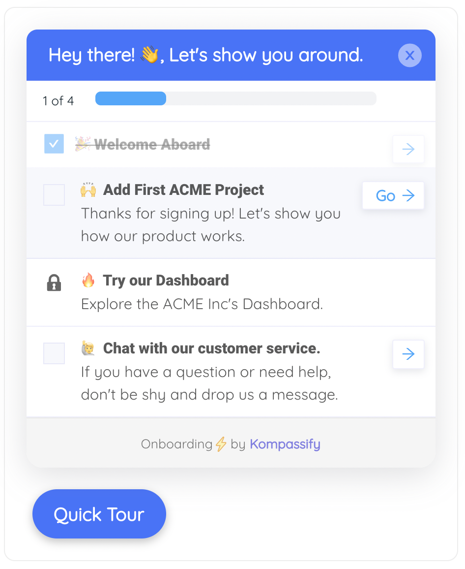
Think about the last product that felt genuinely good to use. Chances are you can't point to why. It wasn't the feature list; its competitors had the same one. It was a hundred moments too small to name: the toggle that glided instead of teleporting, the Save button that answered with a quiet "Saved ✓," the checklist item that drew its checkmark the instant you earned it. Each of those moments is a microinteraction, a complete little loop of interaction design built around one tiny task, and together they are the difference between a product that works and a product that feels alive.
Microinteractions are easy to dismiss precisely because each one is trivial. No roadmap ever prioritized "make the checkbox satisfying." But users form their opinion of your product's quality in the first minutes of use, long before your best feature gets a chance to testify, and in those minutes, microinteractions are almost the only evidence available. A new user who clicks something and gets silence doesn't think "the feedback layer is missing"; they think "is this thing broken?" That's why the craft matters most exactly where Kompassify's customers live: in the first-time user experience, where every acknowledged action deposits trust and every silent one withdraws it.
This guide covers the whole subject: what microinteractions are (and aren't), the four-part anatomy every one of them shares, trigger, rules, feedback, loops & modes, a set of live examples you can watch right on this page, the places where microinteractions do their heaviest lifting in user onboarding, and eight best practices for designing small moments that still feel right the five-hundredth time.
Key Takeaways
- A microinteraction is the smallest complete unit of interaction design: one trigger, one tiny task, one piece of feedback; the toggle glides, the button confirms, the checkmark draws itself.
- Every microinteraction has four parts: the trigger that starts it, the rules that decide what happens, the feedback the user perceives, and the loops & modes that govern what repetition does to it.
- They're how a product talks back. Users read responsiveness as quality and silence as breakage; perceived polish is mostly accumulated microinteraction craft.
- Onboarding runs on them: checklist ticks, progress nudges, inline validation, and beacon pulses are the micro-rewards that turn a list of setup tasks into momentum.
- Timing has a sweet spot: most feedback belongs between 100 and 400 milliseconds, fast enough never to cost the user time, slow enough for the eye to follow.
- Design for the five-hundredth use, not the demo. Delight decays with repetition; restraint, not spectacle, is what keeps a microinteraction likeable for years.
What Are Microinteractions? (Meaning & Definition)
A microinteraction is a contained product moment built around a single small task: turning a setting on, saving a change, marking a step complete, copying a link. It has a beginning (something triggers it), a middle (the product decides what happens), and an end (the user sees, hears, or feels the result). The whole loop usually lasts well under a second, which is why the pattern hides in plain sight. Users never inspect a microinteraction; they only accumulate the impression it leaves.
Microinteraction, defined. A microinteraction is a single-purpose trigger-feedback loop: one user or system action, processed by invisible rules, answered with perceivable feedback, and shaped by what should happen when it repeats. It is the smallest unit of design that still contains the full contract of interactivity: you did something, and the product tells you what happened.
The term gets stretched to cover anything that moves, so it's worth drawing the borders. A microinteraction is a structure, not a material; most use animation as their feedback, but a moving pixel isn't automatically a microinteraction, and the neighbors each have a different job:
| Concept | What it is | Its job | Example |
|---|---|---|---|
| Microinteraction | A complete trigger→feedback loop around one tiny task | Confirm the task happened; make state visible | Toggle glides on; Save button becomes "Saved ✓" |
| UI transition | Motion between screens or layout states | Preserve context so the user doesn't get lost | A modal sliding in from the same button that opened it |
| UI animation | Any moving pixels, decorative or communicative | Varies: from storytelling to pure ornament | A looping illustration on a landing page |
| Microcopy | The few words at the point of interaction | Explain, reassure, and set expectations | "You can change this later" under a form field |
The closest sibling is microcopy, and the two are best understood as a pair: microcopy is what the interface says at the small moments, microinteractions are what it does. A great form field validates as you type (microinteraction) and explains the fix in nine words (microcopy). Ship one without the other and the moment limps; ship both and the product feels like it's paying attention.
Why Microinteractions Matter More Than Their Size Suggests
The case for sweating the sub-second details, in five arguments:
-
They're how the product talks back
Interfaces have exactly one way to say "that worked": immediate, visible feedback. Every click that lands in silence forces the user to wonder: did it register? Should I click again? The double-submitted form and the rage-click are both symptoms of the same disease: a missing microinteraction. Feedback isn't decoration on top of function; for the user, feedback is the function's receipt.
-
They carry your product's perceived quality
Users can't audit your architecture, but they can feel your toggle. Craft at the smallest scale is read, correctly, as evidence of craft everywhere else, the same instinct that judges a car by the sound of its door. Two products with identical features split into "clunky" and "polished" almost entirely on the accumulated weight of their microinteractions.
-
They teach without teaching
A knob that glides tells you it can be dragged; a field that validates as you type teaches the format before the error; a card that lifts on hover announces it can be opened. Well-built microinteractions make an interface self-explaining, which quietly shrinks the amount of explicit guidance (tooltips, tours, docs) the rest of your onboarding has to carry.
-
They create momentum in onboarding
Every onboarding step a user completes should feel completed: the tick, the strike-through, the progress bar's nudge. Each is a micro-reward, and chained together they turn a list of setup chores into a streak the user wants to continue. This is the engine inside every effective onboarding checklist: the tasks get the user set up, but the microinteractions are what pull them to the next task.
-
They prevent errors and kill uncertainty
Inline validation catches the typo before submission; the disabled button with a spinner prevents the double charge; the "copied ✓" confirmation saves a paranoid re-copy. Multiply these across every session and microinteractions quietly remove a whole layer of user friction, the small, unreported kind that never becomes a support ticket but slowly convinces users the product is hard work.
The failure mode is the mirror image. Everything above holds for microinteractions built with restraint. Overbuilt ones invert the value: a 900ms bounce on an action performed forty times a day is a tax, not a delight; motion everywhere means attention nowhere. Microinteractions spend the user's attention to buy them certainty; a good one buys a lot with a little, and a self-indulgent one is just spending. Half the best practices below are about knowing the difference.
The Anatomy of a Microinteraction: Trigger, Rules, Feedback, Loops & Modes
The canonical dissection comes from interaction designer Dan Saffer, whose book Microinteractions named the pattern: every microinteraction, from a mute switch to a checklist tick, is built from the same four parts. The framework earns its keep because each part fails differently. When a moment feels wrong, this is the diagnostic:
Four parts, four distinct ways to fail: the trigger starts the loop, the rules decide the outcome, the feedback reports it, and the loops & modes decide how the moment ages with repetition.
1. The trigger: what starts it
Triggers come in two kinds. User triggers are deliberate: a click, a tap, a drag, a keystroke. System triggers fire on the product's initiative: the sync finished, a teammate commented, the session is about to expire. The design questions are recognizability and honesty: does the control advertise that it can be triggered (a toggle should look flippable before it's flipped), and does the trigger fire when, and only when, the user expects it to?
2. The rules: what happens, invisibly
Once triggered, something decides the outcome: turning on notifications enables these three kinds but not that one; marking a step complete increments the checklist but doesn't re-fire if clicked twice. Users never see the rules; they infer them from the feedback, building a little mental model with each use. Rules fail when that inferred model and the real one disagree: the setting that silently didn't apply, the "complete" that didn't stick. Most "confusing UX" complaints are rule failures wearing a feedback costume.
3. The feedback: the only part users perceive
Everything the user sees, hears, or feels: the glide, the color change, the drawn checkmark, the haptic tap. Feedback's job is to answer three questions instantly: did it work? what changed? what state am I in now? and its craft is proportionality. A hover deserves a whisper; a destructive delete deserves a firm, unmissable answer; completing onboarding has earned a small celebration. Feedback that answers louder than the question warranted is how products become exhausting.
4. Loops & modes: what time does to it
The forgotten part, and the one that separates professionals from portfolios: what happens the fifth time, the five-hundredth? A long-loop microinteraction can quiet down as it becomes familiar (the elaborate first-time animation becomes a brief tick by week three) or adapt to context. Designers preview a microinteraction a dozen times; users live with it for years. Designing the loop means designing for the user's year, not the designer's demo.
Microinteraction Examples You Can Watch Live
The four workhorses of SaaS interfaces, rebuilt below in pure CSS: these are live microinteractions running on this page, not videos of them. Each demonstrates the full anatomy: a trigger (simulated on a loop), rules, and feedback tuned to the 100–400ms sweet spot:
The everyday inventory goes far beyond these four: inline form validation that catches the typo mid-keystroke, the password strength meter filling as you type, "copied to clipboard ✓," the notification badge incrementing, pull-to-refresh, the typing indicator, the pulsing hotspot beacon inviting a click. None of them is a feature. All of them are the reason a product feels finished.
Microinteractions in User Onboarding: Where They Do Their Best Work
Onboarding is the microinteraction's biggest stage, for a simple reason: a new user performs more first-time actions in their first session than in the next month combined, and every first-time action is a moment of doubt: did I do that right? Feedback is the answer, and its accumulation is what "this product is easy" actually feels like from the inside. The high-leverage placements:
- The checklist tick. The single hardest-working microinteraction in onboarding: each completed task in a user onboarding checklist gets its instant tick, strike-through, and progress increment. The tasks set the user up; the ticks keep them going.
- The progress fill. An onboarding progress bar that eases forward on every step converts an abstract "you're getting there" into something the user watches happen, and near-complete bars are famously hard to abandon.
- Inline validation in signup. Catching the invalid email while the user is still in the field, instead of after submission, is the microinteraction that most directly protects your signup flow's conversion rate: every error caught early is an error screen never shown.
- The tour step transition. In a product tour, the way the highlight travels from one element to the next is doing navigation work: smooth movement tells the user's eye where to go, so each step arrives oriented instead of lost.
- The beacon pulse. A hotspot's slow pulse is a microinteraction running on a system trigger, a calm, ignorable signal that something is worth discovering, covering the long tail of feature discovery after the tour ends.
- The empty-state hint. A well-made empty state that responds to the user's arrival (the call-to-action settling into place, ready) turns a dead end into an invitation at exactly the moment motivation is highest.
- The completion moment. When the last step ticks, a brief celebration is earned and effective, the one place spectacle belongs, because it marks a genuine milestone. Used well it's the emotional punctuation of onboarding gamification; used on every minor step it's confetti-flavored noise.
The pattern behind the placements: onboarding microinteractions convert effort into evidence. Every acknowledged action tells the new user two things at once: the product works, and you're doing it right. Both messages compound, and both directly serve activation: users keep doing what the product visibly rewards.
The Same Moment, Two Ways: Overdone vs. Calm
Here is one interaction, marking an onboarding task complete, built twice, live. The left version is what happens when a microinteraction is designed to impress in a demo; the right applies the rules from this guide:
Run both versions through the only test that matters: the fortieth repetition. On the left, the bounce that was charming at 10 a.m. is a toll booth by 4 p.m.: the user is paying a second of forced spectacle per task, the perpetual badge has trained them to see motion as noise, and the wiggling card never lets the eye rest. On the right, the feedback costs nothing, confirms everything, and hands the stage back to the user's work, and because it stays quiet, the one big celebration at the end of onboarding still has something left to say. Feedback is for the user; applause is for the designer. Build the first one.
Microinteraction Best Practices: 8 Rules for Tiny Moments That Age Well
The principles, in the order you should apply them:
1. Let no action meet silence
The baseline rule, and the one most products still break somewhere: every user action gets an acknowledgment, within roughly 100 milliseconds, even if the real work takes longer. Press states, spinners, optimistic ticks: the form doesn't matter; the contract does. Audit your product for silent moments the way you'd audit for broken links: click everything, and note every place where nothing answers. Each one is a spot where users are currently double-clicking, doubting, or quietly deciding your product is flaky.
2. Keep feedback in the 100–400ms sweet spot
Motion has a budget, and it's the user's time. Below ~100ms a change reads as instant, right for hovers and presses. Between 100 and 400ms the eye can follow what changed without the hand having to wait, right for toggles, ticks, and progress. Beyond that, the animation starts billing the user on every repetition, and past ~700ms it reads as lag wearing a costume. When in doubt, shave: nobody has ever churned because the checkmark drew too crisply.
The feedback timing scale: hovers feel instant under 100ms, state changes belong between 100–400ms, and anything longer had better be a milestone the user reaches once.
3. Make motion carry information, not decoration
Every animated property should answer one of the user's three questions: did it work, what changed, where did it go? The toggle's traveling knob shows state moving; the progress bar's ease shows distance covered; the modal growing out of its button shows origin. If you can't say what a movement is telling the user, it isn't telling them anything; it's telling them about you. Cut it, and spend the attention budget where it informs.
4. Match the feedback's weight to the moment's weight
Proportionality is the craft in one word. A hover gets a whisper; a saved form gets a clear receipt; a destructive action gets an unmissable answer; completing onboarding gets the one celebration you've been saving. Products go wrong in both directions: the mission-critical delete that flickers by unnoticed, and the trivial task that triggers fireworks. Rank your product's moments by importance, and let the feedback volume follow that ranking exactly.
5. Design the five-hundredth use, not the first
This is Saffer's "loops" made operational: before shipping any microinteraction, imagine it performed forty times today by someone mid-deadline. Charm decays; utility doesn't. The safest designs are quick and quiet from day one; the cleverest quiet down over time: the elaborate first-run flourish that becomes a brief tick once the moment is familiar. Either way, the demo is the wrong audience. Your user's Tuesday afternoon is the audience.
6. Respect reduced motion, and every other body
Vestibular disorders make gratuitous motion genuinely nauseating, which is why every platform ships a reduced-motion preference; honor it by swapping movement for instant state changes (every live demo on this page does). Beyond motion: never let color carry a state change alone (the colorblind user needs the checkmark, not just the green), keep focus states as crafted as hover states, and make sure screen readers hear what sighted users see: a visual "Saved ✓" needs its announced equivalent. Accessible microinteractions aren't a variant of the pattern; they're the pattern done completely.
7. Keep one physics across the product
Microinteractions teach users what your product's world feels like, so the world needs consistent laws. One easing family, one duration scale, one accent color for confirmation, the same tick everywhere a tick appears. When every surface invents its own bounce, users can't build the muscle memory that makes an interface disappear; when the physics are uniform, every microinteraction reinforces every other one. A small motion spec (three durations, two easings, one celebration) outperforms a hundred bespoke animations.
8. Watch where feedback fails, then fix the loop
Microinteractions generate their own diagnostics. Double-clicks on single-click actions mean feedback arrived too late or too faintly. Users re-doing completed steps mean completion didn't register. Abandoned signup forms at the same field mean validation is punishing instead of helping. Session recordings and step analytics surface these patterns quickly; treat each as a broken contract between trigger and feedback, repair it, and measure again. Small moments, like everything else in onboarding, improve when watched.
Microinteraction Design: Do vs. Don't
✅ Do
- Acknowledge every user action within ~100ms
- Keep state-change feedback between 100–400ms
- Use motion to show what changed and where it went
- Match feedback volume to the moment's importance
- Quiet down repeated moments; design the long loop
- Honor prefers-reduced-motion with instant state changes
- Pair every color change with a shape or icon change
- Keep one motion spec: durations, easings, one accent
❌ Don't
- Leave any click, save, or submit unanswered
- Make users wait out an animation to continue working
- Animate for spectacle on actions repeated daily
- Fire celebrations for trivial steps; save them for milestones
- Ship the demo version without imagining use #500
- Rely on color alone to signal success or failure
- Give every component its own bespoke bounce
- Treat accessibility settings as an edge case to skip
Onboarding Microinteractions Without Engineering Time
Here's the practical problem: the microinteractions that matter most for activation live inside onboarding patterns (checklists, progress bars, tours, hotspots) and building those patterns in-house means building all their feedback too, plus the per-user state that makes it behave. With Kompassify, the patterns arrive with their microinteractions already designed in:
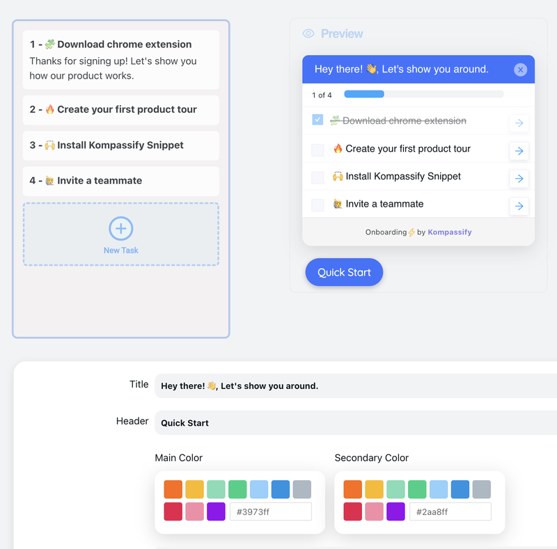
- Checklists that tick. Build a user onboarding checklist in the visual editor and every completed task gets its acknowledgment (the tick, the progress increment) with completion tracked per user, automatically.
- Progress that fills. Onboarding progress advances visibly as users move through their steps, giving every flow the momentum mechanics without a line of animation code.
- Beacons that pulse politely. Hotspots ship with the calm pulse the pattern demands, and they retire per user once consumed, so the microinteraction never decays into a nag.
- Tours that move the eye. Product tours carry the user's attention from step to step, targeted by segment and launched without a release cycle.
- Measured, not guessed. Built-in analytics show where users complete, stall, or drop each flow: the signal you need to apply rule #8 without wiring your own event pipeline.
You design the journey; the small moments come pre-crafted. Kompassify is GDPR compliant and EU-hosted, free for under 100 monthly active users, with paid plans from $129/month.
Ship Onboarding That Feels Alive
Kompassify puts product tours, onboarding checklists, hotspots, and announcements on top of your existing product (no code, no release cycle) with the ticks, fills, and pulses that make guidance feel responsive already built in. Give your new users a first session where every action answers back. GDPR compliant, EU-hosted, and free for under 100 monthly active users.
Start for Free →Frequently Asked Questions
What are microinteractions?
A microinteraction is the smallest complete unit of interaction design: a single trigger-feedback loop built around one tiny task. The user (or the system) triggers it, flipping a toggle, pressing Save, completing a checklist step; invisible rules decide what happens, and visible feedback tells the user it happened: the toggle glides, the button confirms, the checkmark draws itself. Individually each one lasts well under a second; collectively they are how a product communicates, and they account for most of what users describe as a product feeling "polished" or "alive."
What are the four parts of a microinteraction?
Every microinteraction has four parts: the trigger (what starts it: a user action like a click, or a system event like a sync finishing), the rules (the invisible logic deciding what happens once triggered), the feedback (everything the user sees, hears, or feels: the animation, the color change, the sound), and the loops and modes (what happens over time and with repetition: does the five-hundredth occurrence behave like the first, or does it quiet down?). This framework was popularized by interaction designer Dan Saffer, and its practical value is that each part fails differently: weak triggers go unnoticed, wrong rules confuse, missing feedback feels broken, and ignored loops turn day-one delight into day-ninety annoyance.
What is the difference between a microinteraction and an animation?
Animation is a material; a microinteraction is a structure. An animation is any moving pixels: decorative, illustrative, or communicative. A microinteraction is a complete functional loop around one small task: trigger, rules, feedback, loops. Most good microinteractions use animation as their feedback layer, but not all animation belongs to a microinteraction: a looping hero illustration on a landing page animates without responding to anything. The test: if it responds to something the user or system did, and tells the user what happened, it's a microinteraction. If it just moves, it's animation.
Why are microinteractions important in user onboarding?
Because onboarding is when users decide whether your product feels trustworthy, and microinteractions are the fastest trust signal you have. A new user performs dozens of first-time actions in their first session; every one that responds instantly and clearly, the checklist item that ticks, the progress bar that nudges forward, the form field that validates as they type, deposits a little confidence. Microinteractions also create momentum: each completed step's feedback is a micro-reward that pulls the user to the next step, which is why onboarding checklists and progress bars work at all. Silence, by contrast, reads as breakage: a click that produces nothing makes new users doubt the product and themselves.
How long should a microinteraction animation last?
Most interface feedback belongs between roughly 100 and 400 milliseconds. Below ~100ms a change reads as instantaneous, right for hover states and button presses. The 100–400ms band is the sweet spot for state changes like toggles, checkmarks, and progress updates: fast enough never to make the user wait, slow enough that the eye can follow what changed. Beyond ~400ms an animation starts costing the user time on every repetition, and past ~700ms it reads as sluggishness or breakage. The exceptions are rare celebration moments (completing onboarding, reaching a milestone) which can afford a second or two precisely because they happen once.
What are examples of microinteractions in SaaS products?
The everyday inventory is bigger than most teams realize: a toggle gliding between states, a Save button morphing into "Saved ✓", a checklist item drawing its checkmark and striking through its label, a progress bar nudging forward, an input field validating inline as the user types, a password strength meter filling, a pull-to-refresh spinner, a "copied to clipboard" confirmation, a notification badge incrementing, a hotspot beacon pulsing to invite a click, and the brief celebration when onboarding completes. Each is a complete trigger-feedback loop around one small task, which is exactly what makes it a microinteraction rather than mere decoration.
How do you add onboarding microinteractions without coding?
With a no-code onboarding platform like Kompassify, the onboarding patterns that carry the most microinteraction weight (checklists that tick, progress bars that fill, hotspot beacons that pulse, product tours that transition between steps) come with their feedback designed in. You build the flow in a visual editor on top of your live product, target it by segment, and publish without a release cycle; the ticks, fills, and pulses ship with it, tracked per user so consumed guidance retires gracefully. Kompassify is GDPR compliant and EU-hosted, free for under 100 monthly active users, with paid plans from $129/month.