A user signs up, lands in your product for the first time, and stares at an empty dashboard. You have a lot you want to tell them: where to start, what your best feature does, the update you shipped last week. So you send an email. It lands in an inbox they will not open until Thursday, if ever.
There is a better place to say all of that: inside the product, while the user is actually there. That is what in-app messaging is. Instead of hoping a user comes back to an inbox, you meet them in the app, in context, at the exact moment your message can help. A welcome modal, a tooltip pointing at the button they are hunting for, a banner announcing the feature they have been waiting for, all shown where attention is highest.
This guide covers exactly what in-app messaging means, why it consistently outperforms email and push for guiding users, the types of in-app messages and when to use each, real examples you can copy, and the best practices for building an in-app messaging strategy that drives onboarding, adoption, and retention in 2026.
Key Takeaways
- In-app messaging reaches users in context. It communicates inside the product, at the moment of use, instead of relying on an inbox the user may never open.
- It is a toolkit, not one widget. Modals, banners, tooltips, tours, checklists, notification widgets, and surveys each fit a different priority and moment.
- Relevance and timing beat volume. One well-targeted message at the right moment does more than ten generic broadcasts, and costs less user patience.
- It is complementary to email and push, not a replacement. Push brings users back, email handles the long-form; in-app messaging makes the in-product session productive.
- Segmentation is what makes it work. Target by role, plan, and behavior so each user only sees the messages that matter to them.
- If you don't measure it, you're guessing. Track view, click, and conversion for every message, and cut the ones that only add noise.
What Is In-App Messaging?
In-app messaging is the practice of communicating with users inside your product, while they are using it, rather than through external channels like email, SMS, or a phone call. An in-app message is any piece of UI shown within the app to guide, inform, or nudge a user toward value, from a first-run welcome modal to a tooltip on a button to a banner announcing a new release.
In-app messaging, defined: proactive, product-led communication delivered to users inside the application itself, ideally in context and at the moment each message is relevant. Because it reaches users where engagement is already highest, in-app messaging is the most reliable way to guide onboarding, surface features, and keep users informed without depending on a separate inbox.
The critical word is in context. In-app messaging is not about broadcasting the same pop-up to everyone the moment they log in. It is about surfacing the right message to the right user at the moment it can help them, a welcome flow for a brand-new user, a feature tip triggered when someone reaches the relevant screen, an announcement shown only to the users a new feature actually helps.
It helps to see where in-app messaging sits relative to your product. Every message is one link in a chain: a user has to be guided before they activate, activate before they adopt features, and keep discovering value before they stay. In-app messaging is how you deliver that guidance at each step, without pulling the user out of the product to read an email. It is a core building block of feature discovery and of a strong onboarding experience.
Why In-App Messaging Matters
The whole appeal of in-app messaging comes down to attention. A message is only useful if someone actually sees it, and the single best place to be seen is inside the product the user has chosen to open. Everything below flows from that simple advantage.
- It reaches an already-engaged user. Email open rates are low and falling; an in-app message reaches a user who is already looking at your product, so visibility is dramatically higher.
- It drives onboarding and activation. New users need guidance exactly when they are stuck, not hours later in an inbox. In-app messages walk them to their first win in the moment.
- It powers feature discovery and adoption. Users cannot adopt features they never notice. Surfacing a capability in-app, when it becomes relevant, is the most reliable way to get it found and used.
- It reduces support load. A well-placed tooltip or checklist answers "how do I..." questions before they become tickets, cutting the volume of repetitive support requests.
- It lifts engagement and retention. Keeping users informed about new value and nudging them past drop-off points inside the product keeps them engaged and moving forward.
The "message everyone, all the time" trap. The power of in-app messaging is also its risk. Because messages are so visible, over-messaging is punishing: fire a modal on every login and users learn to dismiss everything on reflex, including the message that mattered. The teams that win with in-app messaging treat user attention as a budget, not an unlimited channel. Relevance and restraint are what make the channel keep working.
In-App Messaging vs. Email vs. Push Notifications
In-app messaging, email, and push are often lumped together as "user messaging," but they reach users in fundamentally different states. Choosing the wrong channel for a message is one of the most common mistakes teams make.
| In-App Messaging | Push Notifications | ||
|---|---|---|---|
| When it reaches the user | While they are inside the product | Whenever they next open their inbox | When they are away from the product |
| User state | Engaged and in context | Out of context, often much later | Not currently using the product |
| Best for | Onboarding, feature discovery, in-moment guidance | Long-form updates, digests, re-marketing | Re-engagement and time-sensitive alerts |
| Relative visibility | Very high, the user is already looking | Low, depends on opens and inbox noise | Medium, depends on opt-in and fatigue |
The takeaway is not that in-app messaging replaces the others, it is that each has a job. Push brings a lapsed user back to the app. Email carries long-form content and reaches users who are not active. In-app messaging makes the session productive once the user is actually there. The best lifecycle strategies use all three in concert, with in-app messaging owning everything that happens in-product.
A simple rule of thumb: if the message helps the user do something right now, in the product, it belongs in-app. If it is meant to pull an absent user back, use push. If it is long-form or for users who are not active, use email. Matching the message to the moment is most of the battle.
Types of In-App Messages
There is no single "in-app message." It is a family of formats, each suited to a different priority and moment. Strong products combine several, matching the format to how urgent and how interruptive a given message should be.
The disruption ladder: in-app message formats ordered by how much attention they demand. Use the ambient formats generously and reserve the most interruptive ones for must-see moments.
-
Modals (centered pop-ups)
The most prominent, most interruptive format. Perfect for high-priority moments, a welcome message, a major announcement, a required action, and best used sparingly so it keeps its impact.
-
Banners and slideouts
A strip across the top or a card sliding in from a corner. Non-blocking, so they are ideal for medium-priority news, maintenance notices, a soft feature nudge, without hijacking the whole screen.
-
Tooltips and hotspots
A contextual hint attached to a specific control, revealing what it does the moment it becomes relevant. The workhorse for surfacing a single feature in context. See how to create an onboarding tooltip and a roundup of tooltip examples.
-
Product tours
A short, multi-step guided walkthrough that strings several messages into a flow through a workflow. The right format when a feature takes more than one step to explain. See how to build a product tour that converts and real product tour examples.
-
Onboarding checklists
A persistent list of getting-started tasks that routes new users through your highest-value actions. The visible progress pulls users forward toward activation. See how to create an onboarding checklist.
-
Notification widgets and inboxes
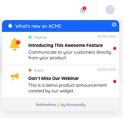
A persistent bell or feed inside the app where updates accumulate for users to read on their own time. Perfect for a running "what's new" that does not interrupt, and the ideal home for release announcements.
-
In-app surveys
Micro-surveys, NPS, or CSAT prompts collected in context, right after a relevant action. Because they reach an engaged user in the moment, response rates far exceed emailed surveys.
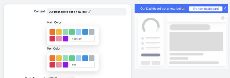
An in-app announcement banner is one format in the toolkit, each type of in-app message fits a different priority and moment, from an interruptive welcome modal to an ambient notification widget.
In-App Messaging Examples
The clearest way to understand in-app messaging is to see how strong products use it. A few patterns you can adapt:
-
The welcome modal that asks one question
Many top SaaS products open with a short welcome modal that asks the user's role or goal, then tailors everything that follows. It turns a generic first run into a personalized one, and the answer feeds segmentation for every later message.
-
Contextual tours triggered by the workflow
Instead of a single tour at sign-up, tools like Canva introduce features exactly when the user reaches the relevant screen. Each in-app message lands when it is useful, which is why it sticks instead of getting skipped.
-
In-app what's-new feeds
Slack and Linear surface new capabilities through an in-product changelog and targeted announcements, reaching engaged users inside the app rather than hoping they read a marketing email. See how to announce a new product feature.
-
The getting-started checklist
Products like Notion greet new users with a checklist of first actions. Each item is an in-app message that nudges the user one step closer to activation, with visible progress doing the motivating.
-
The in-context micro-survey
A one-tap NPS or "was this helpful?" prompt shown right after a key action collects feedback while the experience is fresh, at response rates an emailed survey could never reach.
The common thread is that none of these are random broadcasts. Each message is triggered by a specific moment and targeted to a specific user. For more patterns you can adapt, see our roundup of great user onboarding examples.
How to Build an In-App Messaging Strategy
A pile of pop-ups is not a strategy. In-app messaging works when every message is tied to a moment in the user journey, matched to the right format, and targeted to the right user. Here is how to put that into practice.
1. Map the moments worth a message
Before building anything, list the moments in the user journey where a message adds real value: first login, the activation milestone, a new feature launch, a drop-off point, an upgrade opportunity, a renewal. A message that is not tied to one of these moments is usually noise. This map is the backbone of your whole strategy.
2. Match each moment to the right format
High-priority, must-see moments earn an interruptive modal. Lower-priority news fits a banner or the notification widget. A single feature calls for a tooltip; a multi-step workflow calls for a tour. Reserve the loud formats for the moments that truly warrant interruption, and use ambient ones for everything else.
3. Guide the first sessions deliberately
Do not leave onboarding to chance. Pair an onboarding checklist that routes users to your highest-value actions with a short welcome flow, so new users reach their first win before they have a chance to bounce. This is where in-app messaging pays for itself fastest.
4. Segment so every message is relevant
A marketer and a developer should not see the same messages. Ask a question or two at sign-up, role, goal, use case, and use the answers, plus behavior and plan, to target each message. A simple welcome segmentation step cuts the noise so each user only sees what matters to them.
5. Trigger by context, not by calendar
The best in-app messages fire when the user does something, not on a fixed schedule. Show the feature tip when they reach the relevant screen, the upgrade nudge when they hit a plan limit, the survey right after a key action. Contextual triggers are the difference between a helpful nudge and an interruption.
6. Announce new features inside the product
When you ship something, reveal it where users already are. Use in-app announcements and a notification widget to surface the release to the specific users it helps, not a blanket email. A targeted "you do X a lot, here's a faster way" beats a generic changelog every time.
7. Measure every message and prune ruthlessly
Treat each message as an experiment. Track its view, click, dismiss, and conversion rate, and kill the ones that only add friction. Kompassify's no-code product analytics let you see how each message performs by cohort, plan, and role, so your messaging gets sharper over time instead of noisier.
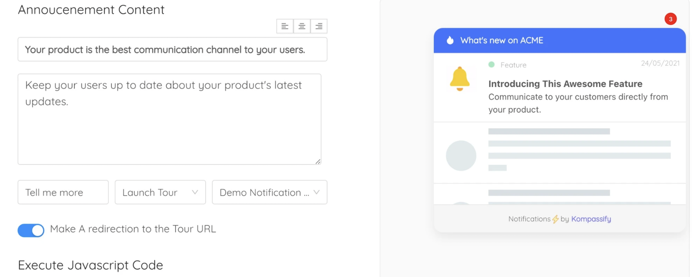
A no-code builder lets product and onboarding teams create, target, and measure in-app messages without waiting on engineering for every change.
In-App Messaging: Do vs. Don't
A quick reference for what makes in-app messaging land and what makes users mute it.
✅ Do
- Tie every message to a moment in the user journey
- Trigger messages by context and behavior
- Match the format to the message's priority
- Segment by role, plan, and behavior
- Keep copy short and lead with the value
- Give every message a clear next action
- Cap frequency and respect dismissals
- Measure view, click, and conversion, then prune
❌ Don't
- Fire a modal on every login
- Broadcast the same message to every user
- Use an interruptive modal for low-priority news
- Stack multiple pop-ups on the same screen
- Write long paragraphs no one will read
- Trigger messages on a fixed calendar, out of context
- Ignore that users dismissed a message already
- Ship messages and never look at whether they work
In-App Messaging Best Practices for 2026
These principles hold whether you are a small startup or a scaling SaaS company. They are simple to state and easy to get wrong.
Relevance over volume
The goal is not to show every user every message, that just recreates the overwhelm you are trying to avoid. The goal is the right message, to the right user, at the right moment. One perfectly-timed prompt beats ten generic ones. In-app messaging is a targeting problem before it is a design problem.
Respect attention as a budget
Every message spends a little of your users' patience. Overspend and they mute, dismiss, and tune out everything, including the message that would have mattered. Use interruptive formats sparingly and ambient ones generously, and always honor a dismissal.
Trigger in context, not on a schedule
A message fired because "it's day three" is a guess; a message fired because the user just hit a plan limit is a certainty. Behavioral and contextual triggers consistently outperform time-based ones, because they arrive exactly when the message is relevant.
Keep it short and action-oriented
In-app real estate is small and attention is short. Lead with the value in one line, and give the user a single clear action. A message with no next step is just an interruption; a message with a button is an invitation.
Make it measurable
If you cannot see which messages drive action and which get dismissed, you are guessing. Instrument every message, then let the data retire the ones that only add noise. The best in-app messaging programs get quieter and more effective over time, not louder.
How to Measure In-App Messaging
In-app messages are easy to ship and easy to over-ship, which is exactly why measurement matters. For every message, watch how it performs across the funnel from seen to acted-on.
Every in-app message is a small funnel: of the users targeted, some view it, fewer click, fewer convert; dismissals leak out along the way, and downstream activation and retention is the outcome that matters.
| Metric | What it tells you |
|---|---|
| View / impression rate | How many targeted users actually saw the message, your reach for that moment. |
| Click / engagement rate | How compelling the message and its call to action are once seen. |
| Conversion rate | How many users completed the action the message was driving, the metric that matters most. |
| Dismiss / close rate | How often users wave the message away, a high rate is a signal to rethink timing or relevance. |
| Downstream activation / retention | Whether users who saw the message go on to activate and stay, the real business outcome. |
The point of measurement is not a dashboard for its own sake, it is a feedback loop. A message with a high view rate but low conversion needs better copy or a clearer action; one with a high dismiss rate needs better timing or targeting; one that drives no downstream activation should be cut. Instrumenting messages the way you instrument the rest of your product is what turns in-app messaging from guesswork into a system that improves every sprint.
Your In-App Messaging Checklist
Use this as a practical checklist for any in-app messaging project.
Plan & Prioritize
- List the moments in the user journey where a message adds real value
- For each moment, decide how urgent and how interruptive the message should be
- Match each moment to the right format, modal, banner, tooltip, tour, checklist, or widget
- Define the segments each message should, and should not, reach
Build & Target
- Guide first sessions with an onboarding checklist and a welcome flow
- Attach tooltips or a product tour to the workflows that need them
- Announce new features in-app with announcements and a notification widget
- Segment surfacing by role and goal with a welcome step
- Trigger each message by context and behavior, not a fixed calendar
Measure & Refine
- Track view, click, conversion, and dismiss rate for every message
- Watch downstream activation and retention, not just clicks
- Cap frequency and always honor a dismissal
- Prune the messages that only add noise, and sharpen the ones that work
Ready to Message Users Where It Counts?
Kompassify gives you every in-app message type in one place, welcome and announcement modals, banners, tooltips, hotspots, product tours, onboarding checklists, and a notification widget, plus segmentation and built-in analytics to measure what each message drives, without writing a single line of code. Free for up to 100 monthly active users, GDPR-compliant, and EU-hosted.
Start for Free →Frequently Asked Questions
What is in-app messaging?
In-app messaging is the practice of communicating with users inside your product, at the moment they are using it, rather than through external channels like email or SMS. An in-app message is any piece of UI shown within the app to guide, inform, or nudge a user: a welcome modal, a feature-announcement banner, a tooltip pointing at a button, an onboarding checklist, or a notification widget. Because in-app messages reach users while they are already engaged and in context, they are far more likely to be seen and acted on than messages sent to an inbox the user may never open.
What is the difference between in-app messaging and push notifications?
In-app messages are shown while a user is actively inside your product, so they are contextual and reach an already-engaged user. Push notifications are sent to a user's device or browser when they are not in the app, to try to bring them back. In-app messaging is best for guiding, onboarding, and surfacing features in the moment; push is best for re-engagement and time-sensitive alerts. The two are complementary: push brings a user back, and in-app messaging makes the session productive once they arrive.
What are the types of in-app messages?
The main types of in-app messages are modals (centered pop-ups for high-priority messages like welcomes or major announcements), banners and slideouts (non-blocking strips or corner cards for lower-priority news), tooltips and hotspots (contextual hints attached to a specific control), product tours (multi-step guided walkthroughs of a workflow), onboarding checklists (task lists that drive activation), notification widgets or inboxes (a persistent feed of updates users can read on their own time), and in-app surveys (NPS, CSAT, or micro-surveys collected in context). Each type fits a different priority and moment.
Why is in-app messaging important?
In-app messaging is important because it reaches users where engagement is highest: inside the product, in context, at the exact moment a message is relevant. It drives onboarding and activation by guiding new users to value, increases feature discovery and adoption by surfacing capabilities in the moment, reduces support load by answering questions before they are asked, and lifts retention by keeping users informed and moving forward. Compared with email, in-app messages have dramatically higher visibility because they do not depend on a user opening a separate inbox.
How do you create an in-app messaging strategy?
Start by mapping the moments in the user journey where a message adds value: onboarding, activation, a new feature launch, a drop-off point, or a renewal. For each moment, pick the message type that matches its priority, use interruptive modals sparingly and ambient tooltips or banners generously. Segment messages by role, plan, and behavior so each user only sees what is relevant to them, trigger messages contextually rather than on a fixed schedule, and measure the view, click, and conversion rate of every message so you can cut what does not work. A no-code tool like Kompassify lets product and onboarding teams build, target, and measure in-app messages without engineering.
What is the difference between in-app messaging and in-app chat?
In-app chat is a two-way conversation between a user and a support agent or bot inside the product. In-app messaging is broader: it is any proactive, product-led message shown inside the app, including one-way announcements, onboarding guidance, tooltips, tours, checklists, and surveys, as well as chat. Most product and onboarding teams use in-app messaging to guide users and drive adoption proactively, while chat handles reactive support requests. The two often live side by side in the same product.
What tools do you need for in-app messaging?
You need a tool that can create in-app messages, target them to the right users, and measure them, ideally without engineering effort for every change. Kompassify provides all of the common in-app message types in one no-code platform: welcome and announcement modals, banners, tooltips and hotspots, multi-step product tours, onboarding checklists, and a notification widget, plus segmentation and built-in analytics to measure what each message drives, without writing code or sending data to a third-party tool. It's free for up to 100 monthly active users and GDPR-compliant with EU-based data hosting.