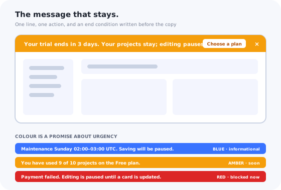
Every in-app message type has a defining property. Modals interrupt. Toasts vanish. Tooltips point. Banners stay. A banner sits at the top of the interface and remains there, page after page, until the user does something about it or the thing it describes stops being true.
That persistence is the entire reason to use a banner and the entire reason most banners fail. Used for a state that genuinely stays true, a banner is the most honest message in the product: it says what is wrong, offers the fix, and leaves when the fix is done. Used for news, promotion or a feature nobody asked about, it becomes a strip of furniture that users learn to see past within a week, and takes every future banner with it.
This guide is about the difference. The types of banner, a rule for choosing a banner over a modal, a toast or a tooltip, eight example patterns with the copy and the end condition, how to write and colour one, and how to tell whether it worked.
Key Takeaways
- A banner is for states, not news. It earns persistence by describing the user's own situation and leaving when it changes.
- Every banner needs an end condition, written down before it ships. A banner with none is the cause of banner blindness.
- One banner at a time. Decide the priority order in advance; stacked banners cancel each other.
- One line, one action, one dismiss. If it needs a second sentence it is a modal or a page.
- Colour is a promise. Red means blocked, amber means soon, blue means informational, green means done. Do not spend red on a webinar.
- Measure the outcome, not the impressions. A state banner succeeds when the state clears.
What Is an In-App Banner? (Definition & Anatomy)
In-app banner: definition
An in-app banner is a persistent, non-blocking message strip anchored to an edge of the interface, usually the top, that stays visible until the user dismisses it or until the condition it describes clears. It carries one line of text, one action and a way to close it. It does not interrupt the task, and it does not disappear on its own.
The anatomy is short because the format is short. A banner has:
- One line. A statement of the situation, in the user's terms: what is true and what it means for them.
- One action. A button or link that resolves the situation or leads to the place where it can be resolved. Not two. Not “learn more” on its own.
- A dismiss control, whose result is remembered, except for the rare state the user genuinely cannot work around.
- A colour and an optional icon that signal urgency before the words are read.
- An anchor: the top of the whole interface for account-level messages, the top of a page or section for page-level ones.
Everything else in in-app messaging can carry more than that. A banner cannot, and trying to make it carry more produces a bad modal that also cannot be closed.
The Five Types of In-App Banner
Banners differ by what triggers them and what ends them. Five types cover almost everything that belongs in the format, and one of the five is the type most teams overuse.
| Type | Triggered by | Ends when | Colour | Example |
|---|---|---|---|---|
| 1. State | Something true about the user's account: trial ending, payment failed, sync paused | The state clears | Amber (soon) or red (blocked) | “Your trial ends in 3 days. Choose a plan.” |
| 2. Onboarding nudge | Setup left unfinished past a threshold | The step is done, or dismissed | Blue | “Connect your calendar to start booking. 2 of 3 steps done.” |
| 3. Page context | Something true about this page: read-only, filtered, archived, changed | The user leaves the page or the condition clears | Grey or blue | “You are viewing an archived project. Restore it to edit.” |
| 4. Announcement | A release, a change of terms, a maintenance window | Dismissed, or a fixed window | Blue | “Maintenance Sunday 02:00–03:00 UTC. Saving will be paused.” |
| 5. Plan and upgrade | A limit reached or approaching | Upgraded, or dismissed | Amber at the limit; never red | “You have used 9 of 10 projects on the Free plan.” |
The overused type is the fourth. Announcements are news, and news is read once; a strip that stays for a week to announce a feature is a strip that will be ignored for six of the seven days. The feature announcement guide covers the formats that suit news better, and the notification centre is where an announcement can live persistently without occupying the top of every page. The banner is reserved for announcements that describe an upcoming change to the user's own experience: maintenance, a terms update, a deprecation with a date.
Banner vs. Modal vs. Toast vs. Tooltip: A Decision Rule
The formats are not interchangeable, and the choice is almost mechanical once two questions are answered: does the user need this before their next action, and will it still be true in a minute?
The banner is the fourth answer, not the first. Most messages that end up as banners should have stopped at question one or question four.
The same rule in a table, with the failure that follows from choosing wrong:
| Banner | Modal | Toast | Tooltip | |
|---|---|---|---|---|
| Interrupts | No | Yes | No | No |
| Persists | Until acted on or cleared | Until closed | Seconds | While relevant |
| Anchored to | An edge | The centre | A corner | An element |
| Right for | A state that stays true | A decision that cannot wait | Confirmation of an action | Explaining one control |
| Wrong for | News, promotion | Anything ignorable | Anything the user must not miss | Anything not about that element |
| Failure when misused | Banner blindness | Resentment, reflex closing | Missed messages | Clutter |
For the neighbouring formats in depth: what a modal is and when it is right, tooltips, and hotspots.
In-App Banner Examples: 8 Patterns
Each example gives the line, the action and, because it is the part that gets forgotten, the end condition. The copy is illustrative; the structure is the point.
1. The trial countdown
Line: “Your trial ends in 3 days. Your projects stay; editing pauses.” Action: Choose a plan. Ends: on conversion, or when the trial ends and a different state banner takes over. Colour: amber from three days out, not before. A countdown that starts on day one of a fourteen-day trial is a decoration for eleven days and a warning for three; start it when it is a warning.
2. The failed payment
Line: “Your last payment did not go through. Update your card to keep your workspace active.” Action: Update payment. Ends: when a payment succeeds. Colour: amber with a date; red only once access is actually restricted. This is the banner with the clearest return of any in the product, and the one most often shown only to the person who cannot fix it. Target it to billing admins, and tell everyone else who to ask.
3. The unfinished setup
Line: “Connect your data source to see your first report. 2 of 3 steps done.” Action: Connect now. Ends: when the step completes, or on dismiss for that session. Colour: blue. The progress fragment is what makes this banner different from a nag: it tells the user how close they are. If the product has an onboarding checklist, the banner is its one-line summary, and it should open the checklist.
4. The maintenance window
Line: “Scheduled maintenance Sunday 02:00–03:00 UTC. Saving will be unavailable.” Action: none needed; a link to details is optional. Ends: when the window closes. Colour: blue before, amber during. Show it from about 48 hours out; a maintenance banner that appears a week early is dismissed and forgotten by the day it matters.
5. The new version available
Line: “A new version is available. Reload to get the latest fixes.” Action: Reload. Ends: on reload. Colour: blue. The banner exists because a modal would interrupt work in progress and a toast would vanish before the user finished their sentence. Never force the reload; the user's unsaved work outranks your deploy.
6. The read-only page
Line: “You are viewing an archived project. Restore it to make changes.” Action: Restore. Ends: when the user leaves the page or restores the project. Colour: grey. A page-level banner sits at the top of the page, not the app, and it prevents the most confusing support ticket there is: “the buttons don't work”.
7. The plan limit
Line: “You have used 9 of 10 projects on the Free plan.” Action: See plans. Ends: on upgrade, or dismissed until the limit is actually reached. Colour: amber at the limit; never red, because a limit is not an error. The in-app upsell guide covers how to keep this banner from reading as a sales pitch: state the fact, let the user decide.
8. The terms or policy change
Line: “Our terms of service change on 1 October. Review what is different.” Action: Review changes. Ends: on the effective date, or on dismiss. Colour: blue. A banner is right here because the change is about the user's own relationship with the product and has a date. An announcement about a feature is not the same thing and should not borrow this slot.
Writing the Banner: The Line, the Action, the Colour
The line
One sentence, sometimes two short ones, that states what is true and what it means for the user, in that order. “Your trial ends in 3 days” is the fact; “editing pauses” is the consequence. Skip the greeting, the apology and the exclamation mark. The microcopy rules for error messages apply almost unchanged: specific, calm, and about the user rather than the system.
The action
A verb that resolves the situation: Update payment, Choose a plan, Connect now, Reload. Not Learn more, which is where actions go to hide, and not two buttons, which is a modal's job. If there is genuinely nothing for the user to do, say nothing to do and leave the action out.
The colour
Colour is read before words, and it is a promise the product makes about urgency. Keep the promise. Red means blocked now: access restricted, data at risk. Amber means soon: a deadline, a limit, a warning. Blue means informational: a nudge, a change, a window. Green means done, and is rarely a banner at all. Grey is for page context. A product that uses red for a webinar has spent the colour, and its next real outage will be dismissed by reflex.
In-App Banner Best Practices: 8 Rules
-
One banner at a time
Write the priority order down: blocking states, then warnings, then nudges, then announcements. When two are true, the higher one shows and the other waits.
-
Every banner has an end condition before it ships
The state that clears it, or the date, or the dismiss. A banner with no end is furniture by day three.
-
Dismissal is remembered
Across page loads and sessions. A dismissed banner that returns on refresh is the format's most reliable way of training people to ignore it.
-
Target the person who can act
Payment banners to billing admins, setup banners to the person doing the setup, page banners to people on that page. A banner shown to someone who cannot resolve it is noise with a button. The segmentation guide covers the attributes to target on.
-
Push content down; never cover it
The banner occupies its own row above the interface. A banner that overlays the navigation or the primary action is a modal that forgot to dim the page.
-
Check it on a phone
A line that fits on desktop wraps to three on mobile and pushes the first action below the fold. Shorten the mobile line, or drop the banner on mobile for anything not blocking.
-
Time the warning to the deadline
Three days for a trial, 48 hours for maintenance, at the limit for a plan. A warning shown too early is dismissed and forgotten by the day it applies.
-
Measure the outcome
Did the state clear, did the step complete, did the payment go through. Impressions measure the banner's existence, not its effect.
Why Banners Get Ignored
Users stop seeing banners for three reasons, all of them the product's fault: the banner was there yesterday and the day before, so it reads as part of the frame; it described something that was not about them, so the strip learned to mean “marketing”; or two of them stacked and neither could be read. Every rule in this guide is a defence against one of the three. The mechanisms, the diagnosis and the seven fixes are in the banner blindness guide; the short version is that persistence has to be earned by relevance, and a banner that is true for the user and gone when it is not keeps earning it.
How to Measure an In-App Banner
| Metric | What it tells you | Healthy looks like |
|---|---|---|
| Outcome rate | Whether the state cleared or the step completed after the banner showed | Higher than for users who did not see it |
| Action click-through | Whether the line and the verb work | Rising when the copy is specific; flat when it is vague |
| Dismiss rate and time to dismiss | Whether the banner is relevant to the people seeing it | Low, and slow; instant dismissal means wrong audience |
| Average lifetime | How long banners stay on screen | Short; a long average means end conditions are missing |
| Tickets about the state | Whether the banner pre-empted the question | Falling for the state it describes |
In-App Banners: Do vs. Don't
Do
- Use banners for states that stay true: trial, payment, setup, read-only, maintenance.
- Write the end condition before the copy.
- Show one at a time, in a written priority order.
- Keep it to one line, one verb, one dismiss that is remembered.
- Keep the colour promise: red blocked, amber soon, blue informational.
- Target the person who can resolve it.
Don't
- Use a banner for a feature launch, a webinar or a promotion.
- Ship a banner with no end condition.
- Stack banners, or let a dismissed one return.
- Put two buttons, a paragraph or “learn more” alone in it.
- Spend red on anything that is not blocking now.
- Cover the navigation or the primary action.
Building In-App Banners Without Engineering Time
The rules above are cheap to state and expensive to keep when every banner is an engineering ticket: the end condition gets deferred, the targeting gets simplified to “everyone”, and the copy that needed changing on Tuesday changes in the next sprint.
Kompassify's announcements include a top banner built in a visual editor: the line, the action, the colours, and the targeting by page, segment and user attribute, published without a release. The notification widget alongside it is where the news goes, so the banner slot stays reserved for states. Dismissals are remembered per user, and analytics show who saw the banner, who clicked, and who closed it.
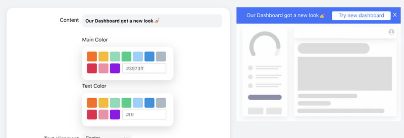
The banner editor: one line, one action, a colour that matches the urgency, and a preview above the real interface. Targeting and the end condition are set in the same place.
One line, one action, gone when it is done
Build state banners, setup nudges and maintenance notices in a visual editor, target them to the people who can act, and see who clicked and who closed. Free up to 100 monthly active users, plans from $129/month, GDPR-compliant and EU-hosted.
Start for free →The One-Paragraph Version
An in-app banner is the message that stays, and it earns that persistence only by describing a state that is true for the user and leaving when it stops being true: a trial ending, a payment that failed, setup left unfinished, a page in read-only mode, a maintenance window with a date. It is the fourth answer in the format decision, after the modal for what cannot wait, the tooltip for what is about one element, and the toast for what will be gone in a minute; news belongs in the notification centre, not in the strip at the top. A banner carries one line, one verb and a dismiss that is remembered, in a colour that keeps its promise about urgency, shown one at a time in a written priority order to the person who can act on it. Write the end condition before the copy, check it on a phone, and measure whether the state cleared rather than how many people saw it.
Frequently Asked Questions
What is an in-app banner?
An in-app banner is a persistent, non-blocking message strip anchored to an edge of the interface, usually the top, that stays visible until the user dismisses it or until the condition it describes clears. It carries one line of text, one action and a way to close it. Unlike a modal it does not interrupt the task, and unlike a toast it does not disappear on its own. That persistence is what makes it the right format for states that remain true, such as a trial ending or a failed payment, and the wrong format for news that the user should see once.
When should I use a banner instead of a modal?
Use a banner when the message describes a state that stays true and the user does not need to deal with it before continuing: a trial expiring, a payment that failed, a workspace in read-only mode, setup that is unfinished. Use a modal when the user must decide something before going on, or when the content is too long for a line. A useful test is what happens if the user ignores the message for an hour. If nothing breaks, it is a banner; if the user needs it before their next action, it is a modal; if it will no longer be true in a minute, it is a toast.
How long should an in-app banner stay visible?
Until its end condition is met, and every banner should have one written down before it ships. A state banner ends when the state clears: the payment goes through, the trial converts, the maintenance finishes. An announcement banner ends when the user dismisses it or after a fixed window such as a week, whichever comes first. A banner with no end condition is the main cause of banner blindness, because users learn that the strip at the top is permanent furniture and stop reading it.
Should in-app banners be dismissible?
Almost always, and the dismissal should be remembered so the same banner does not return on the next page load. The exception is a blocking state the user genuinely cannot work around, such as a suspended account or a required security update, where the banner should stay until the action is taken and should say so plainly. A banner that keeps coming back after being dismissed is not persistent; it is nagging, and it trains users to ignore the whole format.
Where should an in-app banner appear?
At the top of the interface for anything about the account or the whole product, and at the top of the relevant page or section for anything about that page alone. The banner should push content down rather than cover it, and it should never sit over the primary navigation or the main action. Bottom-anchored banners are best kept for consent and cookie notices, where the convention is established; a product message at the bottom of the screen is easy to miss and easy to confuse with a toast.
How many in-app banners can I show at once?
One. If two conditions are true at the same time, show the more urgent one and queue the other, or merge them into a single line. Stacked banners push the interface down, compete for the same attention, and are the fastest way to make every banner invisible. A priority order written in advance, blocking states first, then warnings, then announcements, then promotions, resolves the conflict before it reaches the user.