A new user lands in your product for the first time. They have no idea where to start, what matters, or how anything connects. If you don't guide them in the first 60 seconds, you've already lost most of them.
That's what product tour modals are for. Not to overwhelm users with every feature at once but to create a focused, intentional first experience that gets people to their first moment of value as quickly as possible.
The problem is that most product tour modals are either too long, too generic, or too clearly built by developers who have never met a real user. Great ones are rare which is exactly why we put this gallery together.
Below you'll find real examples of product tour modals in action, broken down by design pattern, with notes on what works, what to watch out for, and how to replicate each style using Kompassify without touching your codebase.
Key Takeaways
- First impressions set the adoption ceiling. Users form a mental model of your product in the first session. A clear, focused onboarding modal shapes that model in your favour.
- 3–5 steps is the sweet spot. More than 5 steps and completion rates fall off a cliff. Each step should introduce one idea, not three.
- The CTA wording matters more than the design. "Let's go" outperforms "Next" every time. Action-oriented language reduces friction and creates momentum.
- Visuals do the heavy lifting. Screenshots, app previews, and video thumbnails tell users what they're getting before they click and reduce the cognitive load of reading.
- Always show a step counter. "2/4" at the bottom left sets expectations and makes users far more likely to complete the flow.
- Give users an exit. A visible close button is not an invitation to leave it's a trust signal. Users who feel in control are more likely to engage.
What Is a Product Tour Modal?
A product tour modal is an overlay dialog that appears inside your SaaS product to guide users through key features, introduce new functionality, or walk a new user through their first session step by step.
Unlike tooltips which attach to specific UI elements modals take center stage. They pause the user's workflow on purpose, which means they earn that interruption or they get dismissed. When designed well, they are one of the highest-leverage touchpoints in the entire onboarding journey.
Most product tour modals share a handful of common ingredients: a headline that states the benefit, a supporting visual (screenshot, illustration, or video thumbnail), one or two lines of copy, a clear CTA, and a step counter so users know how long the tour lasts. The examples below show how different products combine these ingredients in different ways and what you can learn from each approach.
Built with Kompassify: All four of the modal examples in this gallery were created using Kompassify's no-code product tour builder. No developer time required you can design, launch, and A/B test every one of these patterns from the Kompassify dashboard.
Product Tour Modal Examples
Each example below is a real modal design pattern used in SaaS onboarding. We've broken down the layout, the design decisions at play, and the key lesson you can take away from each one.
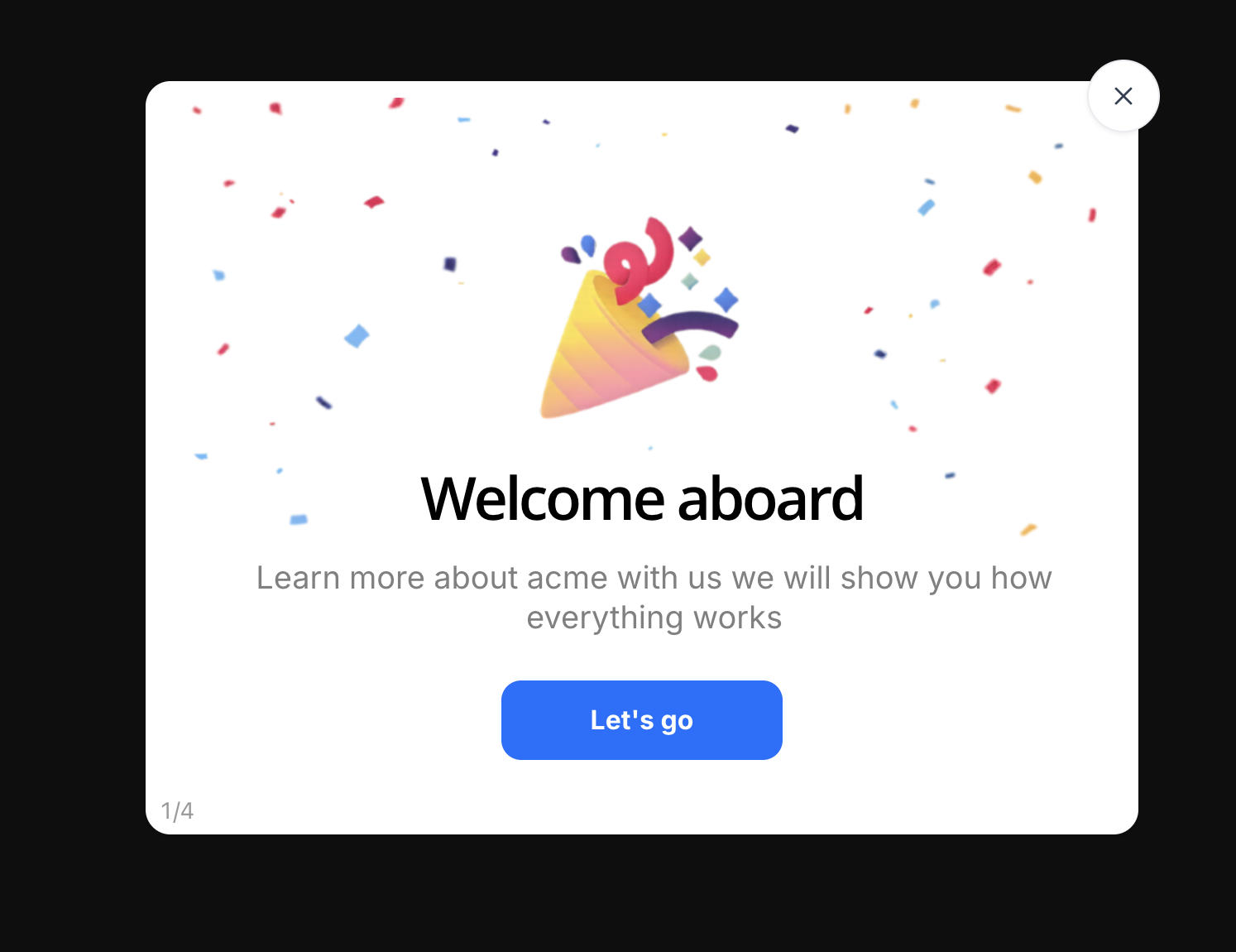
This is the classic SaaS welcome modal: the user has just signed up, and the product greets them with a moment of celebration before asking anything of them. The confetti background and party popper illustration do the emotional work they signal that signing up was the right decision and that something good is about to happen.
Notice what the design doesn't do. There's no form, no question, no settings to configure. The only job of step 1 is to set a positive emotional tone and make the user feel confident enough to click forward. The "Let's go" CTA is worth looking at specifically it's action-oriented language that creates forward momentum rather than the passive "Next" or "Continue" that most teams default to.
The 1/4 counter in the bottom-left corner is a small but critical detail. It tells users the tour is short, sets accurate expectations, and makes completion far more likely. Users who don't know how long something takes will often abandon it to be safe. Users who can see the end will push through.
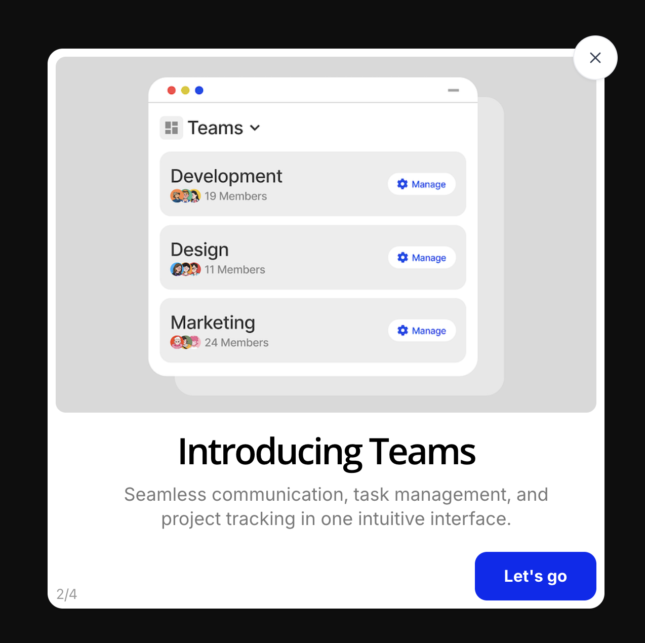
This modal introduces a specific product feature Teams by showing users what it actually looks like inside the app. The upper half is a realistic app preview rendered inside a macOS window chrome (complete with the red/yellow/green traffic-light buttons), displayed against a neutral grey background. The lower half delivers the headline and a two-line description of the value proposition.
The design decision to use a real UI screenshot rather than an illustration is deliberate. It reduces the gap between what the modal promises and what the user will find when they click through. Users who can see exactly what a feature looks like before they interact with it are less likely to be surprised, confused, or disappointed and more likely to adopt it.
The copy here does its job cleanly: "Introducing Teams" is direct, and the subtitle "Seamless communication, task management, and project tracking in one intuitive interface" answers the implicit user question: "Why should I care?" without overloading the modal with details.
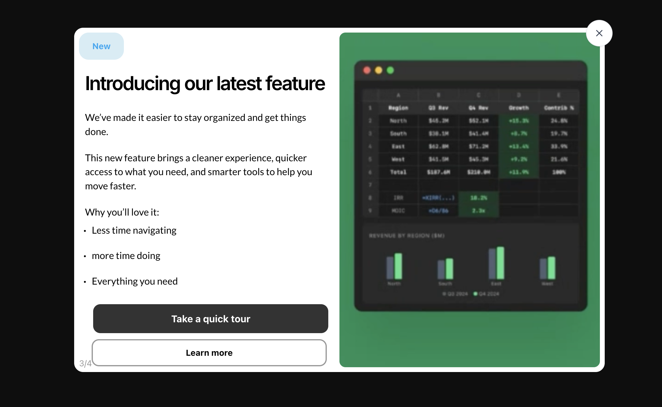
This is a more ambitious modal format a two-column split layout that gives equal visual weight to the copy and the product screenshot. The left column carries the text: a "New" badge, a short headline, two paragraphs of body copy, a bullet list of benefits, and two CTA buttons. The right column is a full-height green panel with a dark-mode data dashboard preview.
The split layout works particularly well for feature announcements that need a little more context than a single line of copy can provide. The green accent panel creates a strong visual contrast and makes the modal feel premium more like a product launch than a standard tour step. The dark-mode screenshot on a bold colour background is a common pattern in developer-tools and analytics products where the product itself looks visually impressive in dark mode.
Notice the dual CTA structure: a primary dark button ("Take a quick tour") and a secondary outlined button ("Learn more"). This is a deliberate design choice that accommodates two types of users those who want to be guided immediately, and those who want to read more before committing. Offering two paths without forcing a choice removes friction for both groups.
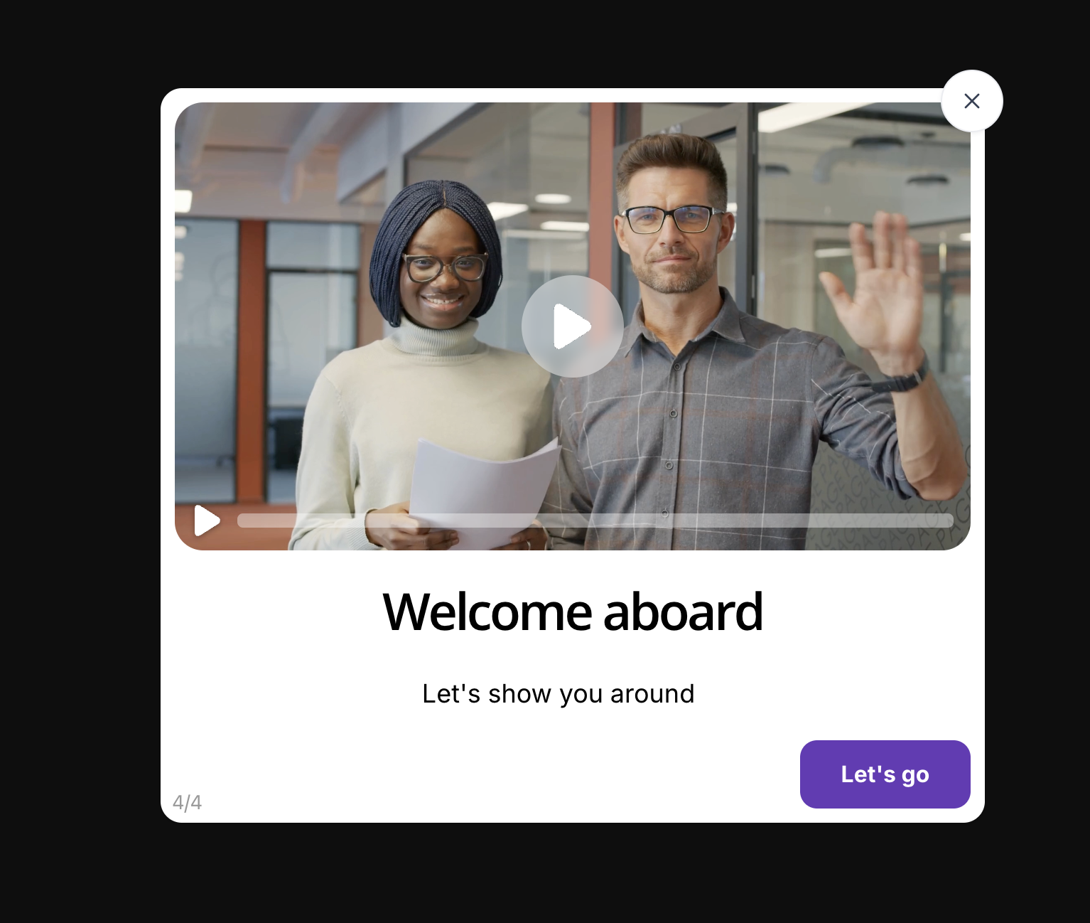
This is the final step of a four-part onboarding tour and it makes a very specific design choice: it puts a video front and center instead of a screenshot or illustration. The video thumbnail features two real team members making eye contact with the camera, one waving. This is not an accident. Human faces trigger an automatic social response that makes users significantly more likely to click play.
The video format at the end of an onboarding flow is a smart structural decision. By the time users reach the final step, they've already been introduced to the core value proposition and seen the main features. The video gives them a chance to see and hear from a real person before they start exploring on their own which builds trust and reduces the anxiety of a complex new product.
The purple "Let's go" CTA at the bottom matches a branded accent colour a subtle but important signal that the design system is coherent and intentional. Users notice when things feel consistent, even if they can't articulate why. The progress bar on the video player (showing zero progress the video hasn't started) is a nice affordance that communicates interactivity without any additional copy.
Design Patterns Compared: Quick Reference
Here's how the four modal types stack up across the dimensions that matter most for onboarding performance.
| Modal Type | Best Used For | Visual Approach | CTA Pattern | Typical Step Position |
|---|---|---|---|---|
| Confetti welcome screen | First login, new user activation | Celebration illustration / animation | Single forward CTA ("Let's go") | Step 1 |
| App preview spotlight | Feature introduction, key workflow | Real UI screenshot in macOS/browser frame | Single forward CTA | Steps 2–3 |
| Split-layout announcement | New feature launch, upsell moments | Accent-colour panel + dark mode screenshot | Primary + secondary CTA | Steps 2–4 |
| Video walkthrough modal | Complex products, high-touch onboarding | Human-face video thumbnail + play overlay | Single CTA after video | Final step |
What Makes a Product Tour Modal Work
Looking across all four examples, the patterns that separate high-performing modals from ones that get dismissed come down to a handful of consistent principles.
One job per step
Every modal step in the examples above introduces a single concept. The welcome screen's only job is to make the user feel good about being there. The Teams spotlight's only job is to show what teams look like. When a step tries to do two or three things at once, it fails at all of them. Keep each modal focused on one message, one visual, one action.
Show before you tell
In each example, the visual element takes up more space than the copy. That's intentional. Users will understand what a feature does faster by seeing a screenshot of it than by reading a description of it. If you find yourself writing more than two sentences to explain a step, the answer is almost always "add a visual, remove words."
Use action-oriented CTA language
"Let's go," "Take a quick tour," and "Try it now" all outperform generic navigation labels like "Next" or "Continue." Action language creates a sense of forward momentum and makes users feel like they're actively choosing to move through the tour not being pushed through it.
Be transparent about length
Every example shows a step counter (1/4, 2/4, 3/4, 4/4). This is not a minor detail. Users who don't know how long something takes will often abandon it. A visible step counter sets accurate expectations and consistently improves completion rates. Always include one.
Make the exit visible
Every modal in this gallery has a visible close button a clear X in the top-right corner. This is a trust signal, not a design failure. Users who feel trapped will dismiss faster and feel worse about the experience. Users who feel in control are more likely to stay. Give people an obvious way out and most of them won't take it.
The most common mistake: trying to show everything in the tour. Teams who pack six, eight, or ten steps into their onboarding modal are optimising for completeness at the expense of completion. A user who finishes a 4-step tour and then explores on their own will always outperform a user who abandons a 10-step tour halfway through. When in doubt, cut a step.
How to Build These Modals Without Code Using Kompassify
Every modal in this gallery was created with Kompassify's no-code product tour builder. You don't need a developer to design, launch, or iterate on any of these patterns you install a single JavaScript snippet once, and everything else is managed from the Kompassify dashboard.
Here's how each modal type maps to Kompassify's builder:
- Welcome screen with confetti: Use a full-width image modal step with a celebration illustration. Set the trigger to "first login" and the frequency to "once per user."
- App preview spotlight: Use an image modal step and upload a screenshot of your UI. Add a headline and two lines of copy below the image.
- Split-layout announcement: Use Kompassify's split-panel template. Assign your accent brand colour to the right panel and upload a product screenshot.
- Video walkthrough modal: Upload your video URL to a video modal step. Set a custom thumbnail image use a human face for best play rates.
All four can be combined into a single multi-step tour flow, segmented by user type, A/B tested, and measured in Kompassify's analytics dashboard without writing a single line of code.
Build your own product tour modal free
Design, launch, and measure multi-step onboarding flows without a developer. Welcome screens, feature spotlights, video modals, and more all from the Kompassify dashboard.
Start for free →Frequently Asked Questions
What is a product tour modal?
A product tour modal is an overlay dialog that appears inside a SaaS product to guide new users through key features, announce updates, or walk a user through a specific workflow step by step. Unlike tooltips which attach to specific UI elements, modals take centre stage and pause the user's workflow intentionally. Used well, they are one of the highest-leverage touchpoints in the onboarding journey.
How many steps should a product tour modal have?
3–5 steps is the sweet spot for most SaaS products. More than 5 and completion rates fall off significantly. Each step should introduce one concept or action, not several. If you have more than 5 things to show, consider splitting the tour — see our guide on how to create a product tour that converts.
What is the difference between a product tour and a product walkthrough?
A product tour is a broader term covering any guided experience inside an app: modals, tooltips, hotspots, checklists, and progress bars. A product walkthrough typically refers specifically to step-by-step modal flows that guide users through a sequence of actions. In practice, the terms are used interchangeably in the SaaS onboarding space.
When should I show a product tour modal?
Show a welcome modal on a user's very first login context is highest and curiosity is at its peak. For feature announcement modals, trigger them the first time a user encounters the relevant section of the product. Avoid showing modals on every session users will start dismissing them reflexively. Use event-based triggers rather than time-based ones wherever possible.
Can I build a product tour modal without writing code?
Yes. Kompassify is a no-code user onboarding platform that lets you build, launch, and A/B test product tour modals including multi-step flows, video modals, split-layout announcement modals, and welcome screens without touching your codebase. You install a single JavaScript snippet once and manage everything from the Kompassify dashboard.