A new user finds the feature they need but they don't know what the button does, why it matters, or what happens if they click it. So they hesitate. And hesitation, repeated across a first session, is how activation quietly dies.
That's what onboarding tooltips are for. Not to narrate every pixel of your interface but to put the right one-line explanation in exactly the right place, at exactly the moment the user needs it, so they keep moving toward value instead of stalling.
The problem is that most onboarding tooltips are either floating in the wrong spot, firing all at once, or written like internal documentation. Great ones are quiet, contextual, and almost invisible until you need them which is exactly why we put this gallery together.
Below you'll find real examples of onboarding tooltips in action, broken down by interaction pattern, with notes on what works, what to watch out for, and how to replicate each style using Kompassify without touching your codebase.
Key Takeaways
- Context beats completeness. A tooltip that explains one element at the moment of use outperforms a long tour that explains everything upfront and is forgotten by the next screen.
- Masking forces focus. Dimming the rest of the screen around the target removes every competing distraction and is the single most reliable way to make sure a critical step is seen.
- Removing the Next button teaches by doing. When the only way forward is to perform the action, passive reading turns into hands-on learning that actually sticks.
- Hotspots are permission, not pressure. A pulsing beacon invites curiosity without interrupting ideal for optional, discoverable guidance.
- Dark tooltips command attention. A dark background with white text creates contrast against light UIs and reads as deliberate and premium.
What Is an Onboarding Tooltip?
An onboarding tooltip is a small contextual message that attaches to a specific element of your interface a button, an input field, a menu item, or an icon to explain what it does or prompt the user to act on it.
Unlike modals, which take over the screen and pause everything, tooltips point at a precise spot in the interface and leave the rest of the product visible. That makes them the natural tool for in-context guidance: highlighting a key feature, clarifying an unfamiliar control, or nudging a user toward their very next step without ripping them out of their flow.
Most onboarding tooltips share a handful of common ingredients: an anchor point on a real UI element, a short headline or one-line explanation, an optional visual, a clear way to advance, and a step counter for multi-step flows. What changes from one tooltip to the next is the interaction model how it grabs attention, how it's triggered, and how the user moves on. The examples below show four distinct models and what you can learn from each.
Built with Kompassify: All four of the tooltip examples in this gallery were created using Kompassify's no-code onboarding builder. No developer time required you can design, launch, and A/B test every one of these patterns from the Kompassify dashboard.
User Onboarding Tooltip Examples
Each example below is a real onboarding tooltip pattern used in SaaS products. We've broken down the interaction model, the design decisions at play, and the key lesson you can take away from each one.
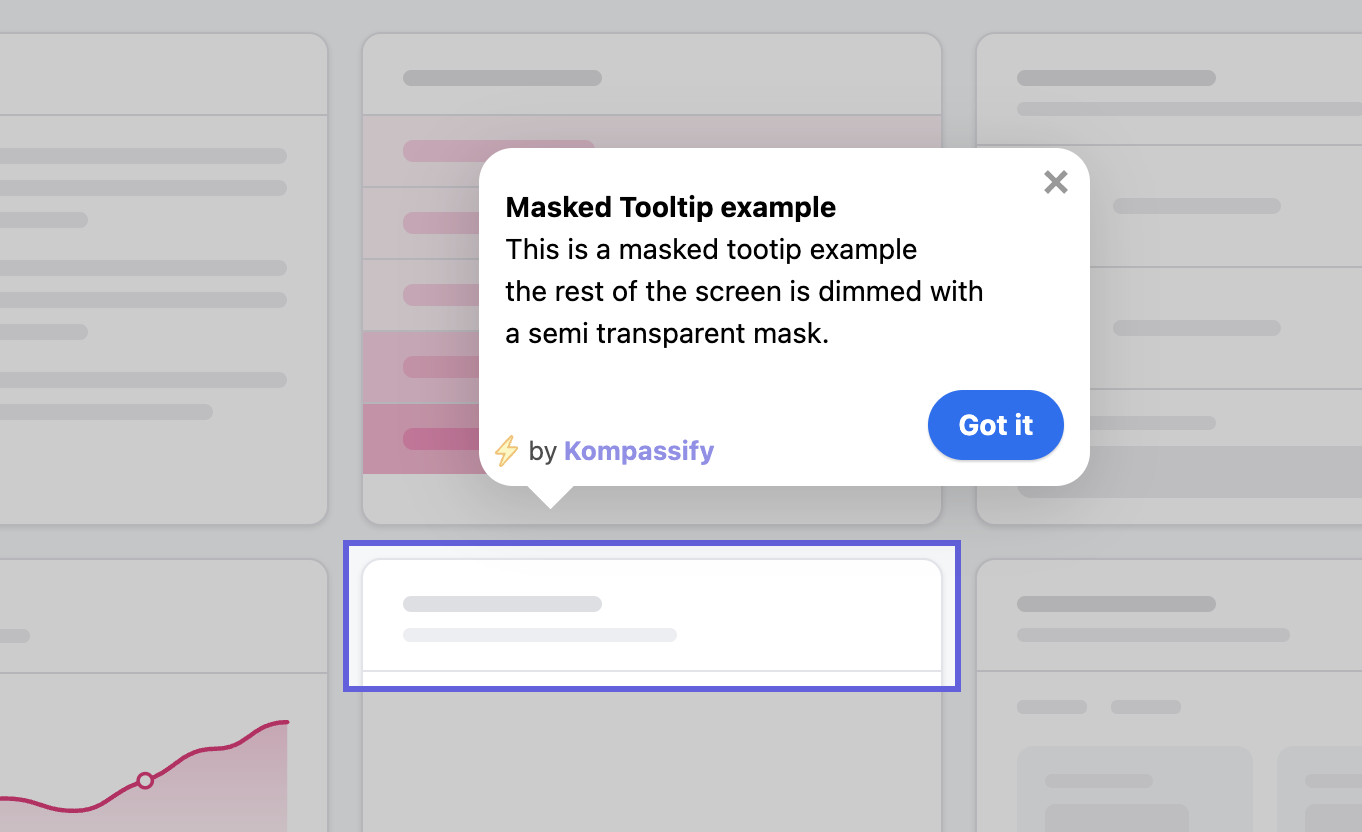
This is the highest-attention tooltip pattern there is. The entire screen is dimmed behind a semi-transparent dark overlay, and a spotlight cutout frames the one element the user is meant to look at. Everything else fades into the background, both literally and cognitively. There is no ambiguity about where to look.
The mask is doing two jobs at once. First, it removes distraction every other button, menu, and notification on the page is visually muted, so the user's eye has nowhere else to go. Second, it signals importance. A masked step reads as "this matters," which raises the perceived value of the action and the likelihood the user completes it.
Because masking is so forceful, it works best when used sparingly. Reserve it for the one or two genuinely critical actions in a flow the moment that defines whether a user activates or churns. If every step is masked, the mask stops meaning anything and starts feeling claustrophobic.
This tooltip deliberately leaves out the one thing most onboarding tooltips include: a Next button. Instead of letting the user read and click through passively, the only way to advance is to actually click the highlighted element the tooltip is pointing at. The flow doesn't move until the user performs the real action.
That single design choice changes the nature of the onboarding. A tooltip with a Next button creates a passive walkthrough the user reads, nods, clicks Next, and forgets. A click-to-continue tooltip creates an interactive walkthrough the user does the thing, in the real product, with their own hands. People remember what they do far better than what they read.
This pattern is ideal for teaching a core workflow: connecting an integration, creating a first project, sending a first message. By forcing the genuine click, you guarantee the user reaches the next state having actually completed the step not having skimmed past it. The trade-off is rigidity, so pair it with a visible skip or close option so users never feel trapped.
A hotspot is a small, gently pulsing dot placed next to a feature. It doesn't say anything on its own it simply invites the user to click it. When they do, the tooltip opens and reveals the explanation. Nothing fires until the user chooses to engage.
This is the lowest-pressure pattern in the gallery, and that's its strength. A hotspot draws the eye through subtle motion without ever interrupting the user's task. People who are busy can ignore it; people who are curious can click it. You get the discoverability of a guided cue without the intrusiveness of an unprompted tooltip popping into their workflow.
Hotspots shine for optional guidance: a secondary feature you'd love users to discover but don't need them to use immediately, a recently shipped capability, or a power-user shortcut. Leaving a few persistent hotspots around the product also turns your interface into something users can explore at their own pace, rather than a flow they're pushed through once and never see again.
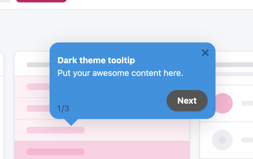
This tooltip flips the usual light card on its head: a dark charcoal background with crisp white text. Against the typically light-coloured interface of most SaaS products, that contrast makes the tooltip pop off the screen instantly. It reads as a deliberate, designed object rather than a default browser tooltip.
The visual psychology here is straightforward. A light tooltip on a light UI can blend in and get overlooked, especially if the surrounding page is busy. A dark tooltip creates separation it sits clearly on top of the interface, drawing the eye without needing a mask or an overlay. It's a quieter way to grab attention than masking, but more assertive than a standard light tooltip.
Dark tooltips also carry a tone. They tend to feel premium and polished, which is why you see them so often in design-led products and developer tools. If your brand uses a dark accent or you want your in-app guidance to feel considered rather than utilitarian, a dark tooltip is an easy, high-impact choice just make sure the contrast ratio keeps the text fully legible.
Tooltip Patterns Compared: Quick Reference
Here's how the four tooltip types stack up across the dimensions that matter most for onboarding performance.
| Tooltip Type | Best Used For | Attention Level | Trigger | User Pressure |
|---|---|---|---|---|
| Masked tooltip | The single most critical step in a flow | Very high (full-screen dim + spotlight) | Auto, on reaching the step | High |
| Click-to-continue tooltip | Teaching a core workflow by doing | High (no escape but the real action) | Auto, advances on target click | High |
| Hotspot tooltip | Optional, discoverable feature guidance | Low (subtle pulsing beacon) | User clicks the hotspot | Low |
| Dark tooltip | Standing out against a light UI | Medium-high (contrast-driven) | Auto or on hover/click | Medium |
What Makes an Onboarding Tooltip Work
Looking across all four examples, the patterns that separate high-performing tooltips from ones that get ignored come down to a handful of consistent principles.
Anchor to a real element, in context
Every tooltip in this gallery points at a specific, real part of the interface not a floating box in the middle of the screen. The power of a tooltip is its proximity to the thing it's explaining. The closer the explanation sits to the element it describes, the less the user has to translate between words and reality. Always anchor; never float aimlessly.
Match the attention level to the stakes
A masked tooltip and a hotspot sit at opposite ends of the same spectrum. The mistake teams make is applying maximum attention to every step. Reserve the heavy patterns masking, forced clicks for the moments that genuinely decide activation, and use the light patterns hotspots for everything optional. The attention you spend should match the stakes of the step.
Decide whether the user reads or acts
The single biggest design decision for a tooltip is whether to include a Next button. If the step is informational, a Next button is fine. If the step is a skill you want the user to learn, remove it and force the real action. Be intentional about this choice on every step it's the difference between a walkthrough users forget and one they internalise.
Respect the user's pace
Hotspots hand control to the user nothing fires until they choose to engage. This respect for pace is why low-pressure patterns so often outperform aggressive ones for non-critical guidance. People resent being interrupted and welcome help they asked for. Give users the option to pull guidance rather than always pushing it.
Always provide an exit
Even in the most forceful patterns the mask, the forced click there should be a visible way to skip or close. A user who feels trapped dismisses faster and trusts you less. A user who can see the exit and chooses to stay is engaged on their own terms. Give people an obvious way out and most of them won't take it.
The most common mistake: firing every tooltip at once on the first screen. A wall of tooltips appearing simultaneously is overwhelming, gets dismissed reflexively, and teaches the user to ignore your guidance for the rest of their journey. Show one tooltip at a time, tied to where the user actually is, and let the flow unfold step by step. Contextual and sequential always beats simultaneous.
How to Build These Tooltips Without Code Using Kompassify
Every tooltip in this gallery was created with Kompassify's no-code onboarding builder. You don't need a developer to design, launch, or iterate on any of these patterns you install a single JavaScript snippet once, and everything else is managed from the Kompassify dashboard.
Here's how each tooltip type maps to Kompassify's builder:
- Masked tooltip: Add a tooltip step, select your target element, and turn on the overlay (mask) option. Kompassify automatically dims the rest of the page and cuts a spotlight around the element.
- Click-to-continue tooltip: Create a tooltip step and remove the Next button, then set the step to advance on a click of the target element. The flow will only move when the user performs the real action.
- Hotspot tooltip: Choose the hotspot (beacon) step type, place the pulsing dot next to your feature, and attach the tooltip content that opens on click.
- Dark tooltip: Use any tooltip step and switch the theme to dark set a dark background colour and white text from the styling panel to match your brand.
All four can be combined into a single onboarding flow, segmented by user type, A/B tested, and measured in Kompassify's analytics dashboard, without writing a single line of code.
Build your own onboarding tooltips free
Design, launch, and measure contextual onboarding tooltips without a developer. Masked tooltips, hotspots, dark themes, and more all from the Kompassify dashboard.
Start for free →Frequently Asked Questions
What is an onboarding tooltip?
An onboarding tooltip is a small contextual message that attaches to a specific UI element a button, menu, input field, or icon to explain what it does or prompt the user to take an action. Unlike modals which take over the screen, tooltips point at a precise spot in the interface, so they're ideal for in-context guidance such as highlighting a feature or nudging a user toward their next step. Learn more in our guide on how to create onboarding tooltips that convert.
What is a masked tooltip and when should I use one?
A masked tooltip dims the rest of the screen with a semi-transparent overlay and cuts a spotlight around the target element. This focuses all of the user's attention on one part of the interface and removes the distraction of everything else. Use a masked tooltip when a step is critical and you cannot afford for the user to miss it such as the single most important action in a first-session flow. Because it's so forceful, use it sparingly.
What is the difference between a tooltip and a hotspot?
A tooltip is the message that explains or points at an element, while a hotspot is a small pulsing dot or beacon that invites the user to click it before any message appears. A hotspot is a low-pressure trigger: it draws the eye without interrupting the user, and the tooltip only opens when the user clicks the hotspot. Hotspots are ideal for optional, discoverable guidance rather than mandatory steps.
Should onboarding tooltips have a Next button?
It depends on the goal. A Next button lets users read passively and click through, which is fine for informational steps. But when you want the user to actually perform an action click a specific button, fill a field, open a menu remove the Next button so the only way forward is to complete the action itself. This converts a passive walkthrough into hands-on learning and dramatically improves how well users retain the workflow.
Can I build onboarding tooltips without writing code?
Yes. Kompassify is a no-code user onboarding platform that lets you build, launch, and A/B test onboarding tooltips including masked tooltips, click-to-continue tooltips, hotspots, and dark tooltips without touching your codebase. You install a single JavaScript snippet once and manage everything from the Kompassify dashboard.
What are the best practices for onboarding tooltips?
The best onboarding tooltips follow a few consistent rules: anchor each tooltip to a real UI element rather than floating it in empty space; show one tooltip at a time instead of firing them all at once; write a single one-line explanation focused on what the user gains, not what the feature is called; trigger the tooltip in context, at the moment the user reaches the relevant element, rather than up front; and give experienced users a clear way to dismiss the flow. Reserve masked tooltips for the one or two steps a user cannot afford to miss, and use hotspots for optional, discoverable guidance. For a step-by-step build, see our guide on how to create onboarding tooltips that convert.