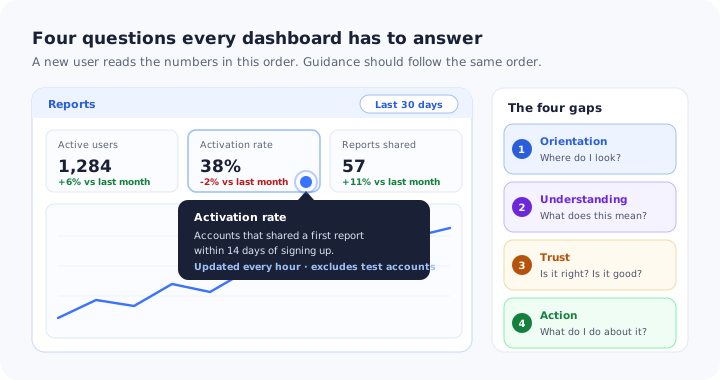
In most B2B products the dashboard is the first screen after login and the screen the product team is proudest of. It is also, very often, the one users understand least. They see a row of tiles, a chart and a date picker, glance at the biggest number, and move on to whatever task they came to do.
That glance is expensive. A reporting screen is where a product proves its value over time: it is the evidence that the work done everywhere else is paying off, and frequently the reason a manager signs the renewal. When users cannot read it, the product does its job invisibly, and invisible value is the easiest kind to cancel.
Dashboard onboarding is the small amount of guidance that closes the distance between seeing a number and acting on it. This guide covers why data-heavy screens are uniquely hard to onboard, the four gaps every user has to cross, seven patterns that close them, what to do while the dashboard is still empty, how guidance should differ for the people reading and the people configuring, and how to tell whether any of it worked.
Key Takeaways
- A dashboard is not self-explanatory just because it is visual. A chart shows that something changed, not what it means or what to do about it.
- Users cross four gaps in order. Where to look, what a number means, whether to trust it, and what to do next.
- Guide the reading, not the widgets. A tour that names every tile teaches nothing; three zones and one real question teach the screen.
- Put definitions where the number is. A tooltip beside the metric label beats a help article nobody opens.
- Measure use, not views. Filters applied, views saved and alerts created say far more than how often the page loads.
What Is Dashboard Onboarding?
Dashboard onboarding: definition
Dashboard onboarding is the in-app guidance that teaches users how to read, trust and act on a data screen inside a product: where to look first, what each metric means, why a number might look wrong, and which action a number should lead to. It sits on top of the dashboard you already have. It changes what the user knows, not what the screen shows.
Two things it is not. It is not the “getting started” home screen with a list of setup tasks, which some teams call an onboarding dashboard; that pattern belongs to onboarding checklists. And it is not dashboard design. Better layout helps, but even a beautifully designed reporting screen uses vocabulary, time windows and calculations the user did not choose, and no amount of layout can explain those.
Why Dashboards Are the Hardest Screen to Onboard
Most screens in a product have an obvious verb: create, invite, send, save. A dashboard’s verb is “understand”, and understanding does not have a button. Five properties make it harder than any other screen to guide.
Many numbers compete at once, and nothing tells a new user which one matters for their job.
Metric names are chosen by whoever built the calculation. “Active”, “engaged” and “converted” each hide a definition the user has never seen.
Thirty-eight per cent is good or alarming depending on last month, the segment and the goal. The screen rarely says which.
New accounts see zeros and flat lines for days, which is exactly when first impressions of the screen are formed.
A chart can show that something dropped. It almost never shows what to do about it, so a worrying number ends in a shrug.
Everyone who reviews the dashboard before release already knows what every tile means, so the confusion never shows up internally.
The result is a familiar pattern. The dashboard is the most visited page in the product, because it is where people land after login, and one of the least used, because landing is all most people do there. If your users are also juggling setup, concepts and configuration, the wider problem is covered in our guide to onboarding for complex products; this guide is about the reporting screen specifically.
The Four Gaps Between Seeing a Number and Acting on It
Watch a new user on a reporting screen and the questions arrive in a consistent order. Each one has to be answered before the next is worth asking, which makes the sequence a useful map for deciding what guidance to build first.
Each gap has its own guidance. A tour of the widgets only closes the first one.
1. Orientation: where do I look?
The first question is spatial. A new user needs to know which area of the screen answers which kind of question: the headline numbers, the trend over time, the breakdown, and the controls that change what everything shows. They do not need a description of every tile. This gap is quick to close, and it is where most dashboard guidance starts and, unfortunately, where most of it finishes.
2. Understanding: what does this number mean?
Every metric has a definition, a time window and an inclusion rule. “Active users” might mean anyone who logged in, anyone who performed a key action, or anyone whose account was not deleted. Until users know which, they read the number through their own assumption, and different people in the same account read the same tile differently. This gap causes most arguments about data, and it is the cheapest one to close.
3. Trust: is it right, and is it good?
Two questions fused together. “Is it right” is about freshness, completeness and filters: data that refreshes hourly, tracking that was only switched on yesterday, a date range someone left on the last seven days. “Is it good” is about comparison. Without both answers, users quietly discount the whole screen, and a dashboard nobody trusts gets exported to a spreadsheet and rebuilt somewhere else.
4. Action: what do I do about it?
The point of the screen. A number that moved should lead somewhere: a breakdown, a list of affected accounts, a setting, a conversation. If the path from insight to action is not visible, users learn that the dashboard is something to look at rather than something to use, and they stop coming back to it on purpose.
7 Dashboard Onboarding Patterns That Close the Gaps
Each pattern below maps to one of the four gaps. Few products need all seven on day one: start with the gap where your users stall most visibly, which is usually understanding or action.
- The three-stop zone tour (orientation)
- Definition hotspots on metric labels (understanding)
- The freshness and scope note (trust)
- The comparison prompt (trust)
- The first-question walkthrough (action)
- The save, share or alert checklist (action)
- The “what changed” note for regular users (all four, again)
1. The three-stop zone tour
Replace the widget-by-widget tour with three stops at most: the headline numbers, the main trend, and the controls. Each step should name the question the zone answers rather than the name of the widget. “This row tells you whether this month is better than last” teaches something; “These are your KPI cards” does not. Trigger it the first time someone opens the dashboard with real data in it, not on first login when every tile reads zero. The general rules for length and timing are in our guide to creating product tours.
2. Definition hotspots on metric labels
Put a small, persistent hotspot beside every metric whose meaning is not obvious, opening a tooltip with three short lines: what is counted, over which period, and what is left out. Persistent is the important word. A definition is reference material that users need again next month, when they are preparing a report for someone else, so it cannot disappear when a tour ends. The pattern itself is covered in depth in our guide to UX hotspots.
Write the definition in the user’s words. “Accounts that shared at least one report in the last 30 days” is a definition. “Users matching the engagement criteria” is a label pretending to be one.
3. The freshness and scope note
A single line near the top of the screen stating when the data was last updated and what is currently included: the date range, any active filters, the segment being shown. It prevents the most common false alarm on any dashboard, which is someone reading a filtered or half-refreshed view as the whole truth. For brand-new accounts the same line does a second job, explaining why numbers look low: tracking began on a particular date, so earlier periods will be empty. A slim in-app banner is usually the right format, because the message is ambient rather than urgent.
4. The comparison prompt
Numbers become readable when they carry a comparison. If the screen already shows change against a previous period, point it out once: green and red mean change since last period, not distance from a target. If it does not, guide users to the control that sets a comparison. Resist the temptation to explain what a “good” number is with a generic benchmark in a tooltip. Benchmarks rarely match the user’s segment or definition, and the most useful baseline is almost always the account’s own history.
5. The first-question walkthrough
This is the pattern that does the most work. Instead of showing the screen, use it to answer one real question, step by step: “Which step of your signup loses the most people?” The walkthrough has the user set the date range, open the breakdown, find the answer and click through to the place they would change it. Having done it once, users generalise. They have learned that the screen answers questions, which is the entire lesson. Pick the question your most successful customers ask most often, and phrase it the way they phrase it. Our guide to product walkthroughs covers how to make each step require the real action rather than a click on “Next”.
6. The save, share or alert checklist
Dashboards that stay in use are the ones users have made their own: a saved view, a report scheduled to the team every Monday, an alert when a number crosses a line. A short checklist with three items of this kind turns a one-off look into a routine, and each item is a clean signal of adoption that you can measure. Keep it separate from any setup checklist, because it belongs to the second week rather than the first day. Treat reporting like any other feature you want adopted, as described in our guide to feature adoption.
7. The “what changed” note for regular users
Dashboards change. A metric gets redefined, a tile moves, a chart type is replaced. Regular users are the people most confused by this, because they read the screen from memory. When a reporting screen changes, show returning users a short, dismissible note anchored to the element that changed, and update the definition tooltip on the same day. A silent change to how a metric is calculated is the fastest way to lose trust in numbers that are actually correct. For larger changes, the approach in our guide to rolling out a product redesign applies directly.
The Empty Dashboard: Onboarding Before There Is Data
New accounts meet the dashboard before it has anything to say, and that first view shapes whether they come back to it at all. Three rules cover most of it.
Replace the flat line with a sentence: what needs to happen for this chart to fill, and roughly when. Zeros without an explanation read as a broken product.
An empty chart is usually waiting on something the user has to do: connect a source, invite the team, publish a first item. Link straight to it.
A zone tour over empty tiles teaches layout with nothing to read. Trigger it on the first visit where the headline numbers are not zero.
The wider pattern library for screens with nothing on them yet, including when a preview built from example data helps and when it misleads, is in our guide to empty states.
Readers, Analysts and Admins Need Different Guidance
The same dashboard is used in three quite different ways, and a single flow for everyone tends to serve none of them well.
| Who | What they want from the screen | Guidance that helps | Guidance that annoys |
|---|---|---|---|
| Reader manager, executive |
The one number that matters and whether it moved | Comparison prompt, freshness note, a scheduled report | A tour of filters and breakdowns |
| Analyst operator, specialist |
Answers to specific questions | First-question walkthrough, definition hotspots | A step explaining what a line chart is |
| Admin account owner |
Confidence that the right data is flowing in | Scope note, data source and permission checks | Advice on interpreting trends |
Route people by role when you already know it, and ask when you do not. One question on the first visit, such as “What do you mainly use reports for?”, is enough to send each person to the right flow. The broader approach is covered in our guide to personalized onboarding.
How to Measure Dashboard Onboarding
Page views are the wrong measure. A dashboard can be the most visited page in a product and still go unused, because it is where users land after login whether they want it or not. Measure interaction with the data instead.
| Signal | What it tells you |
|---|---|
| Deliberate return visits, excluding the login landing | Whether users come to the screen on purpose |
| Filters, date ranges and breakdowns applied | Whether users are asking questions of the data |
| Views saved, reports scheduled, alerts created | Whether the screen has become part of a routine |
| Click-throughs from a metric to a related screen | Whether insight is turning into action |
| Support questions about what a metric means | Whether the definitions are landing (this one should fall) |
| Step completion on the tour and walkthrough | Where the guidance itself loses people |
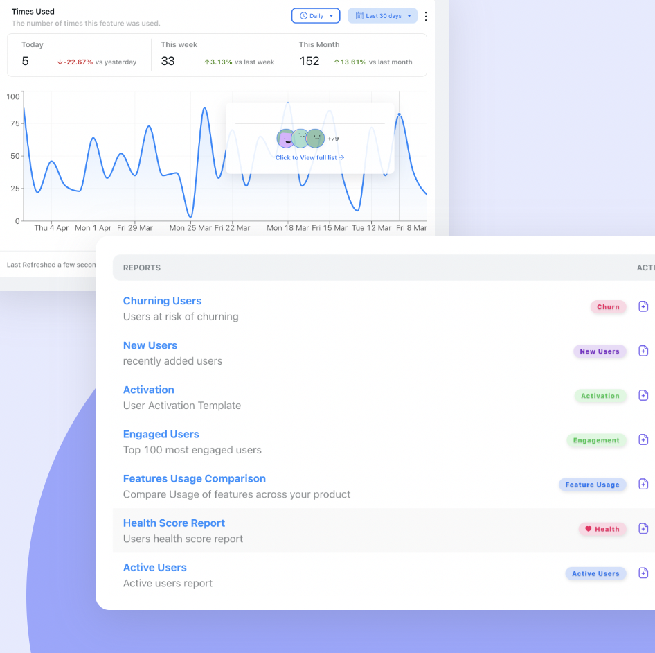
Track how often a filter, export or saved view is actually used, not how often the page loads. Notice how each number carries its own comparison.
Compare these signals between users who saw the guidance and users who did not, and look at them per role, since a reader who never touches a filter may be perfectly well served. The definitions behind each measure are in our guide to user onboarding metrics.
A useful first check. Pick the single action on your dashboard that shows genuine use, such as applying a filter or saving a view, and count how many active accounts did it last month. That one number is usually more honest than any engagement score, and most teams have never looked at it.
Dashboard Onboarding: Do vs. Don’t
✅ Do
- Guide three zones, not every widget
- Put a definition beside every non-obvious metric
- State data freshness and active filters in plain words
- Use the screen to answer one real question
- Hold the tour until the dashboard has data
- Route readers, analysts and admins differently
- Update tooltips the day a metric changes
- Measure filters, saves and alerts, not page views
❌ Don’t
- Name every tile in a twelve-step tour
- Hide metric definitions in a help centre article
- Explain a good number with a generic benchmark
- Launch a tour over an empty dashboard
- Redefine a metric without telling regular users
- Assume the team that built it reads it like a newcomer
- Count the post-login landing as engagement
- Leave a worrying number with no path to action
Building Dashboard Onboarding With Kompassify
Everything above is a layer on top of the dashboard you already have, which is exactly why it should not wait for the next reporting release.
With Kompassify you build that layer visually, without code. Add hotspots and tooltips beside metric labels so a definition is always one click away. Run a three-stop product tour the first time a user opens the dashboard with data in it, and a walkthrough that answers one real question with the screen. Show a slim banner for data freshness or a recently changed metric. Send each role to its own flow from a multi-choice question on the first visit, and add a short checklist for saving a view or scheduling a report. Target all of it by page and user segment, and publish a change on the same day a metric changes.
Measurement sits in the same place. Per-step completion shows where a walkthrough loses people, and product analytics shows whether filters, exports and saved views are actually being used after the guidance ships, by account and by segment.
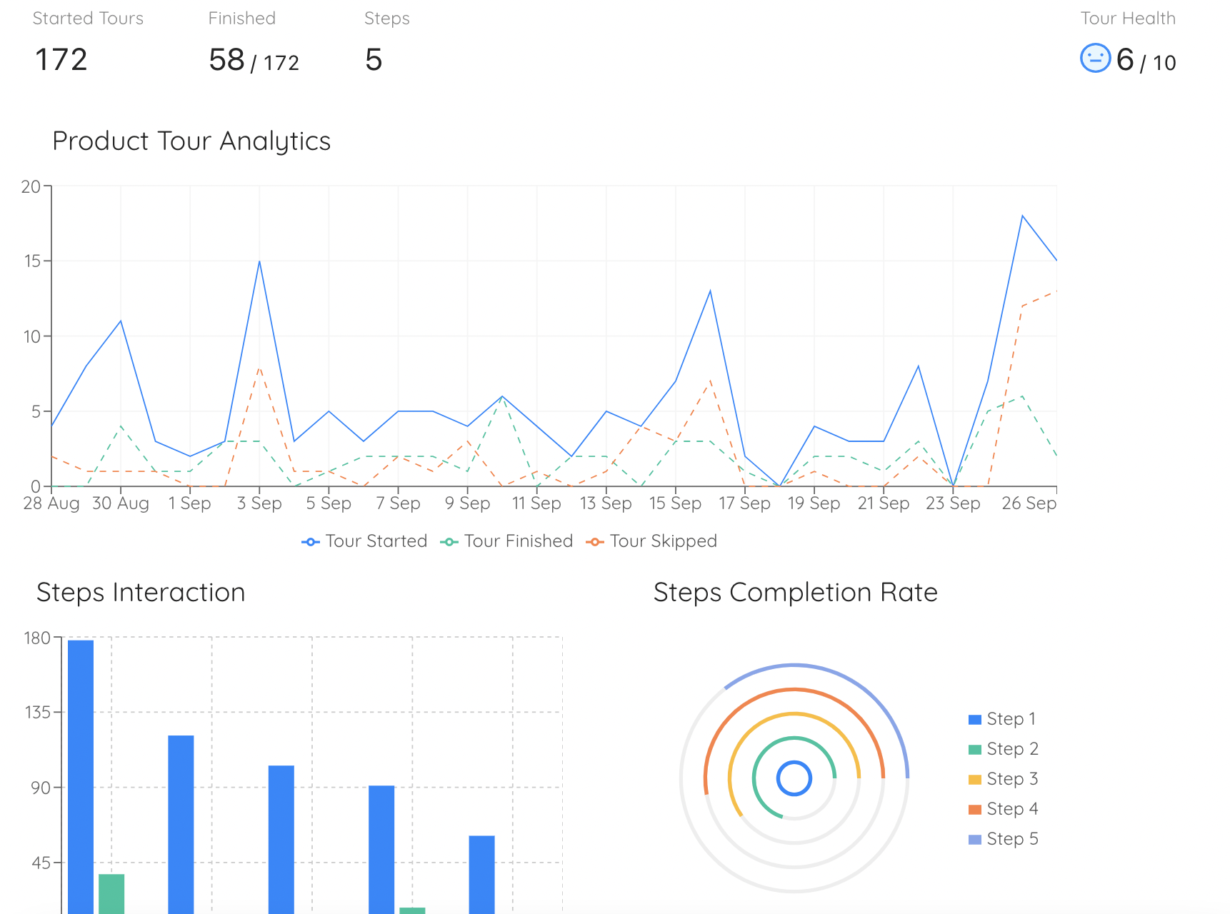
Per-step completion for a dashboard walkthrough shows exactly which question, or which control, loses people.
Make your dashboard readable on day one
Add metric definitions, a three-stop tour and a first-question walkthrough to the dashboard you already have, then see which reports people actually use. No code required. Free up to 100 monthly active users, plans from $129/month, GDPR-compliant and EU-hosted.
Start for free →The One-Paragraph Version
A dashboard is often the first screen users see and the one they understand least, because a chart shows that something changed without saying what it means or what to do. Dashboard onboarding closes four gaps in order: orientation, understanding, trust and action. Replace the widget-by-widget tour with three stops that name the question each zone answers, and show it only once there is data to read. Put persistent definitions beside metric labels, state data freshness and active filters in plain words, and point users to comparisons against their own history rather than generic benchmarks. Then make the screen useful with a walkthrough that answers one real question and a short checklist to save, share or set an alert, route readers, analysts and admins to different guidance, and tell regular users whenever a metric changes. Measure filters applied, views saved and alerts created rather than page views, because a dashboard can be the most visited page in a product and still go unused.
Frequently Asked Questions
What is dashboard onboarding?
Dashboard onboarding is the in-app guidance that teaches users to read, trust and act on a data screen inside a product. It covers where to look first, what each metric means, why a number might look wrong, and which action a number should lead to. It works on top of the existing dashboard, so it changes what the user understands rather than what the screen displays.
How do you onboard users to a dashboard?
Close four gaps in order. Orient users with a short tour of three zones rather than every widget. Explain metrics with persistent definition tooltips beside the labels. Build trust with a note on data freshness and active filters, and by pointing out comparisons with previous periods. Then drive action with a walkthrough that uses the screen to answer one real question, followed by a short checklist to save a view, schedule a report or create an alert.
Should a dashboard have a product tour?
A short one, shown at the right moment. A tour that names every tile is forgotten immediately. Three stops that explain which question each area of the screen answers, triggered on the first visit where the dashboard has real data, work far better. The most effective dashboard guidance is often not a tour at all but a walkthrough that uses the screen to answer one question the user actually has.
How do you explain metrics to users inside a product?
Put the definition where the number is. A small hotspot or tooltip beside each non-obvious metric label should say what is counted, over which period and what is left out, written in the user's words rather than the language of the database. Keep it persistent rather than part of a one-time tour, because users need a definition again weeks later, and update it on the same day the metric changes.
What should an empty dashboard show new users?
A sentence instead of a flat line. Say what needs to happen for the data to appear and roughly when, and link directly to the action that feeds it, such as connecting a data source or inviting the team. Hold any dashboard tour until the first visit where the headline numbers are not zero, because guiding someone around empty tiles teaches the layout with nothing to read.
How do you measure whether users understand a dashboard?
Measure interaction rather than views. Useful signals are deliberate return visits beyond the post-login landing, filters and date ranges applied, views saved, reports scheduled and alerts created, click-throughs from a metric to a related screen, and a falling number of support questions about what a metric means. Page views alone mislead, because the dashboard is often simply where users land after they log in.
Is dashboard onboarding different from dashboard design?
Yes. Design decides what the screen shows and how it is laid out; onboarding decides what the user knows when they look at it. Even a well-designed dashboard relies on definitions, time windows and calculations the user did not choose, and layout cannot explain those. The two work together: good design reduces how much guidance is needed, and guidance covers what design cannot.