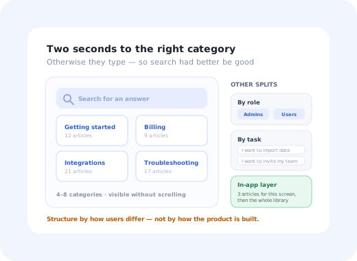
Watch someone use a help center and the behaviour is always the same. They land, they scan for about two seconds, and then one of two things happens: they see a category that obviously contains their problem and click it, or they give up on the page entirely and type into search. There is no third option where they read all your categories carefully.
Which means the landing structure is doing exactly one job, making the right category obvious in two seconds, and most help centers fail at it for a structural reason rather than an editorial one. They are organised around how the company thinks about the product (modules, plans, teams) rather than around the one dimension along which their users genuinely differ.
Below are eight structures that work, described as patterns you can copy rather than screenshots that will be out of date next quarter. Each has a shape, an audience it fits, and a specific way it goes wrong. If you need the how-to-build-it side (article types, writing rules, ownership and pruning) that is our knowledge base guide; this piece is about the shape of the thing.
Key Takeaways
- Structure by how your users differ: by role, by task, by product or by lifecycle stage. Picking a split that matches no real difference forces everyone into search.
- Four to eight top-level categories. If the landing page needs scrolling, it has become a decorated search page.
- Search is the primary navigation for most visitors, so it deserves the most visual weight and the most maintenance attention.
- Proximity beats volume. Three relevant articles surfaced on the screen where the question arises deflect more tickets than a large site users have to remember.
- Zero-result searches are your best report. They are a literal list of what customers wanted and did not find.
- Some questions should not be documented at all: they are interface problems wearing a help-article costume.
The 8 Help Center Structures
Read these as archetypes. Most real help centers are one of them plus a borrowed element, and the interesting question for your product is which dimension deserves the top level.
1. Search-first, minimal categories
Fits: products with a wide, shallow surface and a lot of long-tail questionsAn oversized search field takes most of the viewport, with four or five category tiles underneath as a safety net rather than as the main route. It concedes the truth (the majority of visitors arrive with a specific question already formed) and optimises for it, usually with type-ahead results and popular-article suggestions.
2. Role-split (admin vs. everyday user)
Fits: B2B tools where the person configuring the product is not the person using itTwo doors at the top, and the same structure repeated behind each. This is the highest-leverage split in B2B, because the two audiences share almost no questions: an admin needs provisioning and permissions, an end user needs to finish a task without knowing what a permission is. It also quietly solves a tone problem: admin articles can be technical without frightening everyone else.
3. Task-based ("I want to…")
Fits: products where users differ by goal rather than by role or seniority- I want to import my existing data
- I want to invite my team and set permissions
- I want to connect another tool
- I want to build my first report
- Something isn't working
The categories are written as sentences in the user's voice rather than as nouns from the product. It works because it matches how people actually arrive (with an intention, not with a feature name) and it is the structure most likely to be understood by someone who has not yet learned your vocabulary. It is the same logic behind jobs to be done, applied to navigation.
4. Product-split (multi-product suites)
Fits: companies selling several products under one brandProduct first, then the same internal structure repeated inside each. The critical detail is the third tile: account, billing and security questions are shared across products and must not be duplicated three times, because duplicated articles drift out of sync and the search index then returns three slightly different answers to the same question.
5. The lifecycle track (setup → daily use → advanced)
Fits: products with a real setup phase, where almost every user follows the same pathStructured as a journey rather than a taxonomy, so it doubles as a self-serve onboarding path for new customers. The strongest versions put a genuine getting-started sequence behind the first tile (ordered, numbered, finishable) instead of an unordered pile of setup articles. That sequence pairs naturally with an in-product onboarding checklist covering the same steps.
6. The in-app resource centre
Fits: every SaaS product, as a layer on top of whichever public structure you chose- ▶ Replay the walkthrough for this page
- 💬 Still stuck? Contact support
A panel inside the product, opened from a persistent control, that leads with the two or three articles relevant to the current screen and only then offers the whole library. This is the structure with the best deflection per article, for an unglamorous reason: it removes the two steps (remember the help center exists, leave the product to find it) where most users give up and open a ticket instead. Our in-app support guide covers the mechanics.
7. The community hybrid
Fits: products with a large, engaged user base and endless configuration questionsOfficial documentation and community discussion side by side, with search covering both and clear labelling of which is which. It scales coverage far beyond what a documentation team can write, and it is the only realistic way to cover the enormous space of "how do I do this specific thing in my specific setup".
8. The docs hybrid (end users + developers)
Fits: products with both a non-technical UI and an APITwo destinations, one search, an obvious switch between them. The split exists because the two content types have incompatible shapes: help articles are short and task-shaped, reference docs are exhaustive and system-shaped. Merging them produces a site where an office manager lands on a webhook payload and a backend engineer lands on an invoice FAQ. Our developer onboarding guide covers what the technical half needs.
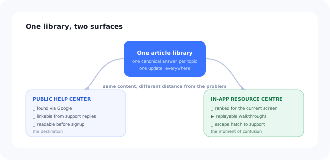
One library, two surfaces: the public site is found by search engines, the in-app layer is found at the moment of confusion.
The Six Things Every Structure Needs
Whichever shape you pick, these are non-negotiable, and a help center that looks beautiful can still be missing four of them.
Synonyms, plurals, misspellings, and the words customers use rather than your product's internal names.
Four to eight categories, visible without scrolling, each obviously distinct from the others.
Same skeleton every time: what this is for, prerequisites, numbered steps, what to do if it fails.
It builds trust when recent and tells you what to prune when it is not. Hiding it helps nobody.
One control, one optional comment box. The comments are more valuable than the votes.
A visible route to a human. Hiding contact options does not deflect tickets, it produces angry ones.
The article that should not exist. Some help articles are documentation of a usability failure: "How to find the export button", "Why your changes weren't saved". Writing them is faster than fixing the interface, so they accumulate, and each one is a small permanent tax on every future user. When one of these appears in your top ten most-viewed articles, treat it as a bug report about the product rather than a success for the help center. Our user friction guide covers how to prioritise which ones to fix first.
Choosing Your Structure in Three Questions
1. Along which dimension do your users actually differ?
If two users would ask completely different questions, the thing that makes them different belongs at the top level. In B2B that is usually role. In a single-purpose tool it is usually the task. In a suite it is usually the product. If your users barely differ at all, use the lifecycle track and keep the page short.
2. What do the search logs say people are looking for?
Your existing search queries and support tickets are a free, unbiased list of the language your customers use. Cluster three months of them and the categories tend to name themselves, usually differently from how the product's navigation is organised, which is exactly the point.
3. Where will the reader be when they need this?
Pre-signup evaluation and Google searches need the public site. Mid-task confusion needs the in-app layer. Both need to be served by the same body of articles, or the two will drift and you will end up maintaining a contradiction.
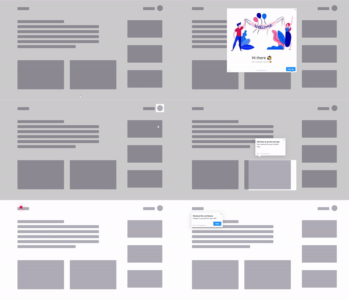
Some answers work better as a replayable walkthrough than as an article the user has to translate into clicks.
Measuring a Help Center Honestly
| Signal | What it tells you | What to do about it |
|---|---|---|
| Zero-result searches | Exactly what customers wanted and did not find | Write the missing article, or add the missing synonym |
| Searches with no click | Results existed but none looked right | Fix titles, usually a vocabulary mismatch, not a content gap |
| Article helpfulness rate | Whether the article answered the question it attracts | Rewrite the worst performers among your most-viewed |
| Tickets per topic vs. views per topic | Where documentation is failing to deflect | High tickets and high views means the article is wrong, not missing |
| Contact rate after help visit | The real deflection number | Segment by entry point: in-app entries usually beat public ones |
Pageviews on their own are the metric most likely to mislead. An article with thousands of views and a poor helpfulness rate is not a hit; it is a queue of people repeatedly hitting the same wall, and it deserves to be read as a signal about the product rather than as traffic. This is the same idea as the deflection thinking in our in-app support guide, applied one level up.
Five Recurring Help Center Mistakes
- Mirroring the product's navigation. Your menu structure is a company artefact. Users searching for help do not think in modules, they think in problems.
- Twenty categories on the landing page. Past about eight, nobody scans; the page has become a search box with expensive decoration around it.
- Hiding the contact route. It converts a deflected ticket into a frustrated one, and the customer arrives at support already annoyed.
- No pruning schedule. Outdated articles do more damage than missing ones, because they are confidently wrong and rank well.
- Public site only. The best-organised help center in the world still requires the user to leave the product and remember it exists.
Help Center Structure: Do vs. Don't
✅ Do
- Pick one top-level dimension and commit to it
- Name categories from search logs, not internal terms
- Give search the most visual weight on the page
- Surface screen-relevant articles inside the product
- Show last-updated dates and prune on a schedule
- Read zero-result searches every month
❌ Don't
- Copy your product's navigation into the help center
- Duplicate shared billing articles per product
- Bury the contact option
- Let community threads outrank current documentation
- Document your way around an interface problem
- Judge success on pageviews
The Layer Most Help Centers Are Missing
Whichever of the eight structures fits your product, the highest-return addition is usually not a better landing page; it is putting the answer where the question happens. A user who is confused on a settings screen is one click from a ticket and three navigational decisions away from the article that would have helped.
A screen-aware in-app layer closes that distance: the two or three relevant articles surfaced on the page itself, a replayable walkthrough for the tasks that are hard to describe in text, and a contextual tooltip on the control that generates the most questions. The library stays where it is; what changes is how far the user has to travel to reach it.
Put the answer on the screen where the question happens
Kompassify adds contextual tooltips, hotspots, guided walkthroughs and checklists on top of your existing product, so the right help appears where users get stuck, targeted by segment, with no code and no release cycle. Free up to 100 monthly active users, plans from $129/month, GDPR-compliant and EU-hosted.
Start for free →The One-Paragraph Version
Pick the one dimension along which your users really differ (role, task, product or lifecycle stage) and put that at the top level with no more than eight categories. Give search the weight it deserves, name everything in your customers' vocabulary, keep one canonical article per shared topic, show update dates, and read your zero-result searches monthly. Then add the layer most teams skip: the same articles, surfaced inside the product on the screen where the question actually comes up.
Frequently Asked Questions
What is a help center?
A help center is the public, self-service destination where customers go to answer their own questions: search, browsable categories, articles, and usually a route to human support when self-service fails. It is the customer-facing front end of your documentation, whereas a knowledge base is the underlying body of articles that can also feed internal tools, chat widgets and in-product help. In practice most teams use the two words interchangeably; the useful distinction is that the help center is a designed destination with a structure, and that structure is what decides whether anyone finds anything.
What makes a good help center?
Six things, regardless of layout: a search box that dominates the page and tolerates the words customers actually use, a shallow category structure people can scan in one screen, articles with a consistent shape, a visible last-updated date, a per-article feedback control, and an honest escape hatch to a human. A help center can have a beautiful landing page and still fail all six, which is why the structures worth copying are the ones that make these easy rather than the ones that look best in a screenshot.
How should a help center be structured?
Pick the split that matches how your users differ from each other. If they differ mostly by role, admins versus everyday users, split by role. If they differ mostly by what they are trying to do, split by task. If you sell several products, split by product first and repeat the structure inside each. If almost everyone is on the same journey, use a lifecycle track from setup to advanced. Choosing a split that does not match a real difference between your users is the most common structural mistake, and it forces everyone to use search whether they wanted to or not.
How many categories should a help center have?
Few enough that the landing page can be scanned in one screen without scrolling: for most products that means somewhere between four and eight top-level categories, with depth added underneath rather than across. A landing page with twenty categories is really a search page with a lot of decoration, because nobody reads twenty options; they scan for two seconds and then type. If you cannot get below eight, that is usually a sign the split is wrong rather than a sign your product is unusually complicated.
Should the help center be inside the product or on a separate site?
Both, serving different moments. A public site is necessary because it is searchable by Google, reachable before signup, and linkable from support replies. An in-product resource centre is what catches the user at the moment of confusion, on the screen where the question arose, without making them leave what they were doing. The strongest setups have one body of articles surfaced in both places, with the in-app layer prioritising the handful of articles relevant to the current screen.
How do you measure whether a help center is working?
Look at searches that returned no results, the top searches that end without an article being opened, ticket volume per topic compared with article views for the same topic, article helpfulness votes, and the share of sessions that end in a support request. Raw pageviews tell you almost nothing: an article with 8,000 views and a 30% helpfulness rate is a hole in your product, not a success. The zero-result search list is usually the single most actionable report you can produce.
What is the difference between a help center and product documentation?
Help center articles are task-shaped and written for someone who is stuck right now: short, specific, one job per article. Product documentation is reference-shaped and written for someone who wants to understand a system: complete, structured, and often technical. Products that serve both audiences usually keep them as separate destinations with cross-links, because merging them produces a site where end users hit API references and developers hit billing FAQs.
Does a help center reduce support tickets?
It can, but only for questions that are genuinely answerable in text and only if users find the article before they open a ticket. The reliable deflection comes from proximity rather than volume of content: surfacing the two or three relevant articles on the screen where the question arises deflects far more than a large, well-organised site the user has to remember exists. Deflection also has a ceiling: questions caused by a confusing interface are better fixed in the interface than documented around.