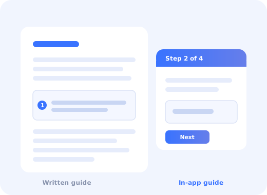
User guides have a reputation problem. Most teams write them because someone has to, nobody enjoys it, and the result is a folder of documents that describe the interface accurately and help nobody.
The guides that do work share a specific property: they are organised around what the user is trying to accomplish, not around what the product contains. That single shift explains most of the difference between documentation people search for and documentation people ignore.
This guide covers the types of user guide worth writing, a structure that works for each, eight examples of guide formats you can copy, and where written documentation stops being the right tool.
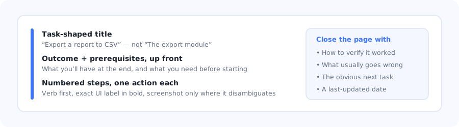
Every good guide page has the same skeleton, whatever the product.
Key Takeaways
- Organise by task, not by menu. Users search for what they want to do, never for the name of your feature.
- One guide, one outcome. A page that covers three tasks will be found by nobody searching for any of them.
- Lead with the result and the prerequisites. Users need to know they are in the right place within five seconds.
- Screenshots are expensive. Every one is a maintenance liability; use them only where words genuinely cannot disambiguate.
- Written guides lose to in-app guidance for first-time tasks. Documentation is best at depth, reference and troubleshooting.
- Support tickets are your content roadmap. The questions people ask are the guides you have not written.
What is a user guide?
User guide definition: a document that helps someone accomplish a specific task with a product, written from the user's point of view and structured around their goal rather than the software's architecture. In SaaS, user guides usually live in a help centre and sit alongside in-product guidance rather than replacing it.
The terms overlap confusingly, so it is worth being precise about what you are writing:
| Format | Answers | Best structure | Length |
|---|---|---|---|
| How-to guide | "How do I do X?" | Numbered steps toward one outcome | 300–800 words |
| Getting-started guide | "How do I begin?" | The shortest path to first value | 500–1,200 words |
| Reference | "What does this setting do?" | Alphabetical or structural; scannable | Whatever it takes |
| Conceptual guide | "Why does it work this way?" | Prose, diagrams, a worked example | 800–2,000 words |
| Troubleshooting | "Why isn't this working?" | Symptom → cause → fix | Short, per symptom |
Mixing these is the most common documentation failure. A how-to guide that pauses to explain architecture loses the person in a hurry; a conceptual guide broken into numbered steps loses the person trying to understand. Decide which one you are writing before the first sentence.
How to create a user guide, step by step
Start from the task, in the user's words
Write the outcome and prerequisites first
Draft the steps by doing the task yourself
Add visuals only where words fail
Close the loop: verification, pitfalls, next step
Test it on someone who has not done the task
Give it an owner and a review date
1. Start from the task, in the user's words
Your feature is called "Segment Builder". Your users search for "how to send this to only new customers". Title the page after the search, not the feature; the feature name can appear in the body where it will still be found.
The best source of these phrasings is free and already sitting in your helpdesk: the exact wording of support tickets, plus your site search queries. Both tell you what people call things when nobody is watching.
2. Write the outcome and prerequisites first
Before step one, answer two questions: what will the user have when they finish, and what do they need before they start (a permission level, a connected integration, an existing object). Prerequisites buried in step four are the reason guides get abandoned halfway with the work half-done.
3. Draft the steps by doing the task yourself
Write while performing the task in the product, not from memory or from a spec. Memory silently skips the steps that have become automatic to you, and those are precisely the steps a new user gets stuck on.
Rules for the steps themselves: one action per step, verb first ("Click", "Select", "Enter"), and the exact interface label in bold. If a step needs a "meanwhile" or a "note that", it is two steps.
4. Add visuals only where words fail
A screenshot for every step feels thorough and is a maintenance trap: your interface changes, and a guide with fifteen stale screenshots is worse than one with none, because it now actively misinforms. Use a visual when the target is genuinely hard to describe, when the user needs to confirm they are in the right place, or when the result is visual. Otherwise, describe it in words.
Where you do use images, crop tight to the relevant area and annotate. A full-window screenshot forces the reader to hunt for the one control the sentence is about.
5. Close the loop: verification, pitfalls, next step
Three short sections that most guides omit and that carry most of the value:
- How to verify it worked: the observable sign of success, so the user does not have to guess.
- What usually goes wrong: the two or three failure modes support sees most often, with the fix.
- The obvious next task: where a user who just finished this typically goes next.
6. Test it on someone who has not done the task
Hand the draft to a colleague outside the team and watch them follow it without helping. Every place they hesitate is a defect. This takes fifteen minutes and finds more problems than any amount of internal review, because reviewers read documentation while writers' knowledge is still in the room.
7. Give it an owner and a review date
Documentation rots silently. A guide with no named owner and no review date will be wrong within two release cycles and nobody will notice until a customer does. Put a visible last-updated date on the page; it also tells users whether to trust what they are reading.
8 user guide formats worth copying
One page, one outcome: the shortest possible path from empty account to first real result. It deliberately ignores configuration, edge cases and alternatives; anything not on the critical path is a link, not a paragraph.
Task-shaped title, outcome and prerequisites at the top, five to nine numbered steps, a verification line, and two common problems. Nothing else.
Parallel entry points ("For admins", "For editors", "For viewers") each with its own short path through the same product. The same feature appears in more than one guide, described differently.
Organised entirely by what the user observes, "My import finished but no records appeared", never by internal cause. Each symptom links to one or more causes with a specific fix.
Every option in one scannable table: name, what it does, default, and (the column most teams omit) what happens if you change it after setup.
A realistic end-to-end scenario with concrete names and numbers, showing how several features combine to solve one real problem, not a feature tour disguised as a story.
A 60–120 second recording, always accompanied by the same steps in text on the same page.
The guide runs inside the application, highlighting the real controls in sequence while the user performs the task on their own data.
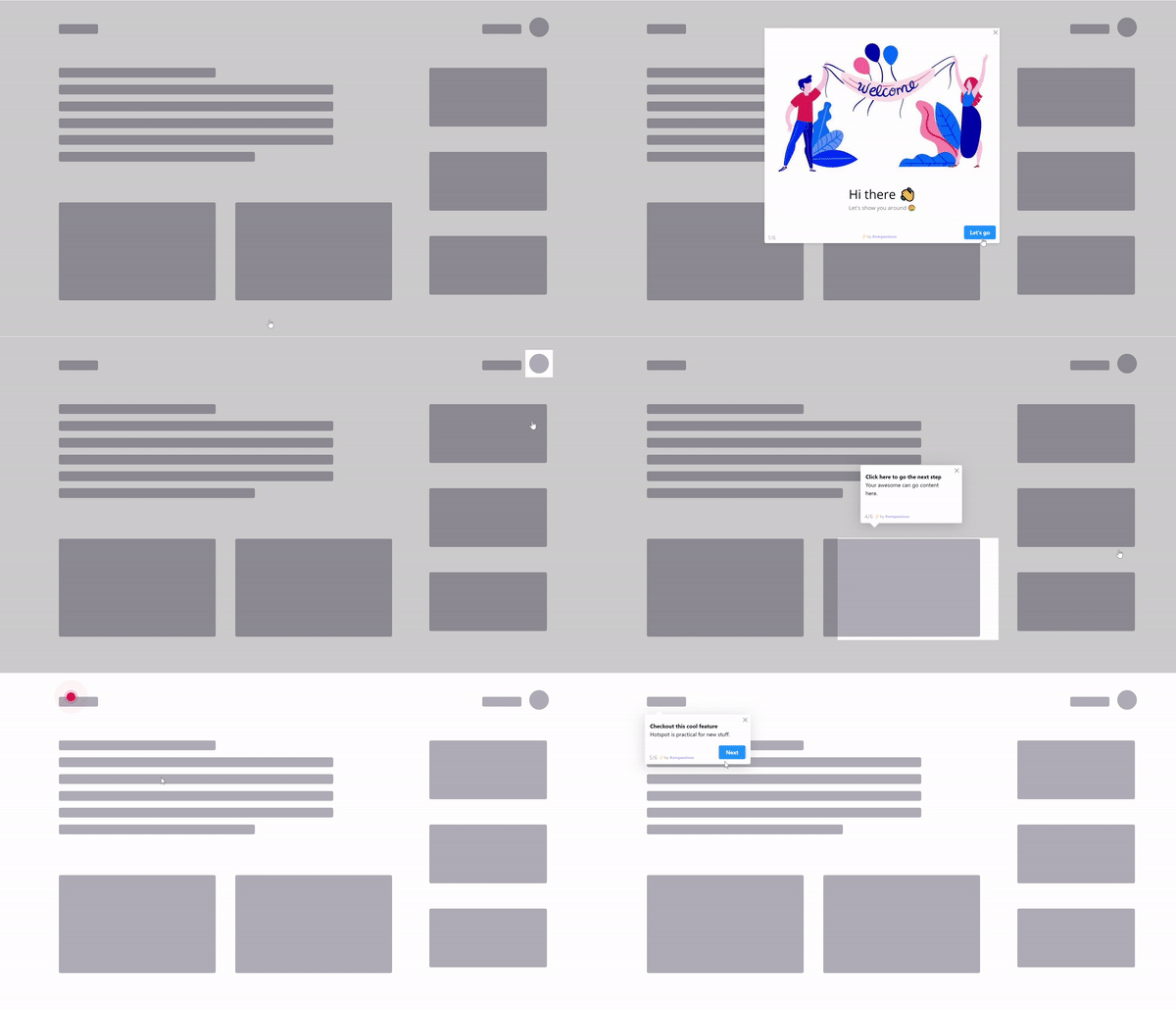
The same instructions as a written user guide, delivered on the real screen the user is looking at.
When a written guide is the wrong tool
Documentation has a structural disadvantage that no amount of good writing fixes: it requires the user to leave the product, find the right page, hold the instructions in their head, and come back. For a first-time task in an unfamiliar interface, that gap is where most people give up.
| Situation | Better tool | Why |
|---|---|---|
| First-time setup task | Product tour | Guides the real UI instead of describing it. |
| A control whose purpose is unclear | Tooltip | Answers the question where it is asked. |
| A sequence of first wins | Onboarding checklist | Tracks progress; a document cannot. |
| An undiscovered feature | Hotspot | Nobody reads a guide for a feature they do not know exists. |
| An empty screen | Empty state copy | The instruction belongs where the blankness is. |
| Deep reference, edge cases, admin config | A written guide | Depth, searchability and permanence are documentation's real strengths. |
The honest division of labour: in-product guidance owns the first hour, and documentation owns everything after it. Teams that try to make written guides carry onboarding end up with thorough documentation and poor activation, and they usually conclude the docs need to be longer.
Keeping user guides alive
✅ Do
- Title pages after tasks, in the user's words
- State the outcome and prerequisites first
- Write while performing the task
- Keep one action per numbered step
- Add a verification step
- Show a visible last-updated date
- Mine support tickets for missing guides
- Link the guide from inside the product
❌ Don't
- Mirror your navigation menu in the docs structure
- Cover three tasks on one page
- Screenshot every single step
- Bury prerequisites in the middle
- Explain architecture inside a how-to
- Publish video with no text equivalent
- Leave guides without an owner
- Expect documentation to do onboarding's job
Let the data tell you what to write next
Three signals, in order of usefulness: the exact wording of repeated support tickets, your help-centre search queries that return nothing, and the pages with high traffic and high exit rates. The first tells you what is missing, the second tells you what people expected to find, and the third tells you which existing guide is failing.
Pairing your guides with in-app guidance
The strongest setup is not documentation or in-product help; it is documentation reachable from inside the product, at the moment the question arises, with the first-time path handled interactively.
- Run the first-time task as a tour. Convert your top three getting-started guides into interactive product tours and compare completion rates against the written versions.
- Answer small questions in place. A tooltip on a confusing field prevents the search that leads to the guide that leads to a support ticket.
- Surface the right guide contextually rather than sending everyone to a help-centre homepage.
- Track which guidance actually gets used with product analytics, and retire what nobody opens.
- Announce documentation changes alongside feature changes through the announcement widget.
Kompassify is a no-code digital adoption platform for SaaS teams: product tours, checklists, tooltips, announcements, in-app surveys and analytics in one place. Free up to 100 monthly active users, paid plans from $129/month, GDPR-compliant with EU hosting.
Turn your best guide into an interactive walkthrough
Take the getting-started page users read most and run it inside your product instead: no code, no engineering ticket.
Start for Free →Frequently Asked Questions
What is a user guide?
A user guide is a document that helps someone accomplish a specific task with a product, written from the user's point of view and structured around their goal rather than the software's architecture. In SaaS it usually lives in a help centre and works alongside in-product guidance rather than replacing it. The defining property of a good one is that it is organised by task, not by menu structure.
How do you write a user guide?
Start from the task in the user's own words, taken from support tickets and site search queries. State the outcome and prerequisites before step one. Draft the steps while actually performing the task in the product rather than from memory, keeping one action per numbered step with the exact interface label in bold. Add visuals only where words genuinely cannot disambiguate. Close with how to verify it worked, what usually goes wrong, and the obvious next task. Then test it on someone who has never done it.
What are the different types of user guide?
There are five worth distinguishing: how-to guides that answer 'how do I do X' with numbered steps; getting-started guides that show the shortest path to first value; reference material that explains what each setting does and should be scannable rather than prose; conceptual guides that explain why the product works a certain way; and troubleshooting content organised by symptom. Mixing these on one page is the most common documentation failure.
How long should a user guide be?
As long as the task requires and no longer. A single-task how-to is usually 300 to 800 words with five to nine steps. A getting-started guide runs 500 to 1,200 words. Conceptual guides can justify 800 to 2,000. Reference material has no natural length. The important constraint is not word count but scope: one page should cover one outcome, because a page covering three tasks will not be found by anyone searching for any of them.
Should user guides include screenshots?
Only where words cannot do the job. Every screenshot is a maintenance liability, and a guide full of stale images is worse than one with none because it actively misinforms after an interface change. Use a visual when the target is hard to describe, when the user needs to confirm they are in the right place, or when the result itself is visual. Crop tightly and annotate rather than pasting the whole window.
When is in-app guidance better than a written user guide?
For first-time tasks in an unfamiliar interface. A written guide requires the user to leave the product, find the page, hold the steps in their head and come back, and that gap is where most people give up. Product tours, tooltips, checklists, hotspots and empty-state copy all remove that translation step. Written documentation remains the better tool for depth, reference, edge cases and troubleshooting.
How do you keep user guides up to date?
Give every guide a named owner and a review date, and show a visible last-updated date on the page so readers know whether to trust it. Tie documentation review to your release process rather than treating it as a separate project. Then use three signals to decide what to fix first: repeated support tickets, help-centre searches that return nothing, and pages with high traffic and high exit rates.
How do you decide which user guides to write next?
Mine your support queue for the questions that repeat, using the customers' exact wording as the page title. Then look at internal search queries that return no results, which tell you what people expected to find. Both beat guessing from a feature list, because they reflect what users are actually trying to do rather than what the product happens to contain.