Somewhere in your analytics tool there is a chart that starts at 100% and only goes down. New teams tend to glance at it, wince, and move on to friendlier charts. That is a mistake, because that falling line, the retention curve, answers the one question every other chart dances around: do people who try your product actually keep using it?
This explainer is for anyone meeting that chart for the first time, or anyone who has nodded along in meetings while quietly wondering what "the curve flattening" actually means. No prior analytics knowledge assumed. By the end you will know exactly what a retention curve is, why your tool may call it a retention chart or retention graph, how to read the shape, and how to build one yourself.
If you already know the basics and want the advanced playbook (benchmarks, retention modeling, cohort-over-cohort analysis, and the levers that bend the curve) that lives in our complete retention curve guide. This page is the ground floor.
Key Takeaways
- A retention curve is a line chart of one cohort over time. It shows what percentage of the users who signed up together is still active on day 1, day 7, day 30, and beyond. It always starts at 100% and falls.
- Retention curve, retention chart, retention graph: same thing. Different tools use different names for the identical visualization. You read them all the same way.
- The shape is the message. A curve that flattens into a plateau means a core of users stayed, the healthy pattern. A curve that slides toward zero means the product isn't holding anyone.
- Retention itself is a simple ratio. Users still active ÷ users who started, measured at each point in time. The curve is just that ratio, drawn.
- You can build one in a spreadsheet in an afternoon, or let a no-code analytics tool plot it continuously from real usage events.
- The curve diagnoses; onboarding treats. A steep early drop is an activation problem, and fixing the first week moves the whole chart.
Retention Curve: The Definition
Retention curve (noun). A line chart showing the percentage of a user cohort, everyone who signed up in the same period, that is still active at each point in time after sign-up. Time since sign-up runs along the bottom; the share of the cohort still active runs up the side. The line begins at 100% on day 0 and declines from there. Also called a retention chart or retention graph.
Every word in that definition is doing work, so let's unpack the two that trip people up.
"Cohort" means the chart never mixes old and new users. It picks one group (say, everyone who signed up in the first week of July) and follows only them. That is what makes the curve honest. A metric like monthly active users can look great simply because marketing had a good month; a cohort can never be topped up. It can only shrink, so the line can only tell the truth.
"Active" means the user did something meaningful (built a dashboard, invited a teammate, exported a report) not merely that their account exists or that they logged in. Every team building its first retention chart has to decide what "active" means for their product, and that decision matters more than any charting detail (more on it in the how-to section below).
Read as a sentence, a point on the curve says: "of the users who joined together on day 0, this percentage was still genuinely using the product N days later." String those points together and you get the curve.
Retention Curve vs. Retention Chart vs. Retention Graph
Three names, one visualization. If you have searched for "retention chart" and "retention graph" and wondered whether they are different artifacts, they are not. The terms are fully interchangeable, and which one you meet first mostly depends on which tool your team uses.
| Term | What it emphasizes | Where you'll hear it |
|---|---|---|
| Retention curve | The shape of the line: the cliff, the slope, the plateau | Product strategy discussions, investor conversations, growth writing |
| Retention chart | The artifact itself, the visualization in your dashboard | Analytics tools, dashboards, reporting decks |
| Retention graph | Same as chart, a regional/stylistic variant | Used interchangeably with "chart," slightly more common in UK English |
One nearby artifact is different and worth naming: the cohort retention table (sometimes "cohort grid"). That's the triangle-shaped table of percentages, one row per cohort, that many analytics tools show alongside the chart. Each row of that table is the raw data for one retention curve; the curve is simply a row of the table drawn as a line. Same data, two views: the table is better for scanning many cohorts at once; the curve is better for actually seeing the shape.
The Anatomy of a Retention Chart
Put any retention graph in front of a product team and they will read it in the same order: start, drop, settle. Here is the anatomy, labeled.
The three landmarks of every retention chart: the guaranteed 100% start, the early drop, and the plateau where the curve settles.
- The start (day 0, 100%). Not an achievement, a definition. Everyone in the cohort was active the day they signed up. The chart only becomes informative from day 1 onward.
- The drop. Every product loses a large share of sign-ups in the first days; the question is how large. This region is governed almost entirely by onboarding, whether new users reach the product's aha moment before friction or distraction wins.
- The plateau (or its absence). Where the curve stops falling, if it does, is the single most important feature of the chart. A plateau is a core of users the product genuinely works for. No plateau means no one is staying, and that no amount of acquisition can fix.
One thing the chart cannot do: predict its own future. A cohort that signed up two weeks ago has a two-week-old curve; you cannot yet know whether it will flatten. Young cohorts always look worse than they will end up; judge a curve only once the cohort has matured past your product's habit window.
Retention Curve Examples: The Three Shapes
Every retention curve ever plotted ends up in one of three families. Here are all three on one chart, followed by what each one is telling you.
The three retention curve shapes on one retention graph: declining (red), flattening (blue), and smiling (green).
Example 1: The flattening curve, the one you want
A worked retention curve example with real numbers. A SaaS product signs up 500 users in one week. On day 1, 225 come back, 45%. By day 7, 140 are still active, 28%. By day 30, 100 remain, 20%. Then something good happens: almost nothing. Day 60 shows 19%, day 90 shows 19%. The curve has flattened at roughly one in five users, and those ~95 people have folded the product into their weekly routine. The early losses still deserve fixing, but the foundation is real: this product holds users.
Example 2: The declining curve, the leaky bucket
Same 500 sign-ups, different product. Day 1: 40%. Day 7: 22%. Day 30: 11%. Day 60: 6%. Day 90: 3%, and still falling. There is no plateau forming; give it long enough and the cohort goes to zero. Every user this product acquires eventually leaves, which means acquisition spend is renting traffic, not building a business. The diagnosis is blunt: users are not finding durable value, and the fix starts with the product and its onboarding, not with more sign-ups.
Example 3: The smiling curve, churned users come back
The rarest shape. The curve drops, flattens, and then, months in, starts climbing back up. Users who had gone dormant are returning: a major feature launch pulled them back, teammates invited them into shared work, or a seasonal workflow (planning season, tax season) resumed. A smiling curve almost never happens by accident, and when it does happen, the job is to find the mechanism and make it repeatable; our guide on announcing new features covers the most controllable trigger.
For the deeper diagnostics (reading the cliff, the slope, and the asymptote like a product team, and benchmarking your plateau) continue with the complete retention curve guide.
How to Make a Retention Chart (In Four Steps)
You do not need a data team to build your first retention graph. You need a list of users, their sign-up dates, and a record of when they did something meaningful. The whole process:
- Group users into cohorts by sign-up date
- Define what "active" means for your product
- Count the percentage still active at each checkpoint
- Plot the percentages as a line
1. Group users into cohorts by sign-up date
Pick a grouping window and assign every user to the cohort of the period they signed up in. Weekly cohorts are the SaaS default: big enough to smooth out noise, frequent enough to show change quickly. If you get a handful of sign-ups a week, use monthly cohorts instead.
2. Define what "active" means for your product
The single most consequential decision in the whole exercise. A login-based chart lies politely: someone can open the app, glance around for ten seconds, and never return, and the chart still records a retained user. Choose the action that represents real value delivered: a document created, an invoice sent, a report shared with the team. If your team has already defined an activation event, the same logic applies here: an outcome, not a visit.
3. Count the percentage still active at each checkpoint
For each cohort, count how many members performed the active action on (or within) each checkpoint (day 1, day 7, day 30, day 60, day 90) and divide by the cohort's starting size. A 500-person cohort with 140 users active in week 2 has 28% retention at that point. In a spreadsheet this is one COUNTIFS per cell; the honest work is in the event data behind it.
4. Plot the percentages as a line
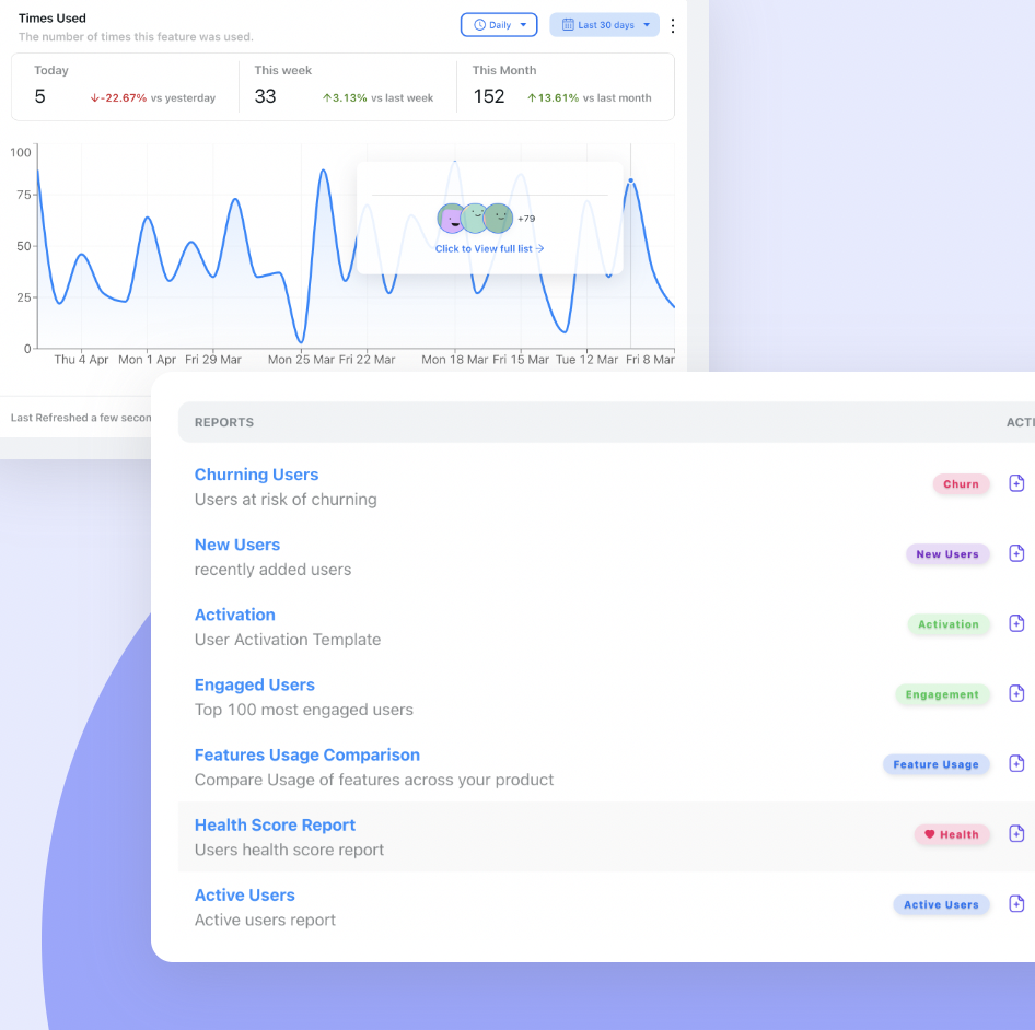
Time on the x-axis, percentage on the y-axis, one line per cohort, and you have a retention chart. The spreadsheet version is a fine first draft, but it goes stale the day you make it. A live version that updates itself is where Kompassify's no-code product analytics comes in: it tracks how users interact with your product and reports churning, engaged, and activated users continuously; no SQL, no event pipeline, and it lives in the same platform as the onboarding tools you will use to act on it.
What Is Retention? The Metric Behind the Curve
Step back from the chart for a moment, because the word underneath it deserves its own definition.
The metric in one line. Retention = users still active ÷ users who started, tracked as time passes. A cohort of 1,000 sign-ups with 200 people genuinely active a month later has 20% day-30 retention. Its opposite is churn, the share who left, and the two always sum to 100%.
Why does everyone from product managers to investors fixate on this one ratio? Because it compounds into everything else. Acquiring a new customer costs 5 to 25 times more than retaining an existing one (Harvard Business Review), and research by Bain & Company shows that increasing retention by just 5% can boost profits by 25% to 95%. Retention sets the ceiling on everything downstream: what a customer is worth over their lifetime, whether referrals can ever outpace churn, and whether your ad spend is building an asset or renting an audience.
The retention curve is simply this metric taken seriously: instead of quoting one number (a "day-30 retention rate of 20%"), the curve shows the whole trajectory, so you can see when users leave, not just that they leave. The rate is the headline; the curve is the story. And once the curve shows you where the losses happen, the treatment is a retention strategy; that playbook lives in our guides to user retention and how to increase it.
You Can Read the Chart. Now What?
Knowing what a retention curve is puts you ahead of most dashboards-glancers. Acting on it is the actual game, and the action depends on where your curve loses people:
- Losing everyone in the first week? That is an activation problem wearing a retention costume. Give new users a guided first session, a short product tour that flows into a small onboarding checklist, so they reach first value before the tab closes.
- Holding users for a month, then losing them quietly? The product hasn't become a habit yet. Put undiscovered features in front of the right users at the right moment with in-app announcements and contextual guidance.
- Curve flattens, but lower than you'd like? Ask. An in-app NPS survey catches both the fans (why they stay) and the detractors (what would have kept them).
This is deliberately the short version; the full diagnostic playbook is in the complete retention curve guide.
See Your Own Retention Curve, Then Bend It
Kompassify pairs no-code product analytics (churning, engaged, and activated user reports) with the tools that actually change the chart: product tours, onboarding checklists, in-app announcements, and NPS surveys. GDPR compliant, EU-hosted, free for under 100 monthly active users, and paid plans from $129/month.
Start for Free →Frequently Asked Questions
What is a retention curve?
A retention curve is a line chart that shows what percentage of a group of users is still using a product as time passes. The group, called a cohort, is everyone who signed up in the same period. The x-axis is time since sign-up, the y-axis is the percentage of the cohort still active. The line starts at 100% on day 0 and falls from there; whether it keeps falling or levels off into a plateau is the fastest available read on whether a product keeps its users.
Are a retention chart and a retention graph the same thing as a retention curve?
Yes. Retention curve, retention chart, and retention graph all describe the same visualization: a cohort's active percentage plotted over time. "Curve" emphasizes the line's shape, "chart" and "graph" emphasize the artifact itself, and analytics tools use all three interchangeably. Whichever name your dashboard uses, you read it the same way: where the line drops, and whether it flattens.
What is retention, exactly?
Retention is the share of users who are still genuinely using a product as time passes, still performing a meaningful action weeks or months after signing up, not just keeping an account open. The math makes it matter: winning a new customer runs 5 to 25 times the cost of keeping one, and Bain & Company found that a 5% improvement in retention can lift profits by 25% to 95%.
What is an example of a retention curve?
Take 500 users who signed up in the same week. On day 1, 225 of them come back (45%). By day 7, 140 are still active (28%). By day 30, 100 remain (20%), and from day 60 onward the number settles at about 95 (19%). Plotting those percentages produces a retention curve that drops steeply, then flattens: the healthy shape, because a stable core of users has stayed.
How do you make a retention chart?
Four steps: group users into cohorts by sign-up week or month; define what counts as "active" (a meaningful action, not a login); count how many of the cohort were active at each checkpoint (day 1, day 7, day 30…) and divide by the cohort's starting size; then plot the percentages as a line. You can do it in a spreadsheet from exported event data, or use a product-analytics tool such as Kompassify that tracks user activity and reports churning, engaged, and activated users without any code.
Why does my retention curve never flatten?
A curve that declines toward zero without leveling off means users try the product, extract no lasting value, and leave: a leaky bucket. The usual causes are an onboarding experience that never gets users to the product's core value, or a product that solves a one-time job rather than a recurring one. Before spending more on acquisition, fix activation: shorten the path from sign-up to first value with a focused product tour and an onboarding checklist, and confirm the curve starts to plateau.
What tool can I use to see my retention curve?
A spreadsheet works for your first chart; a product-analytics tool keeps it alive. Kompassify's no-code product analytics is built for exactly this: it follows how users interact with your product and reports churning, engaged, and activated users, and the same platform includes the product tours, onboarding checklists, in-app announcements, and NPS surveys you'll use to act on what you see. It is GDPR compliant, EU-hosted, and free for under 100 monthly active users.