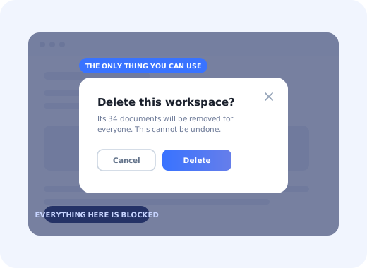
Almost every piece of software you use puts a window in your way at some point. It dims the page, sits in the middle of the screen, and refuses to let you click anything else until you answer it. That pattern has a precise name, and the name explains the behaviour: it is a modal.
The word gets used loosely: people say popup, lightbox, overlay, dialog and modal as if they were interchangeable. They are not, and the difference is the single most important thing to understand about the pattern, because it is what makes a modal powerful when it is right and infuriating when it is wrong.
This guide covers the definition, where the word comes from, the types of modal you will actually build, how a modal compares with the neighbouring patterns, the eight rules that make one bearable, the accessibility requirements, and the cases where the correct number of modals is zero.
Key Takeaways
- A modal blocks. The defining property is not the shape or the overlay; it is that the rest of the interface is unusable until the modal is dealt with.
- "Popup" is not a synonym. Every modal is a popup in casual speech; most popups are not modal, because you can keep working around them.
- Interruption is the cost. A modal spends the user's attention up front, so it must carry something worth more than whatever they were doing.
- One modal, one job. The moment a modal has two primary actions or three paragraphs of explanation, it should have been a page, a tooltip or a notification.
- Accessibility is not optional. Focus trap, Escape to close,
role="dialog", returned focus. A modal that cannot be closed with a keyboard traps people. - Most in-app messages should not be modals. Tooltips, hotspots, banners and notification feeds cover the majority of cases at a fraction of the interruption cost.
What Is a Modal?
Modal: definition
A modal is a window that opens on top of the current page, covers or dims what is behind it, and takes control of the interface until the person deals with it. While it is open, the content behind cannot be clicked, scrolled or tabbed into. The name describes that behaviour rather than the appearance: the application has entered a temporary mode in which one question is the only thing you are allowed to answer.
That single property, blocking, is what separates a modal from everything else that appears over a page. A cookie banner you can ignore while you read is not modal. A chat bubble in the corner is not modal. A tooltip pointing at a button is not modal. A confirmation dialog asking whether you really want to delete twelve records is modal, because there is nothing else you can do until you answer.
A modal is therefore best understood as a trade. You take the user's attention by force, and in exchange you promise the thing you are showing them matters more than whatever they were doing. Most badly-received modals are simply trades where the second half was never true.
Where the Word "Modal" Comes From
The term predates the web. In desktop software, an interface could be modal or modeless. A modeless window let you keep working in the main application while it stayed open: a find-and-replace panel, for example. A modal window locked the application until you closed it. The word came from the idea of a "mode": a temporary state where the same inputs mean something different from usual.
That is why the phrases modal window, modal dialog and modal box all describe the same thing. "Window" is a leftover from desktop operating systems, where dialogs really were separate windows. On the web the modal is just an element positioned above the page on an overlay, but the behaviour it borrows is identical.
Quick test: if you can still click something behind it, it is not a modal. It might be a popover, a toast, a banner or a slideout: all useful, all cheaper, and all covered further down.
The Anatomy of a Modal
Almost every modal, whatever it is for, is built from the same six parts. Knowing the list is useful because most modal problems turn out to be a missing or duplicated part rather than a design problem.
The six parts of a modal. Most modal problems are a missing part, usually the close control or the single primary action, rather than a styling problem.
Two of the six deserve emphasis. The close control must exist even when you are sure the user should act, because a modal with no exit is the single most reported form of interface frustration. And the actions row must contain exactly one primary button. Two primaries is not a choice, it is a stall.
The 6 Types of Modal
Modals fall into a small number of recognisable jobs. The type determines almost everything else: how insistent it can be, whether it may be shown more than once, and whether it deserves to block the interface at all.
-
Welcome modal
The first thing someone sees after signing in for the first time. Its job is routing, not greeting: confirm who they are, ask at most one question that changes what happens next, and offer one obvious first action. Related to but distinct from a full welcome screen, which can take over the whole viewport.
-
Confirmation dialog
The original and most defensible modal. Something destructive or irreversible is about to happen and the system wants an explicit yes. Name the consequence in the heading ("Delete 12 records?" beats "Are you sure?") and label the button with the verb rather than "OK".
-
Announcement modal
Used to tell existing users that something changed. Justified for changes that alter how someone works; not justified for every release. When in doubt it belongs in a feed or a banner instead; see how to announce a new feature for choosing the channel.
-
Form or task modal
A short, self-contained task lifted out of the page: invite a teammate, rename a project, pick a plan. Good when the task is under about five fields and the page context behind it is useful. Bad when it grows into a wizard: at that point it wants to be a page with a URL you can return to.
-
Media or lightbox modal
Opens an image, video or document at a larger size over the page. The least controversial type, because the user asked for it by clicking. Escape and a visible close control matter more here than anywhere, since people open these expecting to get straight back out.
-
Tour step modal
A step in a guided walkthrough that is too big to anchor to a single element, typically the opening and closing steps. The middle steps of a good tour are usually tooltips instead. Real examples are collected in our product tour modal examples.
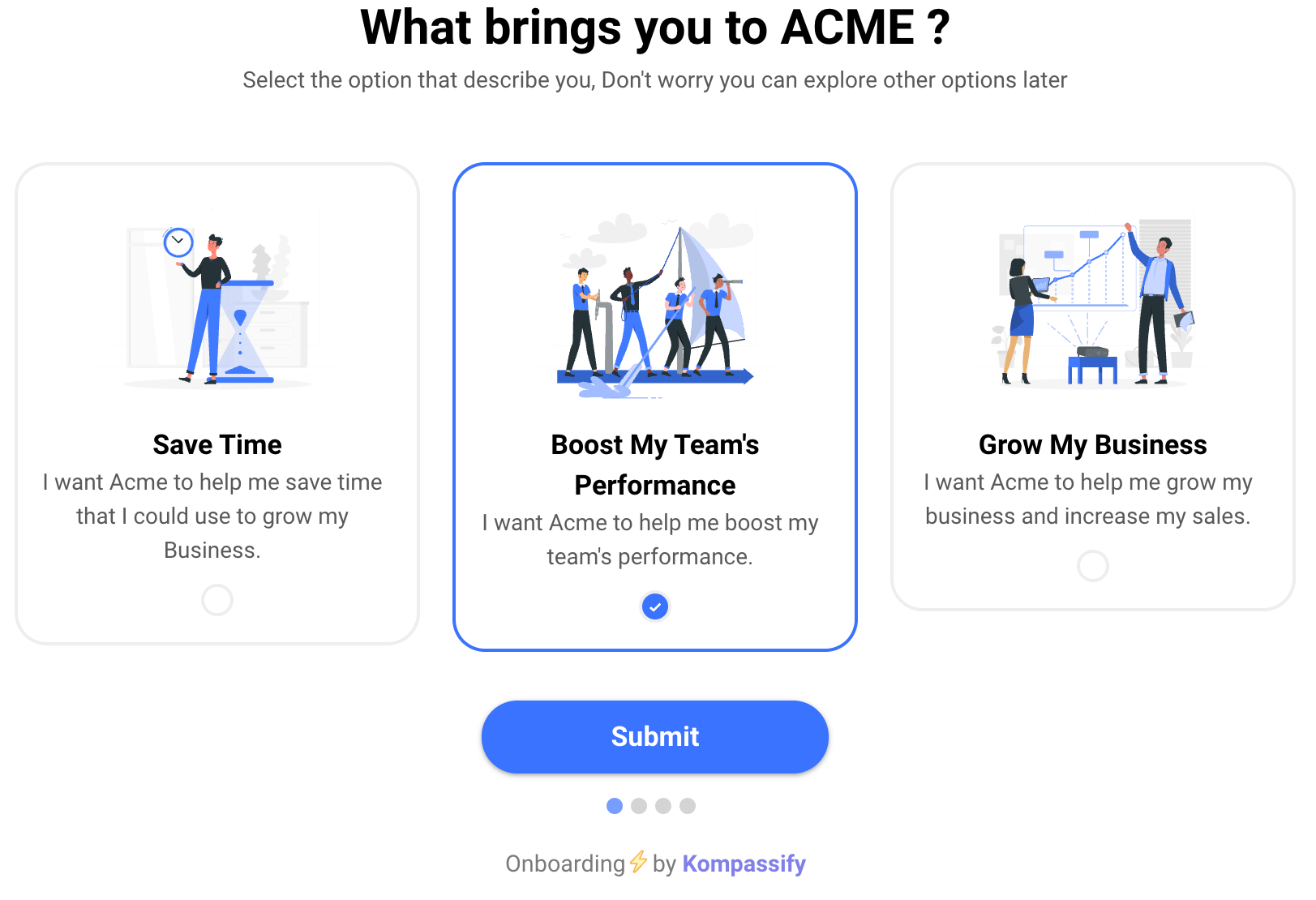
A welcome modal doing its actual job: one question whose answer changes what the user sees next, rather than a paragraph of introduction.
Modal vs Popup vs Tooltip vs Slideout vs Banner
The neighbouring patterns all put content over a page. What separates them is how much of the user's attention they take and whether they take it by force. The table is the fastest way to pick.
| Pattern | Blocks the page? | Attention cost | Use it when |
|---|---|---|---|
| Modal | Yes, nothing behind is clickable | Highest | The decision must happen now, or the task deserves full focus |
| Popover / dropdown | No, closes when you click away | Low | Extra detail or options attached to a specific control |
| Tooltip | No | Very low | Explaining one element, in place, without stopping the flow |
| Slideout / drawer | Sometimes, depends on the implementation | Medium | Secondary content that needs room but keeps the page as context |
| Banner / notification bar | No | Low, and falls further over time | Persistent, non-urgent messages people can act on later |
| Toast | No, disappears on its own | Lowest | Confirming that something just happened |
The practical rule that falls out of this table: start at the bottom and move up only when forced. Most in-app messages that ship as modals would have worked as a tooltip or a banner, and the ones that ship as banners often fail for the opposite reason: people stop seeing them, a problem covered in banner blindness.
When a Modal Is the Right Pattern
There are four situations where interrupting is genuinely the correct choice, and it is worth being strict about them.
Deleting, cancelling, publishing to an audience, spending money. The cost of an accidental click exceeds the cost of the interruption.
Under five fields, self-contained, and better with the page behind it as context than as a separate screen.
First login, before any work has started. Nothing is being interrupted yet, which is exactly why the welcome modal is the one message that gets a free pass.
They clicked the thumbnail, the "invite" button, the preview link. A modal opened on request is not an interruption at all.
Someone half-way through a form or a flow will dismiss without reading, and will resent the product slightly more than before.
Webinars, surveys, minor releases and upsells belong in a feed, a banner or an email; see in-app messaging for the alternatives.
Modal UX Best Practices: 8 Rules
None of these are stylistic. Each one comes from a specific way modals go wrong in production.
- One modal, one job
- Say the consequence in the heading
- Always give a way out
- Never stack modals
- Respect a dismissal
- Watch the height, not just the width
- Rethink it entirely on mobile
- Time it against behaviour, not the clock
1. One modal, one job
A modal should ask one question or complete one task. The clearest symptom of a modal doing two jobs is two primary buttons, closely followed by a heading joined by "and". If you cannot write the heading as a single short sentence, the content wants to be a page.
2. Say the consequence in the heading
"Are you sure?" tells the reader nothing they did not already know. "Delete this workspace and its 34 documents?" lets them decide without reading the body copy at all. The same goes for buttons: label them with the verb (Delete, Publish, Invite) never OK. Our UX microcopy guide has the formulas for both.
3. Always give a way out
A visible close control, the Escape key, and a click on the overlay should all dismiss the modal. The one legitimate exception is a modal in the middle of a destructive confirmation where the overlay click is disabled to prevent accidents, and even then, Escape and the close button stay.
4. Never stack modals
A modal opening another modal produces two overlays, two focus traps and a user with no idea which Escape key press does what. If a modal needs a follow-up question, replace its contents in place and keep a single container.
5. Respect a dismissal
If someone closes a modal, that is an answer. Showing it again on the next page load converts a mild annoyance into a reason to leave. Onboarding modals in particular should be shown once and then never again unless the user's situation genuinely changes; the logic for that lives in onboarding triggers.
6. Watch the height, not just the width
Designers test modals on tall screens. On a laptop with a browser toolbar, a modal that scrolls internally hides its own action buttons, and the user cannot see the thing they are supposed to click. Cap the content height, scroll the body only, and pin the action row.
7. Rethink it entirely on mobile
A centred dialog on a phone is a full-screen takeover whether you designed it that way or not. Make that deliberate: full width, a real header with a close control in a thumb-reachable position, and actions stacked rather than side by side.
8. Time it against behaviour, not the clock
"Show after 5 seconds" interrupts whoever happens to be reading at second five. Fire modals on meaningful events instead: an empty state reached, a feature opened for the first time, a plan limit hit. Behavioural timing is also what stops the same modal reaching users it does not apply to, which is where user segmentation earns its keep.
Modal Accessibility: The Non-Negotiables
A modal is one of the few patterns that can genuinely trap a user. Someone navigating by keyboard or screen reader can end up unable to reach the close button or unable to tell that the page behind has become inert. The requirements are short and worth treating as a checklist rather than an aspiration.
| Requirement | What it means in practice |
|---|---|
| Announce it as a dialog | role="dialog" with aria-modal="true" on the container |
| Give it a name | aria-labelledby pointing at the modal's heading element |
| Move focus in | On open, focus the heading or the first interactive element, not the page behind |
| Trap focus | Tab and Shift+Tab cycle inside the modal and never reach the background |
| Return focus on close | Focus goes back to the control that opened the modal, so the user keeps their place |
| Close on Escape | Always, with the single exception of an in-progress destructive confirmation |
| Hide the background | Mark the page behind as inert so assistive technology does not read through the overlay |
| Lock background scroll | Scrolling the page behind a modal is disorienting on desktop and broken on mobile |
If you are building onboarding that has to clear a formal accessibility bar, the wider requirements (contrast, motion, timing, keyboard operability across tours and checklists) are covered in our accessible onboarding guide.
Modal Do vs. Don't
Do
- Write the heading as the consequence, not as a question about certainty
- Keep exactly one primary action and one quiet dismissal
- Trigger on behaviour: an event, a state, a limit reached
- Show onboarding modals once, then trust the user
- Design the mobile version as a full-screen sheet on purpose
- Test the whole thing with a keyboard before shipping
Don't
- Interrupt someone in the middle of a form or a flow
- Stack a second modal on top of the first
- Hide the close control to force a decision
- Use a modal for news that could sit in a feed
- Let the content scroll past the action buttons
- Re-show a modal that has already been dismissed
How to Build Modals Without Code Using Kompassify
Most of the modals a product needs after launch are not product features; they are messages. A welcome modal for a new segment, an announcement for a change that alters someone's workflow, the opening step of a walkthrough. Building each one as a component, shipping it in a release and removing it in another is why so many of them never get built at all, and why the ones that do get built stay live long after they were relevant.
Kompassify puts that layer outside the codebase. You build the modal visually, decide who sees it with segmentation rules, trigger it on a real event rather than a timer, and set it to show once. Every modal reports how many people saw it, dismissed it and acted on it, so the decision to keep or kill it is made from data rather than from whoever remembers it exists. The same builder covers the cheaper patterns (tooltips, hotspots, banners, checklists) which matters, because the honest answer to "should this be a modal?" is usually no.
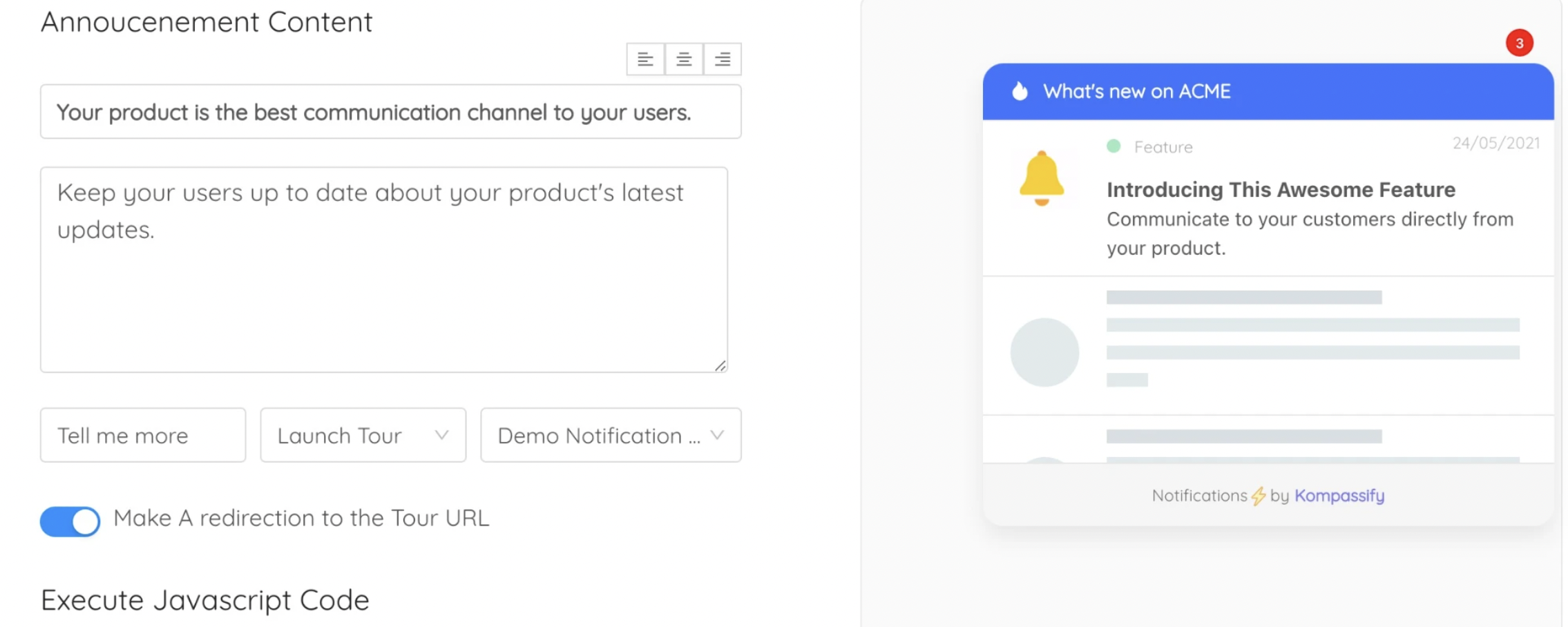
An announcement modal built without a release. Because it lives outside the codebase, retiring it is a toggle rather than a ticket.
Build your first modal, no engineering ticket
Kompassify lets product, onboarding and customer-success teams build modals, tooltips, checklists and in-app announcements visually, target them by segment and behaviour, and measure what each one did. Free up to 100 monthly active users, plans from $129/month, GDPR-compliant and EU-hosted.
Start for free →The One-Sentence Version
A modal is a window that stops everything else until it is answered, which makes it the strongest pattern you have, the most expensive one you can spend, and the wrong answer to most of the questions it gets used for.
Frequently Asked Questions
What is a modal?
A modal is a window that opens on top of the current page, dims or covers what is behind it, and takes control of the interface until the person deals with it. While it is open the rest of the page cannot be clicked, scrolled or tabbed into. The word describes that behaviour rather than the look: a modal puts the application into a temporary mode where one question is the only thing you can answer. That is why a confirmation dialog, a welcome window on first login and a full-screen upgrade prompt are all modals even though they look nothing alike.
What is the difference between a modal and a popup?
Popup is a loose, informal word for anything that appears over a page, including browser windows opened by script, cookie notices, chat bubbles and adverts. Modal is a precise technical term: the content blocks interaction with everything behind it until it is dismissed. Every modal can be described as a popup, but most things people call popups are not modal because you can keep using the page around them. In product work the distinction matters because blocking the interface is the expensive part, and it needs justifying.
What is a modal window in web design?
A modal window is the visible element itself: a panel, usually centred, sitting on a dimmed overlay that covers the page. In markup it is normally a container with role="dialog" and aria-modal="true", an accessible name from its heading, a focus trap that keeps keyboard focus inside it, and a close control. Modal window, modal dialog and modal box all refer to the same pattern; the word window is simply borrowed from desktop software, where dialogs really were separate operating-system windows.
Are modals bad UX?
Modals are not inherently bad; they are expensive. Interrupting someone is justified when the message is genuinely more important than what they were doing: a destructive action that needs confirming, a short focused task, or a first-run welcome that sets up the rest of the session. It becomes bad UX when the interruption serves the company rather than the user, when it fires while someone is mid-task, when it repeats after being dismissed, or when the content could have been a tooltip, a banner or an entry in a notification feed.
What is a welcome modal?
A welcome modal is the modal shown the first time someone signs into a product. Its job is not to say hello but to route: confirm the person is in the right place, ask at most one or two questions that change what they see next, and hand them a single obvious action such as starting a short tour or creating their first item. It should appear once, be dismissible without penalty, and never be used as a container for a feature list nobody asked for.
How do you make a modal accessible?
Give the container role="dialog" and aria-modal="true", label it with its heading through aria-labelledby, move keyboard focus into the modal when it opens and return focus to the element that triggered it when it closes, trap Tab and Shift+Tab inside it so focus cannot wander behind the overlay, close it on the Escape key, hide the background from assistive technology, and lock background scrolling. A modal that cannot be closed with the keyboard is not merely awkward: it traps some users on the page.