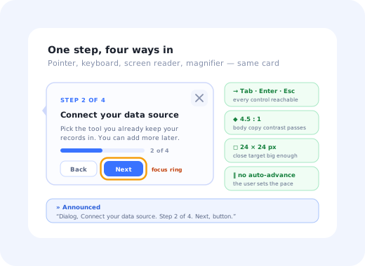
Most onboarding flows are tested by the people who built them, on the machine they built them on, with a mouse. That is a narrow slice of the people who will actually meet the flow. Some of your new users navigate entirely by keyboard. Some are running a screen reader. Some have tremor and cannot reliably hit a 16-pixel close button. Some are sixty-eight years old, new to the category, and reading your tooltip on a phone in bright sunlight.
Accessible onboarding is what you get when in-app guidance (tooltips, tours, checklists, modals, hotspots) works for all of those people rather than just the median one. It is not a separate flow you build for a minority. It is the same flow, built so that it does not depend on a mouse, on colour alone, on fine motor control, or on the assumption that the user can see everything at once.
This guide covers what accessible onboarding means in practice, the barriers that actually exclude people, the WCAG success criteria that apply specifically to in-app guidance, how to make each onboarding pattern accessible, and a testing routine you can run in an afternoon without hiring an auditor.
Key Takeaways
- Onboarding is the worst place to have an accessibility bug. It is the one flow a user cannot skip, cannot come back to later, and has no muscle memory for.
- Keyboard access is the single highest-value fix. If a tour step cannot be reached, read, advanced and dismissed with Tab, Enter and Escape, it excludes several groups at once.
- Overlays are the classic failure. A tour that dims the page and traps focus behind the dim layer is unusable with a screen reader and often invisible to keyboard users.
- Colour is never the whole message. A green tick and a grey tick must also differ in shape, text or position.
- Plain language is an accessibility feature. Cognitive load excludes more users than any technical barrier, and it is the cheapest thing on this list to fix.
- Automated checkers find roughly the easy third. Keyboard-only and screen-reader passes find the rest, and both take minutes per flow.
What Accessible Onboarding Actually Means
Accessible onboarding, in one paragraph
Accessible onboarding is the practice of designing and building in-app guidance so that people with visual, motor, auditory or cognitive disabilities, and people in temporary or situational difficulty, can complete it independently. In practice it means every onboarding element is operable by keyboard, announced correctly to assistive technology, legible at real-world contrast levels, large enough to hit reliably, free of time limits the user cannot control, and written in language that does not assume prior product knowledge.
The reason onboarding deserves special attention is that it is the least forgiving flow in the product. Everywhere else, a user who hits a barrier can work around it: they know where the button normally is, they have a keyboard shortcut, they can ask a colleague. In onboarding none of that exists yet. A modal that traps focus in the middle of a settings page is annoying. The same modal on step two of a product tour is a dead end, and the user's only remaining option is to close the tab.
The situational majority. Accessibility work is usually justified by permanent disability, but the same fixes serve a much larger group: someone using a trackpad with one hand while holding a coffee, someone on a laptop in a bright room, someone whose second language is your interface language, someone who is simply tired. Every barrier you remove for a permanent impairment removes it for a temporary one too.
The Four Barriers Onboarding Creates
Accessibility guidance is easier to act on when you stop thinking about categories of people and start thinking about categories of barrier. Onboarding creates four, and most flows create at least two of them without anyone noticing.
Low-contrast tooltip text on a tinted background, meaning carried by colour alone, a hotspot pulse that is invisible at 200% zoom, an overlay that hides the very element the step is describing.
A close button smaller than a fingertip, a "next" control that only responds to a click, a tooltip that vanishes the moment the pointer moves, a step that requires a precise drag.
An onboarding video that carries the instructions in narration with no captions or transcript, a success chime with no visual equivalent.
Nine steps with no progress indicator, jargon in step one, a tour that auto-advances before the sentence has been read, instructions that describe three actions in one paragraph.
The cognitive column is the one product teams skip, and it is the one that costs the most conversions. It is also the barrier with the widest reach: it affects users with dyslexia, ADHD and memory impairment, users reading in a second language, and users who are simply new to the problem your product solves. Our guide to onboarding non-technical users goes deeper on that specific audience.
The WCAG Criteria That Apply to In-App Guidance
WCAG (the Web Content Accessibility Guidelines, published by the W3C, currently at version 2.2) is the standard almost every accessibility law points at. It is long, and most of it is about page content rather than overlays. The subset below is the part that decides whether a tooltip, tour or checklist is usable, and it is short enough to keep on a sticky note.
| Criterion | What it requires | What it means for onboarding |
|---|---|---|
| 1.4.3 Contrast (Minimum) | 4.5:1 for normal text, 3:1 for large text | Tooltip body text on a blue or tinted card usually fails. Check the actual rendered pair, not the brand swatch. |
| 1.4.11 Non-text Contrast | 3:1 for UI components and meaningful graphics | The hotspot dot, the checklist tick, the progress fill and the focus ring all count. |
| 1.4.13 Content on Hover or Focus | Hover content must be dismissible, hoverable and persistent | A tooltip that disappears when the pointer moves toward it fails outright. This is the single most commonly broken rule in tooltip design. |
| 2.1.1 Keyboard | All functionality available from a keyboard | Next, back, skip and close must be real focusable controls, not click handlers on a styled div. |
| 2.1.2 No Keyboard Trap | Focus can always move away again | A modal focus trap is allowed and correct, as long as Escape and the close button both release it. |
| 2.2.1 Timing Adjustable | Time limits can be turned off, adjusted or extended | Auto-advancing tour steps and toasts that vanish after three seconds are time limits. |
| 2.4.3 Focus Order | Focus order preserves meaning and operability | When a step opens, focus moves into it; when it closes, focus returns to where it came from. |
| 2.4.7 Focus Visible | The focused element has a visible indicator | Never outline: none on a tour button because it looked untidy in the mockup. |
| 2.4.11 Focus Not Obscured | The focused element is not entirely hidden by other content | Added in WCAG 2.2, and aimed squarely at overlays, sticky bars and floating launchers. |
| 2.5.8 Target Size (Minimum) | Targets are at least 24×24 CSS pixels | The tiny × in the corner of a tooltip is the usual offender. |
| 3.1.5 Reading Level | Plain-language alternative for complex text (AAA) | Not required at AA, but the cheapest quality win in the whole list. |
| 4.1.2 Name, Role, Value | Components expose a name, role and state | A tour step should announce itself as a dialog with a title, not as an anonymous block of text. |
On the legal side, keep it factual. Accessibility obligations depend on where you operate and who your users are: the European Accessibility Act, the ADA and Section 508 in the US, and national transpositions all differ in scope and in who they cover. Most of them reference WCAG at Level AA. Treat that as the engineering target and take the legal question to someone qualified to answer it for your jurisdiction; this guide is about building the thing well, not about compliance advice.
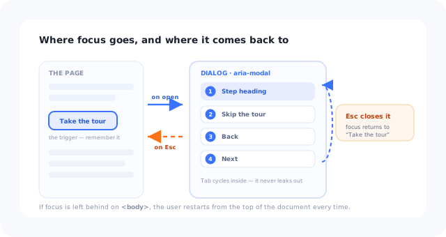
Focus enters the step, cycles inside it, and returns to where it came from. Everything else is a bug.
Making Each Onboarding Pattern Accessible
The rules above apply differently to each pattern. Here is what "accessible" concretely means for the six elements almost every onboarding flow is built from.
Tooltips
A tooltip that only appears on hover excludes every keyboard and touch user immediately. Show it on focus as well as hover, let the pointer travel into it without it vanishing, and let Escape dismiss it. If the tooltip contains the only copy of some information (a required format, a constraint, a definition) it should not be a tooltip at all; put it in the field's help text where it is always available. Our walkthrough on building an onboarding tooltip covers the copy side.
Tour steps and modals
A tour step is a dialog, so build it like one: role="dialog", aria-modal="true",
an aria-labelledby pointing at the step title, focus moved into the dialog when it opens,
focus trapped while it is open, Escape to close, and focus returned to the triggering element
afterwards. Announce the position, "Step 3 of 6", as real text in the dialog rather than as a row of
coloured dots, so it is available to a screen reader as well as to the eye. The patterns in our
product tour modal examples
all work with these attributes added; none of them require a redesign.
Highlight overlays
The dim-the-page-and-spotlight-one-element pattern is the most accessibility-hostile thing in onboarding, because it does two dangerous things at once: it changes what is visually prominent without changing anything in the accessibility tree, and it usually lowers the contrast of the very element being taught. If you use it, make sure the spotlit element is still reachable in the focus order, that the overlay does not sit on top of the focus ring, and that the step text describes the target in words, "the Import button in the top right", so it works when the visual highlight does not.
Checklists
An onboarding checklist is a list of links with state, and it should be marked up as one. Each item needs a text label that makes sense out of context, a state that is exposed to assistive technology rather than implied by a green tick, and a progress figure written as text ("3 of 5 complete") next to any progress bar. When an item completes while the panel is open, announce it through a polite live region; otherwise the one reward in the whole pattern is silent for screen-reader users.
Hotspots and beacons
A pulsing dot is a purely visual affordance, which means it does not exist for a large share of your
users. Give it a real accessible name ("New: bulk export, what's this?"), make it a proper button in
the tab order, meet the 24-pixel target size, and respect
prefers-reduced-motion by dropping the animation rather than the element. Our
guide to UX hotspots
covers when the pattern is worth using in the first place.
Surveys and banners
In-app surveys are forms: every input needs a real label, not a placeholder pretending to be one, and a rating scale needs its endpoints described in text. Banners must not be dismissible by hover alone, must reach the contrast minimum against whatever they sit on, and, if they announce something time-sensitive, should use a live region rather than relying on the user noticing a new strip of colour at the top of the page.
Keyboard and Focus: The Part Most Tours Get Wrong
If you only fix one thing, fix this. Keyboard operability is a prerequisite for screen-reader use, for switch access, for voice control and for anyone whose pointer use is limited, so a single keyboard bug excludes several groups simultaneously. It is also trivially testable: unplug the mouse.
The correct behaviour for an onboarding step is a short, unglamorous list:
- When the step opens, focus moves to the step, normally to its heading or its primary action, never left behind on the page underneath.
- Tab cycles within the step while it is open, and does not escape into the dimmed page behind it.
- Every control in the step is reachable and activates with Enter or Space.
- Escape closes the step, everywhere, without exception.
- On close, focus returns to the element that opened it, so the user does not restart from the top of the document.
- The focus indicator is visible against the step background, not only against the page background.
The two-minute test. Load your onboarding in a fresh session, put the mouse away, and complete it with Tab, Shift+Tab, Enter and Escape only. Then do it again with the browser zoomed to 200%. Between them, those two passes find the majority of real accessibility defects in in-app guidance, and neither requires a tool, a licence or a specialist.
Writing for Cognitive Accessibility
Technical accessibility gets a user to the text. Cognitive accessibility decides whether the text does anything for them. This is where onboarding fails most often and most invisibly, because nothing errors: people just stop.
-
One idea per step
If a step contains the word "then", it is probably two steps. Splitting is free; re-reading is not.
-
Name things the way the user would
Your internal noun for a feature is not the word a new user is searching for. Our UX microcopy guide covers how to choose it.
-
Always show where they are
"Step 2 of 4" costs nothing and removes the fear that the flow is endless, the single most common reason people abandon a tour.
-
Never auto-advance
Reading speed varies by an order of magnitude. Let the user press Next; the flow is not a slideshow.
-
Make it resumable
Anyone who gets interrupted, which is everyone, should be able to reopen the flow from where they left it rather than from the beginning.
-
Short sentences translate better
Plain, unidiomatic English survives translation intact. Wordplay does not.
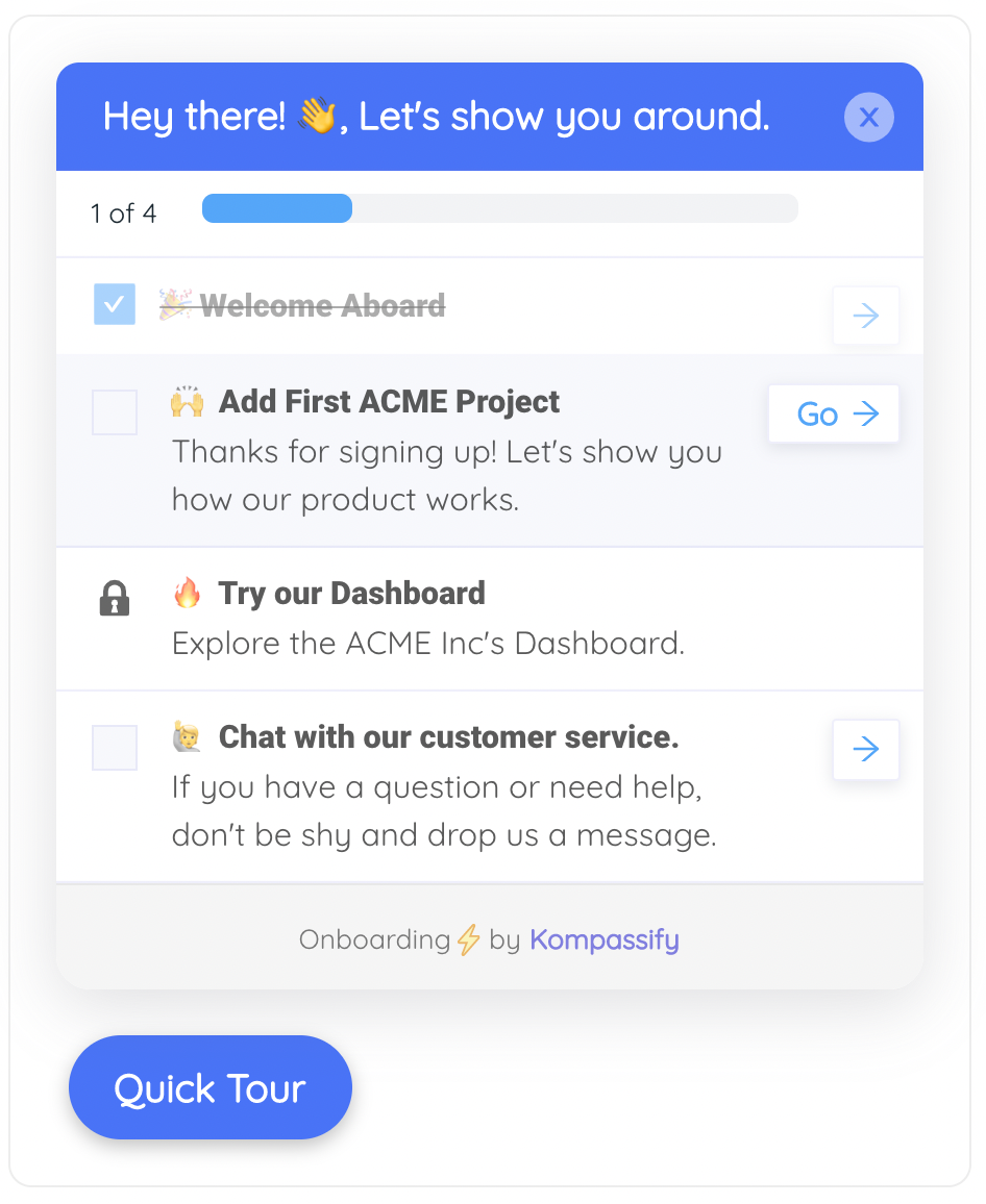
"1 of 4" as words beside the bar. The bar is for the eye; the text is for everyone else.
How to Test Onboarding for Accessibility in an Afternoon
A full audit is a specialist job. Catching the defects that actually block people is not; it is a repeatable checklist that fits inside a normal QA pass. Run these seven in order; the first three alone will find more than an automated scan does.
1. Do the keyboard-only pass
Complete the entire flow with Tab, Shift+Tab, Enter, Space and Escape. Note every point where focus disappears, where you cannot reach a control, or where Escape does nothing. These are blockers, not polish items.
2. Zoom to 200% and reflow to 320 pixels
Tooltips and tour cards are positioned relative to a target, so they are the first things to fall off screen or cover their own anchor when the viewport shrinks. Check that every step is still fully readable and that nothing requires horizontal scrolling.
3. Listen to one full run with a screen reader
VoiceOver on macOS and NVDA on Windows are both free. You are not auditing pronunciation; you are checking three things: does the step announce itself when it opens, is its content read in a sensible order, and is the current position in the flow spoken at all.
4. Run an automated checker on the page with the guidance open
Automated tools reliably catch contrast failures, missing labels and broken ARIA relationships: a useful but partial slice. The important detail is to run the scan while the tour step is open, since most teams scan the page underneath and declare it clean.
5. Check contrast on the rendered element, not the design file
Overlays, opacity, gradients and dark mode all change the effective pair. Sample the actual pixels in the browser. Remember that the focus ring, the progress fill and the hotspot dot need 3:1 as non-text elements.
6. Turn on reduced motion and repeat
With prefers-reduced-motion: reduce set at the OS level, pulses, slides and
spotlight transitions should become instant state changes. Nothing should disappear, and nothing
should keep animating.
7. Read every step aloud to someone outside your team
This is the cognitive test, and it is embarrassing in a productive way. Anything you find yourself explaining after reading it out is a step that needs rewriting. Usability testing formalises this; five minutes with a colleague from another department gets you most of the value.
Accessible Onboarding: Do vs. Don't
✅ Do
- Make every step reachable, operable and dismissible by keyboard
- Mark tour steps up as dialogs with a real accessible name
- Return focus to the trigger when a step closes
- Write the step position as text, not only as dots
- Describe the target element in words as well as highlighting it
- Respect
prefers-reduced-motionand system font size - Give every control a 24-pixel minimum target
- Caption and transcribe onboarding video
❌ Don't
- Remove the focus outline because it clashed with the design
- Put required information only inside a hover tooltip
- Auto-advance steps or auto-dismiss toasts
- Signal completion with colour alone
- Trap focus with no Escape route
- Use a styled
<div>where a<button>belongs - Ship a launcher that floats over the focused element
- Scan the page with the tour closed and call it audited
Building Accessible In-App Guidance with Kompassify
Most of the fixes above are decisions rather than engineering: whether a step auto-advances, whether the position is written out, whether the copy is one idea or three, whether the close control is big enough to hit. That matters, because it means accessibility improvements to onboarding do not have to queue behind a release.
With Kompassify, tours, tooltips, checklists and surveys are built and published without touching the codebase, so a step that reads badly, advances too fast or hides its own target can be rewritten and republished the same afternoon. Steps are advanced by the user rather than by a timer, the flow can be resumed rather than restarted, and the same guidance can be served in several languages so that reading in a second language stops being a barrier. Kompassify is GDPR-compliant and EU-hosted, free up to 100 monthly active users, with paid plans from $129/month.
The honest caveat: no tool makes a flow accessible on its own. Your brand colours still have to pass contrast, your copy still has to be readable, and someone still has to unplug the mouse and try it. What a builder changes is the cost of fixing what that test finds, from a sprint to an afternoon.
Build onboarding everyone can finish
Create keyboard-friendly tours, tooltips and checklists without an engineering ticket, then rewrite any step that trips people up and publish it the same day. Free up to 100 monthly active users, plans from $129/month, GDPR-compliant and EU-hosted.
Start for free →The One-Paragraph Version
Accessible onboarding is ordinary onboarding built so it does not depend on a mouse, on colour, on fine motor control or on prior knowledge. Make every step reachable and dismissible by keyboard, mark tour steps up as dialogs that move and restore focus, keep hover content dismissible and persistent, never auto-advance, write the position as text, meet 4.5:1 on body copy and 3:1 on the dots and rings, respect reduced motion, and say things once and plainly. Then test it the cheap way: no mouse, 200% zoom, one screen-reader run, and one colleague reading it aloud.
Frequently Asked Questions
What is accessible onboarding?
Accessible onboarding is in-app guidance (tooltips, tours, checklists, modals, hotspots and surveys) built so that people with visual, motor, auditory or cognitive disabilities can complete it independently. In practice that means every element is operable by keyboard, announced correctly to assistive technology, legible at the contrast levels the design actually renders at, large enough to hit reliably, free of time limits the user cannot control, and written in language that does not assume prior product knowledge. It is not a separate flow built for a minority; it is the same flow, built without dependencies on a mouse, on colour or on perfect vision.
Which WCAG criteria apply to product tours and tooltips?
The subset that decides whether in-app guidance is usable is short. Contrast (1.4.3) and Non-text Contrast (1.4.11) cover the card text and the dots, rings and progress fills. Content on Hover or Focus (1.4.13) requires hover tooltips to be dismissible, hoverable and persistent. Keyboard (2.1.1) and No Keyboard Trap (2.1.2) cover operability. Timing Adjustable (2.2.1) rules out auto-advancing steps. Focus Order (2.4.3), Focus Visible (2.4.7) and Focus Not Obscured (2.4.11) cover what happens when a step opens and closes. Target Size (2.5.8) covers the close button. Name, Role, Value (4.1.2) is what makes a step announce itself as a dialog rather than as an anonymous block of text.
How do I make a product tour keyboard accessible?
Treat each step as a dialog. When it opens, move focus into it, normally to the heading or the primary action. Trap Tab inside the step while it is open so focus does not leak into the dimmed page behind. Make every control a real focusable element that activates with Enter or Space, not a click handler on a styled div. Let Escape close the step everywhere, without exception. When it closes, return focus to the element that opened it so the user does not restart from the top of the document. Finally, check that the focus indicator is visible against the step's own background, not just against the page.
Why do tooltips fail accessibility checks so often?
Two reasons. First, most tooltips only appear on hover, which excludes keyboard and touch users outright: the fix is to show them on focus as well. Second, WCAG 1.4.13 requires hover content to be hoverable and persistent, and a tooltip that vanishes the moment the pointer moves toward it fails that. A third, quieter failure is putting information that exists nowhere else inside a tooltip: if the copy states a required format, a constraint or a definition, it belongs in permanently visible help text, not in something that has to be summoned.
Does an onboarding overlay hurt accessibility?
It can, and the spotlight pattern is the worst offender. Dimming the page changes what is visually prominent without changing anything in the accessibility tree, so a screen-reader user gets no signal at all, and the dim layer frequently lowers the contrast of the very element being taught. If you use an overlay, keep the highlighted element in the focus order, make sure the overlay never sits on top of the focus ring, and describe the target in words inside the step, “the Import button in the top right”, so the instruction still works when the visual highlight does not.
How do you test onboarding for accessibility without an auditor?
Run four cheap passes before anything else. Complete the whole flow with the mouse unplugged, using only Tab, Shift+Tab, Enter, Space and Escape. Repeat it at 200 percent browser zoom and check nothing falls off screen or covers its own anchor. Listen to one full run with VoiceOver or NVDA, checking only that the step announces itself, reads in a sensible order and speaks its position. Then run an automated checker with the tour step open rather than on the page underneath. Those four take under an hour together and find far more than a scan alone.
Is plain language really an accessibility issue?
Yes, and it reaches more users than any technical barrier. Cognitive accessibility affects people with dyslexia, ADHD and memory impairment, people reading in a second language, and people who are simply new to the category your product is in. The practical rules are cheap: one idea per step, no jargon in the first step, the position written out as text rather than shown only as dots, no auto-advance, and a flow that can be resumed rather than restarted. WCAG has a reading-level criterion at AAA, but you should treat plain language as a quality standard rather than as a compliance target.
Do accessibility laws require accessible onboarding?
Obligations depend on where you operate and who your users are: the European Accessibility Act, the ADA and Section 508 in the United States, and the national laws that transpose them all differ in scope and in whom they cover. What they overwhelmingly share is a reference to WCAG at Level AA, which is why that makes a sensible engineering target regardless of your jurisdiction. Treat the standard as the build target and take the legal question to someone qualified to answer it for the markets you actually sell in.