There is a whole class of software where a large share of users are over 60, and where the design team almost never is: insurance portals, banking, pension and benefits systems, patient portals, council and government services, energy and utility accounts, and the internal tools of industries with long careers. In those products, guidance built around the reflexes of a 32-year-old designer is not a minor mismatch. It is the reason the phone rings.
This is not the same problem as accessibility compliance, and it is not the same problem as writing for non-technical users, though both help. It is the ordinary, gradual set of changes almost everyone experiences with age, combined with a set of interface conventions that were introduced without explanation and are now assumed to be obvious.
What follows is what actually changes, why confidence matters more than capability, nine rules that reliably improve things, the patterns that quietly exclude, and how to test with real older users without a research budget.
Key Takeaways
- It is not a knowledge gap. The difficulty is with recent interface conventions that were never explained, not with technology as a concept.
- Remove automatic timing first. Auto-advance, disappearing messages and session timeouts cause more failure than anything else, and cost nothing to fix.
- Fear outranks ability. Users who worry about breaking something or being defrauded stop before they get stuck.
- Design for the phone call. Someone is often helping, so every control needs a name that can be said out loud.
- Offer the slower path, do not impose it. Detecting age is unreliable and patronising; a visible way to ask for help is neither.
- Five real testers beats a persona. Almost every serious problem appears in the first two sessions.
What Kind of Problem This Is
Onboarding older users: definition
Designing onboarding for older users means building in-app guidance that works with the ordinary, gradual changes of ageing, in vision, fine motor control, processing speed and confidence, and that does not assume familiarity with interface conventions introduced in the last fifteen years. It is distinct from accessibility compliance and from simplifying language for non-technical audiences, although all three overlap.
Holding those three apart matters, because each has a different fix and confusing them wastes effort.
| Accessibility work | Non-technical users | Older users | |
|---|---|---|---|
| The barrier | Assistive tech and input compatibility | Vocabulary and mental models | Timing, precision, conventions, confidence |
| Typical fix | Semantics, focus order, contrast ratios | Plain language, outcome-first labels | No timing, bigger targets, visible undo |
| Fails silently? | Sometimes, caught by audits | Shows up as support questions | Almost always, shows up as abandonment |
| Who notices | Compliance and legal | Support teams | Nobody, until a phone line gets busy |
Our guides to accessible onboarding and onboarding non-technical users cover the first two columns in depth. This guide is the third one.
What Actually Changes
Vision, gradually and unevenly
From around the mid-forties, focusing at screen distance gets harder, contrast sensitivity drops, and more light is needed to read the same text. The practical consequences are specific: light grey text on white becomes genuinely hard rather than merely fashionable, thin fonts lose their edges, and small secondary text is skipped rather than read. Most people are also wearing corrective lenses set for a distance that is not quite the one they are sitting at.
Fine motor control and pointing
Precision pointing degrades before anything else does, so small targets take several attempts, and a control that appears only when the cursor is over it becomes a moving goal. Drag-and-drop is particularly costly: it requires holding a position while moving, and a failed drag usually leaves the interface in a state the user did not intend and cannot explain.
Working memory and interruption
Holding several things in mind while switching context is harder, which is exactly what multi-step forms, modal-over-modal flows and instructions that vanish when you start typing all demand. A message that says four things and then disappears is a memory test administered under time pressure.
Speed, not comprehension
The single most important distinction in this guide: reading speed and reaction time change with age, but comprehension does not. Older users understand your product fine. They need slightly longer to read it, and almost every automatic timing decision in modern interfaces was chosen without them in mind.
Confidence Is the Bigger Barrier
If you watch older users struggle with a product, the striking thing is usually not that they cannot find something. It is how long they hesitate before touching anything at all.
Three fears do most of that work, and none of them are unreasonable. The first is breaking something: many people in this group learned computing in an era where mistakes were expensive and undo was not assumed, and nothing in your interface tells them otherwise. The second is money: on a portal that touches payments, pensions or insurance, an unfamiliar button might commit them to something. The third is fraud, which they have been repeatedly warned about and which makes any unexpected message asking them to click, confirm or log in again read as a possible attack.
Your onboarding messages look like the thing they were warned about. An unexpected overlay, arriving unprompted, asking them to click a button, is exactly the shape of a scam they have been told to close immediately. Guidance that identifies itself, uses the product's own visual language, and never asks for credentials or payment details gets read; guidance that appears from nowhere gets dismissed by the most cautious users you have.
The design response to fear is not encouragement, it is evidence. Say what will happen before it happens, show that the action is reversible, and make the way back obvious. A visible undo does more for confidence than any amount of friendly copy, and the same is true of trust signals generally, as our guide to building user trust covers.
Nine Rules for In-App Guidance
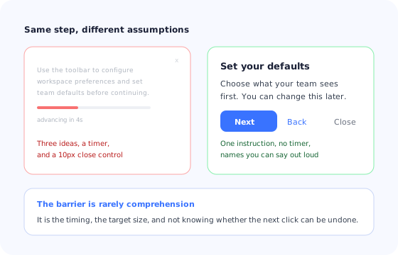
Nothing on the right is a concession. It is the same step, without the assumptions.
1. Remove every automatic timer
No auto-advancing steps, no messages that fade, no carousels that move on their own, and a session timeout measured in tens of minutes with a clear warning before it fires. This is the highest-return change on the list and the cheapest.
2. One instruction per step
If a step contains an “and”, it is two steps. Guidance that lists three actions relies on the reader holding all three while executing the first, which is the exact demand that gets harder with age and is unnecessary for everyone else too.
3. Make targets big and stationary
Larger click areas, generous spacing between adjacent actions, and nothing that only appears on hover. Where an icon is the only label, add the word. This is also the fix for touch devices, so it is rarely a trade-off.
4. Name controls so they can be said aloud
“Select Continue at the bottom of the form” works over the phone and in a screen reader; “click the blue arrow” works only if you are looking at the same screen with the same colour perception. Assume someone is being talked through it, because often they are.
5. State the consequence before the action
Say what will happen, whether it costs anything, and whether it can be undone. “This saves your choice. You can change it later” removes the hesitation that stops cautious users well before confusion does.
6. Keep a visible way back
Every step needs a back control and every completed action needs a route to reverse it. Wizards that only go forward are a common cause of abandonment, because a user who suspects they made a mistake two screens ago will stop rather than continue.
7. Make guidance identify itself
Use the product's colours, logo and voice; never ask for a password or payment details inside a guidance message; and let the user close it in an obvious way. Anything that looks like it came from elsewhere will be treated as a scam by the users most likely to have been targeted by one.
8. Let people re-open the help
Guidance shown once and then gone is guidance nobody can go back to. A persistent, easy-to-find “show me how” entry point on the page itself, not buried in a menu, lets a user repeat a step as many times as they want, which is what actually builds independence.
9. Write in the outcome, not the interface
“Add the people who will use this with you” beats “Configure user provisioning” for every audience, and for this one it is the difference between proceeding and stopping. Our UX microcopy guide has the patterns.
Patterns That Quietly Exclude
-
Auto-advancing tours
The step moves on while the user is still reading, so they finish the tour having read the first half of every step. They will not say so, because it feels like their fault.
-
Hover-only controls
A menu that appears when the cursor passes over an element is invisible to anyone who does not already know it is there, and unreachable on touch. If it matters, it should be visible.
-
Tiny dismiss controls
A small cross in a corner is a precision-pointing task with a punishing failure mode: miss it and you activate whatever is underneath. Give dismissal a real target and, where possible, a word.
-
Session timeouts mid-task
Being logged out during a long form destroys work and confidence at the same time. If security requires a timeout, warn before it, preserve the entry, and return the user to the same place.
-
Points, streaks and playful pressure
Gamification that implies competition or scores tends to land badly with an audience using the product because they have to, particularly for financial or medical tasks. Progress that is purely informative is fine.
-
Interfaces that move between visits
Occasional users navigate by remembered position. Frequent layout changes, personalised reordering and rotating promotional slots reset that memory every time, which is expensive for users who visit rarely. Our re-onboarding guide covers what to show when they return.
Design for the Assisted Session
A meaningful share of sessions in this audience are not solo. An adult child is on the phone, a colleague is looking over a shoulder, a support agent is talking someone through a form. Almost nothing in standard onboarding design accounts for that, and a few small choices make assisted sessions far easier.
- Give every screen a visible, stable name so both people can confirm they are in the same place.
- Label steps with numbers and names so a helper can ask “which step does it say you are on?”.
- Never rely on colour or position alone to identify a control.
- Keep the layout consistent between visits so a helper's memory of it remains accurate.
- Make the help entry point findable by description, not just by icon.
These are also the properties that make a product easy to write support documentation for, easy to describe over a phone line, and easy to navigate with a screen reader. It is one of the rare places where designing for a specific group improves the product for everyone with no trade-off.
Testing Without a Lab
You do not need a research programme. You need five people over 65 who do not work with you, a real task, their own device, and the discipline not to help.
- Start earlier than you think. Begin at finding the site or the login page, not at the first screen of your flow. A large share of failures happen before the part you designed.
- Use their device and their settings. Their zoom level, their browser, their font size, their notifications. A tester on your laptop is testing a different product.
- Do not narrate or rescue. The moments where you want to intervene are the findings. Write down where the hand stops moving, not just where an error appears.
- Ask what they thought would happen before each click, rather than what they think of the design afterwards. Predictions expose the mental model; opinions expose politeness. Our usability testing guide covers the session structure.
In analytics, the signals worth watching are the ones that indicate hesitation rather than error: abandonment on steps that everyone else completes, repeated attempts on the same control, sessions that end at a confirmation screen, and support contacts that begin with an apology. None of these show up in an average completion rate, which is why this problem stays invisible for so long.
Onboarding Older Users: Do vs. Don't
Do
- Remove auto-advance, fading messages and short timeouts.
- Keep one instruction per step, in the outcome's words.
- Name controls so they can be spoken over a phone.
- Say the consequence, and show it is reversible.
- Leave a permanent, findable way to re-open the guidance.
- Test with five real people over 65, on their own devices.
Don't
- Hide anything important behind hover.
- Use light grey body text or hairline fonts.
- Rely on icons without words.
- Detect age and impose a different experience.
- Add scores, streaks or countdowns to a financial or medical task.
- Assume silence in your analytics means nothing is wrong.
Building the Slower Path With Kompassify
The practical objection to all of this is that a slower, more explicit path would frustrate confident users. It would, if it were the default. The answer is to build it as an option that anyone can start, and to make it easy to find rather than automatic.
In Kompassify that is a small amount of configuration. Build the step-by-step walkthrough with manual advance only, one instruction per step, named controls and a back button on every step, then launch it from a checklist item on the pages where people get stuck, so it can be replayed as many times as someone needs. Add tooltips that stay until dismissed rather than fading, and a checklist that holds progress across sessions so an interrupted task can be picked up tomorrow without starting again.
Because guides are built in a visual editor, the team that hears the support calls can fix the wording the same afternoon rather than filing a ticket, which matters in this audience more than most: the difference between a step that works and one that does not is usually a single sentence.
Guidance that waits for the user
Build walkthroughs with no timers, tooltips that stay until dismissed, and a checklist your least confident users can replay them from. Free up to 100 monthly active users, plans from $129/month, GDPR-compliant and EU-hosted.
Start for free →The One-Paragraph Version
Older users understand your product; they read it more slowly, point less precisely, and have good reasons to be careful with anything involving money or an unexpected message. Almost every failure traces back to a timing decision, a small target, an unnamed control, or a missing reassurance rather than to comprehension. Remove automatic timers, put one instruction in each step, make controls big and speakable, state consequences and show they are reversible, and leave a permanent way to reopen the guidance. Offer the slower path rather than imposing it, design for the phone call that is often happening alongside the session, and test with five real people over 65 on their own devices. Every one of those changes makes the product better for everybody, which is why this is the rare accessibility adjacent work with no trade-off to argue about.
Frequently Asked Questions
Is onboarding older users the same as accessibility?
They overlap but they are not the same task. Accessibility work is largely about meeting specific criteria so that assistive technology and non-standard input work correctly, and it is necessary regardless of who your users are. Designing for older users is about the ordinary, gradual changes most people experience with age, in vision, fine motor control, processing speed and confidence, none of which meet a disability threshold and most of which are invisible in your analytics. A product can pass an accessibility audit and still be exhausting for a 70-year-old, usually because of timing, target size and tone rather than markup.
Are older users just less technical?
That framing leads to the wrong fixes. Many older users are highly competent with the systems they use regularly, and struggle with newer interface conventions rather than with technology as a concept. The specific difficulty is usually with recent idioms that were never explained anywhere: hidden menus behind icons, gestures with no visible affordance, controls that only appear on hover, and interfaces that change position between visits. Treating it as a knowledge gap produces condescending copy; treating it as an interface-convention gap produces better design for everybody.
What is the single most useful change to make?
Remove automatic timing. Auto-advancing tour steps, messages that disappear after a few seconds, sessions that expire mid-form and carousels that move on their own all fail the same way: they require the user to read and act at a speed the product chose. Letting the person move at their own pace, with an explicit next control and no disappearing content, removes more difficulty than any amount of copy rewriting, and it costs nothing to implement.
How do we handle the fact that someone is often helping them?
Design for the assisted session, because it is common in this audience: a relative or colleague is on the phone, or looking at a different screen. That means every step needs a name that can be said out loud, screens need stable and describable landmarks, and instructions must not depend on colour or position alone. A step called 'the blue button on the right' cannot be followed over the phone; 'the Continue button at the bottom of the form' can, and it also happens to be better for screen readers.
Will designing for older users slow everyone else down?
Not if the slower path is optional rather than default. Most of the rules are universal improvements with no cost to anyone, such as larger targets, no timeouts, explicit next controls and visible undo. The few that would genuinely slow a confident user, such as a step-by-step walkthrough of a form, should be offered rather than imposed: a persistent, easy-to-find 'show me how' entry point that anyone can start and stop. The mistake is to detect age and impose a different experience, which is both unreliable and patronising.
How do we test this without a research lab?
Recruit five people over 65 from outside your company, give them a real task on their own device, and watch without helping. Do not use employees' colleagues, and do not use a prepared demo account. Almost every serious problem appears in the first two sessions, and most of them will be things nobody on the team considered a step at all, such as finding the login page, dealing with a cookie banner, or recovering from an autocorrected email address.