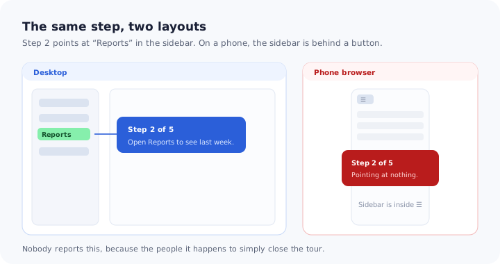
Onboarding gets designed where it gets built, which is on a wide screen with a browser window taking up two thirds of a large monitor. The tour is reviewed there, approved there, and shipped.
Some share of your users then meets it on a phone, in a browser, standing somewhere. The sidebar that step two points at has collapsed into a menu button. The modal that looked generous now covers everything. The tooltip that sat neatly to the right of a field has nowhere to sit. Nobody files a complaint about this, because the natural response to guidance that does not make sense is to close it and carry on.
Mobile web is not native app onboarding and it is not desktop onboarding with smaller margins. It is a third case with its own constraints, and the good news is that the failures are specific and predictable enough to design around. This guide covers what breaks and why, the decision rule for adapting versus suppressing a step, the patterns that work in a narrow viewport, how much a phone step can carry, what to test before shipping, and why every onboarding number you look at should be split by device.
Key Takeaways
- Most mobile failures are anchoring failures. The step points at an element that is now inside a collapsed menu or below the fold.
- Decide per step, not per flow. Keep, re-anchor or suppress each step according to whether the task is realistic on a phone.
- Precise tooltips are the weakest pattern on a small screen. Bottom-anchored cards and slim banners do the same job without needing space beside a target.
- Halve the words, keep one action. A step longer than three short lines pushes its own button out of reach.
- Split every metric by device. A healthy blended completion rate is the most effective way to never discover this.
Why Mobile Web Is Its Own Problem
Teams usually have a mental slot for “mobile onboarding” and it is occupied by the native app. That slot is about installs, permission prompts, push notifications and release cycles, and it is covered in our guide to mobile app onboarding. Mobile web shares none of that machinery and inherits a different set of problems.
| Desktop web | Mobile web | Native app | |
|---|---|---|---|
| How the user arrives | Deliberately, at a desk | Often mid-task, from a link | After an install decision |
| Navigation | Persistent and visible | Collapsed behind a control | Tab bar or drawer |
| Room for guidance | Space beside any element | Almost none horizontally | Almost none horizontally |
| Hover exists | Yes | No | No |
| Shipping a change | Immediate | Immediate | Through a release |
| Session length | Long, focused | Short, interrupted | Variable |
The last row deserves attention because it is the one most often ignored. A desktop user opening your product has usually decided to spend some time on it. A phone user is frequently checking something between other things, which means a six-step tour is not merely cramped, it is mistimed. Guidance on a small screen has to assume the session could end at any moment and still be useful if it does.
The Five Things That Break
1. The step is anchored to something that is not there
This is the dominant failure, by a distance. A guidance step attaches to an element; on a narrow layout, that element may be inside a collapsed menu, moved far below the fold, stacked into a different order, or simply not rendered. The step then attaches to nothing, points at the wrong thing, or floats without an obvious referent. It is the same class of problem described in our guide to why product tours break — except here nothing changed in your product at all, only the width of the window.
2. Everything stacks, so “beside” stops existing
Desktop layouts put things next to each other; narrow layouts put things underneath each other. A tooltip positioned to the right of a field has no right side to occupy. What tends to happen is that the guidance either covers the very element it is describing, or gets pushed somewhere with no visual relationship to it, which is worse than no guidance because the user now has to work out what is being pointed at.
3. Modals swallow the screen
A dialogue that occupies a comfortable portion of a desktop window occupies all of a phone. The user loses the context they were about to be shown, and if the dismiss control ends up off-screen below a long body of text, they lose the exit as well. Everything worth knowing about the pattern itself is in our guide to modals; the mobile-specific rule is that a full-screen interruption needs to earn its place far more strongly than the same content does on desktop.
4. Hover does not exist
Any guidance that reveals itself on hover is invisible on touch, and any instruction that says “hover over” is simply wrong there. This also affects the surrounding interface: hidden affordances that desktop users discover by moving a pointer are undiscoverable, which makes the guidance more necessary on the small screen, not less.
5. The keyboard eats half the viewport
The moment a user taps into a field, the on-screen keyboard takes a large portion of the visible area. Guidance anchored near the bottom is covered; a step whose action is below the field becomes unreachable without dismissing something. Any step that involves typing should assume it will be read in roughly half the space it was designed for.
None of these produce an error. There is no failure state, no support ticket and no alert — only a slightly lower completion rate hidden inside an average that desktop users keep looking respectable.
Decide Per Step: Keep, Re-Anchor or Suppress
The instinct is to make the whole flow responsive. The better unit of decision is the individual step, because the answer genuinely differs from one step to the next.
Three outcomes, applied step by step. Most desktop flows lose two or three steps and improve.
Suppress the steps whose underlying task nobody will perform on a phone. Importing a file, configuring permissions across a wide table, building a complex rule — guiding someone into work they cannot comfortably finish produces an abandoned session and a worse impression than staying quiet. Suppressing is not ignoring: note the step and offer it when the same person next appears on a larger screen.
Re-anchor the steps whose task is fine but whose target has moved. If the item lives behind a menu control on small screens, point at the menu control and say what is inside it, or drop the anchor entirely and use a bottom-anchored card that describes the action in words. Silently keeping the desktop anchor is the one option that is always wrong.
Keep everything else, with the text cut down. In most flows this leaves a mobile version that is two or three steps shorter than the desktop one, which is usually an improvement even judged on its own terms.
Patterns That Work in a Narrow Viewport
Small screens do not need new invention so much as a different ranking of the patterns you already have.
| Pattern | How it behaves on a phone | Use it for |
|---|---|---|
| Bottom-anchored card | Strong. Sits where thumbs already are, needs no space beside a target | The default for tour steps |
| Slim banner | Strong. Takes one line, never blocks the task | Ambient messages, status, a single nudge |
| One-step checklist | Good, if collapsed to show only the open step | Multi-session setup |
| Full-screen welcome | Acceptable once, at the start, with a visible dismiss | First entry only |
| Anchored tooltip | Weak. Rarely room beside the target; easy to cover it | Only large, unambiguous targets |
| Hotspot on a small control | Weak. Hard to hit accurately, easy to miss entirely | Avoid below tablet width |
Two notes on the list. The bottom-anchored card is the workhorse and deserves to be the default rather than a fallback: it is reachable, it does not need to find space next to anything, and it leaves the interface visible above it. The in-app banner is the most under-used pattern on small screens precisely because it is modest; a single line that does not interrupt is often the whole intervention a phone user needs.
Checklists survive the transition well if they are collapsed. A ten-item list on a phone reads as a wall of obligation, while the same list showing only the current open step, with a small indication of progress, reads as momentum — the effect described in our guide to onboarding progress bars.
Writing for a Phone
The text budget on a small screen is roughly half of what desktop tolerates, and the reason is physical rather than stylistic: every additional line pushes the action button further down, and past a certain point it leaves the comfortable reach of a thumb or goes under the fold.
A workable discipline is to write the step for desktop, then cut it to the single sentence that says what to do next. What survives should be the instruction; what gets cut is the explanation that justifies it. This feels wrong to most writers and is almost always right on a phone, because a user standing in a corridor is not weighing your reasoning.
Three specific rules carry most of the value. One action per step, since a step with two instructions will be half-completed. Lead with the verb, because the first three words may be all that is read. Never refer to screen position — phrases like “in the left sidebar” or “the panel on the right” are false on a narrow layout, and they are the single most common reason a step reads as broken even when it renders correctly. Our guide to UX microcopy covers the formulas; the mobile constraint is simply that you get fewer words to apply them in.
Shorter steps also relieve the load problem that small screens make worse: less context is visible, so the user is holding more in their head while reading your instruction, for the reasons set out in our guide to cognitive load in onboarding.
Four Behaviours to Check Before Shipping
None of this requires a test lab. Open the flow on an actual phone and walk through it, watching for four specific things.
1. Every step still has a target
Go through the flow at phone width and confirm that each anchored step points at something that is visible on screen, without opening a menu first. This single pass catches the majority of mobile onboarding faults.
2. The guidance does not cover what it describes
Check that the card or tooltip is not sitting on top of the field it is telling the user to fill. It happens constantly in narrow layouts and it is invisible in a desktop review.
3. The keyboard does not hide the action
For any step involving typing, tap into the field and confirm the instruction and its button are still reachable with the keyboard open.
4. Rotating the device does not strand the flow
Turn the phone sideways mid-step. The layout changes, and guidance that was positioned correctly may end up somewhere unhelpful. It is a thirty-second check that catches a genuinely annoying class of bug.
One more check is worth adding for completeness: confirm that the guidance can be dismissed with a control that is visible without scrolling. A user who cannot close a step will not persevere with it. The same reasoning appears in our guide to accessible onboarding, where an inescapable overlay is the most serious failure of all.
Measure by Device or You Will Not See It
The reason mobile web onboarding stays broken for years in otherwise well-run products is arithmetic. If three quarters of sessions are desktop and they complete at seventy per cent, a mobile completion rate of fifteen per cent still produces a blended figure in the high fifties. That number looks like a flow with room to improve rather than a flow that is failing entirely for a quarter of the people who see it.
Split three things by device class and the picture resolves immediately. Completion rate, which tells you the size of the gap. Step-level drop-off, which tells you where it happens — and a step with a dramatically worse mobile drop-off is almost always an anchoring or layout problem rather than a copy problem. Time to first value, which tells you whether phone users are reaching an outcome at all or merely completing a tour. The definitions in our guide to user onboarding metrics need no adjustment; the only change is the grouping.
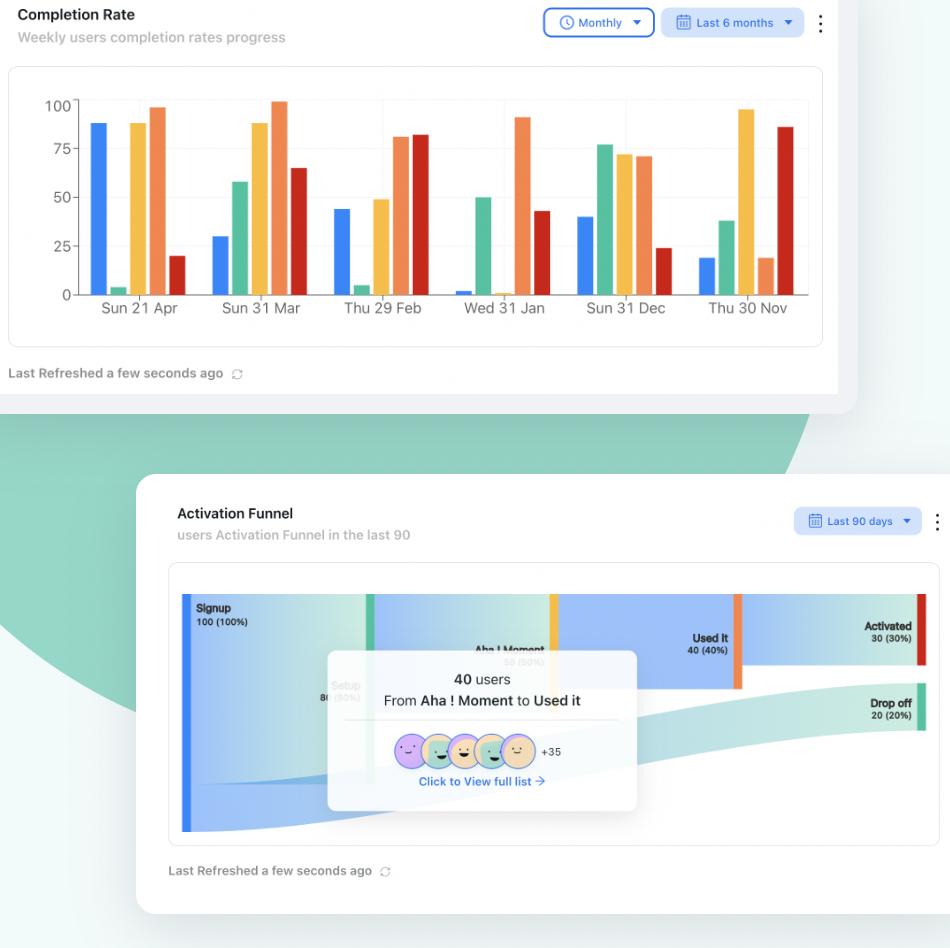
The same funnel, split by device, is where a healthy blended completion rate stops hiding a broken phone experience.
A reasonable first look. Pull last month’s onboarding completion for phone sessions only. Most teams have never seen that number in isolation, and it is usually the most informative thing they look at all week.
Mobile Web Onboarding: Do vs. Don’t
✅ Do
- Decide keep, re-anchor or suppress for each step individually
- Make the bottom-anchored card your default pattern
- Point at the menu control when the real target is inside it
- Cut the text to one action and lead with the verb
- Assume half the viewport once a keyboard opens
- Walk the flow on a real phone before shipping
- Split completion and drop-off by device class
- Offer suppressed steps later, on a larger screen
❌ Don’t
- Ship the desktop flow unchanged and call it responsive
- Refer to the left sidebar or the right-hand panel
- Anchor a step to a small control on a narrow layout
- Use hover to reveal anything
- Put a dismiss control below a long body of text
- Guide someone into a task they cannot finish on a phone
- Judge mobile guidance by a blended completion rate
- Assume nobody uses your product on a phone without checking
Building Mobile Web Onboarding With Kompassify
Most of the work here is targeting and pattern choice rather than engineering, which is exactly the kind of change that stalls when it has to go through a development queue.
With Kompassify you can build and adjust it without code. Show a different flow to small-screen sessions, so phone users get the short version and desktop users keep the full one. Re-anchor a step to the control that actually exists on a narrow layout, or drop the anchor and use a bottom-anchored card instead. Suppress the steps whose task belongs on a larger screen and surface them when the same user returns to one. Keep a checklist collapsed to the current step, and replace a heavy dialogue with a single-line banner where that is all the moment needs. Because everything is edited visually and published without a release, fixing a broken mobile step takes minutes rather than a sprint.
The reporting matters as much as the building: per-step completion tells you where phone users stop, which is the difference between guessing that mobile is weaker and knowing which step to re-anchor.
Stop shipping a tour that points at nothing
Build a separate, shorter flow for small screens, re-anchor the steps that moved, and see exactly where phone users drop off. No code required. Free up to 100 monthly active users, plans from $129/month, GDPR-compliant and EU-hosted.
Start for free →The One-Paragraph Version
Mobile web onboarding is a third case, distinct from both desktop guidance and native app onboarding, and it usually exists by accident as a degraded copy of the desktop flow. The dominant failure is anchoring: a step points at an element that has moved behind a menu control or below the fold, and the guidance either covers the wrong thing or floats with no referent. Work step by step rather than flow by flow — suppress the steps whose task nobody will do on a phone, re-anchor the ones whose target moved, and keep the rest with the text cut to a single action. Make the bottom-anchored card the default pattern and treat precise tooltips and small hotspots as weak choices in a narrow viewport. Never refer to screen position, assume half the viewport once a keyboard opens, and walk the flow on a real device checking for a missing target, guidance covering its own field, a hidden action and a rotation that strands the step. Then split completion, step drop-off and time to first value by device, because a blended average is the most reliable way to never find out that a quarter of your users have been closing a tour that pointed at nothing.
Frequently Asked Questions
What is mobile web onboarding?
Mobile web onboarding is the guidance a user receives when they use your web product in a phone or tablet browser, rather than on a desktop screen or in a native app. It matters as a separate discipline because the product is the same but the layout is not: navigation collapses, panels stack, hover does not exist and the visible area is a fraction of what the guidance was designed against. Most teams do not build mobile web onboarding deliberately; they inherit a desktop version of it that degrades quietly.
Is mobile web onboarding the same as mobile app onboarding?
No. Native app onboarding deals with app stores, permission prompts, push notifications and release cycles, and it begins with an install. Mobile web onboarding happens in a browser: there is no install, no permission dialogue and no release gate, and the user often arrives mid-task from a link rather than deliberately opening the product. The interface constraints overlap, so patterns transfer, but the surrounding process is entirely different.
Why do product tours break on phones?
Usually because a step is anchored to something that is not on the screen. A tour step points at an element, and on a narrow layout that element may be inside a collapsed menu, moved below the fold, stacked into a different order or removed altogether. The step then has no valid target and either attaches to the wrong thing, floats in the middle of the screen, or disappears. The second most common cause is a step that assumes hovering, which does not exist on touch.
Should you show the same onboarding on mobile and desktop?
Only where the step is genuinely doable in both places. The right unit of decision is the individual step rather than the whole flow: keep the steps whose target exists and whose task is realistic on a phone, re-anchor the ones whose target moved, and suppress the ones that ask for work nobody will do on a small screen, such as a long configuration or a bulk import. A shorter mobile flow that finishes beats a complete one that strands people.
How much text should a mobile onboarding step have?
Roughly half what you would write for desktop, and one action per step. A phone step that runs past three short lines pushes the button out of comfortable reach and reads as an obstacle rather than help. The practical discipline is to write the step for desktop first, then cut it to the single sentence that says what to do next, because the explanation that justifies the action is what can be lost without losing the step.
What guidance patterns work best on small screens?
Patterns that respect the narrow viewport rather than fight it: a bottom sheet or full-width card anchored to the bottom of the screen where thumbs already are, a slim banner for anything ambient, and a checklist that shows one open step at a time instead of a long list. Precisely positioned tooltips are the weakest pattern on a phone, because there is rarely room beside a target, and the ones that do work point at something large and unambiguous.
How do you know whether your mobile onboarding is working?
Split every onboarding measurement by device class and compare. A blended completion rate hides the failure almost perfectly: desktop users finishing at a healthy rate can carry an average while phone users abandon at the first anchored step. Look at completion, step-level drop-off and time to first value for phone sessions specifically, and treat a step whose drop-off is far worse on mobile as a layout problem rather than a copy problem.