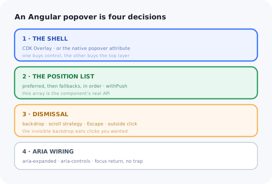
Angular gives you more popover machinery than any other framework, which is exactly why Angular popovers go wrong in a particular way. The CDK Overlay can do everything, so the component ends up doing everything: a backdrop that swallows clicks, a scroll strategy nobody chose, a position list copied from a Stack Overflow answer, and a subscription that outlives the component.
The symptoms are familiar. The panel opens in the wrong place near the bottom of the viewport. It stays pinned in mid-air after the page scrolls. Clicking the trigger a second time closes and immediately reopens it. Nothing announces to a screen reader that anything happened.
This guide builds an Angular popover as four explicit decisions — the shell, the position list, the dismissal contract, the ARIA wiring — and then lists what stays hard once it works.
Key Takeaways
- Pick the shell deliberately. CDK Overlay for control and legacy support; the native
popoverattribute when you want the top layer and light dismiss for free. - The position array is the API. A preferred position plus ordered fallbacks beats any amount of manual measuring.
- An invisible backdrop is not free. It eats the click that would have hit the trigger, which is why the panel flickers closed and open again.
- Choose a scroll strategy. The default repositions forever; a popover anchored to a row in a long table should usually close instead.
- A popover does not trap focus. If it must, you wanted a dialog.
- A UI popover is not an onboarding popover. Same rectangle, different lifecycle, different owner.
Popover, Tooltip, Modal: Three Different Components
These three get merged in design systems and then argued about for a year. The axis that separates them is who controls the page while it is open.
| Tooltip | Popover | Modal dialog | |
|---|---|---|---|
| Opened by | Hover or focus | A deliberate click or key press | A deliberate action |
| Contains | A short string, nothing focusable | Anything, including inputs | A whole task |
| Rest of the page | Usable | Usable | Inert |
| Focus | Never moves | May move in, never trapped | Moves in and is trapped |
| Angular building block | MatTooltip or custom — see the Angular tooltip guide |
cdkConnectedOverlay |
Dialog / MatDialog |
The tell: the moment you add cdkTrapFocus and a visible backdrop to
your popover, you have built a dialog out of the wrong primitive. Use the CDK's
Dialog before the keyboard semantics become a bug report.
1. The Shell: CDK Overlay or the Native Popover
Angular now has two credible answers, and the right one depends on what you need to control.
CDK Overlay when…
- you need a position list with ordered fallbacks and push behaviour;
- you need scroll strategies, backdrops and detachment as first-class concepts;
- you are rendering a component, not a template fragment;
- you support browsers without the popover API.
Native popover when…
- you want the top layer, so clipping and
z-indexstop being your problem; - light dismiss and Escape should be the browser's job;
- the panel is simple markup inside the same component;
- you want it to work before hydration.
The CDK version is declarative and lives entirely in the template. Nothing here is imperative, which is what keeps it out of trouble:
A signal for open rather than a plain boolean matters more than it looks: the overlay can
detach on its own — a scroll strategy fired, the origin left the DOM — and the
(detach) handler is what writes that back into your state. Without it the trigger needs
two clicks after every self-dismissal, which is the single most reported Angular popover bug.
2. The Position List Is the Component's Real API
FlexibleConnectedPositionStrategy walks your array in order and uses the first position
that fits. That array — not the CSS — is where a popover's behaviour actually lives, and
writing it out explicitly is the difference between a panel that behaves near the bottom of a
viewport and one that does not.
Two modifiers change how that list is read. withPush(true) (the default) nudges the panel
back into the viewport instead of moving to the next fallback — convenient, but it means the
panel can end up visibly detached from its trigger, so turn it off when the connection matters.
withFlexibleDimensions(true) lets the CDK shrink the panel to fit rather than reposition
it, which is what you want for a long list and wrong for a fixed-size form.
Write the fallbacks you want; the CDK will not invent them for you.
3. Dismissal: The Backdrop and the Scroll Strategy
Two CDK defaults cause most of the reported weirdness, and both are one line to fix once you know what they are.
The transparent backdrop eats the trigger click
With hasBackdrop, the CDK inserts a full-viewport element above the page. Click the
trigger while the panel is open and that click hits the backdrop, not the button: the panel closes,
then your (click) never fires — or, if the backdrop is not there, it fires and
reopens what you just closed. That is the flicker.
Pick one contract and hold it. Either use the backdrop and let (backdropClick) be the
only close path — the trigger's own handler becomes open-only — or drop the backdrop and
handle outside clicks yourself, excluding the trigger's own element from the check.
The default scroll strategy is rarely the right one
reposition() is the CDK's default: the panel follows its origin forever. In a long table
that means a filter popover that stays glued to a row you can no longer see, or hovers over unrelated
content once the origin scrolls out of view. Usually you want one of the other two.
| Strategy | Behaviour on scroll | Use it for |
|---|---|---|
reposition() |
Follows the origin | Short pages, panels anchored to fixed chrome |
close() |
Detaches the overlay | Row menus and cell popovers in long tables |
block() |
Prevents page scroll entirely | Almost never for a popover — that is modal behaviour |
4. ARIA and Keyboard: A Short, Non-Negotiable List
A popover is not a dialog, so it needs far less than the CDK's a11y module offers. What it does need:
- A real
<button type="button">trigger. Adivwith(click)is invisible to the keyboard, and no ARIA attribute repairs that. [attr.aria-expanded]bound to the open signal, andaria-controlspointing at the panel'sid.- Escape closes it. With the native
popoverattribute you get this free; with the CDK, subscribe tooverlayKeydownor useoverlayRef.keydownEvents(). - Focus return. If focus moved into the panel, put it back on the trigger on close — including when the overlay detached by itself.
- No
cdkTrapFocus. The page behind stays reachable; that is what makes it a popover.
Resist adding role="dialog" to make a screen reader announce the panel. It announces it
as a dialog, which promises modality you are not providing. Leave the role off for a panel of form
controls; use role="menu" only if you are also implementing arrow-key roving focus and
menuitem children, because the role is a promise about the keyboard.
What Stays Hard After It Works
Change detection
An overlay rendered from a template attaches outside the host component's view. With
OnPush, content that changes from a callback the CDK invoked can render stale. Signals
largely fix this; if you are still on Subject-driven state, expect a
markForCheck() in the close path.
Leaks on destroy
backdropClick(), keydownEvents() and
positionChanges are long-lived streams. An overlay that is detached but not
dispose()d keeps its subscriptions and its DOM. Use takeUntilDestroyed()
and dispose in the destroy hook.
Nesting
A select or datepicker opened from inside a popover creates a second overlay whose backdrop sits
above the first. Clicking inside the child then closes the parent. You have to teach the parent
that the child's DOM counts as "inside" — which is why composedPath and an
explicit panel reference are worth the effort.
Testing
Overlays render outside the fixture's own element, so fixture.debugElement.query finds
nothing. Query the overlay container, and remember that jsdom implements neither the top layer nor
light dismiss — native-popover dismissal needs a real browser.
A UI Popover Is Not an Onboarding Popover
The component ships, and the next ticket asks for "a popover that points new users at the export button". Same rectangle, different product.
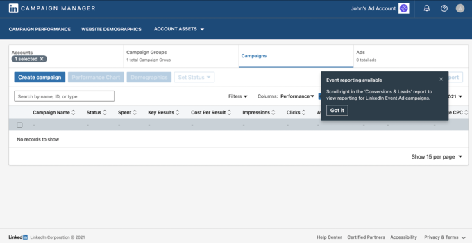
A panel anchored to a control — but opened because of who the user is, not because they clicked.
| UI popover (what you just built) | Onboarding popover | |
|---|---|---|
| Opens because | The user clicked a control | This user has not done something yet |
| Audience | Everyone, identically | A segment: plan, role, tenure, feature usage |
| State | One interaction | Seen / dismissed / completed, per user, persisted |
| Sequencing | None | Step 3 of 6, resumed days later |
| Changes | Rarely, in a release | Weekly, by a non-engineer, with no release |
| Success is | It positioned correctly | Activation moved — which means measuring it |
The positioning work carries over. Segment targeting, per-user persistence, sequencing, per-step analytics and a copy loop that does not touch your release train do not — and those are the expensive parts. That is a contextual help system rather than a UI component, which is the honest framing of the build-versus-buy decision.
Keep the component. Skip the content pipeline.
Kompassify lets product and onboarding teams add popovers, tooltips, hotspots, checklists and guided tours to an Angular app without shipping a release for every copy change — targeted by segment, with adoption data on each one. Free up to 100 monthly active users, plans from $129/month, GDPR-compliant and EU-hosted.
Start for free →Build It, or Configure It?
Both — the line is drawn by who edits it and how often, not by how it looks.
Build the component
- Menus, filter panels, pickers, column choosers — the product's own interface.
- Anything a designer specified and a developer maintains.
- Anything that must obey your design tokens and work offline.
Configure the guidance
- Anything targeted at a segment rather than everyone.
- Anything whose copy will change without a deploy.
- Anything you need completion data for, step by step.
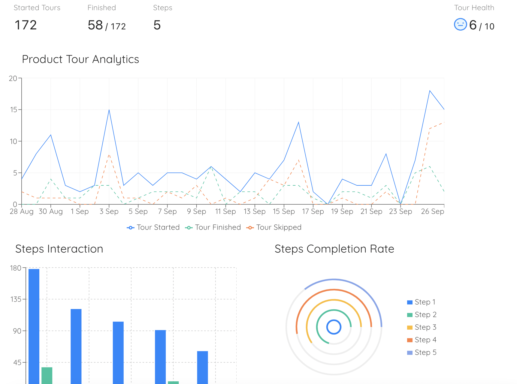
Per-step completion is the question a UI popover cannot answer about itself.
Teams that build both quietly acquire a second product — an under-instrumented onboarding platform — as a side effect of having written a popover.
A Pre-Ship Checklist
- Trigger is a real
<button type="button">witharia-expandedandaria-controls. - Position array has explicit fallbacks, and the panel is verified at all four viewport corners.
withPushchosen deliberately, not inherited.- Scroll strategy chosen deliberately;
(detach)writes back into your open state. - One dismissal contract: backdrop or a document listener that excludes the trigger.
- Clicking the trigger while open closes once — no flicker, no double-click to reopen.
- Escape closes it, and focus returns to the trigger.
- Overlays are disposed and streams unsubscribed on destroy.
- A nested overlay (select, datepicker) does not close the parent.
- Nothing essential lives only inside the popover.
The One-Sentence Version
Build an Angular popover as four deliberate decisions — CDK Overlay or the native popover for the shell, an ordered position list instead of manual measuring, exactly one dismissal contract, and the short ARIA list that does not pretend to be a dialog — and recognise that the moment the panel needs to know which user is looking at it, you have left UI and entered onboarding.
If the next ticket is a sequence of these pointing at five features for trial users only, read the product tour guide first — and the hotspot UX guide if the trigger is meant to be a pulsing dot rather than a button. The same pattern in other frameworks: React and Vue 3.
Frequently Asked Questions
How do you create a popover in Angular?
Use the CDK Overlay's declarative form: put cdkOverlayOrigin on the trigger button, put cdkConnectedOverlay on an ng-template holding the panel, and bind cdkConnectedOverlayOpen to a signal. Supply an explicit cdkConnectedOverlayPositions array — a preferred position plus ordered fallbacks — so the panel behaves near every edge of the viewport, and choose a scroll strategy rather than accepting the default reposition. Handle the overlay's (detach) event by writing false back into your open signal, because the overlay can close itself. Then wire aria-expanded and aria-controls on the trigger and return focus to it on close. If you do not need the CDK's control and can rely on modern browsers, the native popover attribute gives you the top layer, light dismiss and Escape with no library at all.
Why does my Angular popover close and immediately reopen?
Because the trigger click is being counted twice, or is hitting the backdrop instead of the button. With cdkConnectedOverlayHasBackdrop the CDK inserts a full-viewport element above the page: clicking the trigger while the panel is open hits the backdrop, which closes the overlay, and then your own click handler toggles it back open. The fix is to pick one dismissal contract. Either keep the backdrop and make (backdropClick) the only close path, leaving the trigger handler open-only, or drop the backdrop and write a document click listener that ignores clicks inside the trigger's host element and inside the panel.
Should I use the CDK Overlay or the native popover attribute in Angular?
Use the CDK Overlay when you need control: an ordered position list with fallbacks and push behaviour, scroll strategies, backdrops, attaching a whole component rather than a template, or support for browsers without the popover API. Use the native popover attribute when you want the browser to do the hard parts: it promotes the panel to the top layer, so no ancestor's overflow can clip it and no z-index can stack over it, and it brings light dismiss and Escape for free. For a simple panel of markup inside one component, the native version is far less code; for a design-system primitive with a documented position API, the CDK still earns its place.
Which scroll strategy should an Angular popover use?
Rarely the default. reposition() keeps the panel glued to its origin forever, which in a long table means a popover that follows a row you can no longer see, or floats over unrelated content once its origin scrolls away. For row menus and cell popovers, close() is almost always right: the overlay detaches on scroll, and your (detach) handler resets the open state. block() prevents page scrolling entirely, which is modal behaviour and wrong for a popover. Reserve reposition() for short pages or panels anchored to fixed chrome like a header.
How do you make an Angular popover accessible?
The list is short but not optional. Use a real button element with type="button" as the trigger, because a div with a click handler cannot be reached by keyboard and no ARIA attribute repairs that. Bind [attr.aria-expanded] to the open state and point aria-controls at the panel's id. Make Escape close it — free with the native popover, or via the overlay's keydownEvents() with the CDK. Return focus to the trigger when it closes, including when the overlay detached by itself. Do not add cdkTrapFocus and do not add role="dialog": both promise modality you are not providing, and the rest of the page staying reachable is precisely what makes this a popover rather than a dialog.
What is the difference between a UI popover and an onboarding popover?
A UI popover is user-invoked and stateless: someone clicked a control, it opens, everyone sees the same thing, and it is finished after one interaction. An onboarding popover is proactive and stateful: it appears because a particular user has not done a particular thing yet, it is targeted by segment, it is often one step in a sequence that must resume days later, and it needs per-user seen and dismissed state plus per-step completion analytics. The positioning work transfers between them; the targeting, persistence, sequencing and the weekly copy changes do not, and those are the parts that consume a roadmap. That is why product and onboarding teams usually configure in-app guidance in a dedicated tool rather than shipping it through the front-end release cycle.