Nobody sets out to build a popover. It arrives sideways: a tooltip that needed a link inside it, a
dropdown that outgrew a <select>, a modal that felt far too heavy for choosing a
date. So the tooltip grows a button, or the modal loses its backdrop, and what ships is a component
with a tooltip's ARIA and a modal's focus trap, doing a third job neither was designed for.
The symptoms are consistent. Keyboard users cannot reach the buttons inside it, because
role="tooltip" told the browser there would not be any. Or the whole page goes inert
while somebody picks a filter. Or it opens fine in Storybook and renders underneath the sticky header
in production.
All three are the same root cause: a popover was built out of the wrong parts. This guide starts by
separating the three components properly, then builds the real one in React, on the native
popover attribute, with anchor positioning and the focus behaviour that belongs to it.
Key Takeaways
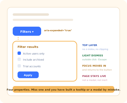
- Three components, three focus models. Tooltip: focus never enters. Modal: focus is trapped. Popover: focus moves in and comes back.
popover="auto"is most of the work. Top layer, light dismiss, Escape, and sibling popovers close each other.aria-expandedon the trigger is the required attribute.aria-haspopupis only correct for menus, listboxes and dialogs.- Never
role="tooltip"on something with buttons in it. That one attribute is what makes the content unreachable. - The page stays live. A popover that makes the background inert is a modal wearing the wrong CSS.
- A UI popover is not an onboarding popover. Same geometry, entirely different system around it.
Popover, Tooltip, Modal: Three Different Components
Before writing anything, settle which one you are building. Three questions decide it, and the answers cascade into every other choice.
| Tooltip | Popover | Modal | |
|---|---|---|---|
| Opens on | Hover and focus | Click, or Enter on the trigger | Click, or a product decision |
| Interactive content | Never | Yes, that is the point | Yes |
| Focus | Never enters it | Moves in, returns to the trigger | Trapped inside until it closes |
| The page behind | Fully usable | Fully usable | Inert |
| Closing | Pointer leaves, blur, Escape | Outside click, Escape, a choice made | An explicit decision |
| ARIA on the trigger | aria-describedby |
aria-expanded |
Nothing special |
| Typical use | Icon button labels, truncated cells | Filters, date pickers, account menus, share panels | Confirmations, full edit forms |
The row that decides everything is focus. If content inside needs to be clicked, focus has to be able to reach it, which rules out a tooltip. If the rest of the page should keep working, focus must not be trapped, which rules out a modal. A popover is exactly the component that sits between those two constraints, and its behaviour follows from them rather than from taste.
Content decides focus; focus decides which component you are actually building.
1. The Native popover Attribute
The single highest-leverage line in a modern popover is an attribute. Adding
popover="auto" to an element buys four behaviours that hand-rolled versions spend a
sprint on:
- The top layer. The element renders above every stacking context in the document, so an ancestor with a
transformcan no longer bury it and no ancestoroverflowcan crop it, without a singlez-index. - Light dismissal. A click anywhere outside closes it, and so does Escape, both without a document-level listener you have to remember to remove.
- Mutual exclusion. Opening one
autopopover closes any other that is not its ancestor, which is exactly the behaviour a row of menu buttons needs. - Events.
beforetoggleandtogglefire on every state change, whoever caused it: your code, a click outside, or the browser.
The one thing to understand before using it is the difference between the two modes:
popover="auto" |
popover="manual" |
|
|---|---|---|
| Outside click closes it | Yes | No |
| Escape closes it | Yes | No |
| Closes other popovers | Yes, non-ancestors | No, several can be open at once |
| Use for | Menus, filters, pickers: the default | Toasts and inline panels the user closes deliberately |
manual is not "I will handle dismissal myself". It turns off
Escape as well as the outside click, and a panel that cannot be dismissed with the keyboard
is an accessibility defect. If you pick manual, you are now responsible for a key handler,
and in almost every case what you actually wanted was auto with a
beforetoggle guard.
2. Driving It From React Without Two Sources of Truth
Popovers are imperative: React has no declarative prop for them, so you call
showPopover() and hidePopover(). The trap is that the browser can also close
the popover on its own (an outside click, Escape, another popover opening) and
if React's state does not hear about it, the next click on the trigger appears to do nothing, because
state still says open.
The toggle event is what keeps the two honest. Let the DOM be the source of truth for
is it open, and mirror it into state for rendering:
The conditional focus return is the detail worth stealing. Blindly focusing the trigger on every close steals focus from wherever the user actually clicked: open a filter panel, click a button elsewhere on the page, and focus snaps backwards to the filter button. Only reclaim it when focus was still inside the panel that is closing.
3. Positioning: Anchor It, Do Not Measure It
The top layer solves stacking; it does not place anything. The popover renders in the middle of the viewport until you position it, and there are two honest options.
1. CSS anchor positioning: no JavaScript at all
Name the trigger, point the popover at that name, choose a side, and give the browser a list of fallbacks for when the chosen side does not fit:
It costs nothing at runtime, keeps position through scrolling for free, and flips on its own. The
catch in 2026 is that engine support is still uneven, so the @supports guard and a
measured fallback are not optional if your users are not all on the same browser.
2. A positioning library: one behaviour everywhere, today
The alternative measures the trigger with getBoundingClientRect, computes a placement
with collision detection, and re-runs on scroll and resize. It is more code and more work per frame,
and it behaves identically in every browser you support. That predictability is usually why teams
with a broad browser matrix still choose it.
What is not a real option is hand-rolling the geometry. Flip, shift along the cross axis, arrow placement, nested scroll containers, and staying attached while an ancestor scrolls add up to a genuinely hard problem, the same conclusion the React tooltip guide reaches from the other direction.
4. ARIA and Keyboard: Less Than You Think, But Exactly That
A popover needs far less ARIA than a modal, and the mistakes are mostly additions rather than omissions.
-
aria-expandedon the trigger: requiredIt is what announces "collapsed" and "expanded". Without it, a screen reader user has no way to know the click did anything. Keep it in sync with the DOM's state, which is what the
toggleevent above guarantees. -
aria-haspopup: only when it is trueValid values describe a specific structure:
menu,listbox,tree,grid,dialog. A panel of checkboxes is none of those, and claimingmenumakes assistive technology promise arrow-key navigation you have not implemented. -
Never
role="tooltip", neveraria-modalThe first tells assistive technology there is nothing to interact with, which hides your controls. The second claims the rest of the page is inert when it is not, a lie the screen reader has no way to check.
-
Focus in, then back: conditionally
Move focus into the panel when it opens so the content is reachable. Return it to the trigger on close only if focus was still inside the panel, so you never steal it from wherever the user has moved on to.
If the popover contains a genuine menu, a list of commands rather than a form, then the keyboard contract is larger: arrow keys move between items, Home and End jump to the ends, typing a letter jumps to a matching item, and only one item is in the tab order at a time. That is a different component with a different name, and it is worth being deliberate about which one you are shipping.
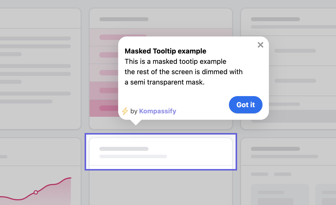
Anchored to a control, above everything, and the page behind it still works.
What Stays Hard After It Works
| Problem | Why it is hard | What usually works |
|---|---|---|
| Popover inside a dialog | Both want the top layer, and Escape is ambiguous: which one should close? | The top layer stacks by open order, so the popover is above and closes first. Verify it, because a portal-based popover inside a native dialog gets this backwards. |
| Nested popovers | A submenu inside a menu closes its parent, because they are siblings in the top layer | Nest the markup, or wire the child's popovertarget from inside the parent so the browser treats it as a descendant |
| Anchors in virtualised lists | The trigger unmounts while the panel is open, leaving it anchored to nothing | Close on trigger unmount, or hoist a single popover to the root and drive its content from the active row |
| Forms inside popovers | Light dismissal silently discards half-typed input | Guard beforetoggle when the form is dirty, or accept that a form probably wanted a dialog |
| Mobile | An anchored panel and a virtual keyboard cannot share a small screen | Promote to a bottom sheet below a breakpoint; anchoring is a pointer-sized-screen idea |
A UI Popover Is Not an Onboarding Popover
The geometry is identical, so the two get conflated constantly. Everything around them differs.
| UI popover | Onboarding popover | |
|---|---|---|
| Who opens it | The user, by clicking the trigger | The product, because of who the user is and what they have not done |
| Audience | Everyone, identically | A segment: a role, a plan, an unactivated cohort |
| State it needs | None beyond the interaction | Per-user and persisted: seen, dismissed, completed |
| Anchored to | Its own trigger, in the same component | An element somewhere else in the app, found by selector at runtime |
| Lives alone? | Yes | No, usually one step of a sequence, with a resume point |
| Measured by | Nothing; it opened or it did not | View rate, completion rate, and the adoption metric behind it |
| Who owns it | Front-end engineering | Product, onboarding or customer success |
The second column is where the work explodes. Anchoring to an element in a part of the app the popover component knows nothing about, surviving that element moving or being renamed, remembering per user that it was dismissed, sequencing it with four others: that is a system, not a component, and it changes every time someone edits a sentence. It is the reason onboarding tooltips and hotspots are usually configured rather than coded, and the full version of that argument is our build vs buy analysis.
Build It, or Configure It?
Filters, date pickers, account menus, share panels, column choosers. Part of the interface, shipped with the feature, owned by the design system.
"Try the new filter", "your trial ends Friday", anything pointed at a segment or a moment. Content that changes weekly should not need a deploy.
If the user cannot finish the task without what is inside, it does not belong behind a click on a small target. Put it on the page.
Kompassify covers the middle column without touching the React codebase: popovers, tooltips, hotspots, checklists and tours are pointed at elements in your live product from a visual editor, targeted by segment, and they report their own completion, so a change of wording is an edit, not a release. Our guide to building a product tour in React walks through the same trade-off for multi-step flows, and the React modal guide covers the heavier component in the same family.
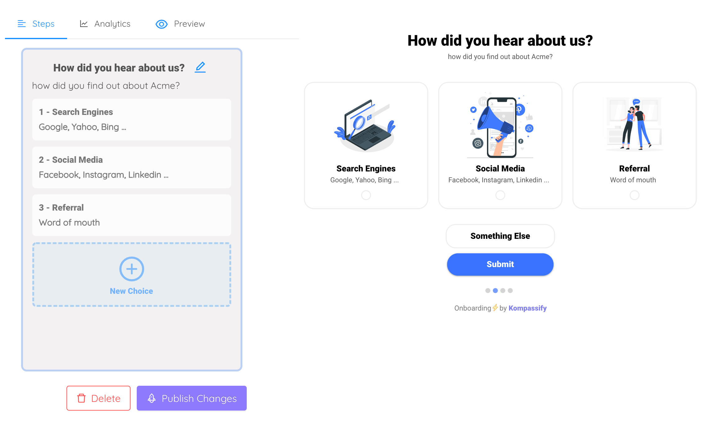
Same anchor problem, same top-layer problem: solved once, outside the release cycle.
Keep the component. Skip the content pipeline.
Kompassify lets product and onboarding teams add popovers, tooltips, checklists and guided tours to a React app without shipping a release for every copy change, targeted by segment, with adoption data on each one. Free up to 100 monthly active users, plans from $129/month, GDPR-compliant and EU-hosted.
Start for free →A Pre-Ship Checklist
Before the popover goes into the design system
- It is a popover, not a tooltip with buttons or a modal without a backdrop, checked against the focus table
popover="auto", so it is in the top layer and light-dismissesaria-expandedon the trigger, kept in sync through thetoggleevent- No
role="tooltip", and noaria-modal aria-haspopuponly if the content really is a menu, listbox, tree, grid or dialog- Focus moves into the panel on open
- Focus returns to the trigger on close only when it was still inside the panel
- Escape closes it, from anywhere inside
- Positioned by anchor positioning or a library, with a fallback path, never hand-rolled geometry
- Flips at every viewport edge, and scrolls internally instead of overflowing
- Behaves when the trigger unmounts while it is open
- Becomes a sheet, not an anchored panel, on a small screen
The One-Sentence Version
A popover is the component where focus moves in and the page stays alive: build it on
popover="auto" for the top layer and light dismissal, keep React in sync through the
toggle event, anchor it in CSS rather than by hand, and keep onboarding content out of the
component entirely.
Frequently Asked Questions
What is the difference between a popover, a tooltip and a modal?
Three axes separate them: who opens it, whether the page behind stays usable, and where focus goes. A tooltip opens on hover or focus, contains no interactive content, and focus never enters it; it only describes the control it is attached to. A modal opens on click, makes the rest of the page inert, traps focus inside itself, and demands a decision before anything else can happen. A popover opens on click, contains interactive content, moves focus into itself, and leaves the rest of the page alive; clicking outside simply closes it. Building a popover with a tooltip's ARIA leaves its buttons unreachable by keyboard; building one with a modal's focus trap makes a filter panel feel like a legal agreement.
Should I use the HTML popover attribute in React?
Yes, for almost every popover. Adding popover="auto" to an element gives you four behaviours the hand-rolled version has to earn: the element is promoted to the browser's top layer, so no z-index competes with it and no ancestor overflow clips it; it light-dismisses on an outside click and on Escape; it closes any sibling popover already open, which is exactly what a menu bar needs; and it fires beforetoggle and toggle events you can hook. React does not manage it declaratively (you still call showPopover() and hidePopover() through a ref, or point a popovertarget button at it) so the integration work is keeping your state and the DOM's state in sync, which the toggle event makes straightforward.
How do you position a React popover next to its trigger?
There are two routes in 2026. CSS anchor positioning is the native one: give the trigger an anchor-name, give the popover a position-anchor and a position-area, and add position-try-fallbacks so the browser flips it when there is no room. It costs no JavaScript, survives scrolling for free, and needs a fallback path in browsers that have not shipped it: wrap the rules in @supports (anchor-name: --x) and fall back to a measured position. The other route is a positioning library that measures the trigger with getBoundingClientRect and recalculates on scroll and resize. Use it when you need a single implementation across every browser today, or when your placement logic is more complex than flip-and-shift. Either way, do not hand-roll the geometry: collision detection with nested scroll containers is a genuinely hard problem.
What ARIA does a popover need?
Less than people think, and different from a tooltip's. The trigger is a <button> carrying aria-expanded, toggled between true and false, so assistive technology announces the state; that single attribute does most of the work. Add aria-haspopup only when the content is a menu, a listbox, a tree, a grid or a dialog, with the matching value; on a plain container of controls it is misleading. Do not put role="tooltip" on it, because a tooltip is not supposed to contain focusable content. Do not add aria-modal, because the page behind a popover is still live. If the panel has a visible heading, aria-labelledby pointing at it gives the popover a name; if it does not, aria-label on the panel serves the same purpose.
Why does my popover render behind other elements?
Because it is not in the top layer, and no z-index will put it there. Any ancestor with a transform, filter, backdrop-filter, will-change, contain or a non-auto opacity creates a stacking context, and a child cannot escape it however large its z-index; any ancestor with overflow: hidden, auto or scroll will crop it. The two real fixes are to add the popover attribute, which promotes the element to the top layer above every stacking context, or to render it through createPortal into document.body so it has no clipping ancestors left. If neither is possible (a table cell popover inside a virtualised list, for instance) the remaining option is to render a single popover at the root and drive its content and position from whichever cell is active.
What is the difference between a UI popover and an onboarding popover?
A UI popover is user-invoked and stateless: someone clicked a filter button, a panel opened next to it, and it says the same thing to everyone. An onboarding popover is product-invoked and stateful: it appears because a particular user has not used a particular feature yet, it is targeted by segment, it usually belongs to a sequence, and it needs per-user dismissal state so it never appears twice. The positioning code is identical; the surrounding system is not. The hard parts of the second are targeting, persistence, sequencing and being able to rewrite the copy without a deploy, which is why product teams typically configure that layer in a tool rather than shipping it through the front-end release cycle.