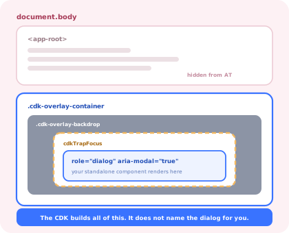
Angular is the odd one out in this family of guides. In React and Vue, building a modal means writing
a focus trap, an inertness strategy, a scroll lock and a dismissal path yourself, or reaching for the
native <dialog> element and hoping the design allows it. In Angular, the CDK has
shipped all of it for years: an overlay container, a configurable focus trap, three scroll strategies
and a dialog service that wires them together.
Which changes the nature of the work. The question is no longer "how do I trap focus" but "which of the three entry points should this dialog use, what does the CDK set for me, and what has it deliberately left blank?" Get that wrong and you end up with a dialog that is technically perfect and announced to a screen reader as an anonymous "dialog", or one that autofocuses a Delete button.
This guide walks the whole path (the choice, the overlay, focus, data in and results out, scroll blocking, the accessibility gap, and dialogs under signals and zoneless change detection) then lists what stays hard when it all works.
Key Takeaways
- Use the CDK
Dialogunless you are already on Material. Same behaviour, no theme in the bundle. - The CDK does not name your dialog.
aria-labelledbyorariaLabelis yours; without it, screen readers announce nothing useful. scrollStrategies.block()beatsoverflow: hidden. It preserves the scroll position and compensates the scrollbar gap.undefinedis the cancel signal. Escape and backdrop clicks resolve with it; a caller that ignores that treats cancel as confirm.- Do not autofocus destructive buttons. Point
autoFocusat the dialog container instead. - A UI dialog is not an onboarding modal. Same component, entirely different lifecycle and owner.
The Three Ways to Open a Dialog in Angular
Before any code, pick the layer. All three are built on the same Overlay primitive; they
differ in how much they decide for you.
MatDialog |
CDK Dialog |
Raw Overlay |
|
|---|---|---|---|
| Focus trap | Included | Included | You attach it |
| Backdrop + Escape | Included | Included | You configure and subscribe |
| ARIA role and modality | Included | Included | You set every attribute |
| Styling | Material, themed | None, entirely yours | None |
| Bundle cost | Material theme + components | CDK only | CDK overlay only |
| Use it when | Material is already the design system | You have your own design system, the default choice | You need positioning the Dialog service will not express |
Drop a layer only when you need something the layer above refuses to express.
1. Opening It Properly
The whole call site, with the options that matter and why:
Three of those options are the ones teams leave at their defaults and regret:
-
ariaLabelledByThe CDK sets
roleandaria-modal, but it cannot know which element in your template is the title. Without this, or a literalariaLabel, a screen reader announces "dialog" and nothing else, which is the single most common accessibility defect in an otherwise correct Angular dialog. -
autoFocus: 'dialog'The default moves focus to the first tabbable element. In a confirmation dialog that is often the destructive button, one Enter away from an accident. Focusing the container instead lets the screen reader read the title first and makes the user tab deliberately to the action.
-
disableClosefor irreversible actionsIt turns off both the backdrop click and Escape. For a form with unsaved work you usually want the opposite: keep them enabled and intercept, which is the next section.
2. Intercepting Dismissal for Unsaved Work
disableClose: true is the blunt instrument. For an edit dialog you want dismissal to be
possible but guarded, and the CDK exposes exactly the hook for it: disable the automatic close, then
subscribe to the two events that would have triggered it.
requestClose(), and the guard can only be right or wrong
once.
3. Focus: What the CDK Does, and the One Case It Cannot Judge
When the Dialog service attaches an overlay it also attaches a ConfigurableFocusTrap from
@angular/cdk/a11y. That gives you three behaviours without writing anything:
Tab and Shift+Tab cycle inside the pane, focus moves into the dialog
when it opens, and focus is returned to the previously focused element when it closes.
The last one is the piece hand-rolled React and Vue modals nearly always forget, and Angular does it by default. Two situations still need your attention.
1. The element that opened the dialog no longer exists
Delete a row, and the button that opened the confirmation is gone by the time the dialog closes. Focus restoration silently falls back to the body, and the next Tab starts at the top of the document. Decide where focus should land instead (the table, a heading, the empty state) and move it yourself after the close resolves.
2. Content that arrives after opening
The trap tracks the DOM inside the pane, so a lazily-loaded section is included automatically. But if
you also use cdkFocusInitial on an element rendered by an @if that is
false at open time, nothing matches and focus lands on the container. That is the safe outcome, and
it is worth knowing it is what happened, rather than assuming your initial-focus marker worked.
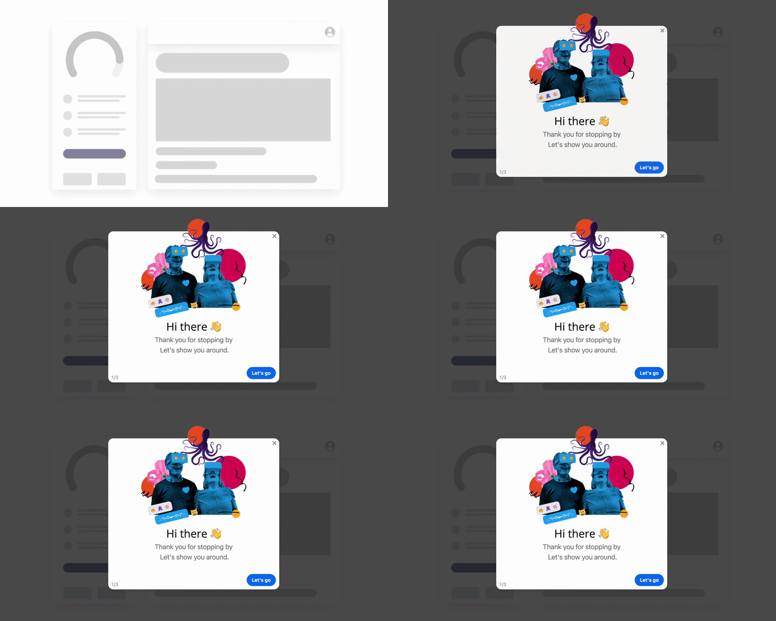
Everything visible here is the easy half; the trap and the focus round-trip are the half that decides who can use it.
4. Scroll Strategies, and Why block() Is Not overflow: hidden
The CDK ships three scroll strategies, and picking the wrong one is how anchored overlays end up floating over the wrong element halfway down a page.
| Strategy | What it does when the page scrolls | Right for |
|---|---|---|
block() |
Prevents scrolling entirely, preserving the current offset and compensating the layout | Modal dialogs, almost always the answer |
reposition() |
Recalculates the overlay position so it stays glued to its origin element | Menus, popovers, autocomplete panels anchored to a control |
close() |
Dismisses the overlay as soon as the page scrolls | Transient hints where following the origin would be worse than disappearing |
noop() |
Nothing: the overlay stays where it was rendered while the page moves | Almost nothing; it is the default only because doing nothing is the safe default |
block() is worth understanding rather than just calling. Setting
overflow: hidden on the body, the usual hand-rolled lock, removes the
scrollbar, so the layout reflows into the space it occupied and the whole page jumps sideways on every
open. The CDK instead records the current scroll offsets, pins the document, and compensates the
dimensions, restoring the exact scroll position on close. Getting that right by hand is a
surprisingly long afternoon; it is one of the better arguments for staying inside the CDK.
5. Signals, Zoneless, and the Dialog That Never Updates
Dialogs are one of the places where zoneless change detection bites first, because so much of what
happens inside them originates outside Angular's own event handling: a DialogRef
observable, a promise resolving after an API call, a native keydown the CDK subscribed to.
Two rules cover most of it. Hold dialog state in signal()s rather than plain fields, so a
change from any source schedules its own update. And convert the ref's observables with
toSignal() when the template reads them, rather than assigning into a field from a
subscription:
The pending flag is doing real work: while a request is in flight the dialog must not be
dismissible, because closing it would leave the user with no idea whether the operation ran. And the
catch branch is the one that gets skipped in review; a dialog that closes on failure
is a dialog that lies.
What Stays Hard After It Works
| Problem | Why it is hard | What usually works |
|---|---|---|
| Stacked dialogs | A confirm inside an edit dialog: two traps, two scroll blocks, and Escape reaching the wrong one | The overlay container stacks by open order; make sure only the topmost ref subscribes to keydownEvents |
| Route changes while open | The router swaps the page, the overlay survives, and the dialog now belongs to nothing | Close open dialogs on NavigationStart, or take the ref until destroyed |
| Mobile keyboards | The virtual keyboard shrinks the viewport and pushes a centred pane off-screen | A full-screen dialog class below a breakpoint, dvh units, internal scrolling |
| Testing | The overlay renders outside the component fixture, so queries against the fixture find nothing | Query the overlay container element, or use the CDK's harnesses |
| Deciding what deserves one | Not a code problem: the third modal on a page is the one users learn to dismiss unread | An interruption budget; the loser is whichever dialog appears second |
For the product side of that last row (the six modal types, when a dialog is the wrong pattern, and the copy rules that make one dismissible without regret) see our guide to what a modal is, and banner blindness for the budget itself.
A UI Dialog Is Not an Onboarding Modal
The two are indistinguishable in a design file and behave nothing alike in production. This is the distinction that decides whether the work belongs in your Angular codebase at all.
| Application dialog | Onboarding modal | |
|---|---|---|
| Who triggers it | The user, by clicking something | The product, from who the user is and what they have not done |
| Audience | Everyone, identically | A segment: new signups, one plan, one role, one unactivated cohort |
| State it needs | None beyond the current interaction | Per-user and persisted: seen, dismissed, completed, snoozed |
| Lives alone? | Yes: one dialog, one decision | No: step one of a sequence, with a resume point |
| Measured by | Nothing; it opened or it did not | View rate, completion rate, and the activation metric behind it |
| How often the copy changes | Rarely: it ships with the feature | Constantly: it is content, not UI |
| Who owns it | Front-end engineering | Product, onboarding or customer success |
Building the second on top of the first means shipping targeting rules, per-user persistence, sequencing, analytics and a copy-editing workflow through your release cycle, every time someone rewrites a sentence. That is why welcome modals and product tours are usually configured rather than coded, and the same argument at larger scale is our build vs buy analysis.
Build It, or Configure It?
Confirmations, edit forms, pickers, destructive-action guards. Part of the interface, shipped with the feature, owned by the design system.
Welcome screens, feature announcements, "you still have not invited your team". Segment-targeted content that changes weekly should not need a deploy.
If the main task only exists inside a dialog, it is a route. Dialogs are for decisions, not destinations.
Kompassify covers the middle column without touching the Angular codebase: modals, tooltips, hotspots, checklists and tours are pointed at elements in your live product from a visual editor, targeted by segment, and they report their own completion, so a change of wording is an edit, not a release. Our guide to building a product tour in Angular walks through the same trade-off for multi-step flows, and the Angular tooltip guide does it for the smallest component in the family.
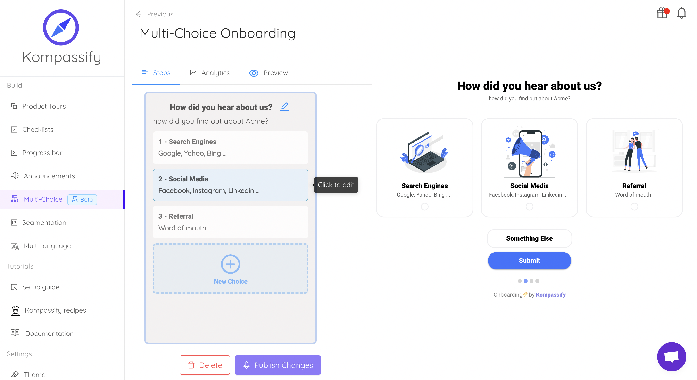
Same overlay problem, solved once, outside the release cycle.
Keep the component. Skip the content pipeline.
Kompassify lets product and onboarding teams add modals, tooltips, checklists and guided tours to an Angular app without shipping a release for every copy change, targeted by segment, with adoption data on each one. Free up to 100 monthly active users, plans from $129/month, GDPR-compliant and EU-hosted.
Start for free →A Pre-Ship Checklist
Before the dialog goes into the design system
- Opened through the CDK
Dialog(orMatDialog), not a hand-rolled overlay ariaLabelledBypoints at a heading that renders, orariaLabelis setautoFocusis not landing on a destructive control- Escape, backdrop click and the close button all route through one
requestClose() - Irreversible dialogs use
disableClose; editing dialogs intercept instead scrollStrategyisblock(), and the page does not jump on open- The caller distinguishes
undefined(dismissed) from a real result - Focus lands somewhere sensible when the opening element no longer exists
- State is held in signals, so it updates under zoneless change detection
- A failed async action leaves the dialog open with an error, never closed
- Dialogs close on navigation, so an overlay cannot outlive its route
The One-Sentence Version
An Angular modal is a CDK Dialog with a name, a non-destructive initial focus, one guarded
exit and block() scrolling: let the CDK do the trapping and the layering, fill in
the four things it deliberately leaves blank, and keep onboarding content out of the component
entirely.
Frequently Asked Questions
How do you create a modal in Angular?
Inject the CDK's Dialog service (or MatDialog if you are on Angular Material) and call open() with a standalone component and a config object. The service creates an overlay, a pane appended to the cdk-overlay-container at the end of document.body, renders your component inside it, attaches a focus trap, applies a scroll strategy and returns a DialogRef. You get the result back from the ref's closed observable. Writing the overlay yourself with the Overlay service is only worth it when you need a positioning or layering behaviour the Dialog service does not expose; in that case you are also taking on the focus trap, the backdrop, the Escape handler and the ARIA attributes by hand.
What is the difference between MatDialog and the CDK Dialog?
They are the same machinery with different amounts of opinion on top. Both build on the CDK Overlay, both attach a focus trap, both give you a ref with a closed observable. MatDialog adds Material Design styling, the mat-dialog-title, mat-dialog-content and mat-dialog-actions directives, the elevation and the animation, and pulls in the Material theme. The CDK Dialog gives you the behaviour with no styling at all, which is what you want when the product has its own design system. Pick MatDialog if you already use Material components elsewhere; pick the CDK Dialog if importing a theme just to get a dialog would be the only reason Material is in the bundle.
How do you pass data into an Angular dialog and get a result back?
Data goes in through the config's data property and is read inside the dialog component by injecting the DIALOG_DATA token (MAT_DIALOG_DATA on Material). The result comes back out through the ref: call close(value) inside the dialog, and subscribe to ref.closed in the caller, or await firstValueFrom(ref.closed). Two rules keep this from turning into a mess. Type the token with a generic so the data shape is checked rather than any. And treat undefined as the cancel signal, because every dismissal the user did not choose explicitly (Escape, a backdrop click) resolves with undefined; if your caller does not distinguish that from a legitimate empty value, cancelling will look like confirming.
How do you stop the background scrolling behind an Angular dialog?
Pass a scroll strategy in the dialog config: scrollStrategy: this.overlay.scrollStrategies.block(). The CDK's BlockScrollStrategy is more careful than overflow: hidden on the body; it records the current scroll offsets, pins the document with a class, and compensates the layout so the page does not jump sideways when the scrollbar disappears, restoring the exact scroll position when the dialog closes. The alternatives are reposition(), which keeps the overlay glued to its origin while the page scrolls, and close(), which dismisses the overlay on scroll; both are meant for anchored overlays such as menus and popovers rather than modal dialogs. For a modal, block() is almost always correct.
Does the Angular CDK make a dialog accessible automatically?
Mostly, but not entirely, and the gap is the part users notice. The CDK sets role="dialog" and aria-modal on the pane, attaches a focus trap so Tab cannot leave, moves focus in on open, restores focus to the previously focused element on close, hides the rest of the application from assistive technology while the dialog is open, and closes on Escape. What it does not do is give the dialog a name: aria-labelledby has to point at your own heading, or you set ariaLabel in the config, and a dialog with neither is announced as an anonymous "dialog". It also cannot decide whether autofocus on the first control is appropriate: if that control is destructive, set autoFocus to the dialog container instead so an accidental Enter cannot fire it.
What is the difference between an Angular dialog and an onboarding modal?
An application dialog is a synchronous interruption the user asked for: they clicked Delete, a confirmation opens, and it is over in two seconds. An onboarding modal is proactive guidance nobody asked for: it appears because a particular user has not done a particular thing yet, it is targeted at a segment, it is usually step one of a sequence, and it needs per-user persistence so it never shows twice. The Angular component is nearly identical; everything around it is different. The hard parts of the second one are targeting, persistence, sequencing and rewriting the copy without a deploy, none of which belong in a component, which is why product teams usually configure that layer in a tool rather than shipping it through the front-end release cycle.