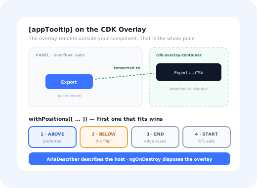
Most tooltip guides spend their length on geometry: measure the trigger, compute a rect, handle the viewport edge. In Angular that part is already solved. The CDK Overlay renders into a container appended to the document, positions it against a host element, and re-runs the calculation when things scroll, which removes the two bugs that dominate every other framework's tooltip.
What is left is the part Angular makes easier to get wrong: a directive that leaks overlays when the host is destroyed, hover handlers running inside the zone and triggering change detection on every pointer move, and an ARIA relationship that looks right and announces nothing. This guide builds the version that avoids all three.
Key Takeaways
- Use the CDK Overlay, not
position: absolute. It already solves clipping, stacking and connected positioning. - Give the position strategy fallbacks. One preferred position plus three alternatives is what "flip" means here.
- Attach hover listeners outside the zone. Re-enter only when the open state actually changes.
- Use
AriaDescriber: it survives the overlay detaching, which a rawaria-describedbydoes not. - Dispose in
ngOnDestroy. A destroyed host with a live overlay is the Angular-specific ghost tooltip. - If you use Material and need plain text,
matTooltipis the answer. Build your own for markup, or a non-Material design system.
First, Do You Actually Need a Custom One?
An honest fork before writing code. Angular Material's matTooltip already handles
positioning, delays, touch gestures, the ARIA description and dismissal. If you depend on Material and
need a plain-text hint, using it is not laziness; it is the correct answer.
| You need… | Use | Why |
|---|---|---|
| A string hint, Material app | matTooltip |
Everything is done, including the parts you would forget |
| Markup, icons or bound data in the bubble | Custom directive + CDK Overlay | Material's tooltip takes a string by design |
| A non-Material design system | Custom directive + CDK Overlay | Keep the mechanics, replace the presentation |
| An interactive bubble with links or buttons | Neither: build a popover | Hover-triggered interactive content is not a tooltip |
The rest of this guide assumes rows two and three: you want your own presentation, and you are sensibly keeping the CDK underneath it.
Three of the four layers are library code. The fourth is where the bugs are.
1. The Directive and the Overlay
A standalone attribute directive, injecting what it needs and owning one overlay reference:
dispose(), not detach(), in ngOnDestroy.
Detaching removes the portal but keeps the overlay's DOM host and its position strategy alive. In a
table that re-renders often, that is a slow leak of empty cdk-overlay-pane nodes,
usually spotted months later as "the DOM keeps growing".
2. Positioning: Preferred, Then Fallbacks
The CDK does not have a "flip" flag. It has an ordered list of positions, and it uses the first one that fits. That is the same behaviour with a more explicit API, and it means a tooltip with a single position will simply overflow the viewport rather than flip.
Two choices worth understanding rather than copying:
-
withPush(false)Push slides the overlay back into the viewport rather than switching position. It keeps the tooltip visible, but it can leave the bubble sitting on top of the very control it describes. With four fallback positions available, an honest fallback is almost always better than a push.
-
reposition()vsclose()Reposition keeps the bubble glued to the trigger while ancestors scroll, right for most pages. In a virtualised table where triggers appear and vanish,
close()is the calmer behaviour: the tooltip disappears on scroll instead of chasing a row that no longer exists.
3. Hover, Focus and the Zone
Here is the Angular-specific performance trap. Pointer events fire continuously; if the listeners are registered inside the zone, every one of them schedules change detection. On a dense table of icon buttons, that is measurable, and entirely avoidable.
Zoneless Angular does not remove the discipline. Without zone.js there is no change detection to accidentally trigger, but the same rule applies through signals: update a signal when the open state changes, not on every pointer event. Position updates stay inside the CDK's strategy either way.
Escape is worth wiring through the overlay itself rather than a global listener:
overlayRef.keydownEvents() gives you a stream scoped to the open overlay, and dismissal
must leave focus exactly where it was. A tooltip is not a dialog; nothing about it should move focus.
4. Accessibility: Describer, Not Just an Attribute
The CDK's AriaDescriber creates a visually hidden element containing the message and
points the host's aria-describedby at it. That indirection is deliberate: the description
survives the overlay being attached and detached, so the relationship does not blink in and out as the
user hovers.
But the same trap as every framework applies, and the CDK cannot rescue you from it:
"Export" button plus a tooltip explaining the format. A description is correct; AriaDescriber is exactly right.
The tooltip is the name. A description leaves the button announced as "button" with no label. Add aria-label to the host as well.
Then the usual list: open on focus, not only hover; no focusable content in the bubble;
prefers-reduced-motion respected in the animation; adequate contrast on the bubble's own
background; and a maximum width so a long string does not become a paragraph floating over the
interface. The UI conventions behind those rules are covered in our explainer on
what a tooltip is,
and the wider accessibility standard for in-app guidance in our guide to
accessible onboarding.
5. Touch: A Decision, Not a Default
There is no hover on a touch screen. Angular Material's tooltip handles this by opening on long-press;
a hand-rolled directive that listens to pointerenter without checking
pointerType will instead open on tap and swallow the interaction meant for the button.
Detect the pointer, not the user agent, and then pick deliberately:
- Suppress the tooltip on coarse pointers, and make sure the information exists somewhere visible. Correct when the tooltip is genuinely supplementary.
- Promote it to a long-press or tap-to-open popover with an explicit dismiss, and make sure the host's own click still behaves.
- Never let essential information live only in a tooltip, on any device.
What Stays Hard After It Works
-
Overlay lifetime vs host lifetime
The overlay lives outside the component tree, so it does not die with the host. Route changes,
*ngIfand virtual scrolling all destroy triggers with tooltips open.ngOnDestroymust dispose the overlay and remove the ARIA description. -
Overlays inside overlays
A tooltip on a control inside a CDK dialog is a second overlay stacked over the first. Ordering usually works, but the backdrop, focus trap and Escape handling interact: Escape should close the tooltip, not the dialog behind it.
-
RTL and translated copy
Fallback positions written as start/end respect direction; ones written as left/right do not. Translated strings also run longer than the English they were designed around, changing which fallback wins. The broader problem is covered in our guide to multi-language in-app guidance.
-
Testing the overlay
The bubble is not inside the component's fixture; it is in the overlay container, so
fixture.debugElement.queryfinds nothing. Tests needOverlayContainerinjected and cleaned up between specs, or the container leaks between tests and produces confident false passes.
A UI Tooltip Is Not an Onboarding Tooltip
Once the directive exists, the request changes shape: show a hint on the reports screen to users who have not built a report yet, and stop showing it once they have. Same visual, different system.
Icon buttons, truncated cells, disabled-state explanations. Same text for everyone, opened by the user, no memory.
One segment, once, until completed or dismissed. Needs per-user state, sequencing and analytics, and copy that changes weekly.
If the task cannot be completed without it, it belongs on the page, not in a bubble.
Extending the directive into the middle column means adding targeting rules, persistence and a copy-editing workflow to an Angular codebase, then shipping a release whenever a sentence changes. That is why onboarding tooltips are normally configured rather than coded, and the argument is stronger still for multi-step flows, as our guide to building a product tour in Angular and the wider build vs buy analysis set out.
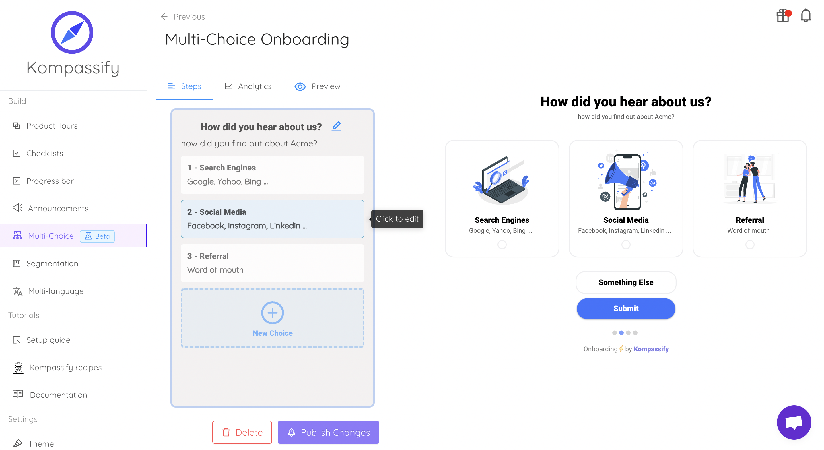
Same anchors, same overlay problem, solved once, outside the release cycle.
Keep the directive. Skip the content pipeline.
Kompassify lets product and onboarding teams add tooltips, hotspots, checklists and guided tours to an Angular app without a release for every copy change, targeted by segment, with adoption data on each one. Free up to 100 monthly active users, plans from $129/month, GDPR-compliant and EU-hosted.
Start for free →A Pre-Ship Checklist
Before the directive goes into your library
- Opens on
focus, verified with the keyboard alone - Escape dismisses it via
keydownEvents()and focus does not move - At least three fallback positions, tested at all four viewport edges
- Listeners registered with
runOutsideAngular; the zone is re-entered only on state change ngOnDestroydisposes the overlay and removes the ARIA description- Icon-only triggers have an
aria-label, not just a description - Something deliberate happens on a coarse pointer
- Tests inject and clean up
OverlayContainer - Scroll strategy chosen on purpose: reposition, or close
The One-Sentence Version
Build the tooltip as a standalone directive over the CDK Overlay, give the position strategy real
fallbacks, keep the hover listeners out of the zone, describe the host with AriaDescriber,
dispose everything in ngOnDestroy, and leave onboarding content to a system built for it.
Frequently Asked Questions
How do you create a custom tooltip in Angular?
Write a standalone attribute directive and let the CDK Overlay do the hard part. The directive injects Overlay and ElementRef, builds a position strategy with flexibleConnectedTo(host) and a list of fallback positions, and attaches a TemplatePortal or ComponentPortal when the trigger is hovered or focused. The overlay renders in a container appended to the body, which is what keeps the tooltip out of ancestors that clip or stack it. Add an open delay of roughly 150–300ms, close on mouseleave, blur and Escape, and connect the trigger to the bubble with the CDK's AriaDescriber so assistive technology announces it.
Should I use Angular Material's matTooltip or build my own?
If you already depend on Angular Material and need a plain-text hint, matTooltip is the right answer: it handles positioning, delays, touch gestures and the ARIA description, and rewriting it yields nothing. Build your own when you need markup inside the bubble rather than a string, a design system that does not follow Material's visual language, or behaviour Material deliberately does not support, such as an interactive bubble. In that case build on the same CDK Overlay that Material itself uses rather than starting from absolute positioning; you keep the hard parts and replace only the presentation.
Why is my Angular tooltip cut off or behind other elements?
Because it is rendered inside the component's own DOM, where an ancestor clips or stacks it. Any ancestor with overflow: hidden, auto or scroll crops it, and any ancestor with a transform, filter, will-change, contain or an opacity below 1 creates a stacking context that no z-index can escape. The CDK Overlay solves this by rendering into a container attached to the document body, the same reason Angular Material tooltips do not suffer from it. If you are hand-rolling with position: absolute inside the component template, you will keep meeting this bug.
How do you make an Angular tooltip accessible?
Use the CDK's AriaDescriber to attach the message to the trigger, which creates a visually hidden description element and points aria-describedby at it. This is how Material's own tooltip works, and it survives the overlay being detached. That is right when the trigger already has an accessible name. When the trigger is an icon-only button whose only text is the tooltip, a description is not enough: give the button an aria-label, otherwise it is announced as an unnamed button. Beyond the relationship: open on focus as well as hover, dismiss on Escape without moving focus, keep interactive content out of the bubble, and honour prefers-reduced-motion.
How do you stop an Angular tooltip from triggering change detection on every mouse move?
Register the hover listeners outside Angular's zone with ngZone.runOutsideAngular, and re-enter with ngZone.run only when the open state actually changes. Pointer and scroll events fire constantly, and letting each one schedule change detection is a measurable cost in a dense table of triggers. In a zoneless application the same discipline applies through signals: update a signal on the state change rather than on every pointer event, and let the overlay's position strategy handle reposition work itself.
What is the difference between an Angular tooltip and an onboarding tooltip?
An Angular tooltip is a stateless UI hint: the user hovers or focuses a control, a bubble describes it, and every user sees the same text. An onboarding tooltip is proactive product guidance: it targets a segment, appears only until the user has done the thing it asks for, is sequenced with other steps, and carries copy that changes far more often than the component. Building the second from the first means adding targeting rules, per-user persistence and analytics to your Angular codebase and shipping a release for every wording change, which is why that guidance is usually configured in a dedicated tool instead.