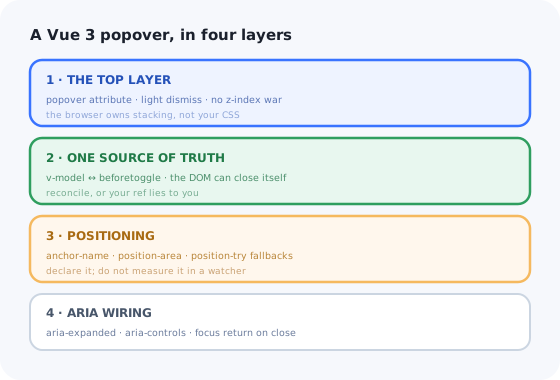
A popover is the component people reach for when a tooltip is too small and a modal is too much.
It holds a filter form, a user menu, a date picker, a "more actions" list. In Vue it usually starts
as a v-if, an absolutely positioned div, and a @click handler
on the document.
Then it gets clipped by a card with overflow: hidden. It opens underneath a sticky
header. Two of them open at once. Closing one closes both. It never closes on
Escape, and when it does close, focus is somewhere near the top of the page.
Most of that is now the browser's job rather than yours. This guide builds a Vue 3 popover on top of the native popover API, keeps Vue's state and the DOM's state from disagreeing, positions it without a measuring loop, and is honest about what stays hard once it works.
Key Takeaways
- Do not build the shell. The native
popoverattribute gives you the top layer, light dismiss and Escape for free. - The DOM can close itself. Light dismiss fires without Vue's knowledge, so a naive
refdesynchronises — reconcile onbeforetoggle. - Declare position, do not measure it. CSS anchor positioning replaces the
getBoundingClientRectwatcher that never quite kept up with scroll. - A popover is not a dialog. It does not trap focus and it does not block the page — if it must, you wanted a modal.
Teleportis still useful, but for the cases the top layer does not cover, not as the default.- A UI popover is not an onboarding popover. Same rectangle, completely different lifecycle and owner.
Popover, Tooltip, Modal: Three Different Components
Teams merge these three and then fight the consequences for a year. They differ on one axis that decides everything else: who is in control while it is open.
| Tooltip | Popover | Modal dialog | |
|---|---|---|---|
| Opened by | Hover or focus | An explicit click or key press | An explicit action |
| Contains | A short string, nothing interactive | Anything, including form controls | A task, often multi-field |
| Rest of the page | Fully usable | Fully usable | Inert, behind a backdrop |
| Focus | Never moves | May move in, never trapped | Moves in and is trapped |
| Vue building block | Custom, see the Vue tooltip guide | popover="auto" |
<dialog> + showModal(), see the Vue modal guide |
The tell: if you find yourself adding a focus trap and a backdrop to your popover,
you have built a modal with the wrong element. Switch to <dialog> before the
keyboard behaviour becomes someone's bug report.
1. Start From the Native Popover, Not From a Div
The popover API is the part of this component you no longer have to write. Adding the
popover attribute to any element promotes it to the browser's top layer
when open, which means it cannot be clipped by an ancestor's overflow and cannot be
stacked under anything by z-index. It also brings light dismiss — a click outside
or Escape closes it — and, when paired with popovertarget, a fully
working control with no JavaScript at all.
Two values matter. popover="auto" (the default) light-dismisses and closes other open
auto popovers — correct for menus, wrong for two independent filter panels. popover="manual"
does neither: it only closes when you tell it to, which is what you want for a persistent side panel
or a stack of popovers that should coexist.
Styling the top layer. A popover is display: none until it opens, so
style the open state with the :popover-open pseudo-class and the backdrop — if you
want one — with ::backdrop. Transitions need
transition-behavior: allow-discrete plus a @starting-style rule, because
you are animating a property that jumps from none.
2. Driving It From Vue Without Two Sources of Truth
Here is the bug that catches every first implementation. The user clicks outside; the browser closes
the popover; Vue's isOpen ref is still true. The next click on the trigger
sets it to true again — no change, no watcher, nothing opens. The button appears
dead until you click it twice.
The DOM is now a second source of truth, and it can change without asking. The fix is to treat the
element as the authority and let Vue follow it, reconciling on the beforetoggle event.
Three details in there are load-bearing. The guard on matches(':popover-open') stops the
two watchers from ping-ponging. Reading newState from beforetoggle rather
than assuming a close is what makes the composable work for programmatic opens too. And
beforetoggle — not toggle — fires before the visual change, so a
v-if inside the panel renders in the same frame instead of one late.
The element is the authority; Vue's ref is a mirror that has to be corrected.
3. Positioning: Anchor It, Do Not Measure It
The classic Vue implementation measures the trigger in onMounted, writes
top and left into a reactive style object, and re-runs on scroll and resize.
It is a lot of code, it fires on every frame of a scroll, and it is always one tick behind.
CSS anchor positioning removes the loop. You name the trigger, tell the popover which edge to sit against, and give the browser a list of fallbacks to try when there is no room.
Support is good in Chromium and shipping elsewhere, so keep a fallback. The pragmatic pattern is to feature-detect once and only pay for the JavaScript path where it is needed:
Where does Teleport fit now? The top layer already solves clipping and
stacking, so a native popover rarely needs teleporting. Keep <Teleport to="body">
for the cases it does not cover: a non-popover overlay you own, a fallback path on a browser without
the API, or a panel that must escape a parent with a transform while
not being in the top layer. Reaching for Teleport first is a habit worth
retiring.
4. ARIA and Keyboard: Less Than You Expect, But Exactly That
A popover is not a dialog, so most of the heavy accessibility machinery does not apply. What it does need is small and non-negotiable.
aria-expandedon the trigger, bound to your reactive state, so the control announces whether it is open.aria-controlspointing at the panel'sid.- A real
<button>as the trigger. Adivwith@clickis not keyboard-operable and no ARIA attribute fixes that. - Focus return. If you moved focus into the panel, put it back on the trigger when it closes — including when light dismiss closed it behind your back.
- No focus trap. The rest of the page stays reachable; that is the difference from a modal.
The role depends on the contents, and guessing wrong is worse than leaving it off. A menu of actions
wants role="menu" with menuitem children and arrow-key navigation — which
is a real commitment, because the roles imply the keyboard behaviour. A panel of form controls wants
no role at all: it is a group of ordinary inputs and Tab is the correct way through it.
What Stays Hard After It Works
The component will pass review. These are the things that show up afterwards, in order of how often they do.
Nesting
An auto popover inside another auto popover closes its parent unless the
browser can see the relationship — through DOM containment or popovertarget.
Open a select from inside a filter panel and both vanish. Anchor the nested one to the parent, or
go manual and own the dismissal yourself.
Scroll containers
The panel is in the top layer, so it no longer scrolls with the element it points at. Scroll a
long table and the popover hovers over nothing. You want it to close on scroll of the nearest
scrollable ancestor — which means finding that ancestor, not listening on window.
SSR and hydration
With Nuxt, showPopover() on an element that has not hydrated throws, and any state
read from matches(':popover-open') during setup is meaningless on the server. Gate the
imperative calls behind onMounted and keep the initial render closed.
Testing
jsdom does not implement the top layer or light dismiss. Component tests will happily assert on a popover that no real browser would have kept open. Dismissal behaviour needs a real browser runner; in jsdom, test the composable's reconciliation logic instead.
A UI Popover Is Not an Onboarding Popover
Once the component exists, someone asks for "a popover that shows new users where the export button is". It looks like the same rectangle. It is a different product.
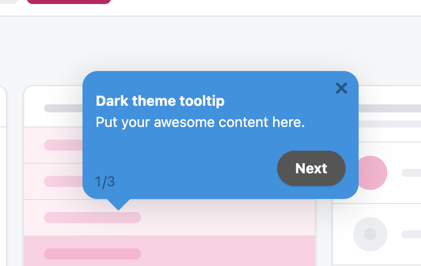
The same rectangle, doing a different job: note the “1/3” — this one knows where the user is in a sequence.
| UI popover (what you just built) | Onboarding popover | |
|---|---|---|
| Trigger | The user clicked something | This user has not done something yet |
| Audience | Everyone, identically | A segment: plan, role, signup date, feature usage |
| State | Lives for one interaction | Seen / dismissed / completed, per user, forever |
| Sequencing | None | Step 2 of 5, resumable across sessions |
| Changes | Rarely, through a release | Weekly, by a non-engineer, without a release |
| Success is | It positioned correctly | Activation went up — which you have to measure |
Building the second on top of the first is where teams lose a quarter. The positioning is the part you already solved; the parts you have not are per-user persistence, segment targeting, sequencing, analytics per step, and a copy-editing loop that does not go through your release train. That is a contextual help system, not a UI component — and the honest version of the build-versus-buy question is whether you want to own that roadmap.
Keep the component. Skip the content pipeline.
Kompassify lets product and onboarding teams add popovers, tooltips, hotspots, checklists and guided tours to a Vue app without shipping a release for every copy change — targeted by segment, with adoption data on each one. Free up to 100 monthly active users, plans from $129/month, GDPR-compliant and EU-hosted.
Start for free →Build It, or Configure It?
Both, and the line is clean once you draw it by who changes it and how often.
Build the component
- Menus, filter panels, pickers — anything that is part of the product's own interface.
- Anything a designer specified and a developer maintains.
- Anything that must work offline, inside your design system, with your tokens.
Configure the guidance
- Anything aimed at a segment rather than at everyone.
- Anything whose copy a PM or CS lead will want to change on a Tuesday.
- Anything you need per-step completion data for.
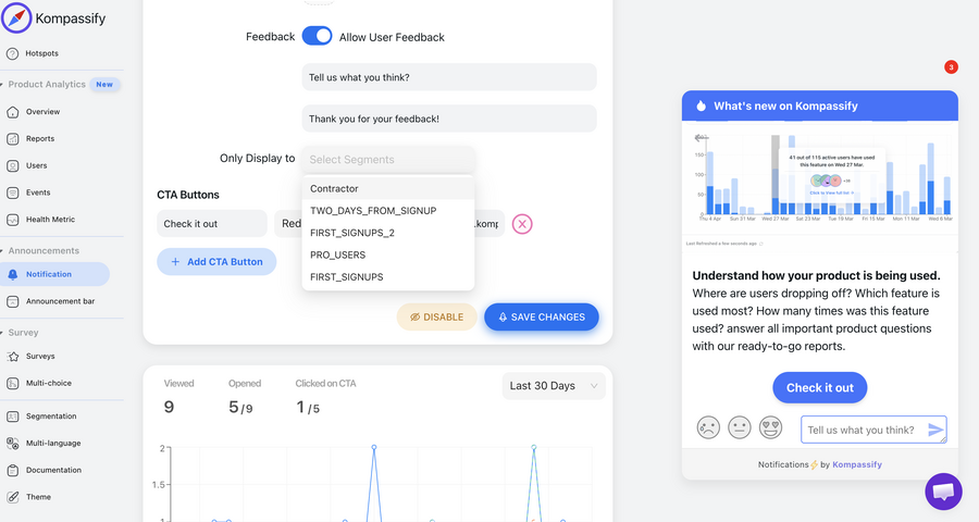
The part a popover component does not give you: who sees it, and whether it worked.
A team that builds both ends up maintaining a small, badly-instrumented onboarding platform as a side effect of having written a popover.
A Pre-Ship Checklist
- Trigger is a real
<button>witharia-expandedandaria-controls. - Vue state reconciles with
beforetoggle— verified by clicking outside, then clicking the trigger once. - Escape closes it, and focus lands back on the trigger.
autoversusmanualchosen deliberately, not by default.- Positioned by anchor positioning, with a tested fallback path where it is unsupported.
- Closes when its scroll container scrolls out from under it.
- Nested popovers verified: opening the child does not close the parent.
- Transitions respect
prefers-reduced-motion. - Renders closed on the server; no imperative calls before
onMounted. - Nothing essential exists only inside the popover.
The One-Sentence Version
Build a Vue 3 popover on the native popover attribute so the browser owns the top layer
and light dismiss, reconcile your ref with the element on beforetoggle so
the two never disagree, position it declaratively with anchor positioning, and recognise that the
moment it needs to know which user is looking at it, you have left UI and entered
onboarding.
If the next ticket is a sequence of these pointing at four different features for new users only, read the product tour guide before you start — and the hotspot UX guide if the trigger is meant to be a pulsing dot rather than a button.
Frequently Asked Questions
How do you create a popover in Vue 3?
Start from the native popover API rather than a positioned div. Put the popover attribute on the panel element, which promotes it to the browser's top layer when open and brings light dismiss and Escape for free, and give the trigger popovertarget so it works before any JavaScript runs. Then add a small composable that owns the open state: it calls showPopover() and hidePopover() when your ref changes, and listens for the element's beforetoggle event to write the element's real state back into that ref. Position it with CSS anchor positioning — anchor-name on the trigger, position-area and position-try-fallbacks on the panel — instead of measuring the trigger in a watcher. Finish with aria-expanded and aria-controls on the trigger, and return focus to it when the panel closes.
Why does my Vue popover need two clicks to reopen?
Because the DOM closed it without telling Vue. Light dismiss — a click outside, or the Escape key — is handled by the browser, so the popover disappears while your isOpen ref is still true. The next click on the trigger sets it to true again, which is not a change, so no watcher fires and nothing opens. The fix is to stop treating your ref as the source of truth: listen for the element's beforetoggle event, read event.newState, and write it back into the ref so Vue and the DOM agree. Guard the outgoing watcher with a matches(':popover-open') check so the two directions do not ping-pong.
Do I still need Teleport for a popover in Vue?
Usually not. Teleport exists to move an element out of an ancestor that clips or stacks it, and the native popover's top layer already solves both problems — it cannot be cropped by overflow: hidden and cannot be stacked under anything by z-index. Keep Teleport for what the top layer does not cover: a non-popover overlay you own, a fallback path on a browser without the popover API, or a panel that must escape a transformed parent without being promoted to the top layer. Reaching for Teleport as the default is a habit from before the API shipped.
What is the difference between popover="auto" and popover="manual"?
An auto popover light-dismisses — clicking outside or pressing Escape closes it — and it also closes any other open auto popover that is not its ancestor. That is exactly right for a menu or a single filter panel, and exactly wrong for two independent panels that should be able to sit open at once, or for a nested popover that keeps closing its parent. A manual popover does neither: it opens and closes only when your code calls showPopover() or hidePopover(), which means you own dismissal, including the outside-click handling. Choose deliberately rather than accepting the default.
How do you make a Vue popover accessible?
A popover is not a dialog, so it needs less than people assume, but the small list is non-negotiable. Use a real button as the trigger, not a div with a click handler. Bind aria-expanded to the open state and point aria-controls at the panel's id. Do not trap focus — the rest of the page must stay usable, and that is the difference from a modal. If you moved focus into the panel, return it to the trigger on close, including when the browser closed the panel by light dismiss. Only add role="menu" if you are also implementing arrow-key navigation and menuitem children; a panel of ordinary form controls should have no role at all.
What is the difference between a UI popover and an onboarding popover?
A UI popover is user-invoked and stateless: someone clicked a control, it opens, it shows the same thing to everyone, and it is gone after one interaction. An onboarding popover is proactive and stateful: it appears because a particular user has not done a particular thing yet, it is targeted by segment, it is usually step two of a sequence that has to resume across sessions, and it needs per-user seen and dismissed state plus completion analytics. The positioning work you did for the UI component carries over; the targeting, persistence, sequencing and weekly copy changes do not, and they are the parts that consume a roadmap. That is why product and onboarding teams usually configure in-app guidance in a tool instead of shipping it through the front-end release cycle.