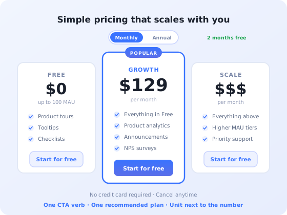
The pricing page is the highest-intent page on a SaaS website. Nobody lands on it by accident; visitors arrive after they have decided they might want the product, and they arrive with one question: is this for someone like me, and what will it cost?
It is also, in most companies, the least maintained page on the site. Plans get added, limits shift, a fourth column appears because sales asked for it, and nobody revisits whether the page still answers the question in under thirty seconds.
This guide covers what the page is actually for, the nine components that belong on it, how to structure plans and comparison tables, the mistakes that quietly cost conversions, and how the page connects to what happens after the click.
Key takeaways
- A pricing page is a decision page, not a price list; its job is to help someone self-select a plan quickly.
- Three visible plans is the working default; a fourth enterprise option sits separately, not as an equal column.
- Hiding all prices behind a form loses the visitors who were closest to buying.
- Comparison tables should carry only rows that change a decision. Identical rows are noise.
- Use one CTA verb across every plan card; mixed verbs make plans look like different products.
- A page with high click-through but poor activation is mis-selling. Measure both.
What the pricing page is actually for
The real job of the page
A pricing page's job is not to list prices. It is to let a visitor answer three questions without help: which plan is for me, what will it cost at my size, and what happens if I click. Every element on the page either serves one of those questions or competes with them.
That framing settles most design arguments. The long paragraph explaining your pricing philosophy does not serve any of the three questions, so it goes below the plans or goes entirely. The comparison row that reads identically across all three plans serves none of them either.
It also explains why pricing pages fail in a specific way. They rarely fail by being ugly. They fail by being ambiguous: the visitor cannot tell which column applies to a team of eight, cannot work out whether "10,000 events" is a lot, and cannot tell whether clicking will ask for a credit card. Ambiguity on a high-intent page does not produce a question. It produces a closed tab.
The nine components of a pricing page that converts
Nine components, in the order a visitor reads them. Anything that is not one of these is competing with them.
1. A headline that names the buyer, not the product
The headline above the plans is doing qualification work. "Pricing" tells the visitor nothing they did not know from clicking the link. A line that names who the plans are for (the size of team, the stage, the use case) lets people locate themselves before they read a single number.
2. A billing toggle with the saving stated concretely
If you sell monthly and annually, one toggle, clearly labelled, with the annual discount expressed as something a person can evaluate. "Save 20%" is weaker than "2 months free" for the same offer, because the second is already computed. Whichever you default to, make sure the displayed prices update visibly; a toggle that changes numbers without any motion is regularly missed.
3. Plan names that describe fit
Names do real work. Metal tiers (Bronze, Silver, Gold) rank plans but say nothing about who each is for, which pushes the whole qualification job onto the feature list. Names tied to the customer (Starter, Team, Business, Scale) let someone rule two columns out immediately. Add a one-line description under each name saying who it is for: "for a single product team getting started", "for companies running onboarding across several products".
4. A price with its unit attached
The number needs the unit next to it, in the same visual block: per month, per user per month, per 1,000 monthly active users. A price without a unit forces the visitor to hunt for it, and hunting on a pricing page is where trust erodes.
If you charge on a metric the visitor cannot estimate for themselves (monthly active users, events, API calls) put an estimate aid next to it. A slider, a short "most teams your size land around here" line, or a worked example. Charging on a unit people cannot predict is one of the most reliable causes of both abandoned signups and later billing complaints.
5. A recommended plan, visually anchored
One plan should be visibly the default: raised slightly, outlined, badged. This is not a trick; most visitors genuinely want a recommendation, and an unmarked set of three equal columns pushes a decision onto someone who has been on your site for ninety seconds.
Anchoring also works structurally. A higher-priced tier to the right of your target plan makes the middle read as sensible rather than as the expensive option, which is most of the reason three-column layouts outperform two.
6. One CTA verb, repeated
Every plan card gets the same verb. When one column says "Start free trial", the next says "Choose plan" and the third says "Contact sales", the plans stop looking like tiers of one product and start looking like three different offers with three different commitments.
Directly under the button, answer the unspoken question: does this ask for a card? "No credit card required" placed under the CTA removes the single largest hesitation on the page. If a card is required, say that too; being surprised at step two costs more than being told at step one.
7. An enterprise strip, not an enterprise column
Custom-priced tiers do not belong as a fourth equal column, because a column with no price in a row of columns with prices reads as an unanswered question. Put it in a full-width strip below the plans, with its own short description and its own CTA. The self-serve buyer skips it cleanly; the enterprise buyer finds it exactly where they expect.
8. A comparison table of differences only
The detailed table below the cards is for the visitor who has narrowed to two plans and needs to break the tie. That purpose implies a hard rule: if a row is identical across every plan, it does not belong in the table. It belongs on the features page. Rows that do not differentiate add scroll depth and dilute the ones that do.
Three further rules earn their keep. Order rows by how often they decide the choice, not by how your product is architected. Use the words your customers use rather than internal feature names. And show real numbers instead of "unlimited" wherever a limit actually exists; a visitor who discovers a cap after signing up remembers that more clearly than the page that promised otherwise.
9. Trust signals and an FAQ that answers billing questions
The bottom of the page absorbs the objections that stop a click: what happens when I exceed a limit, can I change plan later, do you delete my data if I downgrade, where is data hosted, is there a contract. These are billing and risk questions, not product questions, and answering them here prevents them becoming support tickets or silent exits.
For teams selling into the EU, hosting and compliance belong on this page rather than buried in a policy; it is a purchase criterion, and one of the reasons Kompassify states plainly that it is GDPR-compliant and EU-hosted.
How many plans, and how to structure them
Three visible plans plus a separate enterprise option is the working default, and it holds for a simple reason: three is the largest number of options most people can compare in a glance, and the structure gives you an entry point, a recommendation and a ceiling.
| Structure | Works when | Watch out for |
|---|---|---|
| One plan | Single, well-defined use case; very early stage | Leaves expansion revenue on the table as accounts grow |
| Two plans | Clear split between individual and team use | No anchor, so the higher plan carries all the price resistance |
| Three plans | Most self-serve SaaS | Middle plan must be genuinely the best fit, not just the middle |
| Four plans | Genuinely distinct segments with different jobs | Comparison becomes work; cards get too narrow on mobile |
| Five or more | Rarely justified on the page itself | Show three and put the rest behind a calculator or the table |
On the free tier: a free plan is a pricing decision, not a page-layout decision, and it changes what the page has to do. Where a free tier exists, the page's job shifts from "which plan do I buy" to "where is the line I will eventually cross", and that line needs to be legible before signup, not discovered later. Kompassify's own line is a concrete example of the pattern: free up to 100 monthly active users, paid plans from $129/month. The freemium guide covers how to choose where that line sits.
The eight things that quietly kill pricing page conversions
-
No prices at all
Forcing every visitor into a sales conversation loses the ones who were closest to buying; they leave and assume it is expensive. Publish self-serve prices; keep contact-sales for the tier where scope genuinely determines the price.
-
A pricing unit nobody can estimate
If a visitor cannot work out roughly what they will pay, they cannot decide. Any metered unit needs a calculator, a slider, or a worked example beside it.
-
A comparison table of forty identical rows
Rows that read the same across all plans dilute the ones that decide the purchase. Cut every non-differentiating row.
-
Different CTA verbs per column
Mixed verbs make tiers look like separate products with separate commitments, and add a decision the visitor did not need to make.
-
Silence on the credit card question
"What happens when I click" is the loudest unanswered question on the page. State it directly under the button either way.
-
"Unlimited" where a limit exists
Fair-use caps discovered after purchase do more damage than an honest number would have done before it.
-
A table that is unusable on a phone
Four-column comparison tables collapse badly. Test the page at 375px width and make the table scroll horizontally inside its own container rather than shrinking the text.
-
A page that ends at the click
The most expensive failure is invisible on the page itself: visitors click, sign up, and never reach anything valuable. That is an activation problem the pricing page created by setting the wrong expectation.
What happens after the click
A pricing page cannot be evaluated on click-through rate alone, and teams that optimise for it in isolation reliably make things worse. Louder claims and vaguer limits lift clicks. They also bring in people the product does not fit, who sign up, fail to find value, and churn, while the pricing page dashboard shows an improvement.
The page is one link in a chain, and the chain has three more links:
- The signup flow has to match the promise the page made. If the page says no credit card, the third screen cannot ask for one. See signup flow best practices for what to ask and when.
- Onboarding has to deliver the specific outcome the plan card advertised. If the Growth plan is sold on multi-product onboarding, the first session should get the user to a second product, not to a generic empty dashboard.
- The upgrade path has to be visible inside the product, not only on the marketing site. Most upgrades happen when a user hits a limit while working; the in-app upsell guide covers how to prompt at that moment without being obnoxious.
The diagnostic that matters: segment new signups by the plan they clicked, and measure what proportion of each group reaches first value. A plan with strong click-through and weak activation is a plan whose page copy is writing cheques the product is not cashing. The free trial conversion guide covers the downstream half of this measurement.
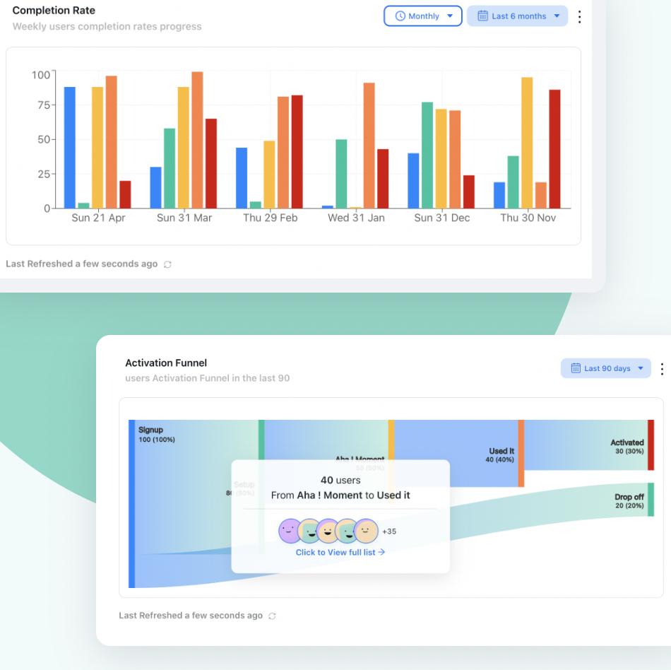
The number that tells you whether a pricing page is converting or mis-selling: how many of the people who clicked each plan actually reach first value.
How to test a pricing page without breaking it
Pricing pages are unusually risky to experiment on: traffic is low relative to a homepage, the stakes per visitor are high, and price changes have consequences that outlive the test. Three practical constraints.
Change presentation, not price, in an A/B test
Testing two different prices on live traffic creates real problems: customers on the same plan paying different amounts, and a result that is hard to unwind. Test layout, plan naming, CTA copy, table ordering and toggle defaults. Test actual price levels through research and cohort comparison instead. Our A/B testing guide covers running valid tests on low-traffic pages.
Watch the scroll, not just the click
Where people stop scrolling on a pricing page is unusually informative, because it marks the point where they either decided or gave up. If most sessions never reach the comparison table, the cards are not doing their job. Heatmaps and scroll maps answer this faster than any survey.
Ask the people who did not click
An exit-intent question on the pricing page (one question, three options) catches the objection the analytics cannot see. "Too expensive" and "I could not tell which plan fits" are very different problems with very different fixes, and the page looks identical in both cases.
Make the plan you sell the plan users succeed on
Kompassify helps you turn signups into activated users with product tours, checklists and in-app guidance, and shows you who reaches first value. Free up to 100 monthly active users, paid plans from $129/month, GDPR-compliant and EU-hosted.
Start for freePricing page dos and don'ts
✓ Do this
- Name who each plan is for, under the plan name
- Put the unit next to the number
- Mark one plan as recommended
- Use one CTA verb across all cards
- State the credit-card answer under the button
- Cut every comparison row that is identical across plans
- Answer billing objections in an FAQ on the page
- Measure activation per plan, not only clicks
✗ Avoid this
- Hiding all prices behind a contact form
- Charging on a unit visitors cannot estimate
- Writing "unlimited" where a cap exists
- Four equal columns, one with no price
- Metal-tier names that describe nothing
- A comparison table that needs pinch-zoom on mobile
- A/B testing actual price levels on live traffic
- Optimising click-through while activation falls
Frequently asked questions
How many pricing plans should a SaaS pricing page show?
Three visible plans is the working default, with a fourth enterprise or contact-sales option presented separately rather than as a fourth equal column. Three gives you a clear entry point, a recommended middle option and a ceiling that makes the middle look reasonable. Beyond four columns the page stops being a comparison and becomes a research task, and visitors who cannot decide quickly tend to leave rather than pick.
Should I show prices or hide them behind a contact form?
Show them. Hiding all prices forces every visitor into a sales conversation they did not ask for, and most will simply leave and assume it is expensive. The reasonable exception is a genuine enterprise tier where the price legitimately depends on scope. Show your self-serve prices openly and keep contact-sales for that tier alone.
What should a pricing page comparison table include?
Include the differences that change a buying decision, not every feature you ship. Practical rules: order rows by how often they decide the plan choice, use plain nouns rather than internal feature names, show real limits as numbers instead of the word unlimited, and never list a row that is identical across all plans. If a row does not differentiate, it belongs on a features page.
Should the pricing page default to monthly or annual billing?
Default to whichever you actually want to sell, and label the saving in a concrete way. Annual defaults raise average contract value and lower churn, but they raise the perceived commitment for a first purchase. A common compromise is to default to monthly for a self-serve product with a free tier, while showing the annual saving prominently on the toggle so the alternative is visible without being forced.
What is the best call to action for a pricing page?
Match the CTA to the actual next step and keep it identical in wording across every plan card. If signup requires no card, say so on the button or immediately under it, because the unspoken question on a pricing page is always what happens when I click. Avoid mixing verbs across columns: one plan saying Start free trial while the next says Choose plan makes the plans look like different products.
How do I know whether my pricing page is working?
Track three things rather than one. First, the click-through rate from pricing page to signup, broken down by plan. Second, the proportion of those signups that reach first value inside the product, which reveals whether the page is attracting the right users or the wrong ones. Third, scroll and interaction data on the comparison table, which shows which rows people actually stop on. A page with a high click rate and poor activation is mis-selling, not converting.
Does the pricing page still matter if we are product-led?
It matters more, because there is no salesperson to correct a misunderstanding. In a product-led motion the pricing page has to do three jobs unaided: set the expectation of what the free tier includes, make the upgrade trigger obvious before anyone hits it, and explain the units you charge on clearly enough that a user can predict their own bill. Ambiguity on any of those surfaces later as churn or as support tickets.