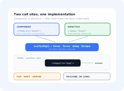
The Vue tooltip question almost never starts with positioning. It starts with an architectural fork:
component or directive? Someone writes v-tooltip="'Export as CSV'",
everyone agrees it reads beautifully, and six months later the codebase has a directive that cannot
render a template, a component that duplicates its logic, and a bug where the tooltip text no longer
updates when the prop changes.
The honest answer is that both are fine, as long as they share one composable and you know what each
one gives up. This guide builds that composable, then wires it into both idioms, with the
<Teleport>, positioning and ARIA layers that decide whether the thing actually
works outside the page it was written on.
Key Takeaways
- One composable, two surfaces. The state machine belongs in
useTooltip(); the component and the directive are both thin wrappers over it. <Teleport to="body">is not optional. Overflow clipping and stacking contexts are ancestor problems thatz-indexcannot solve.- Directives give up templates and reactivity. Anything richer than a string, and you want the component.
- Open on
focusin, not just hover. Otherwise the tooltip does not exist for keyboard users. - SSR needs a mounted guard. There is no
bodyto teleport into and no geometry to measure on the server. - Onboarding guidance is a different component. Targeting, persistence and weekly copy changes do not belong in your design system.
1. The Composable That Owns the State
Everything stateful lives here, so the component and the directive cannot drift apart. Hover, focus, both delays, and Escape:
Use shallowRef for DOM nodes. A plain ref makes Vue walk
and proxy the element deeply. It usually still works, and it costs you performance and the
occasional baffling reactivity bug for no benefit; you never want a DOM node to be deeply reactive.
The asymmetric delays are deliberate: the open delay stops a row of icon buttons from strobing as the pointer crosses them, and the close delay gives the pointer time to travel into the bubble. Focus bypasses both; someone who tabbed to a control did not do it by accident.
2. <Teleport>: Escaping the Ancestor That Clips You
This is the failure everyone hits and almost everyone first tries to fix with z-index.
Two unrelated ancestor behaviours produce it:
An ancestor with overflow: hidden | auto | scroll crops anything sticking out of its box. Data tables, side drawers, cards with rounded corners.
An ancestor with transform, filter, backdrop-filter, will-change, contain, or opacity below 1 opens a stacking context. Inside it, your z-index: 9999 only competes with siblings.
The bubble moves in the DOM; the component tree does not notice.
Note the v-if inside the <Teleport>, not on it: nothing is
mounted while the tooltip is closed, but the teleport target is resolved once. And because the bubble
is now a child of <body>, scoped styles no longer reach it; style
it with a global class or :deep(), which is the second-most-reported surprise after
clipping.
3. Positioning That Survives the Viewport
Measuring the trigger and adding an offset works until the trigger is near an edge. Then you need two behaviours: flip (no room above → render below) and shift (would overflow sideways → slide along the cross axis, keeping the arrow on the trigger).
This is geometry, not framework work, and it is worth delegating. Floating UI ships a Vue package that returns reactive styles you can bind straight into the template:
whileElementsMounted: autoUpdate is the line that matters most in a real application: it
keeps the bubble attached while any ancestor scroll container moves, which is exactly the case
a hand-written window.addEventListener('scroll') misses.
4. The v-tooltip Directive, and Where It Goes Wrong
Directives are the Vue-flavoured temptation. v-tooltip="'Export as CSV'" is undeniably
nicer than wrapping every icon button in a component. What you give up is not obvious until later:
| Component | Directive | |
|---|---|---|
| Call site | Wraps the trigger, more markup | One attribute, clean |
| Content | Slots, components, formatted markup | A string, unless you mount a second app |
| Reactivity | Automatic | Manual, in the updated hook |
| Cleanup | Automatic on unmount | Yours, in unmounted; miss it and you leak listeners |
| Scoped styles | Work (with :deep() past the Teleport) |
Do not apply at all |
If you want the directive anyway, and for plain-text hints it is a reasonable want, write it as a thin adapter over the same composable, and handle the three lifecycle hooks that most implementations forget:
The three hooks a hand-rolled v-tooltip usually ships without.
The three directive bugs, in order of frequency: text that never updates because
there is no updated hook; listeners and orphaned bubbles left behind because there is
no unmounted hook; and an SSR crash because getSSRProps is missing. All
three are invisible in a small demo and guaranteed in a real application.
5. Accessibility: Describe or Label, Never Both
The wiring depends on a question the framework cannot answer for you: does the trigger already have an accessible name?
-
The trigger is named, the tooltip adds detail
A button reading "Export" with a tooltip explaining what gets exported. This is a description:
aria-describedbyon the trigger,role="tooltip"on the bubble. -
The trigger is an icon and the tooltip is its only text
This is a label. Use
aria-labelon the button. A description on a nameless control leaves a screen reader announcing "button" and nothing else: technically valid ARIA, practically unusable. -
The bubble contains a link or a button
Then it is not a tooltip. Hover-triggered content that must be clicked is unreachable for a keyboard user without focus management; build a popover instead.
Then the small things that are always skipped: open on focusin so keyboard users get the
tooltip at all; close on Escape without moving focus; keep the copy short; honour
prefers-reduced-motion; and check the bubble's contrast on its own dark background. The
UX conventions behind all of it are in our explainer on
what a tooltip is.
Touch devices need a decision, not a default. There is no hover on a phone, so
check window.matchMedia('(hover: none), (pointer: coarse)') and either suppress the
tooltip, making sure the information exists somewhere visible, or promote it to a tap-dismissible
popover that does not swallow the trigger's own click. Leaving it hover-only means it simply does
not exist for mobile users.
6. Nuxt and SSR: What Only Breaks in Production
- No
bodyon the server. Teleport has no target during server rendering. Guard it with amountedflag or<ClientOnly>, as in the code above. - No geometry either. Positioning needs a laid-out document; anything measured during SSR is meaningless, so the bubble must only exist after mount.
- Ids must be stable. A counter that starts at zero on both server and client is fine; anything random will mismatch during hydration. Vue's
useId()handles this properly in modern versions. - Directives need
getSSRProps. Without it, a custom directive throws during server rendering, usually the first Nuxt-only failure a Vue tooltip produces.
What Stays Hard After It Works
-
Nested scroll containers
A teleported bubble does not scroll with the panel its trigger lives in.
autoUpdatecovers the common cases; in deeply nested or virtualised scrollers it is usually better to close the tooltip on scroll than to chase it. -
Triggers that unmount while open
Inside a
v-forover live data, the trigger can disappear mid-hover and leave a bubble anchored to nothing. The teardown path needs to run on trigger removal, not only on component unmount. -
RTL and translated copy
Hard-coded "left"/"right" placements invert in right-to-left locales, and translated strings run appreciably longer than the English they were designed around, which changes which side the bubble fits on. The broader version of this problem is covered in our guide to multi-language in-app guidance.
-
Dialogs and the top layer
A bubble teleported to
bodyrenders behind a native<dialog>, because the dialog sits in the browser's top layer. Inside a modal, teleport to the dialog element instead, or use the Popover API where it is available.
A UI Tooltip Is Not an Onboarding Tooltip
The component works, so the next request arrives: show a hint on the reports page to users who have not created a report yet, until they do. That is not a bigger tooltip. It is a different system wearing the same shape.
Icon buttons, truncated cells, keyboard shortcuts. Same text for everyone, opened by the user, no memory between sessions.
Shown to a segment, once, until dismissed or completed. Needs per-user state, sequencing, analytics, and copy that changes weekly.
If the task cannot be completed without it, it does not belong in a tooltip on any device.
Building the middle column into your Vue app means shipping targeting rules, persistence and a copy-editing workflow through the release cycle. That is why onboarding tooltips are normally configured rather than coded, and why the same argument gets sharper for multi-step flows; see our guide to building a product tour in Vue and the wider build vs buy analysis.
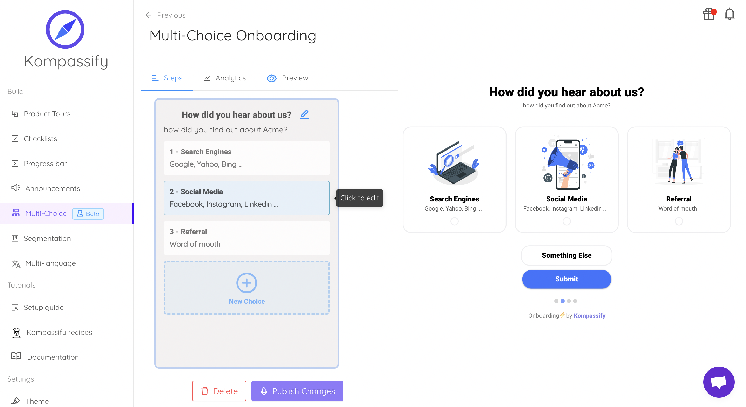
Same anchors, same overlay problem: solved once, outside the release cycle.
Keep the component. Skip the content pipeline.
Kompassify lets product and onboarding teams add tooltips, hotspots, checklists and guided tours to a Vue app without shipping a release for every copy change, targeted by segment, with adoption data on each one. Free up to 100 monthly active users, plans from $129/month, GDPR-compliant and EU-hosted.
Start for free →A Pre-Ship Checklist
Before the tooltip lands in your design system
- Opens on
focusin, verified with the keyboard alone - Escape dismisses it and focus stays on the trigger
- Teleported, and tested inside a scrolling panel and a transformed ancestor
- Styled correctly past the Teleport (global class or
:deep()) - Flips and shifts at all four viewport edges
- Described or labelled, and icon-only buttons still have a name
- Directive version has
updated,unmountedandgetSSRProps - Something deliberate happens on a coarse pointer
- Renders nothing on the server, and hydrates without an id mismatch
The One-Sentence Version
Put the state machine in a composable, the bubble in a <Teleport>, the geometry in a
positioning library and the relationship in ARIA; then let the directive be a thin wrapper over all
four, and keep onboarding content out of the component entirely.
Frequently Asked Questions
How do you make a tooltip in Vue 3?
Build it as a component with four pieces. A composable owns the open state: it opens on pointerenter and focusin, closes on pointerleave, focusout and Escape, and uses an open delay of roughly 150–300ms with a shorter close delay. A <Teleport to="body"> moves the bubble out of any ancestor that would clip or stack it. A positioning pass measures the trigger against the viewport and flips or shifts the bubble when it does not fit. Finally the ARIA wiring connects them: a stable id, aria-describedby on the trigger and role="tooltip" on the bubble. A tooltip missing the Teleport works until the first scrolling panel; one missing the ARIA wiring works until the first keyboard user.
Should a Vue tooltip be a component or a v-tooltip directive?
A directive reads beautifully at the call site, v-tooltip="'Export as CSV'", but it gives up Vue's template rendering, so the bubble content has to be built with DOM calls or a manually mounted app, and reactivity has to be handled by hand in the updated hook. A component keeps templates, slots, scoped styles and reactivity, at the cost of wrapping the trigger. The pragmatic answer used by most design systems is a component for anything with rich or reactive content, and a thin directive for plain-text hints that delegates to the same composable underneath. What you should not do is maintain two separate implementations.
Why is my Vue tooltip clipped or hidden behind other elements?
Because an ancestor is clipping or stacking it, and no z-index can fix either. Any ancestor with overflow: hidden, auto or scroll crops children that extend beyond its box, and any ancestor with a transform, filter, backdrop-filter, will-change, contain or an opacity below 1 creates a stacking context that traps the tooltip inside it. The fix is <Teleport to="body"> so the bubble is rendered outside the offending subtree, combined with position: fixed and coordinates measured from the trigger element.
How do you use Teleport for a tooltip in Vue?
Wrap the bubble in <Teleport to="body"> and keep the trigger where it is. Vue renders the bubble as a child of document.body while the component tree, props and events continue to behave as if it were still nested, so state and reactivity are unaffected. Two production details matter: guard the teleport with v-if so nothing is mounted while the tooltip is closed, and in Nuxt or any SSR setup use <ClientOnly> or a mounted flag, because the target element does not exist during server rendering and the position cannot be measured before the browser has laid out the page.
How do you make a Vue tooltip accessible?
First decide what the tooltip is. If the trigger already has a visible name and the tooltip adds detail, that is a description: aria-describedby on the trigger, role="tooltip" on the bubble. If the trigger is an icon-only button whose only text is the tooltip, that is a label, and it needs aria-label or aria-labelledby: a description on an unnamed control leaves it announced as just "button". Then: open on focusin as well as hover so keyboard users get it, close on Escape without moving focus, keep interactive elements out of the bubble, and respect prefers-reduced-motion in the transition.
What is the difference between a Vue tooltip and an onboarding tooltip?
A UI tooltip is stateless and user-invoked: it appears on hover or focus, describes the control it is attached to, and shows the same text to everybody. An onboarding tooltip is product-invoked: it appears because a specific segment has not done a specific thing, it needs per-user seen and dismissed state, it is sequenced with other steps, and its copy changes far more often than the component around it. Extending a UI tooltip into that role means building targeting, persistence and analytics into your front-end and shipping a release every time the wording changes, which is why product and onboarding teams normally configure that guidance in a dedicated tool instead.