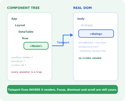
Vue 3 is unusually helpful about modals, right up to the point where it stops.
<Teleport> solves the single most annoying part (a dialog buried twelve
components deep, clipped by a scrolling panel and stuck under a stacking context) in one line.
<Transition> handles the fade. It feels like the framework has this covered.
It does not. Teleport moves markup; it does not trap focus, does not make the page behind inert, does not close on Escape, does not stop the body scrolling and does not give the dialog a name a screen reader can read. Those four are still yours, and they are the four that decide whether the modal works for everyone or only for people using a mouse.
This guide builds the component properly: native <dialog> inside a
Teleport, defineModel for the open state, a focus composable, one dismissal path,
then covers the three ways Nuxt breaks it and what stays hard afterwards.
Key Takeaways
- Teleport is a layout fix, not a modal. It solves clipping and stacking; every behaviour is still unwritten.
- Put a real
<dialog>inside the Teleport. The browser then supplies the top layer, inertness and Escape for free. - Never bind the
openattribute.<dialog open>is a non-modal dialog, identical in a screenshot, useless as a modal. - Own the open state with
defineModel. A modal with private state cannot be opened by a route, a shortcut or a store. - Restore focus to the trigger. The browser traps focus; giving it back is the half nobody writes.
- A UI modal is not an onboarding modal. Same SFC, entirely different lifecycle and owner.
What a Modal Actually Has to Do
The specification does not change between frameworks, only who supplies each line. Marked below with what Vue gives you and what you write:
| Requirement | Supplied by |
|---|---|
| Renders outside clipping and stacking ancestors | <Teleport to="body"> |
Sits above every other layer, without a z-index war | <dialog>.showModal() |
| Page behind it is inert, not merely dimmed | <dialog>.showModal() |
| Tab cannot leave the dialog | <dialog>.showModal() |
| Escape closes it | <dialog>, via the cancel event |
| Enter and exit animation | <Transition>, or CSS discrete transitions |
| Focus returns to the element that opened it | You |
| One dismissal path, one unsaved-changes guard | You |
| Background scroll lock without a layout jump | You |
| An accessible name | You, aria-labelledby |
The framework and the platform cover most of it. The remainder is the accessible part.
1. Teleport, and Why It Is Not Enough Alone
Teleport takes the rendered output of a component and appends it to a different DOM node, while keeping
the component itself exactly where it was in the Vue tree. Props, emits, provide /
inject and reactivity all behave as if nothing moved.
That solves two real problems at once. An ancestor with overflow: hidden can no longer crop
the dialog, and an ancestor with a transform, filter or
backdrop-filter can no longer trap it in a stacking context that no z-index
escapes, the classic "my modal renders behind the sticky header" bug.
What it does not do is make the thing a dialog. So put a real one inside it:
<dialog :open="isOpen">. Binding the attribute renders
a non-modal dialog: it appears in the normal flow, the page behind stays interactive,
Tab walks straight out of it, Escape does nothing and there is no backdrop. It
looks correct in a screenshot and is a different component entirely. Open it imperatively with
showModal().
2. defineModel and Who Owns "Open"
A modal that keeps a private isOpen ref is fine until somebody needs to open it from a
route guard, a keyboard shortcut, a Pinia action or a deep link. At that point a second source of truth
appears and the two drift within a sprint. Make it controlled from the start:
Four details in there earn their place:
-
flush: 'post'Without it the watcher runs before Vue has patched the DOM, and on the very first open
dialogRef.valuecan still benull. Post-flush guarantees the element exists. -
Capture the opener first
showModal()moves focus immediately, so readingdocument.activeElementafterwards returns something inside the dialog. Capture it on the line before, restore it on close, and usepreventScrollso the page does not lurch back. -
@cancel.preventThe native
cancelevent fires on Escape and is cancelable. Preventing it and callingrequestClose()means the unsaved-changes guard covers the keyboard too; otherwise Escape is the one exit that silently discards work. -
dismissible: falsefor destructive dialogsIf the outcome is irreversible, a stray click on the backdrop should do nothing at all. Light dismissal is for dialogs where closing costs the user nothing.
3. The Scroll Lock Composable
showModal() makes the background inert but does not stop it scrolling. The naive lock,
overflow: hidden on the body, removes the scrollbar and shifts the entire
page sideways by its width, on every open.
The counter matters as soon as a drawer and a dialog can be open together, or a confirmation opens on
top of an edit form: without it the inner component's cleanup unlocks scrolling while the outer one is
still visible. onScopeDispose covers the case where the route changes while the modal is
open, which is exactly when a leaked overflow: hidden is most confusing to debug.
4. Animating an Element in the Top Layer
<Transition> is the reflex, and it works, but only if the element is actually
being added and removed by Vue. A <dialog> opened with showModal() is
already in the DOM; what changes is its open property and its promotion into the top
layer, which Vue's transition classes never see.
The clean answer in 2026 is to let CSS own presence, with discrete transitions:
Including overlay in the transition list is the load-bearing part: it tells the browser to
keep the dialog in the top layer until the animation finishes, instead of dropping it out on the first
frame and playing the fade behind the rest of the page. And the reduced-motion block is not decoration;
a dialog that slides is one of the more provocative animations in a product, which is covered
with the rest of the rules in our
accessible onboarding guide.
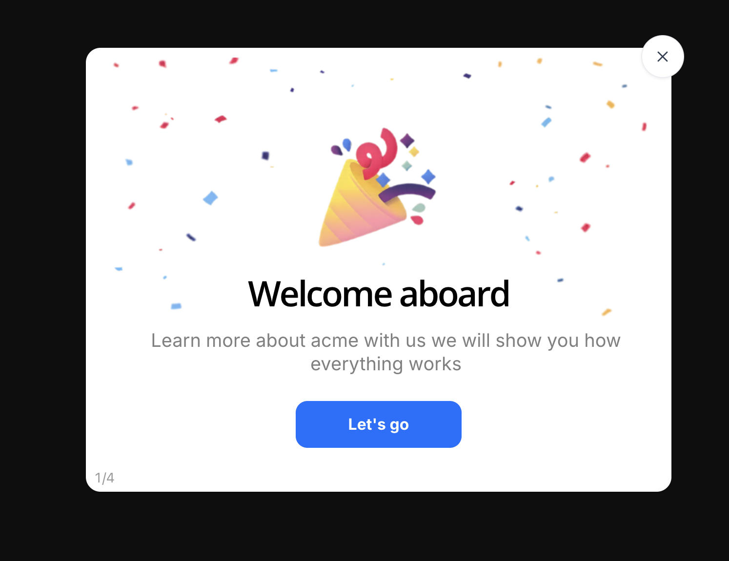
The visual result is the easy half. The keyboard, the screen reader and the phone are the other half.
5. Nuxt and SSR: The Three Failures
A modal is one of the few components that touches the DOM directly, so it is one of the few that breaks differently on a server. Three failures account for almost all of it.
1. The teleport target does not exist
<Teleport to="body"> is evaluated during server rendering, where there is no
body to append to. Either render the modal only on the client (wrap it in
<ClientOnly> in Nuxt) or, when the target is a node another component
mounts, pass the defer prop so the teleport waits a tick.
2. A composable touching document at setup time
useScrollLock above is safe because everything happens inside a watcher callback, which
never runs on the server. The version that measures the scrollbar width eagerly in
setup() throws document is not defined and takes the whole page render with
it. Any DOM measurement belongs in onMounted or in a watcher.
3. Hydration says open, the browser was never told
If a cookie, a store or a query parameter says the modal should be open, the server renders it and
the client hydrates it, without showModal() ever being called. The result is a
dialog that is visible, has no backdrop, does not trap focus and ignores Escape: all the
symptoms of the open-attribute mistake, from a completely different cause. Fix it by
starting closed on the server and opening in an immediate: true watcher after mount.
What Stays Hard After It Works
| Problem | Why it is hard | What usually works |
|---|---|---|
| Stacked dialogs | A confirm inside an edit modal: two scroll locks, two Escape handlers, two focus owners | The lock counter above, plus provide/inject for a modal stack where only the top entry reacts |
| Route changes while open | Vue Router unmounts the page, the dialog vanishes without a close(), and body styles leak |
onBeforeUnmount closes it; onScopeDispose releases the lock |
| Mobile keyboards | The virtual keyboard shrinks the viewport and pushes a centred dialog off-screen | Bottom-anchor on small screens, dvh units, and let the panel scroll internally |
| Async close | The dialog must stay open while a save is in flight, then close, or stay and show the error | A pending state that disables every dismissal path, and an explicit failure branch |
| Deciding what deserves one | Not a code problem: the third modal on a page is the one users learn to dismiss unread | An interruption budget; the loser is whichever dialog appears second |
For the product side of that last row (the six modal types, when a dialog is the wrong pattern and the copy rules that make one dismissible without regret) see our guide to what a modal is, and banner blindness for the budget itself.
A UI Modal Is Not an Onboarding Modal
The two are indistinguishable in a design file and behave nothing alike in production. This is the distinction that decides whether the work belongs in your Vue codebase at all.
| UI modal | Onboarding modal | |
|---|---|---|
| Who triggers it | The user, by clicking something | The product, from who the user is and what they have not done |
| Audience | Everyone, identically | A segment: new signups, one plan, one role, one unactivated cohort |
| State it needs | None beyond the current interaction | Per-user and persisted: seen, dismissed, completed, snoozed |
| Lives alone? | Yes: one dialog, one decision | No: step one of a sequence, with a resume point |
| Measured by | Nothing; it opened or it did not | View rate, completion rate, and the activation metric behind it |
| How often the copy changes | Rarely: it ships with the feature | Constantly: it is content, not UI |
| Who owns it | Front-end engineering | Product, onboarding or customer success |
Building the second on top of the first means shipping targeting rules, per-user persistence, sequencing, analytics and a copy-editing workflow through your release cycle, every time someone rewrites a sentence. That is why welcome modals and product tours are usually configured rather than coded, and the same argument at larger scale is our build vs buy analysis.
Build It, or Configure It?
Confirmations, edit forms, pickers, destructive-action guards. Part of the interface, shipped with the feature, owned by the design system.
Welcome screens, feature announcements, "you still have not connected your data source". Segment-targeted content that changes weekly should not need a deploy.
If the main task only exists inside a dialog, it is a page. Modals are for decisions, not destinations.
Kompassify covers the middle column without touching the Vue codebase: modals, tooltips, hotspots, checklists and tours are pointed at elements in your live product from a visual editor, targeted by segment, and they report their own completion, so a change of wording is an edit, not a release. Our guide to building a product tour in Vue walks through the same trade-off for multi-step flows, and the Vue tooltip guide does it for the smallest component in the family.
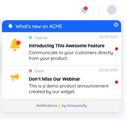
Same overlay, same anchor problem, solved once, outside the release cycle.
Keep the component. Skip the content pipeline.
Kompassify lets product and onboarding teams add modals, tooltips, checklists and guided tours to a Vue or Nuxt app without shipping a release for every copy change, targeted by segment, with adoption data on each one. Free up to 100 monthly active users, plans from $129/month, GDPR-compliant and EU-hosted.
Start for free →A Pre-Ship Checklist
Before the modal goes into the design system
- A real
<dialog>, opened withshowModal(), never theopenattribute - Inside a
<Teleport>, and rendered client-side only under SSR - Open state owned by the parent through
defineModel - Watcher uses
flush: 'post'so the element exists when it runs - Focus returns to the trigger on close, verified with the keyboard alone
- Escape, backdrop and close button all route through
requestClose() - Destructive dialogs are not dismissible by backdrop click
- Scroll lock is reference-counted and compensates the scrollbar width
aria-labelledbypoints at a heading that actually renders- Closes itself in
onBeforeUnmount, so a route change cannot leak body styles - Animation collapses to ~0ms under
prefers-reduced-motion
The One-Sentence Version
A Vue 3 modal is a native <dialog> inside a Teleport, a defineModel
boolean, a focus round-trip and one requestClose(): let the browser do the layering
and the trapping, write the four pieces it does not, and keep onboarding content out of the component
entirely.
Frequently Asked Questions
How do you create a modal in Vue 3?
Render a native <dialog> element inside a <Teleport to="body">, and drive it from a boolean you own with defineModel. A watcher calls showModal() when the value becomes true and close() when it becomes false; never bind the open attribute directly, because <dialog open> renders a non-modal dialog with no top layer, no focus trap and no Escape. Then add the three things Vue does not provide: a composable that remembers the element which had focus before opening and restores it on close, a single requestClose() function that Escape, the backdrop and the close button all call so an unsaved-changes guard applies once, and a scroll lock on the body that compensates for the scrollbar width so the page does not shift.
What does Teleport actually solve in a Vue modal?
One thing, precisely: where the element lives in the DOM. Teleport moves the rendered markup to a target such as document.body while keeping the component inside its parent's tree for props, events, provide/inject and reactivity. That escapes ancestors with overflow: hidden that would clip the dialog and ancestors with a transform or filter that would trap it in a stacking context no z-index can beat. It does not trap focus, does not make the background inert, does not handle Escape, does not lock scrolling and does not give the dialog an accessible name. Teleport solves the layout problem and none of the behaviour problems, which is why pairing it with the native <dialog> element is worth doing, since the browser then supplies the top layer, inertness and Escape.
Why does my Vue modal break in Nuxt or with SSR?
Three separate failures wear the same costume. First, Teleport runs on the server and the target does not exist there, so a dialog teleported to body during SSR throws or silently vanishes; the fix is to render it only after mount, or wrap it in <ClientOnly>, or use the defer prop when the target is mounted by another component. Second, any composable that touches document or window at setup time crashes the server render; move that work into onMounted. Third, a hydration mismatch: if the server renders the modal closed and a cookie or a store rehydrates it open, Vue patches over the difference and the dialog ends up in the DOM without showModal() ever running, which produces a visible but completely non-functional dialog. Open it in a watcher with immediate: true after mount, not during setup.
How do you trap focus in a Vue modal?
If you use <dialog>.showModal(), the browser traps focus for you and you only need the restore half: capture document.activeElement before opening, and call focus() on it in the dialog's close event. If you are building on a plain div inside a Teleport, you need the full composable: query the focusable descendants on every Tab keypress rather than caching them, because a dialog's contents change while it is open; wrap from the last element to the first and back; and always restore focus in onBeforeUnmount or the watcher cleanup. One Vue-specific trap: querying refs in onMounted inside a Teleport can run before the teleported content is in the target, so query from the dialog element ref itself rather than from document.
Should the parent or the modal own the open state?
The parent, exposed through defineModel so the modal is a controlled component. A modal that keeps its own internal isOpen ref cannot be opened from a route guard, a keyboard shortcut, a store action or a deep link, and the first time somebody needs one of those they add a second source of truth and the two drift. With defineModel the parent writes v-model:open and the modal reads and writes the same ref, which also makes the dirty-state guard possible: the modal can refuse to set the value to false. The exception is a purely local confirmation that no other part of the app will ever need to trigger, and even then, promoting it later costs nothing if it was controlled from the start.
What is the difference between a Vue modal and an onboarding modal?
A UI modal is a synchronous interruption the user asked for: they clicked Delete, a confirmation appears, and it is over in two seconds. An onboarding modal is proactive guidance nobody asked for: it appears because a particular user has not done a particular thing yet, it targets a segment, it is usually step one of a sequence, and it needs per-user persistence so it never shows twice. The Vue component is nearly identical; everything around it is different. The hard parts of the second are targeting, persistence, sequencing and being able to rewrite the copy without a deploy, none of which belong in a single-file component, which is why product teams usually configure that layer in a tool rather than shipping it through the front-end release cycle.