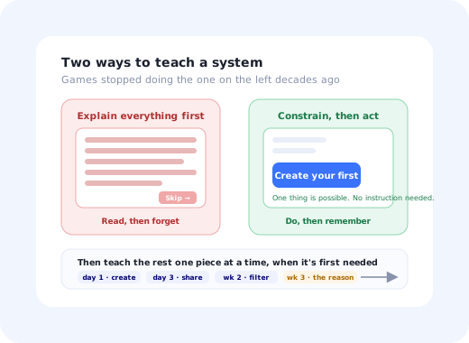
Games solve a harder version of the onboarding problem than SaaS does, under worse conditions. A game has to teach a completely invented system (mechanics that exist nowhere else, with no real-world analogue) to someone with no obligation to learn it, who paid up front, and who will simply stop playing if the first twenty minutes are boring. There is no account manager to call, no training session, and nobody being paid to persevere.
Business software has it comparatively easy: users often have a genuine reason to be there, someone has usually bought the product on their behalf, and a colleague can be asked. And yet a great deal of SaaS onboarding is still a sequence of modal dialogs explaining an interface, which is the exact technique game design abandoned decades ago because it demonstrably did not work.
This guide is about tutorial design rather than rewards; it is not about points, badges or streaks, which are a separate topic covered in onboarding gamification. It is about the eight structural techniques games use to teach complex systems without a manual, and what each one looks like translated into a product.
Key Takeaways
- Teach by doing, never by describing. Games retired the wall-of-text tutorial because players skip explanation and remember action.
- Constrain the first screen instead of explaining it. When only one thing is possible, no instruction is needed.
- Teach each mechanic at the moment it is first needed, not all of them at the start.
- Make early failure safe and instructive: undo, sandboxes and reversible actions do more for learning than warnings.
- Give a visible goal in the first minute. Players know what they are trying to do before they know the controls.
- Measure where people stop, not whether they finished: the per-step drop-off is the whole signal.
Why the Game Version Is the Harder Problem
| Game | Business software | |
|---|---|---|
| What must be taught | An invented system with no real-world analogue. | Usually a familiar task, in an unfamiliar interface. |
| User's motivation | Voluntary. Leaves the instant it stops being enjoyable. | Often obligatory or at least purposeful. |
| Available help | None. No colleague, no manager, no support call. | Colleagues, documentation, support, sometimes a specialist. |
| Tolerance for a bad start | Minutes. | Somewhat more, but shrinking. |
| Consequence of failing to teach | Abandoned, refunded, reviewed badly. | Low adoption, high support load, churn at renewal. |
Given those constraints, game design converged on a set of techniques over several decades of very direct feedback. The useful part for a product team is that the constraints are only different in degree, not in kind, and that the techniques translate almost directly.
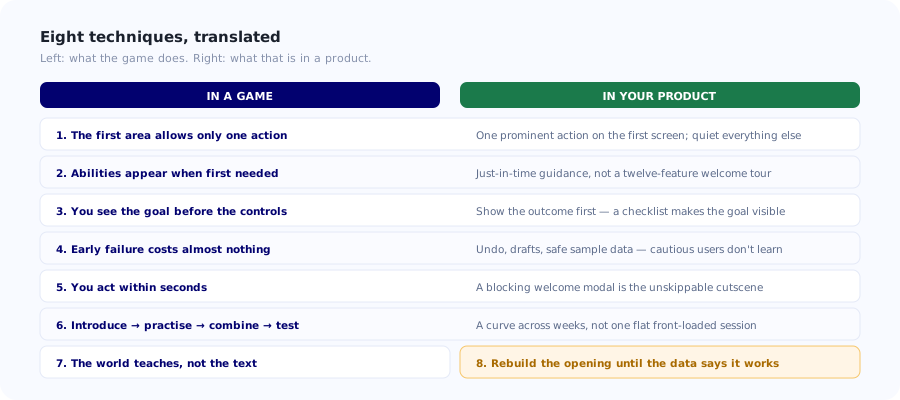
Eight techniques games use to teach invented systems without a manual, and their direct product equivalents.
Eight Techniques Worth Stealing
1. Constrain the space instead of explaining it
The classic game technique is a first area where almost nothing is possible. There is one direction to move, one thing to interact with, one obvious next action. The player is not told what to do; the environment makes the correct action the only available one, and they discover it themselves, which is far stickier than being told.
In a product: a first screen with one primary action and everything else quieted down. Instead of a tour explaining eight navigation items, show a screen where creating the first project is the only prominent thing on it. Most onboarding tours exist to compensate for a first screen that offers too many equally-weighted choices; fix that and much of the tour becomes unnecessary.
2. Teach one mechanic at a time, when it is first needed
Games introduce abilities across hours of play, each at the moment the player first encounters a situation requiring it. Nothing is taught before it is useful, because a mechanic explained an hour before its first use has been forgotten by then.
In a product: stop front-loading. The single most common onboarding mistake is a welcome tour covering twelve features, of which the user needs one today. Teach the sharing permissions when they first share something; teach filters when they first have enough data to need one. This is exactly what progressive onboarding means in practice, and games have been doing it since long before the term existed.
3. Give a visible goal before teaching the controls
Players almost always know what they are trying to achieve (reach that place, defeat that thing) before they know how the controls work. The goal supplies the motivation to learn the mechanics; reversing the order produces a player performing exercises for reasons they do not yet have.
In a product: show the destination first. "Here is the report you will have in five minutes" before "here is how the filter panel works". A checklist is essentially this technique: it makes the goal state visible and the steps subordinate to it, which is why it consistently outperforms a feature tour.
4. Make early failure cheap and reversible
Early game sections are forgiving by design: frequent checkpoints, minimal loss, immediate retry. Not because the designer is being kind, but because experimentation is how the system gets learned, and players only experiment when failure is cheap.
In a product: new users are cautious for exactly this reason. They avoid the button they are unsure about, which means they avoid learning what it does. Undo, a clear draft state, sample data they can safely mangle, and confirmations that are informative rather than merely alarming all convert caution into exploration. A warning dialog teaches people to avoid a feature; a reliable undo teaches them to try it.
5. Let the player act within seconds
Very few games open with five minutes of exposition any more. The player is doing something (moving, choosing, pressing) almost immediately, because that first action is what converts a spectator into a participant.
In a product: the welcome modal that must be read before anything can be clicked is the equivalent of the unskippable cutscene, and it gets treated the same way, dismissed unread. Get the user to a real action in the first thirty seconds, even a small one. See welcome screen patterns for versions that ask something useful rather than announcing something.
6. Design the difficulty curve deliberately
Games pace difficulty: introduce, practise, combine, test. A mechanic appears in a safe context, gets used a few times, is then combined with a previous one, and only later appears in a genuinely demanding situation. Nothing is introduced and immediately required at full complexity.
In a product: most onboarding has no curve at all. It is a flat sequence of equally-weighted steps, and then the user is left alone with the full interface. A curve looks like: first week, one workflow done simply; second week, the same workflow with one more capability; third week, the thing that made them buy. This is also why time-boxed onboarding beats a single front-loaded session.
7. Teach through the interface, not through text about the interface
Well-designed games communicate an enormous amount without words: the path that is lit, the shape that signals interactivity, the visual language that says "this is different from that". Text is a fallback, not the primary channel.
In a product: every tooltip explaining what a control does is partly a report that the control did not explain itself. Sometimes the tooltip is the correct answer, but the question worth asking first is whether the label, the icon, the grouping or the empty state could carry the meaning instead. An empty state that shows what will appear here and how to make it appear teaches more than a tooltip pointing at a button.
8. Instrument the tutorial and expect to rebuild it
Studios playtest opening sections repeatedly, watching where people get stuck, and revise them, often more times than any other part of the game, precisely because it is the part everyone experiences and the part that determines whether the rest is ever seen.
In a product: onboarding is usually built once at launch and then left. It should be the most frequently revised part of the product, because it is the only part every single user encounters. Instrument every step, read the drop-off, change the worst one, repeat. The mechanics are in onboarding funnel analysis.
What Not to Copy
The translation is not total, and the places it breaks down are where most "gamified onboarding" projects go wrong.
✅ Translates well
- Constrained first experiences.
- Just-in-time teaching of one thing at a time.
- Visible goals before mechanics.
- Cheap, reversible early failure.
- A deliberate difficulty curve across weeks.
- Relentless instrumentation and revision.
❌ Translates badly
- Difficulty as a source of satisfaction: nobody wants a challenging invoicing tool.
- Artificial scarcity or time pressure on someone doing their job.
- Celebration animations for routine work, which read as condescending at work.
- Mandatory linear tutorials nobody can skip.
- Points and badges detached from real outcomes.
- Mystery and discovery: delight in a game, friction in a tool.
The central difference: in a game, the activity is the reward. In business software, the outcome is the reward and the activity is a cost the user is trying to minimise. That single distinction explains why the structural techniques transfer beautifully and the motivational ones usually do not. Copy how games teach; be very careful about copying how they motivate.
Applying This to an Existing Product
You do not need to rebuild onboarding to use most of this. In rough order of return on effort:
- Cut the front-loaded tour to the one thing this user needs today. Almost always the single highest-impact change, and the easiest to reverse if wrong.
- Make the first screen constrained. One prominent action; everything else quieter. Much of the tour becomes redundant.
- Show the goal state before the steps. A checklist, or a preview of the outcome they are working toward.
- Add a real undo and a safe place to experiment. Cautious users do not learn; make being wrong cheap.
- Move the other eleven things you cut into just-in-time moments, each triggered when it first becomes relevant rather than on day one. See onboarding triggers.
- Instrument every step and read per-step drop-off, not the completion rate: completion is achievable by clicking Next until it stops.
- Revisit it every quarter. Treat onboarding as a permanently unfinished part of the product, because it is the only part every user sees.
A useful test. Watch someone use your product for the first time without saying anything. The moment you feel the urge to explain something is the moment your interface failed, and it is a much more precise signal than any survey, because it identifies the exact screen and the exact second. Game studios have been running this test on opening levels for decades; it costs an afternoon and it is the cheapest onboarding research available. The structured version is a user onboarding audit.
Build just-in-time guidance instead of a front-loaded tour
Kompassify lets you replace one long welcome tour with short, triggered guidance that appears when a feature first becomes relevant, plus checklists that make the goal visible and per-step analytics showing exactly where new users stop. No engineering, no deploy for a change. GDPR compliant, EU-hosted, free up to 100 monthly active users and from $129/mo after that.
Start for Free →The One-Sentence Version
Games taught themselves, through unusually harsh feedback, that people learn a system by acting inside it rather than by reading about it, so they constrain the beginning, teach one thing at a time at the moment it matters, make being wrong cheap, and then rebuild the opening until the data says it works. None of that requires a game; it only requires accepting that a new user's attention is the scarcest resource you will ever be given, and that a modal explaining your navigation is a poor use of it.
Frequently Asked Questions
What can SaaS onboarding learn from video game tutorials?
Eight structural techniques transfer almost directly: constrain the first experience so the correct action is the obvious one rather than explaining a crowded screen; teach one thing at a time at the moment it is first needed rather than front-loading a feature tour; give a visible goal before teaching the controls, because the goal supplies the motivation to learn; make early failure cheap and reversible so users experiment instead of avoiding things; get the user acting within seconds; design a deliberate difficulty curve across weeks; teach through the interface rather than text about the interface; and instrument the opening and rebuild it repeatedly.
Why is teaching a game harder than teaching business software?
A game must teach a completely invented system with no real-world analogue, to someone whose participation is entirely voluntary, who cannot ask a colleague or call support, and who will stop within minutes if the opening is dull. Business software usually teaches a familiar task in an unfamiliar interface, to someone with a purpose for being there, often with colleagues, documentation and support available. Games therefore converged on techniques under much harsher feedback, which is exactly why those techniques are worth borrowing.
Is this the same as gamification?
No, and the distinction matters. Gamification is about motivational mechanics (points, badges, streaks, progress rewards) layered on top of a product. This is about tutorial design: the structural techniques games use to teach a system without a manual. The two are separate, and the structural half transfers far better. The central difference is that in a game the activity is the reward, whereas in business software the outcome is the reward and the activity is a cost users want to minimise, which is why copying how games teach works well and copying how they motivate often does not.
What does 'just-in-time onboarding' mean?
Teaching each capability at the moment the user first encounters a situation that needs it, rather than explaining everything at the start. Games introduce abilities across hours of play, each when it first becomes useful, because a mechanic explained an hour before its first use has been forgotten by then. The product equivalent is teaching sharing permissions when someone first shares something, and filters when they first have enough data to need one, instead of a welcome tour covering twelve features of which the user needs one today. It is the core idea behind progressive onboarding.
How do you make new users experiment with a product?
Make being wrong cheap. New users are cautious: they avoid the button they are unsure about, which means they avoid learning what it does. Early game sections are deliberately forgiving (frequent checkpoints, minimal loss, immediate retry) because experimentation is how a system gets learned and players only experiment when failure costs little. In a product that means a reliable undo, clear draft states, sample data that can be safely mangled, and confirmations that are informative rather than merely alarming. A warning dialog teaches people to avoid a feature; a good undo teaches them to try it.
Which game design techniques should you not copy into a business product?
Anything motivational rather than structural. Difficulty as a source of satisfaction does not transfer: nobody wants a challenging invoicing tool. Neither does artificial scarcity or time pressure applied to someone doing their job, celebration animations for routine work which read as condescending in a professional context, mandatory linear tutorials that cannot be skipped, points and badges detached from real outcomes, or designed mystery and discovery, which is delightful in a game and pure friction in a tool people use to get something done.
How do you know if your onboarding is teaching or just explaining?
Watch someone use the product for the first time and say nothing. The moment you feel an urge to explain something is the moment the interface failed, and it identifies the exact screen and second, far more precisely than any survey. Beyond that, check whether your onboarding asks users to read or to act: if the first thirty seconds contain no real action, it is explanation rather than teaching. And check whether tooltips are compensating for controls that could have explained themselves through a clearer label, icon or empty state.
How often should onboarding be rebuilt?
Far more often than most teams rebuild it. Game studios playtest and revise opening sections repeatedly, more than almost any other part of the game, precisely because it is the part every player experiences and the part that determines whether the rest is ever seen. Most SaaS onboarding is built once at launch and then left untouched for years, despite being the only part of the product every single user encounters. Instrument each step, read per-step drop-off rather than completion rate, fix the worst step, and revisit at least quarterly.