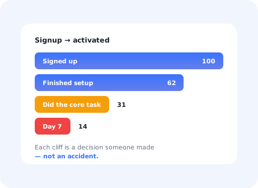
Onboarding rarely fails because a team did not care about it. It fails because a series of individually reasonable decisions (show them everything, collect a bit more data, add a tour) add up to an experience that asks for a lot and gives back nothing for several minutes.
The mistakes below are the ones that show up again and again in SaaS products, roughly in the order a new user meets them. Each comes with the fix, and none of them requires rebuilding the product.
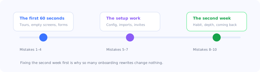
Three moments, ten mistakes. Most teams only ever redesign the first one.
Key Takeaways
- Showing everything is the most common mistake and the most expensive: attention spent on features the user does not need yet is attention taken from the one that matters.
- Onboarding should be judged by an outcome, not by tour completion. A 90% completion rate on a tour nobody needed is not a win.
- Asking before giving, long forms and setup walls before any value, is where most signups are lost.
- Empty screens are onboarding surfaces. The blank state after signup is the single most-visited screen of a new user's first session.
- Onboarding does not end at day one. Nothing guides the user who comes back on day four and has forgotten everything.
- Most fixes are guidance, not engineering. Check whether users who receive help sail through before you schedule a rebuild.
The first 60 seconds
1. Showing the whole product instead of the next step
The instinct to demonstrate everything you built is understandable and almost always wrong. A twelve-step tour of the navigation teaches a new user the layout of a product they have not yet decided to care about, and it spends the only attention budget you get.
The fix: pick the single task that produces the first visible result, and guide only that. Everything else can be discovered later, contextually, when the user has a reason to want it. Our guide to product tours that convert covers how to choose that task.
2. Asking for a lot before giving anything
Company size, role, team name, use case, phone number: collected on the way in, before the user has seen anything work. Each field is small; the cumulative message is that this product will be a chore.
The fix: ask for what you need to personalise the very next screen, and nothing else. Collect the rest progressively, once value has been delivered and the user has a reason to invest. The signup flow guide covers where each field belongs.
3. Treating every new user as the same person
An agency owner, a solo freelancer and an enterprise admin arrive through the same door with different goals, and a single linear tour is wrong for at least two of them. Generic onboarding is the safest-looking decision that reliably underperforms.
The fix: one question at the start, "what are you here to do?", branching into two or three genuinely different paths. This is cheap to build and is usually the highest-impact change available. See user segmentation for how to define the splits.
4. Leaving the empty state empty
The screen a new user sees most in their first session is the one with nothing on it: no projects, no data, no results. Shipping it as a blank panel with a grey icon wastes the single best piece of onboarding real estate in the product.
The fix: make the empty state do the teaching: what this screen is for, what the first action is, and a way to see it populated with sample data. The empty states guide covers the patterns.
The setup work
5. Putting the hardest step first
Connect your data source. Invite your team. Configure your workspace. These are the steps that make the product valuable and they are also the steps a stranger is least willing to do for a tool they have used for ninety seconds.
The fix: let the user reach a visible result with sample or partial data first, then ask for the real thing. Motivation to do setup work is created by seeing what it will produce, not by being told it is required.
6. Hiding progress
Multi-step setup with no indication of how much is left is where people quit, not because the work is hard, but because it appears unbounded. Uncertainty about remaining effort is its own form of friction.
The fix: a checklist or progress bar that shows what is done, what is left, and roughly how long it takes. Starting it partially complete (account created, already ticked) measurably increases the odds people finish.
7. Explaining the interface instead of the job
"This is the dashboard. Here you can see your metrics. Click here to filter." Tooltips that narrate the UI teach vocabulary, not capability. The user did not come to learn your navigation; they came to answer a question.
The fix: write every step as the user's task, not as a description of the widget. "Find out which customers stopped using the product this month" instead of "This is the Segments tab." The microcopy guide has the formulas.
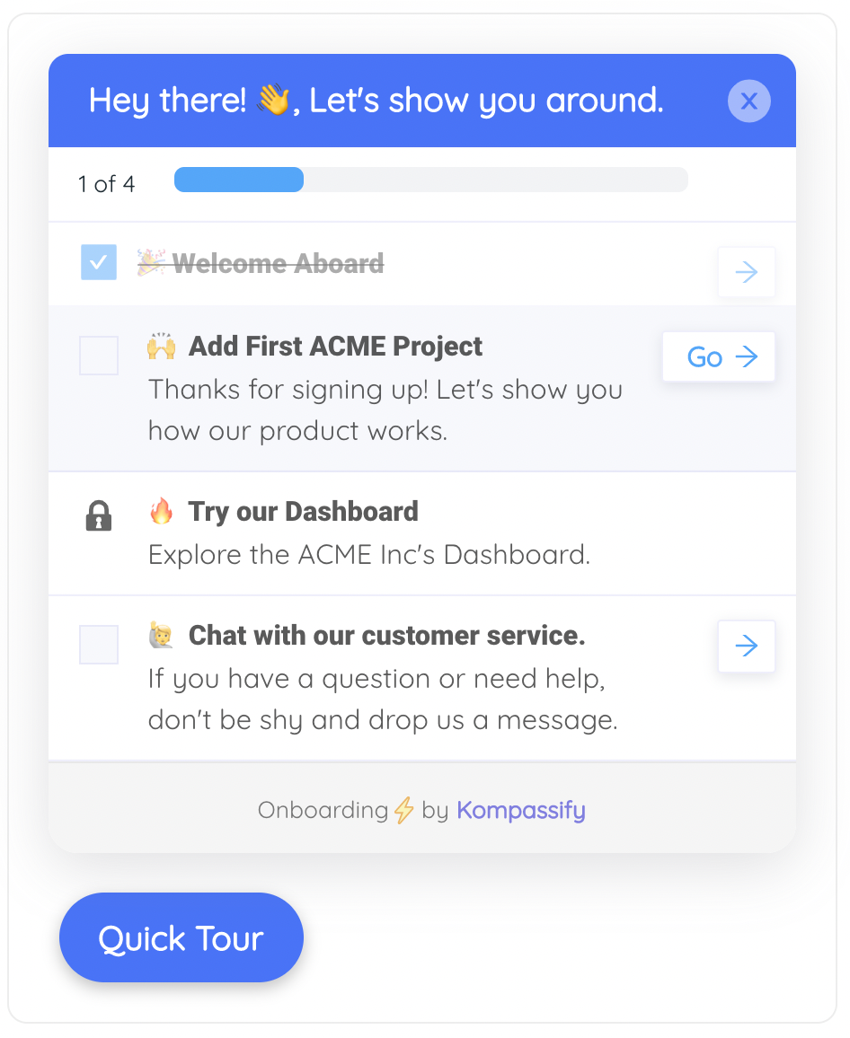
Bounded work gets finished. Unbounded work gets abandoned.
The second week
8. Assuming onboarding ends on day one
The user who comes back on day four has forgotten the tour, is on a different screen, and has a different question. Almost no product has anything waiting for them; onboarding was a first-session event that has already been marked complete.
The fix: treat onboarding as continuous. Guidance that fires on conditions (first visit to a screen, a feature never used after two weeks, a task started and abandoned) keeps working long after the welcome modal is gone.
9. Measuring the tour instead of the outcome
Tour completion rate is the most reported and least useful onboarding metric. It tells you people clicked "Next", which is a measure of your tour, not of your product.
The fix: define activation as a specific completed action with a time window, and measure that. If tour completion goes up and activation does not move, the tour is decoration. Our onboarding metrics guide covers the twelve that matter.
10. Never watching anyone use it
Every onboarding flow was designed by someone who already knows the product, which makes it invisible to them. Analytics tell you where users stop; they never tell you why, and teams routinely spend a quarter fixing the wrong cause.
The fix: five new users, one realistic task, no help, and you stay silent. It takes an afternoon and reorders your backlog. Pair it with an in-app survey on the step people abandon to get the same signal continuously.
How to find which of these you are making
You do not need to fix all ten. Three checks will tell you which two or three are actually costing you users:
-
Build the funnel and find the cliff
Signup → setup complete → core task done → returned on day seven. One step will have a disproportionate drop. Start there and ignore the rest.
-
Watch five sessions
New users, one real task, silence from you. Every pause and wrong click is a mistake from the list above, made visible.
-
Read the first-week tickets
Group them by the underlying question rather than by feature. The biggest group is your most expensive onboarding mistake, and it is usually a labelling problem.
Before you schedule a rebuild: check whether users who get help (a demo, a colleague, a support reply) complete the step easily and never struggle with it again. If they do, the flow is not broken, it is unexplained. That is a guidance fix measured in days, not an engineering project measured in sprints. The user friction guide covers how to tell the two apart.
Onboarding do's and don'ts
✅ Do
- Guide one task to one visible result
- Branch on intent with a single question
- Make empty states teach
- Show progress and bound the work
- Write steps as jobs, not as UI labels
- Trigger guidance on behaviour, not on day one
- Measure activation, not tour completion
❌ Don't
- Tour the whole product on the first visit
- Collect data before delivering value
- Ship one linear flow for every persona
- Put the hardest setup step first
- Narrate the interface
- Treat onboarding as a first-session event
- Redesign a flow you have never watched anyone use
Fixing these with Kompassify
Most of the mistakes above are guidance decisions rather than product architecture, which means they can be changed and measured this week.
- Find the cliff with product analytics: step-level completion across your onboarding funnel.
- Replace the grand tour with a short product tour that drives one task.
- Branch by intent with a multi-choice welcome step that routes users into different paths.
- Bound the setup with a persistent onboarding checklist.
- Keep onboarding running with tooltips and announcements triggered by behaviour, weeks after signup.
Kompassify is a no-code digital adoption platform for SaaS teams: tours, checklists, tooltips, announcements, surveys and analytics in one place. Free up to 100 monthly active users, paid plans from $129/month, GDPR-compliant with EU hosting.
Fix the one mistake that costs you the most
Find the step where new users stop, guide it in place, and check whether activation moved, no engineering ticket required.
Start for Free →Frequently Asked Questions
What is the most common user onboarding mistake?
Showing the whole product instead of the next step. A long tour of the navigation teaches a new user the layout of a product they have not yet decided to care about, and it spends the only attention budget you get. The fix is to identify the single task that produces the first visible result and guide only that; everything else can be discovered later, in context, once the user has a reason to want it.
Why do users abandon onboarding?
Usually because they were asked for effort before they received anything in return. Long signup forms, a setup wall that requires connecting data or inviting colleagues, and multi-step flows with no visible end all ask a stranger to invest in a product they have used for ninety seconds. The second common cause is uncertainty: when the remaining work looks unbounded, people quit even when each individual step is easy.
Is a product tour a mistake?
No, but the default implementation usually is. A tour that narrates the interface across a dozen steps teaches vocabulary rather than capability and gets measured by a metric that means nothing. A tour that drives one task to one visible result, branches by what the user said they came to do, and is judged on activation rather than completion is one of the highest-leverage things in onboarding.
How do you know which onboarding mistake you are making?
Three checks. Build the funnel from signup to core task to day-seven return and find the step with the disproportionate drop, then ignore everything else. Watch five new users attempt one realistic task in silence, which shows you why rather than where. And read the first-week support tickets grouped by the underlying question rather than by feature, because the largest group is your most expensive mistake and it is usually a labelling problem.
Should onboarding end after the first session?
No. The user who returns on day four has forgotten the tour, is on a different screen and has a different question, and in most products nothing is waiting for them. Continuous onboarding means guidance that fires on conditions rather than on dates: first visit to a screen, a feature never used after two weeks, a task started and abandoned. That approach keeps working long after the welcome modal has been dismissed.
What metric should replace tour completion rate?
Activation, defined as a specific completed action within a time window that you can name and verify. Tour completion tells you people clicked Next, which measures your tour rather than your product. The useful test is whether the two move together: if tour completion rises and activation does not, the tour is decoration and should be redesigned around the task that produces the first visible result.
How do you fix onboarding without engineering time?
Check first whether the problem is complexity or explanation. If users who receive any help complete the step easily and never struggle with it again, the flow is not broken, it is unexplained, and that subset is solvable with in-app guidance: a contextual tooltip on the control people misread, a better empty state, a checklist that names the next action. Genuine complexity needs engineering; unexplained steps do not.
How many steps should a user onboarding flow have?
Few enough that the user reaches a visible result before the flow ends, which for most products means three to five steps rather than ten to twelve. The number matters less than the ordering: the hardest setup work should come after the user has seen what it produces, and every step should be a task the user recognises rather than a description of an interface element.