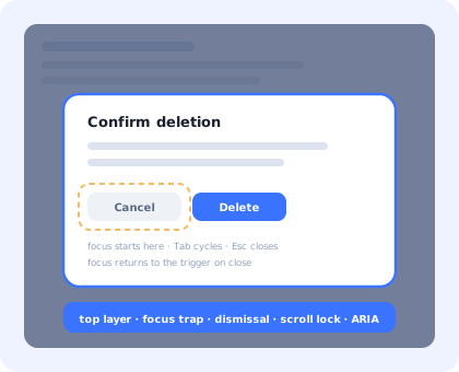
Every React codebase eventually grows a <Modal>. It usually starts as a fixed
div, a semi-transparent backdrop, and a z-index chosen by adding a zero to
whatever the header uses. It looks finished after twenty minutes.
Then a keyboard user presses Tab four times and lands on a link in the page behind the overlay. A screen reader reads the whole page underneath as if nothing had opened. Escape discards a half-written comment with no warning. The page shifts four pixels to the left every time the modal opens. On an iPhone, the background scrolls while the dialog sits still. And the fade-out never plays, because the component unmounted the moment the state flipped.
None of that is exotic. It is the normal difficulty of a dialog, and it is why the browser eventually grew a native element for it. This guide builds a modal properly in React, in five layers, and then lists what stays hard once the component is done.
Key Takeaways
- Reach for
<dialog>first.showModal()gives you the top layer, inertness and Escape without writing any of it. - Focus is the whole feature. Move it in, keep it in, and give it back; the last part is the one everybody forgets.
z-indexis not a layering strategy. The top layer sits above every stacking context; a portal only escapes the ones above it in the tree.- Route every dismissal through one handler. Escape, backdrop and the close button must share the unsaved-changes guard, or two of the three will bypass it.
- Scroll lock needs the scrollbar gap. Compensate the width or the page jumps on every open.
- A UI modal is not an onboarding modal. Same component, completely different lifecycle and owner.
What a Modal Actually Has to Do
Before any code, the specification. A modal that ships into a real design system has to:
- render above everything: sticky headers, toasts, a third-party chat widget;
- take focus when it opens, and return it to the trigger when it closes;
- keep Tab and Shift+Tab inside itself while it is open;
- make the rest of the document inert, not merely dimmed;
- close on Escape, on a backdrop click and on its own close button, through one code path;
- stop the page behind it from scrolling, without shifting the layout;
- announce itself with a name, so a screen reader user knows what appeared;
- survive being animated, unmounted, and reopened before the animation finished.
Eight requirements, five of which are invisible on the developer's machine. Here is the shape of the component that satisfies them.
Each layer fixes a failure the others cannot see.
1. <dialog> or a Portal?
This is the first decision, and in 2026 it is a much easier one than it was three years ago. The native
<dialog> element, opened with showModal(), is supported everywhere that
matters and hands you four things for free that a hand-rolled overlay has to earn:
| Behaviour | <dialog> + showModal() |
createPortal + a div |
|---|---|---|
| Stacking | Browser top layer, above every stacking context, no z-index at all |
Escapes ancestors only; still competes with anything else portalled to body |
| Background inertness | Automatic: everything outside the dialog becomes inert | You add inert to the app root yourself, and remember to remove it |
| Focus trapping | Handled by the browser | You write it, including the Shift+Tab wrap |
| Escape | Fires a cancelable cancel event |
A keydown listener you add and remove |
| Backdrop | ::backdrop, stylable, animatable |
A sibling element you position and z-index |
| Focus restoration | Still yours to write | Still yours to write |
The one row that does not change is the last one, and it is the row users notice. Here is the hook, written against the native element.
Two details are load-bearing. document.activeElement is captured before
showModal() runs, because the browser moves focus as soon as the dialog opens. And the
restore is hung off the element's own close event rather than a React cleanup, so it fires
whichever route closed the dialog: state change, form submission with
method="dialog", or the browser itself.
open as an attribute. Rendering
<dialog open> puts the dialog in the page as a non-modal dialog: no top
layer, no inert background, no focus trap, no Escape. It looks identical in a screenshot and
is a completely different component. Always open it imperatively with showModal().
2. Focus: Trap It, Then Give It Back
If you are on the native element, the trap is already done. If you are on a portal (and plenty of design systems still are, for stacked-dialog reasons) you write it yourself, and it is worth seeing what you are signing up for.
Three decisions in there are worth defending:
-
Re-query on every keypress
A dialog's contents change while it is open: a disabled Save button becomes enabled, a validation error adds a link, a list loads. Caching the focusable elements at mount produces a trap that silently skips whatever appeared afterwards.
-
Restore focus in the cleanup
Focus returning to
<body>means the next Tab starts at the top of the document. For someone who opened the dialog from a row in a long table, that is losing their place entirely.preventScroll: truestops the page from jumping back at the same time. -
Focus the container, not always the first control
If the first focusable element is a destructive button, focusing it invites an accidental Enter. Give the dialog
tabindex="-1"and focus that instead, so the screen reader reads the title and the user tabs deliberately into the actions.
3. Dismissal, and the Unsaved-Changes Problem
A modal has at least four ways to close: the close button, Escape, a click on the backdrop, and a successful submit. Teams usually implement them in four places, and then discover that the "discard your changes?" guard only fires on one of them.
The fix is structural: every path calls the same requestClose(), and only
requestClose() is allowed to decide.
e.target === dialogRef.current is more reliable than measuring click coordinates against
the panel's bounding box, because it cannot be fooled by a drag that starts inside the panel and ends
on the backdrop: a text selection that overshoots, for example, which coordinate-based checks
famously treat as "close and throw everything away".
A last rule that costs nothing: destructive dialogs should not close on backdrop click at all. If the outcome of the dialog is irreversible, an accidental click outside it should do nothing. Reserve light dismissal for dialogs where closing loses nothing.
4. Scroll Lock Without the Layout Jump
The naive lock is one line, and it is why so many products shift four pixels sideways every time a
dialog opens: removing overflow removes the scrollbar, and the layout reflows into the
space it occupied.
Storing the previous values rather than resetting to an empty string matters as soon as two dialogs can be open in sequence, or a drawer and a dialog share the lock: the second cleanup would otherwise wipe state the first one still needs. If several components can lock scrolling, promote this to a counter in a shared module and only touch the body when the count crosses zero.
The residual problem is iOS Safari, where overflow: hidden on the body does not reliably
stop momentum scrolling behind a fixed overlay. The usual workaround is to record
window.scrollY, set the body to position: fixed with
top: -{y}px, and restore the scroll position on unlock, which works, at the cost of
a repaint and a brand-new edge case if the user rotates the device while the dialog is open. Test it on
a real phone; the simulator lies about this one.
Same visual result whichever route you take: the difference is what happens on a keyboard and a phone.
5. Animation, Reduced Motion and the Unmount Race
You cannot animate an element that React has already removed. That single fact is behind most of the "my modal fades in but disappears instantly" bug reports.
The cheapest fix in 2026 is to stop asking React to manage presence at all and let CSS do it, using discrete transitions:
The element stays in the DOM the whole time; the browser keeps it in the top layer until the transition
finishes, because overlay is in the transition list. No state machine, no
transitionend listener, no timeout fallback that fires while the tab is backgrounded and
leaves the dialog stuck half-open.
The prefers-reduced-motion block is not decoration. Motion sensitivity is a real
accessibility requirement, and a dialog that slides is one of the more provocative animations in a
product; it is covered alongside the rest of the in-app guidance rules in our
accessible onboarding guide.
What Stays Hard After It Works
The component above is genuinely finished. These are the problems that arrive afterwards, and none of them are solved by writing the modal better.
| Problem | Why it is hard | What usually works |
|---|---|---|
| Stacked dialogs | A confirm inside an edit dialog: two traps, two scroll locks, two Escape handlers competing | A single stack in context; only the top entry listens. The top layer stacks correctly by open order, so the browser is already on your side. |
| Mobile keyboards | The virtual keyboard shrinks the viewport and pushes a centred dialog off-screen | Anchor to the bottom on small screens, use dvh units, and let the panel scroll internally |
| The back button | Users expect Back to close a full-screen mobile dialog; it navigates away instead | Push a history entry when a full-screen dialog opens, and close on popstate |
| Async close | The dialog must stay open while a save is in flight, then close, or stay open and show an error | A pending state that disables dismissal, and an explicit failure path that never silently closes |
| Deciding what deserves one | Not a code problem at all: the third modal on a page is the one users learn to dismiss unread | A budget: interruptions compete with each other, and the loser is whichever one appears second |
That last row is where front-end work stops and product work starts. If you want the UX side of the decision (the six modal types, when a dialog is the wrong pattern, and the copy rules that make one dismissible without regret) that is our guide to what a modal is, and the interruption budget itself is covered in banner blindness.
A UI Modal Is Not an Onboarding Modal
The two look identical in Figma and behave nothing alike in production. This is the distinction that decides whether the work belongs in your React codebase at all.
| UI modal | Onboarding modal | |
|---|---|---|
| Who triggers it | The user, by clicking something | The product, because of who the user is and what they have not done |
| Audience | Everyone, identically | A segment: new signups, one plan, one role, one unactivated cohort |
| State it needs | None beyond the current interaction | Per-user, persisted: seen, dismissed, completed, snoozed |
| Lives alone? | Yes: one dialog, one decision | No: step one of a sequence, with a resume point |
| Measured by | Nothing; it either opened or it did not | View rate, completion rate, and the activation metric behind it |
| How often the copy changes | Rarely: it ships with the feature | Constantly: it is content, not UI |
| Who owns it | Front-end engineering | Product, onboarding or customer success |
Building the second on top of the first means shipping targeting rules, per-user persistence, sequencing, analytics and a copy-editing workflow, through your release cycle, every time someone rewrites a sentence. That is the reason welcome modals and product tours are usually configured rather than coded, and the same argument at larger scale is our build vs buy analysis.
Build It, or Configure It?
A clean split that holds up in practice:
Confirmations, edit forms, pickers, destructive-action guards. They are part of the interface, they ship with the feature, and they belong in your design system.
Welcome screens, feature announcements, "you have not finished setting up billing". Content aimed at a segment, changed weekly, should not need a deploy.
If the main task only exists inside a dialog, it is a page. Modals are for decisions, not destinations.
Kompassify covers the middle column without touching the React codebase: modals, tooltips, hotspots, checklists and tours are pointed at elements in your live product from a visual editor, targeted by segment, and they report their own completion, so a change of wording is an edit, not a release. Our guide to building a product tour in React walks through the same trade-off for multi-step flows, where the state machine is considerably worse than a dialog's, and the React tooltip guide does it for the smallest component in the family.
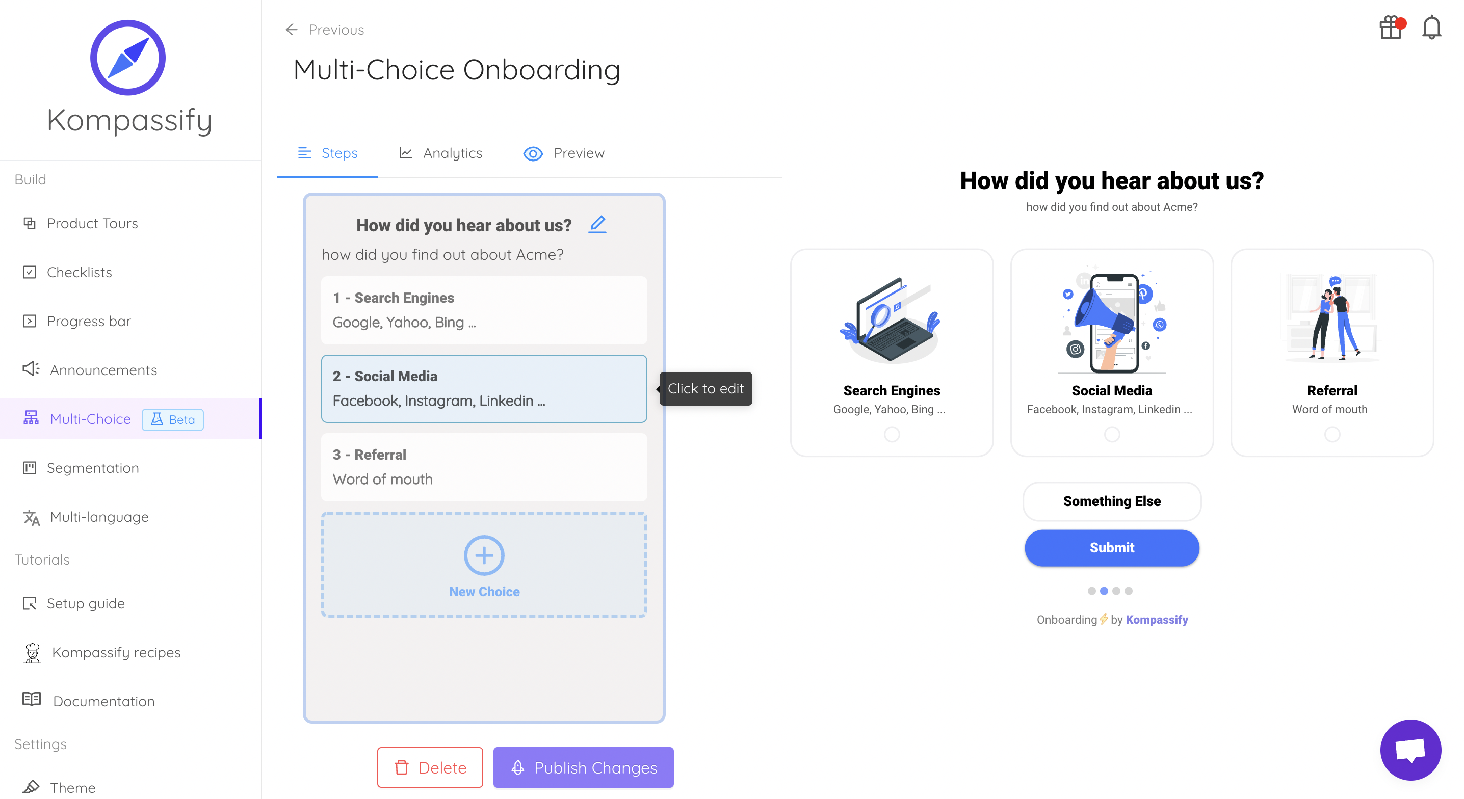
Same overlay problem, solved once, outside the release cycle.
Keep the component. Skip the content pipeline.
Kompassify lets product and onboarding teams add modals, tooltips, checklists and guided tours to a React app without shipping a release for every copy change, targeted by segment, with adoption data on each one. Free up to 100 monthly active users, plans from $129/month, GDPR-compliant and EU-hosted.
Start for free →A Pre-Ship Checklist
Before the modal goes into the design system
- Opened with
showModal(), not theopenattribute - Focus moves in on open and returns to the trigger on close, verified with the keyboard alone
- Tab and Shift+Tab cannot reach the page behind it
- The background is
inert, not just dimmed, tested with a screen reader's virtual cursor - Named with
aria-labelledby, pointing at a heading that exists - Escape, backdrop and close button all route through one handler, with one dirty-state guard
- Destructive dialogs do not close on backdrop click
- Scroll lock compensates the scrollbar width; no horizontal jump on open
- Exit animation actually plays, and collapses to ~0ms under
prefers-reduced-motion - Usable on a phone with the keyboard open, and Back closes a full-screen dialog
The One-Sentence Version
A React modal is a top-layer element, a focus round-trip, one dismissal handler and a scroll lock that
compensates the scrollbar; build those four on top of native <dialog>, and
keep onboarding content out of the component entirely.
Frequently Asked Questions
How do you create a modal in React?
A production React modal has five parts. First, a rendering strategy: either the native <dialog> element opened with showModal(), which puts the dialog in the browser's top layer, or createPortal into document.body when you need to support older rendering targets or want full control of the backdrop. Second, focus management: move focus into the dialog on open, keep Tab and Shift+Tab inside it, and return focus to the element that opened it on close. Third, dismissal rules: Escape and a backdrop click, both routed through the same close handler so unsaved-changes guards apply once. Fourth, background scroll lock that compensates for the scrollbar width so the page does not jump. Fifth, the ARIA wiring: role="dialog" with aria-modal="true", plus aria-labelledby pointing at the title. Skipping the second part is the most common defect, and it is the one that makes the modal unusable by keyboard.
Should I use the native dialog element or a React portal?
Use the native <dialog> element with showModal() unless you have a specific reason not to. It gives you the top layer for free, which means no z-index war with sticky headers and toasts; it gives you Escape handling, the ::backdrop pseudo-element, and inert-by-default content behind it. The reasons to reach for createPortal instead are narrow: you need the same component to render in a non-browser target, you need multiple stacked dialogs with custom layering rules the top layer does not give you, or your design requires a backdrop that animates in a way ::backdrop cannot express. Even then, portal-based modals still have to reimplement focus trapping, inertness and Escape by hand, which is exactly the work the native element removes.
How do you make a React modal accessible?
Four things, in order of how often they are missed. Give the dialog an accessible name with aria-labelledby pointing at the heading inside it, so screen reader users hear what opened. Move focus into the dialog when it opens (to the first meaningful control, or to the dialog container itself if there is no obvious target) and return it to the trigger on close, because focus landing back at the top of the document loses the user's place. Make the rest of the page inert, so a screen reader's virtual cursor cannot wander into content that is visually behind a dark overlay. And make sure Escape closes it. The native <dialog> element handles inertness, Escape and the top layer for you; the focus return is still yours to write.
Why does my page jump when a React modal opens?
Because the usual scroll lock, setting overflow: hidden on the body, removes the vertical scrollbar, and the content reflows into the width the scrollbar used to occupy. The fix is to measure the gap before you lock, with window.innerWidth minus document.documentElement.clientWidth, and add that number as padding-right on the body while the modal is open. Restore both values on close, and store the original inline styles rather than assuming they were empty, because two modals opening in sequence will otherwise clear each other's state. On iOS Safari the same approach is not enough on its own, since the body keeps scrolling under a fixed overlay; the common workaround is to record the scroll position, set the body to position: fixed with a negative top offset, and restore the scroll position on close.
How do you animate a React modal that unmounts?
You cannot animate an element that is already gone, so the component has to stay mounted until the exit animation finishes. There are three workable approaches. The simplest is to drive presence from CSS rather than from React: keep the dialog mounted, toggle a data attribute, and use transition-behavior: allow-discrete with @starting-style so the browser animates the element in and out of display: none. The second is to keep a small state machine (opening, open, closing, closed) and only unmount on the transitionend or animationend event, with a timeout fallback in case the event never fires. The third is a presence library that does this for you. Whichever you pick, gate the animation behind prefers-reduced-motion, and make sure a fast double-toggle cannot leave the component stuck in the closing state.
What is the difference between a React modal and an onboarding modal?
A UI modal is a synchronous interruption the user asked for: they clicked Delete, so a confirmation appears, and the interaction is over in two seconds. An onboarding modal is proactive guidance nobody asked for: it appears because a particular user has not done a particular thing yet, it is targeted by segment, it is often step one of a sequence, and it needs per-user dismissal state so it never shows twice. The component is nearly the same; everything around it is different. The hard parts of an onboarding modal are targeting, persistence, sequencing and being able to rewrite the copy on a Tuesday afternoon, none of which belong in a React component, which is why product teams usually configure that layer in a tool instead of shipping it through the front-end release cycle.