Every front-end codebase eventually grows a <Tooltip>. It usually starts as
twenty lines someone wrote in a hurry: a boolean, onMouseEnter, an absolutely
positioned div. It works on the page it was written for, and then it meets the rest of
the application.
It gets cropped by a table with overflow: auto. It renders behind a dialog no matter
how much z-index you throw at it. It never appears for anyone navigating by keyboard.
It flickers when the pointer crosses the two-pixel gap between the trigger and the bubble. On a
phone, the first tap opens it and swallows the click that was supposed to save the form.
None of that is exotic. It is the normal difficulty of the component, and it is why a tooltip is a better interview question than it looks. This guide builds one properly in React, in four layers, and then lists what remains hard after the component is done.
Key Takeaways
- Four layers, not one component. Trigger state machine, portal, positioning engine, ARIA wiring: each solves a different failure.
z-indexwill not save you. Clipping and stacking are ancestor problems; the fix is a portal or the top layer.- Focus is not optional. A hover-only tooltip does not exist for keyboard users, and that is usually an accessibility defect, not a nice-to-have.
- Describe or label: pick one.
aria-describedbyon a control with no accessible name leaves it nameless. - Delay is a feature. Open delay stops flicker on pointer transit; close delay lets the pointer reach the bubble.
- A UI tooltip is not an onboarding tooltip. Different problem, different lifecycle, and usually a different owner.
What a Tooltip Actually Has to Do
Before any code, the specification. A tooltip that ships into a real design system has to:
- open on hover and on keyboard focus, and close on leave, blur and Escape;
- wait a moment before opening, so it does not strobe as the pointer crosses a toolbar;
- stay open long enough for the pointer to travel into it, if it contains anything selectable;
- render outside any ancestor that clips or stacks it;
- position itself against the trigger, and flip or shift when the viewport says it cannot go where it wanted;
- follow the trigger while ancestors scroll or the window resizes;
- be announced by assistive technology, with the right relationship for the job;
- degrade sensibly where there is no hover at all.
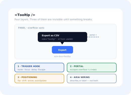
Eight requirements, four of which are invisible on the developer's machine. Here is the shape of the component that satisfies them.
Each layer fixes a failure the others cannot see.
1. The Trigger: Hover, Focus, Delay and Escape
Open state is where most tooltips are quietly wrong. A single useState(false) toggled by
onMouseEnter and onMouseLeave misses focus, misses Escape, and
flickers. What you want is a small hook that owns the timers.
Three decisions in there are worth defending:
-
Asymmetric delays
Opening waits ~180ms so a pointer crossing five toolbar buttons does not fire five tooltips. Closing waits ~80ms so the pointer can cross the gap into the bubble without it vanishing. If your tooltip contains selectable text, the close delay is what makes it usable at all.
-
Focus opens immediately
Delays exist to suppress accidental hovers. A keyboard user who tabbed to a control did not do it accidentally, so make focus bypass the timer. Blur closes without delay for the same reason.
-
Pointer events, filtered by type
onPointerEnterfires for touch as well as mouse, which is how tooltips end up stuck open on phones. CheckingpointerTypekeeps hover behaviour on hover devices and lets you decide touch behaviour deliberately.
Escape must not move focus. Per the ARIA authoring practices, dismissing a tooltip leaves focus exactly where it was, on the trigger. A tooltip is not a dialog; nothing about it should trap or restore focus.
2. Rendering It Somewhere Safe
This is the bug that generates the most Stack Overflow traffic, and the one most often "fixed" with
z-index: 9999. Two different ancestor behaviours cause it:
Any ancestor with overflow: hidden | auto | scroll crops descendants that stick out of its box. Tables, side panels, cards with rounded corners and virtualised lists all do this by design.
An ancestor with a transform, filter, backdrop-filter, will-change, contain, or an opacity below 1 creates a stacking context. Your tooltip's z-index is then only compared against its siblings inside that context; it can never climb above it.
The reliable answer is to render the bubble somewhere else in the DOM and position it with viewport coordinates:
Two notes. position: fixed with a transform applied from measured coordinates is easier
to reason about than absolute, because it removes the offset-parent question entirely.
And rendering null on the server keeps hydration honest; there is no trigger geometry to
measure before the browser has laid the page out.
The native alternative. The Popover API puts an element in the browser's top layer, which sidesteps stacking contexts without a portal, and CSS anchor positioning aims to remove the measuring code as well. Popover support is now broad enough to build on; anchor positioning is still arriving browser by browser, so treat it as progressive enhancement over a JavaScript fallback rather than the baseline. The layers in this guide do not change; the platform just takes over two of them.
3. Positioning: Flip, Shift and the Arrow
Naive positioning reads getBoundingClientRect() on the trigger and adds an offset. That
is correct until the trigger is near an edge; then the tooltip renders half off-screen, or under the
viewport, and the information is gone.
The two behaviours you need are flip (if there is no room above, go below) and shift (if there is no room to the left, slide along the cross axis until there is, while keeping the arrow on the trigger).
Flip changes the side. Shift slides along it. The arrow stays on the trigger through both.
You can hand-roll this. You should not. Collision detection against the right boundary, tracking the trigger through nested scroll containers, and keeping an arrow visually attached while the bubble slides is where the subtle bugs live. A positioning library (Floating UI is the common choice in the React ecosystem) reduces the whole layer to a few lines:
Two details that are easy to miss. Round the coordinates: sub-pixel translations
make text render blurry on non-retina displays. And use useLayoutEffect,
not useEffect, so the first paint already has the right position; otherwise the tooltip
visibly jumps from the top-left corner on open.
4. Accessibility: Describe or Label, Never Both
This is the layer that gets skipped, and the one that turns a tooltip from a convenience into a defect. The first question is not "which ARIA attribute"; it is what is this tooltip for?
| Situation | What the tooltip is | Wiring |
|---|---|---|
| Button already reads "Export", tooltip adds "Downloads a CSV of the current view" | A description | aria-describedby on the trigger → bubble with role="tooltip" |
| Icon-only button whose only text is the tooltip word "Export" | A label | aria-label on the button (or aria-labelledby → the bubble) |
| Bubble contains a link, a "Learn more", or anything clickable | Not a tooltip at all | Use a popover with proper focus management |
The failure mode worth remembering: an icon-only button with only aria-describedby has
no accessible name. A screen reader announces "button" and then, maybe, a
description. The control is unusable, and automated accessibility checks often miss it because the
attribute is technically present and technically valid.
Round it off with the details that cost nothing and are always missed: never put focusable content in
the bubble; keep the text short enough that it does not need to be re-read; respect
prefers-reduced-motion in the fade; and make sure the tooltip's contrast ratio survives
the dark background it is probably drawn on. The same rules apply whatever the framework; the
underlying pattern is covered in our explainer on
what a tooltip is
and the UX conventions around it.
5. Touch Devices: The Hover That Never Comes
There is no hover on a touch screen. A tooltip that only opens on mouseenter is simply
invisible to a phone user, and the usual "fix", opening on tap, quietly steals the tap that was meant
for the button underneath.
With that in hand you have two honest options, and one dishonest one:
- Suppress it. Do not render the tooltip on coarse pointers, and make sure the information exists elsewhere: a visible label, a caption, an inline hint. Best choice when the tooltip is genuinely supplementary.
- Promote it. Turn it into a tap-to-open popover with an explicit close affordance, dismissible by tapping outside, and make sure the trigger's own action still fires or is deliberately suppressed. Best when the content is genuinely needed.
- Leave it hover-only and hope. This is the dishonest option, and it is the one shipping in most design systems today.
The rule that resolves most of these arguments: if information is essential, it must not live only in a tooltip, on any device. A tooltip is a shortcut for people who already know what they are looking at, never the only path to a fact the user needs.
What Stays Hard After It Works
The component is done, reviewed, in the design system. Here is what still generates tickets.
-
Nested scroll containers
A portalled tooltip does not scroll with the panel its trigger lives in, so it detaches and floats over unrelated content.
autoUpdatehandles the common cases; deeply nested or virtualised scrollers still need the tooltip closed on scroll rather than repositioned. -
Virtualised lists and unmounting triggers
In a windowed table the trigger can unmount while its tooltip is open, leaving an orphaned bubble anchored to nothing. The component needs to observe its trigger's existence, not just its geometry.
-
RTL and translated copy
Placement logic written as "left" and "right" breaks in right-to-left locales; use logical start/end placements. And translated strings are routinely 30–40% longer, which changes which side the tooltip fits on, a layout that only ever passed review in English. Our guide to multi-language in-app guidance covers the wider version of this problem.
-
Dialogs, iframes and the top layer
A tooltip portalled to
document.bodyrenders behind a native<dialog>, because the dialog is in the top layer and body content is not. Inside an embedded iframe, the tooltip cannot escape the frame at all, so a trigger near the frame edge has nowhere to go. -
Testing it honestly
Unit tests assert that the bubble is in the document, which passes even when the tooltip renders off-screen, behind a modal, or is never announced. The failures that matter are geometric and assistive; catching them needs visual regression and a real screen-reader pass, not another
expect(screen.getByRole('tooltip')).
A UI Tooltip Is Not an Onboarding Tooltip
Once the component exists, someone will ask it to do a different job: show a tip to new users on the reports page until they have created their first report. That request looks like a small extension. It is a different system.
| UI tooltip | Onboarding tooltip | |
|---|---|---|
| Who opens it | The user, by hovering or focusing | The product, when conditions are met |
| Who sees it | Everyone, identically | One segment, once, until dismissed or completed |
| State it needs | None: it is stateless | Seen / dismissed / completed, per user, across devices |
| How often the copy changes | Rarely | Constantly: it is content, not UI |
| Who owns it | Front-end engineering | Product, onboarding or customer success |
Building the second on top of the first means shipping targeting rules, per-user persistence, sequencing, analytics and a copy-editing workflow through your release cycle, every time marketing rewrites a sentence. That is the reason onboarding tooltips and product tours are usually configured rather than coded, and the same argument applies at larger scale in our build vs buy analysis.
Build It, or Configure It?
A clean split that holds up in practice:
Icon buttons, truncated cells, form hints, keyboard shortcuts. They are part of the interface, they ship with the component, and they belong in your design system.
"Try this new filter", "Finish setting up billing", anything targeted at a segment or a moment in the user's life. Content that changes weekly should not need a deploy.
If the user cannot complete the task without it, it is not a tooltip. Put it on the page.
Kompassify covers the middle column without touching the React codebase: tooltips, hotspots, checklists and tours are pointed at elements in your live product from a visual editor, targeted by segment, and they report their own completion, so a change of wording is an edit, not a release. Our guide to building a product tour in React walks through the same trade-off for multi-step flows, where the state machine is considerably worse than a tooltip's.
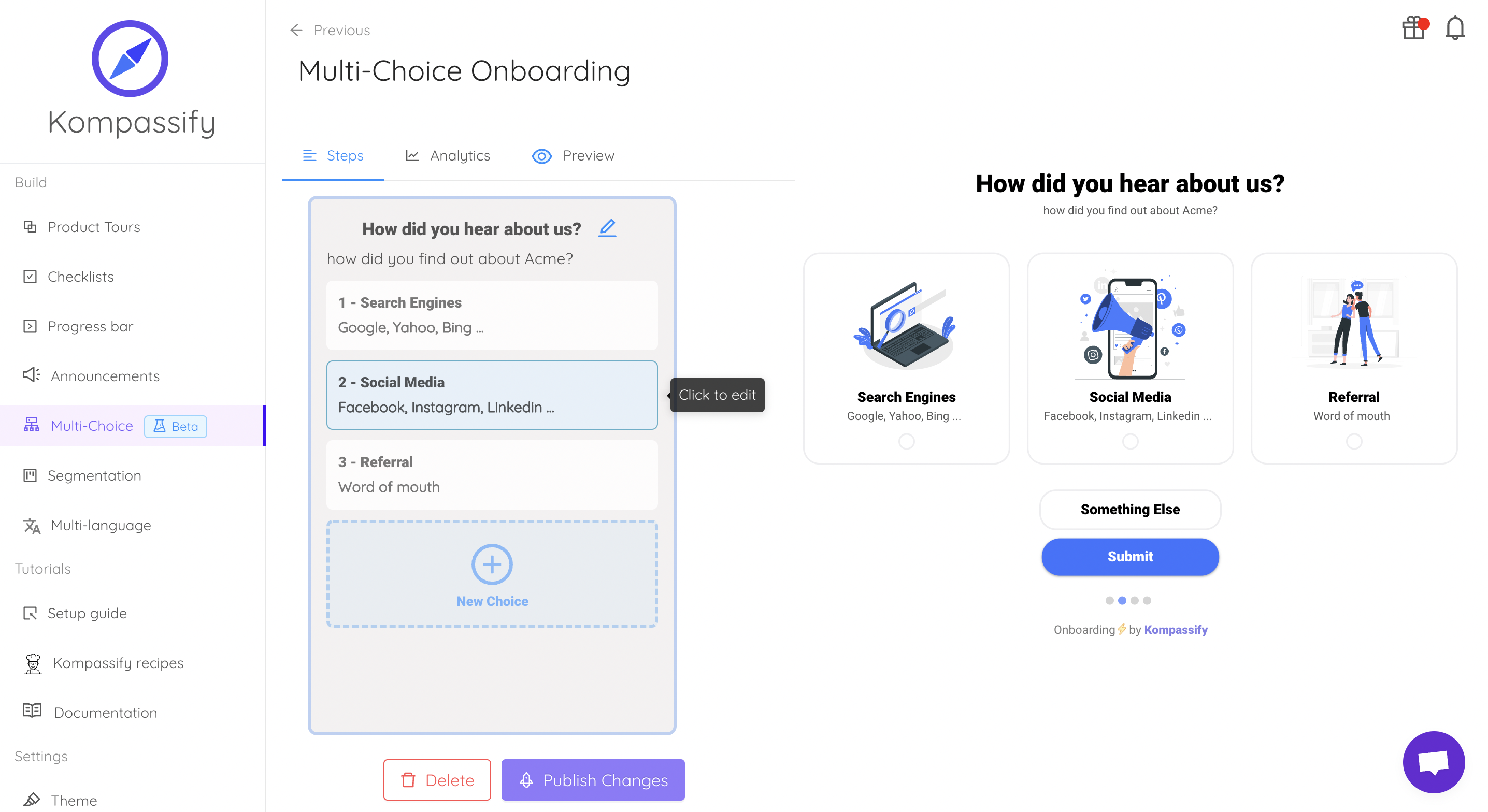
Same anchor targets, same overlay problem: solved once, outside the release cycle.
Keep the component. Skip the content pipeline.
Kompassify lets product and onboarding teams add tooltips, hotspots, checklists and guided tours to a React app without shipping a release for every copy change, targeted by segment, with adoption data on each one. Free up to 100 monthly active users, plans from $129/month, GDPR-compliant and EU-hosted.
Start for free →A Pre-Ship Checklist
Before the tooltip goes into the design system
- Opens on focus, not only on hover, verified with the keyboard alone
- Escape closes it and focus does not move
- Renders through a portal; tested inside a scrolling panel and a transformed ancestor
- Flips and shifts at all four viewport edges
- Correct relationship chosen: described, or labelled; and icon-only buttons still have a name
- No focusable content inside the bubble
- Something sensible happens on a coarse pointer
- Honours
prefers-reduced-motion, and passes contrast on its own background - Behaves when the trigger unmounts while open
The One-Sentence Version
A React tooltip is a trigger hook, a portal, a positioning pass and an ARIA relationship; build those four properly, borrow the geometry from a positioning library, and keep onboarding content out of the component entirely.
Frequently Asked Questions
How do you create a tooltip in React?
A production React tooltip has four parts. First, a trigger hook that opens on mouseenter and focus and closes on mouseleave, blur and Escape, with an open delay of roughly 150–300ms and a shorter close delay so pointer travel between trigger and tooltip does not dismiss it. Second, a portal, createPortal into document.body, so the tooltip is not clipped by an ancestor with overflow: hidden or trapped under a stacking context. Third, a positioning pass that measures the trigger and the viewport and flips or shifts the tooltip when it would overflow. Fourth, the ARIA wiring: a stable id from useId, aria-describedby on the trigger, and role="tooltip" on the bubble. Skipping the fourth part produces a tooltip that only sighted mouse users can read.
Why is my React tooltip cut off or hidden behind other elements?
Almost always because it is rendered inside an ancestor that clips or stacks it. Any ancestor with overflow: hidden, auto or scroll will crop a child positioned outside its box, and any ancestor with a transform, filter, backdrop-filter, will-change, contain or a non-auto opacity creates a containing block and a stacking context that no z-index on the tooltip can escape. The fix is not a larger z-index; it is to render the tooltip through createPortal into document.body, or into a top-layer popover, and position it with fixed coordinates measured from the trigger.
Should I use a library or write my own React tooltip?
Write the component, but do not write the geometry. Collision detection, flipping, shifting along the cross axis, arrow placement and keeping position in sync while ancestors scroll or resize is a genuinely hard problem that a positioning library solves better than a hand-rolled getBoundingClientRect pass. Owning the component keeps the markup, ARIA and styling under your control, which is where design systems need the flexibility. The exception is when the tooltip is not really a tooltip but onboarding guidance aimed at a specific user segment. That is content, not UI, and it should not be shipped through your release cycle at all.
How do you make a React tooltip accessible?
Decide first whether the tooltip is a description or a label. A description, extra detail about a control that already has a name, uses aria-describedby on the trigger pointing at a bubble with role="tooltip". A label, an icon-only button whose only text is the tooltip, needs aria-label or aria-labelledby instead, because a describedby relationship on a nameless control leaves the control unnamed. Beyond that: open on focus as well as hover, close on Escape without moving focus, never put interactive elements inside the bubble, and honour prefers-reduced-motion in the transition.
How do React tooltips work on touch devices?
They mostly do not, and that is the point. There is no hover on a touch screen, so a hover-only tooltip is invisible to a phone user, while naive tap-to-open handlers hijack the tap that was meant for the control underneath. The workable pattern is to detect the coarse pointer with a media query rather than user-agent sniffing, then either suppress the tooltip entirely and make sure the information also exists somewhere visible, or promote it to a tap-dismissible popover that does not swallow the trigger's own action. Anything essential should never live only inside a tooltip on any device.
What is the difference between a React tooltip and an onboarding tooltip?
A UI tooltip is a passive, user-invoked hint: it appears because someone hovered or focused a control, it describes that control, and it says the same thing to everyone. An onboarding tooltip is proactive guidance: it appears because a particular user has not done a particular thing yet, it is targeted by segment and sequenced with other steps, and it needs dismissal state, analytics and copy that changes weekly. Building the second on top of the first is where teams get stuck, because the hard parts are targeting, persistence and iteration speed rather than positioning, which is why product and onboarding teams usually configure those guides in a tool instead of shipping them through the front-end release cycle.