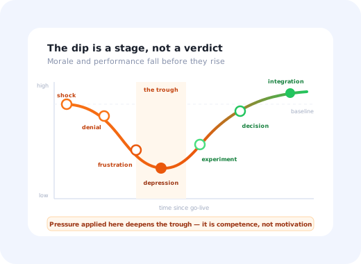
Four weeks after go-live, every rollout has the same meeting. Usage has fallen from its launch spike. The support queue has taken on a tone. Someone senior asks whether the tool was the right choice, and someone else suggests reopening the old system "just while we sort this out". The project is at its lowest point, and the decisions made in that room determine whether it recovers.
The change curve exists to make that meeting less dramatic. It says that a fall in morale and performance is not evidence of a bad decision: it is the normal shape of a group of competent people being temporarily made incompetent by something they did not choose. The curve goes down before it goes up, and the important questions are how deep, how wide, and how you avoid making both worse.
This guide covers the seven stages, what each one sounds like in a real support queue, how to measure the dip instead of arguing about it, and what actually shortens it. It sits alongside our change management guide and the software rollout plan.
Key Takeaways
- The dip is a stage, not a verdict. Performance falls before it rises because competent people are temporarily made new again.
- Plan for it as a schedule item. A rollout plan with no trough in it is a plan that will treat the trough as an emergency.
- Pushing harder at the low point deepens it. The trough is a competence problem, so pressure sends people back to where they are still competent.
- Measure depth, width and recovery ceiling. A curve that recovers to below its starting level is a failed rollout that looked fine.
- Segment the curve by team. The average hides the group that never came back up, which is the group that matters.
- Use the shape, not the grief vocabulary. The stages are a planning tool; telling people they are in denial is not a change strategy.
What the Change Curve Is and Where It Comes From
The Kübler-Ross change curve, in one paragraph
A model plotting morale and performance against time during a significant change, showing a decline through shock, denial, frustration and a low point, followed by a recovery through experiment, decision and integration. It is adapted from Elisabeth Kübler-Ross's 1969 research on responses to terminal illness, which described stages including denial, anger, bargaining, depression and acceptance. Change practitioners borrowed the shape for organisational change, where its value is predictive: it tells you the dip is coming, roughly when, and that it ends.
A note on the origin, because it matters. Kübler-Ross was writing about dying patients and their families, not about people learning a new expenses system. The transfer is a loose analogy, and it can sound crass if it is pushed hard: the loss of a familiar workflow is genuinely not comparable to bereavement, and staff notice immediately when a change programme implies otherwise.
What does transfer is narrower and still worth having: an imposed change produces a fairly predictable sequence of responses, capability drops before it recovers, and the worst moment is neither the beginning nor the end. Use the shape. Leave the clinical vocabulary out of your internal communications, and never tell a team they are "in denial"; it is the fastest way to convert an accurate observation into an argument.
One more caveat. The original stages were never claimed to be a fixed sequence everyone completes in order, and the workplace adaptation inherits that looseness. People skip stages, revisit them, and sit in two at once. Treat the curve as a description of a tendency, not a schedule.
The Seven Stages, and What They Sound Like
The most useful thing about the stages is that each has a recognisable signature in the support queue and in meetings, which means you can tell where a team is without running a survey.
😐 1. Shock
The announcement lands. Short, often quiet, and easy to mistake for acceptance. Performance dips slightly because attention has moved to what the change means personally.
"Is this definitely happening? When?"
🙈 2. Denial
People conclude it will not really apply to them, or that it will be delayed, scaled back or quietly dropped like the last one. Behaviour does not change at all. Attendance at optional sessions is low.
"That's for the new team, our process is different." · "They tried this in 2023."
😤 3. Frustration
Reality arrives. The new way is slower for someone who was fast, steps are missing, a report has vanished. This is where visible resistance appears, and where most projects mislabel it as attitude. Ticket volume peaks and tone sharpens.
"This takes four clicks and it used to take one." · "Who signed this off?"
📉 4. Depression: the trough
The lowest point: energy for the change is gone, usage sags, and people quietly revert to whatever still works. Notably, the support queue often goes quiet here, which is easily misread as improvement. It usually means people have stopped trying.
"I'll do it in the old system this once, the customer is waiting."
🧪 5. Experiment
The turn. People start genuinely trying the new way, mostly on low-risk work first. Questions become specific and practical rather than general and rhetorical, a reliable signal that the curve has bottomed out.
"How do I do a partial credit note in this?"
🧭 6. Decision
People work out how to be effective in the new system, develop their own shortcuts, and stop comparing everything to the old one. Performance climbs back towards baseline and, for some tasks, past it.
"Actually, saved views are better than what we had."
✅ 7. Integration
The new way stops being "the new system" and becomes how the work is done. Newcomers learn it without any reference to what came before. This is Lewin's refreeze, and it is where rollouts are won or quietly lost.
"…and then you raise it here." with no mention of the old tool at all.
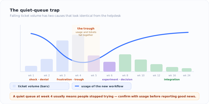
Each stage has a signature in the support queue, including a quiet trough that is easy to misread.
Measuring the Dip Instead of Arguing About It
The curve is usually drawn with an unlabelled y-axis, which is why it gets used rhetorically. Give it three real numbers and it becomes a management tool.
How far weekly completion of the target workflow falls below its pre-change baseline at the worst point. If you never measured the baseline, you cannot measure the dip; capture it before go-live.
Weeks from go-live until completion returns to baseline. This is the number to reuse when planning the next rollout, and it is specific to your organisation.
Where it settles. Recovering to 80% of the old throughput is a failed rollout with a reassuring shape, and it is invisible unless you look past the point where the line stops falling.
Then segment. The organisation-wide curve is an average, and averages hide the case that matters: one team that never recovered, pulled up by three that did. Break the curve down by team, role and location, and look specifically for a segment whose line is still flat when everyone else's has turned. A per-segment view of adoption analytics makes that obvious in a way that a project status report never will, and our guide to user segmentation covers how to cut the population sensibly.
The quiet-queue trap. Support volume falling is the most commonly misread signal in a rollout. It has two possible causes: people have learned the system, or they have stopped using it, and they look identical from the helpdesk. Always confirm with usage data before reporting an improvement.
What Actually Shortens the Trough
The dip cannot be eliminated; learning has a cost. It can be made shallower and narrower, and the interventions that work all share one property: they reduce the cost of being new, rather than increasing the pressure to move.
1. Put help where the hesitation is
Training delivered three weeks before go-live addresses a moment of confusion that has not happened yet. By the time it does, the material has gone. Guidance that appears on the actual screen at the actual step (a walkthrough for the first run of a task, a tooltip on the field everyone asks about) is the single most effective way to flatten the frustration stage, because it removes the gap between getting stuck and getting unstuck. Our guides to product tours and tooltips cover the mechanics.
2. Sequence an easy win before the hard migration
If the first thing anyone does in the new system is the most complex thing it does, the trough starts on day one and starts deep. One genuinely useful task that is faster than before, guided, in the first session, changes the story people tell each other in week two.
3. Name the dip in advance
Telling people beforehand that weeks two to five will be slower, that this is expected, and that they are not being measured on it during that window removes an enormous amount of anxiety. Unnamed, the same experience is interpreted as personal failure or as proof the tool is bad. Named, it is a phase with an end date.
4. Answer specific questions fast
In the experiment stage, questions get concrete, and a concrete question that waits two days for a ticket response sends someone back to the old system. A searchable knowledge base available from inside the application, plus champions who can answer directly, matters more here than at any other point in the curve.
5. Fix the things frustration surfaces
Stage three complaints are the highest-quality product feedback the rollout will ever generate, because they come from people doing real work under real pressure. Triage them as defects first and attitude second, and visibly ship a few fixes: nothing shortens frustration faster than evidence that complaining produced a change.
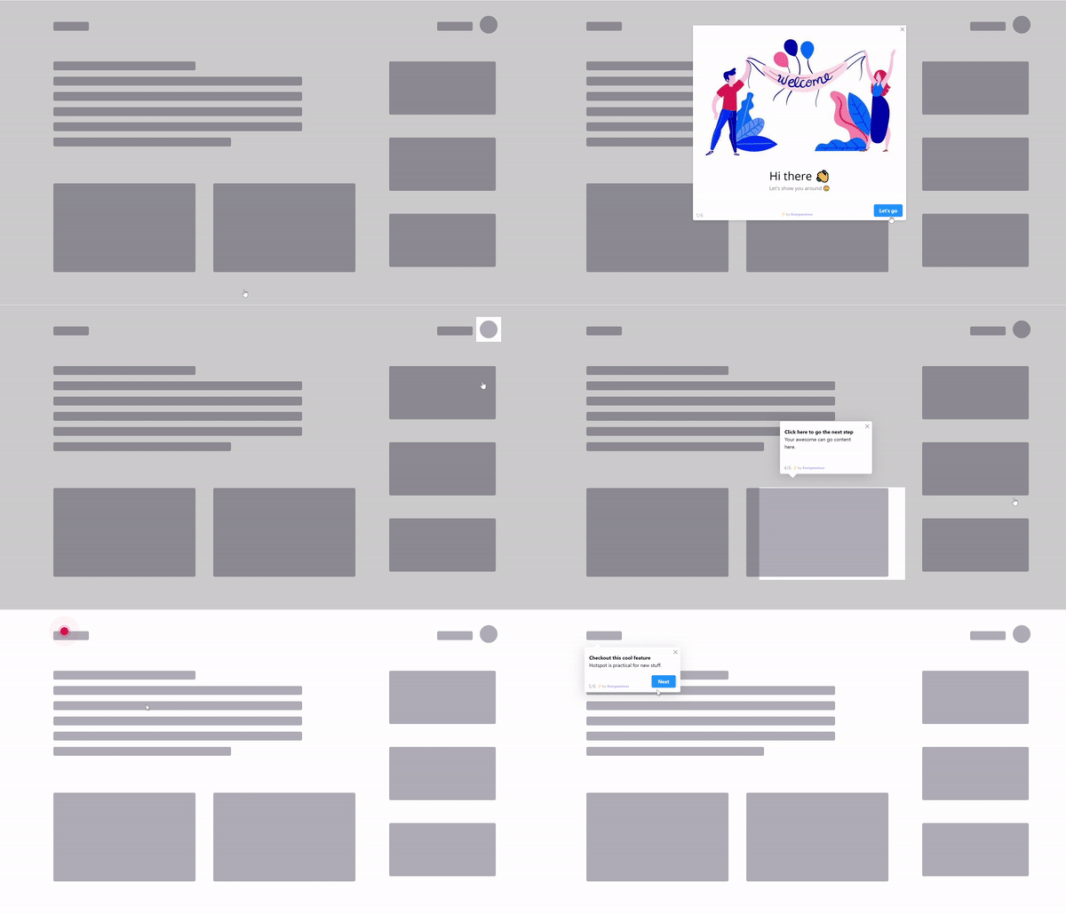
Shortening the dip means closing the gap between getting stuck and getting unstuck.
The Four Ways Teams Make the Dip Worse
- Escalating during the trough. Pressure applied to a competence problem produces reversion, because the old system is where people are still good at their jobs.
- Reopening the old system "temporarily". It resets the curve to stage two for everyone, including the people who had reached stage five, and the second attempt is always harder.
- Declaring success at the launch spike. The peak on day one is curiosity and compliance. The number that matters arrives six to twelve weeks later.
- Withdrawing support when the queue goes quiet. Quiet is a trough signal at least as often as it is a recovery signal.
Not Everyone Is on the Same Point of the Curve
The curve is drawn as one line, which hides its most practical implication: at any moment your population is spread across several stages at once, and each stage needs a different intervention. Champions may be in integration while a back-office team is still in denial, and a single organisation-wide message will be wrong for most of them.
| Where the group is | Observable signal | What to send them |
|---|---|---|
| Denial | No logins, no tickets, no attendance | A concrete, personal message showing their own screen and their own date |
| Frustration | Ticket spike, sharp tone, workaround requests | Fixes for what they named, plus in-app help at the exact steps they abandon |
| Trough | Usage falling, tickets falling together | Guided first tasks, direct outreach, explicit permission to be slower |
| Experiment | Specific how-do-I questions | Fast, contextual answers and advanced tips, not beginner material |
| Integration | Steady usage, no comparisons to the old tool | Nothing, except recruiting them to help the groups behind them |
Sending the right message to each group means targeting by behaviour rather than by department, which is exactly what behavioural triggers are for: show the beginner walkthrough only to people who have not completed the task once, and the advanced tip only to people who have.
Where the Curve Fits Among the Other Models
The change curve is descriptive rather than prescriptive: it tells you what people are feeling and roughly when, but not what to do. That is why it works best alongside a model that does.
| Model | What it tells you | Use it when |
|---|---|---|
| Change curve | What people are experiencing, and that it will pass | You need to explain the trough and decide when to hold your nerve |
| Lewin | Which stage of the project you are in | The plan has no unfreeze or no refreeze |
| Kotter | What to do next, in sequence | You are planning or auditing the programme |
| ADKAR | Which specific element an individual is missing | One group is stuck and you need to know why |
A common and effective pairing: use the curve to hold the room steady during the trough, and ADKAR to work out whether a particular team is stuck on desire or on ability, because those two look identical from the outside and need completely different responses.
Make the trough shallower
Kompassify puts guided tours, checklists and contextual tooltips inside the application you are rolling out (no engineering time) and shows exactly where users stop, so help arrives at the moment of hesitation and you can see the curve turn instead of guessing. Free up to 100 monthly active users, plans from $129/month, GDPR-compliant and EU-hosted.
Start for free →The One-Sentence Version
The change curve says performance falls before it rises, so the useful response to the week-four trough is not more pressure or a reopened legacy system but cheaper help, an easier first win, and the patience to check usage rather than mood.
Frequently Asked Questions
What is the Kübler-Ross change curve?
The Kübler-Ross change curve plots morale and performance over time during a significant change, showing that both fall before they rise. It is adapted from Elisabeth Kübler-Ross's 1969 work on how people respond to terminal illness and bereavement, which described stages including denial, anger, bargaining, depression and acceptance. Change practitioners later applied the shape to organisational change, usually as seven stages: shock, denial, frustration, depression, experiment, decision and integration. Its practical value is that it turns the post-launch dip from an alarming surprise into an expected phase you can plan around.
What are the stages of the change curve?
Most workplace versions use seven. Shock: the announcement lands and performance briefly drops. Denial: people assume it will not really apply to them or will be reversed. Frustration: reality arrives, the new way is slower, and irritation surfaces. This is where visible resistance appears. Depression: the low point, where energy for the change is at its lowest and reversion is most likely. Experiment: people begin trying the new way properly. Decision: they work out how to be effective in it. Integration: the new way becomes normal and stops being noticed.
How long does the productivity dip last in a software rollout?
There is no universal number, and anyone quoting one is guessing. What you can do is measure your own: track weekly active use of the new workflow and the time it takes to complete the target task, then record how many weeks pass before both return to their pre-change baseline. Do that once and you have a planning figure for the next rollout in the same organisation, which is far more useful than a benchmark from a different company with a different system and different users.
Is it valid to apply a grief model to software adoption?
Partly, and it deserves care. Kübler-Ross wrote about dying patients, not people learning a CRM, and the comparison can sound tasteless if it is pushed too far: losing a colleague and losing a familiar spreadsheet are not the same order of experience. What transfers is narrower and still useful: a change imposed on someone produces a predictable sequence of responses, performance falls before it recovers, and the low point is a stage rather than a permanent judgement. Use the shape, keep the vocabulary practical, and do not tell people they are grieving.
Why does pushing harder during the dip make it worse?
Because the trough is caused by competence loss, not by insufficient motivation. Someone who was good at their job is temporarily worse at it while learning a new system, and additional pressure at that moment adds anxiety to a workload that is already harder than usual. The result is faster reversion to the old method, since the old method is where they are still competent. The interventions that shorten the dip all reduce the cost of being new: help at the moment of confusion, easy tasks first, fast answers, and explicit permission to be slower for a period.
How do you measure the change curve?
Use three numbers. Depth: how far weekly usage or task completion falls below the pre-change baseline at its worst. Width: how many weeks pass before it returns to baseline. Recovery ceiling: whether it settles above, at, or below where it started. A rollout that recovers to 80 percent of the old level has not succeeded, however smooth the curve looked. Segment all three by team, because the average curve hides the group that never came back up.
How does the change curve relate to Lewin's model?
The change curve describes what people experience during Lewin's middle stage. Lewin says change has three stages: unfreeze, change, refreeze. And the curve zooms into the second one to show that it has an emotional shape of its own. The two are complementary: Lewin tells you which stage of the project you are in, and the curve tells you what the people inside stage two are going through and when to expect the low point.
What is the difference between the change curve and ADKAR?
The change curve is descriptive: it tells you what a person is feeling and roughly when. ADKAR is diagnostic: it tells you what is missing and therefore what to fix. They pair well because the curve explains why a group is stuck without saying what to do, and ADKAR names the barrier: someone in the frustration stage usually lacks Desire or Ability, and knowing which one determines whether the answer is a conversation or a guided walkthrough.