Every product team has the same arithmetic problem. The backlog holds two hundred items. The next quarter holds capacity for maybe twelve. Sales wants the enterprise permissions work, support wants the bulk-edit screen that would kill a third of their tickets, the CEO saw a competitor demo on Tuesday, and three of your largest accounts have asked for the same integration in different words.
Feature prioritization is how that gets resolved without the answer defaulting to whoever spoke last or loudest. It is not a spreadsheet ritual; it is the mechanism that converts opinions into a decision the team can defend three months later when someone asks why the integration slipped.
This guide covers what prioritization actually decides, the seven frameworks worth knowing, how to build a scoring matrix your team will trust, and how to choose the right method for the decision in front of you.
Key takeaways
- Prioritization is a sequencing decision, not a quality judgement: a good idea ranked tenth is still a good idea.
- A value versus effort matrix filters a large backlog fast; RICE ranks a shortlist defensibly. Most teams need both.
- Every framework is only as honest as its inputs: reach and impact numbers must come from analytics and research, not from the room.
- Confidence is the most useful term in any scoring model, because it exposes which estimates are actually guesses.
- Scoring in public is what neutralizes stakeholder politics; a private spreadsheet does not.
- Prioritizing well decides what ships. Announcement and in-app guidance decide whether it gets used.
What feature prioritization actually is
Feature prioritization, defined
Feature prioritization is the process of deciding which features to build next, and in what order, when demand exceeds engineering capacity. It scores each candidate against agreed criteria (typically how many users it reaches, how much it moves a goal, how confident you are in those estimates, and what it costs to build) and turns an unordered backlog into a sequenced roadmap.
Two things follow from that definition, and both are routinely missed.
First, prioritization ranks, it does not reject. A feature that scores tenth is not a bad feature. It is a feature whose turn has not come. Teams that treat the exercise as a verdict on quality end up with stakeholders who fight the process instead of feeding it, because being ranked low feels like being told no.
Second, prioritization is only as good as what enters it. A scoring model applied to a backlog of vague feature titles produces confident-looking nonsense. "Better reporting" cannot be scored. "Account admins cannot export last month's usage without asking support, which generates roughly forty tickets a month" can. Turning raw requests into problem statements of that kind is upstream work; our guide to collecting and triaging feature requests covers that pipeline in detail, and it is worth having in place before you pick a framework.
Prioritization frameworks only work on well-framed candidates; the funnel does the heavy lifting before any scoring happens.
Why roadmap decisions go wrong
Before reaching for a framework, it helps to know which failure you are trying to fix. There are four common ones, and they call for different remedies.
-
The loudest voice wins
The roadmap tracks organizational seniority rather than user value. The fix is not a better spreadsheet; it is making the criteria explicit and scoring where everyone can see it, so the discussion moves from who is asking to what the evidence says.
-
The last big deal wins
One enterprise prospect asks for something in a late-stage call and it jumps the queue. Sometimes that is genuinely correct. It becomes a problem when nobody records the trade: which three items moved down, and what that cost.
-
Effort is systematically underestimated
Features are scored before engineering has looked at them, so "small" items expand mid-sprint and the sequence collapses. Any model with an effort term needs that term supplied by the people who will build it.
-
Shipping is mistaken for finishing
The feature is built, merged, and then quietly ignored by users. Prioritization decided it was worth building; nothing decided that anyone would find it. This is the most expensive failure of the four, because the cost is already sunk.
Worth naming early: a framework cannot fix a political problem it is not allowed to see. If scores are computed privately and presented as conclusions, stakeholders will simply argue with the conclusions. Scoring sessions work when the people who care about the outcome are in the room while the numbers go in.
The 7 feature prioritization frameworks worth knowing
There are dozens of published frameworks. In practice, seven cover almost every real decision, and they divide neatly into three jobs: filtering a big list, ranking a shortlist, and understanding what users actually value.
1. Value vs effort matrix
Plot everything on two axes and read the quadrants. Fastest way to make trade-offs visible in a room. Low precision, very high throughput.
2. RICE
Reach × Impact × Confidence ÷ Effort. The default when several teams compete for the same engineers and the ranking has to be defensible.
3. ICE
Impact × Confidence × Ease, each 1–10. RICE with the paperwork removed. Good for early-stage teams and rapid triage.
4. MoSCoW
Must, Should, Could, Won't. Not a ranking model: a scoping model for a fixed release or a fixed date.
5. Kano model
Separates features that delight from features whose absence merely annoys. Answers "which of these actually creates satisfaction?"
6. Opportunity scoring
Ask users how important an outcome is and how satisfied they are with it today. The gap is the opportunity. Customers set the agenda, not stakeholders.
7. WSJF
Cost of delay ÷ job size. Built for release trains and dependency-heavy work where waiting has a measurable price.
1. The value vs effort matrix
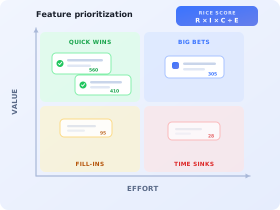
The workhorse. Draw two axes (value to the user or business on one, engineering effort on the other) and place every candidate. The four quadrants tell you what to do without any arithmetic.
The matrix is a filter, not a ranking. Its job is to remove the bottom-right quadrant from the conversation entirely.
Its weakness is precision. "High value" hides an enormous range, and two features in the same quadrant may differ tenfold in actual return. Use it to cut a backlog of sixty down to twenty, then rank those twenty with something arithmetic.
2. RICE
RICE is the most widely used scoring model in SaaS product teams, because it forces the four questions that matter into separate boxes instead of letting them blur into one gut feeling.
| Term | What it measures | Typical scale | Where the number comes from |
|---|---|---|---|
| Reach | How many users or accounts this touches in a fixed period | Actual count per quarter | Product analytics: how many users hit that screen or flow |
| Impact | How much it moves the goal for each user reached | 3 = massive, 2 = high, 1 = medium, 0.5 = low, 0.25 = minimal | Research, past experiments, comparable releases |
| Confidence | How much you trust the three numbers above | 100% = high, 80% = medium, 50% = low | Honest assessment of evidence quality |
| Effort | Total work across design, engineering and QA | Person-months | Engineering, never the person proposing the feature |
A worked example. Two candidates compete for the same sprint capacity:
| Feature | Reach | Impact | Confidence | Effort | RICE score |
|---|---|---|---|---|---|
| Bulk edit on the records screen | 1,400 | 1 | 80% | 2 | 560 |
| Custom dashboard themes | 3,000 | 0.25 | 50% | 3 | 125 |
Themes reach more than twice as many users, which is exactly why they felt like the obvious choice in the room. Splitting reach from impact is what exposes the difference: a change that half of the affected users barely notice, estimated with low confidence and costing more to build, loses to a narrower change that removes real work from a smaller group.
The confidence term is the one to protect. Teams under pressure drift toward entering 100% everywhere, at which point RICE degenerates into value-over-effort. A useful house rule: confidence above 80% requires a named piece of evidence (an experiment, a support-ticket count, a research session) recorded next to the score.
3. ICE
ICE scores Impact, Confidence and Ease from 1 to 10 and multiplies them. There is no reach term and no person-month estimate, which makes it far quicker and correspondingly cruder. It suits early-stage teams where the whole product has one user segment, and it suits fast triage sessions where the goal is to sort thirty items into rough tiers in twenty minutes.
The trap is scale drift. Without anchors, everything converges on sevens and eights. Write down what a 3, a 5 and a 9 mean for each term before the first session, and keep that legend visible.
4. MoSCoW
MoSCoW sorts work into Must have, Should have, Could have, and Won't have this time. It is not a ranking model and does not pretend to be; it answers a different question: given this fixed release or this fixed date, what is genuinely non-negotiable?
It is the right tool for a launch scope, a migration, or a compliance deadline. It is the wrong tool for an open-ended quarter, because everything becomes a Must within about a week. The discipline that makes it work is capping the Must category, commonly at around 60% of available capacity, so the deadline survives the first surprise.
5. The Kano model
Kano asks a question the arithmetic models cannot: what kind of satisfaction does this feature produce? Some features delight when present and are not missed when absent. Others are invisible when present and infuriating when absent: nobody praises a working password reset. Treating those two categories identically leads to over-investment in table stakes and under-investment in the things people actually talk about.
Kano is a survey-driven method with a specific question format and a categorization table. We cover it fully in the Kano model guide, including how to run the survey and read the results. Use it as an input to a scoring model rather than a replacement for one: Kano tells you what a feature is, RICE tells you when to build it.
6. Opportunity scoring
Opportunity scoring, which comes out of outcome-driven innovation, flips the source of authority. Rather than asking stakeholders to estimate impact, it asks users two questions about each desired outcome: how important is this to you, and how satisfied are you with how it works today. Both on a 1–10 scale.
Outcomes that are important and poorly served rise to the top; outcomes that are important and already handled well drop out, which is the useful part: it stops teams polishing what already works. The method pairs naturally with jobs-to-be-done, since it needs outcomes phrased as jobs rather than as features. The practical constraint is that it requires real responses from real users; in-app surveys triggered on the relevant screen are the cheapest way to collect them at sufficient volume.
7. WSJF (weighted shortest job first)
WSJF divides cost of delay by job size, where cost of delay combines user and business value, time criticality, and risk reduction or opportunity enablement. It comes from scaled-agile practice and it earns its keep in one specific situation: when waiting has a measurable price, such as a regulatory date, a partner launch, or a dependency that blocks three other teams.
For a single product team shipping continuously, WSJF is usually more machinery than the decision warrants. RICE captures most of the same signal with fewer terms to argue about.
How to build a prioritization matrix in five steps
The framework is the easy part. What determines whether prioritization sticks is the process around it. Here is the sequence that works, whichever model you land on.
- Agree the goal the scores serve
- Turn requests into scoreable problem statements
- Source each input from the right place
- Score together, in one session, in public
- Publish the scores next to the roadmap
1. Agree the goal the scores serve
"Impact" is meaningless without a target. Impact on what: activation, expansion revenue, support load, retention? A feature that is a 3 for activation may be a 0.25 for expansion. Fix the goal for the scoring round first, and say it out loud: this quarter we are scoring for activation. If your team already runs on a north star metric, that is the natural anchor.
2. Turn requests into scoreable problem statements
Each candidate needs four things before it can be scored: the segment affected, the job they are trying to do, the evidence that it is a problem, and a rough count of how many users hit it. Requests that cannot be written this way are not ready; they go back for research, not into the model. This step removes more bad decisions than the scoring itself.
3. Source each input from the right place
Reach comes from analytics, not from memory. Effort comes from engineering, not from the requester. Impact comes from research and from what comparable past releases actually did. Confidence comes from an honest look at how thin the other three are. When one person supplies all four numbers, the model is just their opinion wearing a formula.
4. Score together, in one session, in public
Put product, engineering, design, support and sales in one room, or one call, and score live. Disagreements about a number are the valuable part of the meeting, because they surface assumptions that would otherwise stay buried until the sprint review. Timebox each item to two or three minutes; if a score cannot be agreed in that window, the item lacks evidence and belongs in step two.
5. Publish the scores next to the roadmap
This is the step teams skip, and it is the one that ends the politics. When anybody can see that their request scored 90 and the one above it scored 560, and can see which term drove the gap, the conversation becomes "our reach number looks wrong, here is why", which is a conversation worth having. A hidden spreadsheet invites people to route around the process entirely.
Which framework should you choose?
Match the tool to the decision rather than adopting one method for everything. In practice most teams run two: something fast to filter, something arithmetic to rank.
| Your situation | Use this | Why |
|---|---|---|
| Backlog of 100+ items, need a shortlist by Friday | Value / effort matrix | Highest throughput; makes trade-offs visible instantly |
| Several teams competing for the same engineers | RICE | Separates reach from impact; the ranking is defensible |
| Small team, one segment, weekly triage | ICE | Same shape as RICE at a fraction of the overhead |
| Fixed launch date or fixed release scope | MoSCoW | Answers "what is non-negotiable", which ranking models do not |
| Unsure which features users actually care about | Kano + opportunity scoring | Moves the input from stakeholder opinion to user evidence |
| Hard external deadlines and cross-team dependencies | WSJF | Prices the cost of waiting, which other models ignore |
One caution about switching. Changing framework mid-year resets everyone's intuition for what a good score looks like, and the first two rounds after a switch are usually noise. If the current model is producing defensible decisions, the marginal gain from a more sophisticated one is smaller than the cost of relearning it.
Where the input data actually comes from
Every framework above consumes the same four raw materials. Knowing where each one lives is what separates a scoring session that takes an hour from one that takes a week.
-
Reach: product analytics
How many users reached the screen, started the flow, or hit the error in the last quarter. Kompassify's product analytics tracks flows and feature usage inside your app, so reach numbers come from behaviour rather than from an estimate.
-
Importance and satisfaction: in-app surveys
Opportunity scoring needs both numbers from users. A two-question micro-survey triggered on the relevant screen collects them at far higher response rates than email. See the in-app surveys guide for question design and trigger timing.
-
Evidence of pain: support tickets and friction data
Ticket volume by topic is the most under-used prioritization input available, because it is already quantified. Pair it with the four types of user friction to distinguish friction worth removing from friction doing a job.
-
Candidate list: a triaged request pipeline
Requests arrive through sales calls, support, churn interviews and the roadmap portal, each with its own bias. The feature requests guide covers how to normalize them before they reach the model.
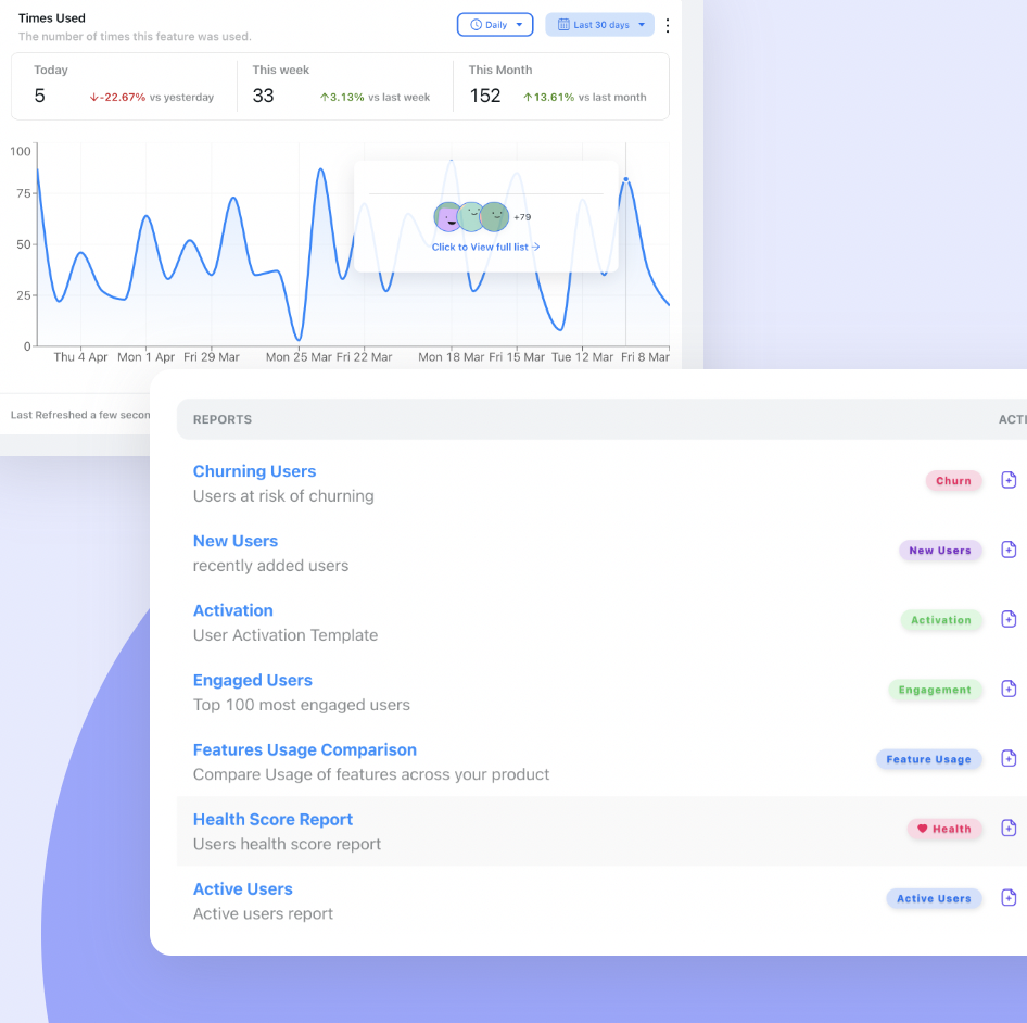
Reach is a measurement, not an estimate; usage reports turn “how many users does this touch?” into a number you can defend in a scoring session.
Prioritizing well is only half the job
Here is the failure that no scoring model catches. A feature scores 560, wins the quarter, ships on time, works exactly as designed, and three months later analytics show that a small fraction of the users it was built for have ever opened it.
The score was not wrong. The reach number was real. What was missing is that reaching a screen and discovering a new capability on that screen are different events. Research cited across the industry consistently finds that a large share of shipped software features go unused, and the most common reason is simply that users never knew they existed.
The practical consequence for prioritization is that the adoption work belongs inside the effort estimate, not after it. When you score a feature at two person-months, that estimate should include the announcement, the in-app guidance, and the instrumentation that will tell you whether it landed. Three things to build in:
- An announcement plan. Who gets told, through which channel, and when. Our guide to announcing a new feature covers the sequencing and copy.
- In-app guidance at the point of use. A tooltip or short product tour shown to the segment the feature was built for, triggered when they reach the relevant screen, not a global modal on next login.
- An adoption definition agreed in advance. Not "did anyone click it" but "did the target segment use it twice in two weeks". The feature adoption guide covers the metrics and how to read them.
A useful reframe: a feature is not done when it merges, it is done when the users it was prioritized for are using it. Teams that adopt that definition tend to prioritize differently: fewer big bets, more attention to whether the last three releases actually landed before starting the fourth.
See whether your prioritized features actually get adopted
Kompassify lets you announce new features in-app, guide the right segment to them with tours and tooltips, and measure adoption, without writing code. Free for up to 100 monthly active users, paid plans from $129/month, GDPR-compliant and EU-hosted.
Start for freeCommon feature prioritization mistakes
✓ Do this
- Fix the goal before scoring: impact on what?
- Take reach from analytics and effort from engineering
- Keep confidence honest; require evidence above 80%
- Score live, with the stakeholders in the room
- Publish scores alongside the roadmap
- Re-score quarterly: reach and effort both drift
- Count announcement and guidance inside the effort estimate
✗ Avoid this
- Scoring vague titles like "improve reporting"
- Letting the requester estimate their own effort
- Entering 100% confidence by default
- Treating a low rank as a rejection
- Changing framework every other quarter
- Filling a quarter with low-effort fill-ins because they are easy
- Declaring a feature finished the day it merges
Frequently asked questions
What is feature prioritization?
Feature prioritization is the process of deciding which features to build next, and in what order, when demand exceeds engineering capacity. It turns an unordered backlog of requests, ideas and bugs into a sequenced roadmap by scoring each candidate against agreed criteria such as reach, business impact, confidence in the estimate, and the effort required to build it.
What is the RICE scoring model?
RICE scores each feature on four factors: Reach (how many users it affects in a given period), Impact (how much it moves the goal per user, usually on a 0.25 to 3 scale), Confidence (a percentage reflecting how sure you are of the first three numbers), and Effort (person-months of work). The score is Reach × Impact × Confidence ÷ Effort. A higher score means more expected value per unit of work.
What is the difference between RICE and ICE?
ICE is the lighter version. It scores Impact, Confidence and Ease on a 1 to 10 scale and multiplies them, with no explicit reach term and no effort estimate in person-months. ICE is faster and works well for early-stage teams or quick triage sessions. RICE separates reach from impact and forces a real effort estimate, which makes it more defensible when several teams are competing for the same engineers.
Which feature prioritization framework should I use?
Match the framework to the decision. Use a value versus effort matrix for a fast, visual first pass on a large backlog. Use RICE when you need a defensible ranking across competing teams. Use MoSCoW when you are scoping a fixed release or deadline. Use the Kano model when you need to know which features delight rather than merely satisfy. Use opportunity scoring when you want customers, not stakeholders, to set the agenda. Most teams end up combining two: one to filter, one to rank.
What is a feature prioritization matrix?
A feature prioritization matrix is a two-axis grid, most commonly value against effort, on which every candidate feature is plotted. It produces four quadrants: quick wins (high value, low effort), big bets (high value, high effort), fill-ins (low value, low effort) and time sinks (low value, high effort). It is the fastest way to make trade-offs visible to a room of stakeholders, though it is a filtering tool rather than a precise ranking tool.
How do I stop the loudest stakeholder from setting the roadmap?
Make the criteria explicit and score in public. When a request is written up as a problem statement with a reach number, an impact estimate and a confidence level, the discussion shifts from who is asking to what the evidence says. Two habits help most: require every request to name the user segment and the job it serves, and publish the scores alongside the roadmap so anyone can see why a feature ranked where it did.
Does prioritizing a feature well guarantee it will be used?
No. Prioritization decides what gets built; adoption is a separate problem. A large share of shipped features go unused, usually because users never discover them. Plan the announcement, the in-app guidance and the adoption measurement as part of the feature, not as an afterthought once it ships.