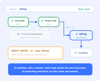
A multi-step form looks like the easiest component a front-end team will build this quarter. An array of screens, a number that goes up, a Next button. Two hours, generously.
Then the questions start. What happens when someone presses the browser's Back button, because they will, constantly, and right now it takes them off the page and deletes everything. What happens on refresh. What happens when step three only applies to teams over ten people. What happens to the 43% of people who abandon the flow and come back tomorrow. What a screen reader user hears when the screen changes, which today is nothing at all.
None of these are edge cases; they are the normal life of a form that spans more than one screen. This guide builds the version that answers all five, then lists what stays hard afterwards.
Key Takeaways
- A machine, not a counter. Each step names its own successor, so branching and Back stop being special cases.
- One form object, per-step validation. Validate on the way forward only, never on the way back, never all at the end.
- The URL owns the step. It is what makes Back, Forward, refresh and shareable links work without any code.
- Guard the step you land on. If the URL says step 4 and the answers do not support it, redirect to the furthest reachable step.
- Version and expire saved drafts. A restored draft from an older schema produces errors nobody can debug.
- Move focus and announce the change. A progress bar tells a screen reader user nothing.
What a Multi-Step Form Actually Has to Do
The specification, before any code. A multi-step form that ships into a real product has to:
- hold one set of answers, not one per screen;
- decide the next step from the answers so far, not from
index + 1; - validate the current step before advancing, and never when going back;
- survive the browser's Back and Forward buttons and a hard refresh;
- refuse to be deep-linked into a step the answers do not support;
- let somebody who left on Tuesday come back on Thursday to the same step;
- tell assistive technology that the screen changed, and put focus somewhere sensible;
- submit once, atomically, and survive a failure without losing the answers.
The refactor from the left box to the right one is expensive; starting on the right is free.
1. The Step Machine
Model the flow as data. Each step knows its own name, which slice of the schema it owns, and which step follows it, given the answers so far.
pathFor() is the function that pays for the whole design. Because the flow is data, you can
replay it at any moment to answer three questions that are awkward in an index-based form:
which steps will this user actually see (the progress indicator),
is the step in the URL reachable (the deep-link guard), and
where does Back go (the previous entry in the path, not step - 1).
2. One Schema, Validated a Slice at a Time
The two common failures are opposites of each other, and both cost completions.
Validating everything on the final step means a user fills four screens, presses Submit, and is thrown back to screen one over a mistyped email. Validating on the way backwards means a user trying to correct an answer is blocked by errors about the screen they are leaving, which reads as the form refusing to let them fix their mistake.
The rule is simple: forward validates, backward never does.
aria-describedby, turns a silent failure into an explanation.
3. The URL Is the Source of Truth
If the current step lives only in useState, the browser's Back button leaves the page. The
user loses six answers, and files it as a bug, correctly, because every other multi-screen thing
on the web works the way they expected.
Putting the step in the route fixes Back, Forward, refresh and shareable links in one move, with no code for any of them:
Two details matter more than they look. goBack delegates to the browser rather than
computing a previous step, so the in-app Back button and the browser's own button can never disagree.
And the guard is not decoration: without it, anyone can type ?step=confirm and skip every
validation you wrote. Recomputing the furthest legitimate step from the answers, on every render, is
cheap and closes that hole permanently.
4. Resume: The Users Who Leave
Long forms are abandoned mid-way as a matter of routine: a meeting starts, a card is in the other room, a colleague has the VAT number. Whether those people come back is largely decided by whether the form remembers them.
Four rules make the difference between a resume feature and a support queue:
-
Version the payload
A draft written against last month's schema restores fields that no longer exist and misses ones that now do. The user sees validation errors on a screen they have not touched. Discard on a version mismatch; it is a two-line check that removes an entire class of bug report.
-
Expire it
A six-week-old half-finished form is not a returning user, it is noise, and quite possibly a different person on a shared machine.
-
Never persist credentials or card details
Strip them explicitly on the way in, rather than trusting that nobody will add a sensitive field later. For signed-in flows, prefer the server: a draft that follows the user to another device is strictly better, and it never sits in a shared browser.
-
Ask before restoring
Dropping somebody into step three of a form they do not remember starting is disorienting. "You have an unfinished signup. Continue, or start over?" costs one small dialog and removes the confusion entirely.
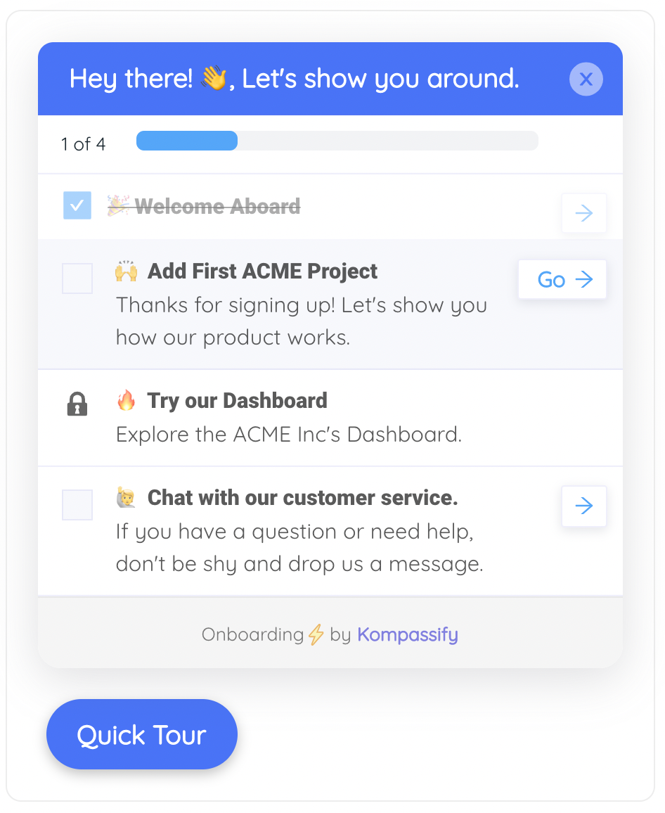
Progress that survives leaving the page is what turns an abandoned form into a completed one.
5. The Transition Is the Accessibility Problem
Everything a single-screen form needs still applies: labels, associated errors, no colour-only signalling. What is specific to a multi-step form is the moment the screen changes, and by default nothing about it is communicated at all.
Three things are happening there. Focus moves to the new heading, so the next Tab starts at the top of the new step rather than at the top of the document. The live region says what changed, which is the only way a screen reader user learns there was a transition. And the visual stepper is hidden from assistive technology, because it would otherwise be read as a meaningless list of numbers immediately after the live region already said the same thing more clearly.
The visible indicator still matters for everyone else; how you shape it, and why an accurate one beats an optimistic one, is covered in our guide to onboarding progress bars.
What Stays Hard After It Works
| Problem | Why it is hard | What usually works |
|---|---|---|
| A branch invalidates an earlier answer | Changing team size from 20 to 1 leaves invite addresses that no longer belong to any step | Clear the fields owned by steps that leave the path, on every branch recomputation |
| Submitting twice | A slow network plus an impatient double-click creates two accounts | An idempotency key generated when the flow starts, and a disabled button that only re-enables on failure |
| Server-side validation errors | The API rejects a field collected three steps back, and the user is on the last screen | Map field names to step ids, jump to that step, and say what was wrong, never a generic banner |
| Analytics | Every step is a drop-off point, and an aggregate completion rate tells you nothing about which one | Emit a step-viewed and step-completed event per step; the gap between them is the funnel |
| Deciding how many steps | Not a code problem: every field costs completions, and no component fixes an over-long form | Cut fields first, then split what remains; ask for the rest later, once the product has earned it |
That last row is the one with the largest effect on completion, and it is the one no amount of React will help with. Asking for less up front and collecting the rest gradually is progressive profiling, and the anatomy of the flow that surrounds this component is in our guide to SaaS signup flows.
A Multi-Step Form Is Not an Onboarding Wizard
They look the same (steps, a progress bar, Next and Back) and they are governed by completely different rules.
| Multi-step form | Onboarding wizard | |
|---|---|---|
| Purpose | Collect data the product cannot work without | Teach, configure, or get the user to a first result |
| Optional? | No, there is no product without the answers | Yes, and it must be skippable without penalty |
| Same for everyone? | Yes, for anyone who reaches it | No, it varies by role, plan and segment |
| Changes how often | When the data model changes, rarely | Whenever the product or the messaging changes, constantly |
| Success is | A valid record was created | The user reached value, and came back |
| Measured by | Completion rate and per-step drop-off | Activation, time to value, retention |
| Who owns it | Front-end and back-end engineering | Product, onboarding or customer success |
The consequence is practical. A required checkout form belongs in your codebase, versioned with the data model it feeds. A five-screen "let's set up your workspace" flow that changes every time the product does is content wearing a component's clothes, and hard-coding it means every copy edit is a release. That distinction, and the six wizard patterns that actually get finished, is our onboarding wizard guide.
Build It, or Configure It?
Checkout, KYC, account creation, anything with server-side validation and a record at the end. It belongs with the data model, in your repository.
"Choose a template", "invite your team", "connect your first data source". Segment-dependent, frequently rewritten, measured by activation rather than by a record.
Every screen between signup and the first useful moment costs users. If a field can be asked for later, ask for it later.
Kompassify covers the middle column without touching the React codebase: checklists, multi-step guides, modals and tours are built in a visual editor against your live product, targeted by segment, and they report their own completion, so changing a question is an edit, not a release. The React modal guide covers the component these flows usually live inside, and onboarding checklists are the pattern that replaces a wizard when the steps do not have to be done in order.
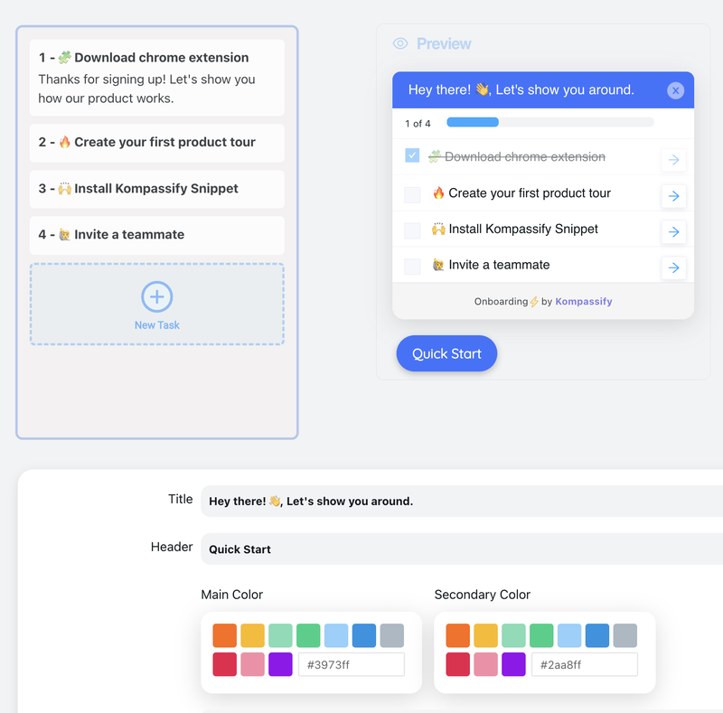
Same steps, same progress, same resume point, configured instead of compiled.
Keep the checkout. Skip the setup wizard.
Kompassify lets product and onboarding teams build multi-step setup flows, checklists and guided tours on a React app without shipping a release for every change, targeted by segment, with completion data on every step. Free up to 100 monthly active users, plans from $129/month, GDPR-compliant and EU-hosted.
Start for free →A Pre-Ship Checklist
Before the form goes live
- Steps are a machine: each one names its successor from the answers, not
index + 1 - One schema, validated a slice at a time, forward only
- Back never validates, and never loses an answer
- The whole schema is re-validated once before submit
- The step is in the URL: Back, Forward, refresh and shareable links all work
- An unreachable step in the URL redirects to the furthest legitimate one
- Drafts are versioned, expired, and never contain credentials or card details
- Restoring a draft is offered, not imposed
- Focus moves to the new step's heading on every transition
- A live region announces "Step N of M", and the visual stepper is
aria-hidden - Validation failure focuses the first invalid field, with the message associated to it
- Double-submit is impossible: idempotency key plus a disabled button
- A server-side error jumps to the step that owns the field
- Every step emits viewed and completed events, so the drop-off is visible
The One-Sentence Version
A multi-step form is a state machine whose current node lives in the URL, validated one slice at a time on the way forward, persisted so people can come back, and announced so people can hear it, and if the steps change every time the product does, it was never a form, it was content.
Frequently Asked Questions
How do you build a multi-step form in React?
Keep one form object for all the steps, and model the steps as a machine rather than an incrementing index. A machine means each step declares which step comes next, given the answers so far, so a conditional branch is a function, not an if-statement scattered through a Next handler. Validate one slice of the schema per step, on Next, and let the user move backwards without validation. Put the current step in the URL so the browser's Back button and a refresh both behave. Persist the partial answers so somebody interrupted on step three can return to step three. And on each transition, move focus to the new step's heading and announce the change, or keyboard and screen reader users will not know anything happened.
How do you make the browser back button work in a multi-step form?
Put the step in the URL and let the router own it. If the current step lives only in React state, Back leaves the page entirely; the user loses everything and reports it as a bug, correctly. With the step as a route segment or a query parameter, Back moves to the previous step for free, Forward returns, a refresh lands on the same step, and a support agent can be sent a link to the exact step somebody is stuck on. Two guards make it safe: on mount, validate that the step in the URL is actually reachable given the answers you have, and redirect to the furthest legitimate step if it is not; otherwise anyone can type step=4 and skip validation. And do not push a history entry for a step the user only passed through.
Should you validate every step or only the last one?
Every step, on the way forward only. Validating the whole schema on the last step means someone can fill in four screens and then be sent back to the first to fix an email address, which is the single most reliable way to lose a signup. Validating on the way backwards is just as bad: the user is trying to change an answer, and blocking them with errors about the screen they are leaving is hostile. The practical shape is one schema for the whole form, split into per-step slices; Next validates its own slice and refuses to advance; Back always moves backwards without checks. Then validate the whole thing once more before submitting, because a branch change can invalidate an answer given three steps earlier.
How do you let users resume a half-finished multi-step form?
Save the answers and the current step on every transition, keyed to something stable. For anonymous flows that is localStorage or sessionStorage under a versioned key; for signed-in flows it should be the server, so the draft survives a different device. Three rules keep it from becoming a support problem. Version the stored shape, and discard a draft whose version does not match, because a restored draft from an older schema produces validation errors nobody can explain. Expire drafts, since a six-week-old half-finished form is usually noise. And never restore silently into the middle of a flow; show the user that a draft was found and let them continue or start over, because jumping to step three of a form they do not remember starting is disorienting.
How do you make a multi-step form accessible?
Two things beyond ordinary form accessibility, both about the transition. First, move focus: when the step changes, focus the new step's heading, which you make focusable with tabindex="-1". Without it, focus stays on the Next button that no longer exists, falls back to the body, and the next Tab starts at the top of the page. Second, announce it: a live region that says something like "Step 3 of 5, billing details", so a screen reader user learns the screen changed at all; a visual progress bar communicates nothing to them. Beyond that the usual rules apply with more weight, because errors are more costly here: label every field, associate errors with aria-describedby, never rely on colour alone, and make sure the progress indicator is not the only signal of where the user is.
What is the difference between a multi-step form and an onboarding wizard?
A multi-step form collects data the product cannot function without: billing details, a shipping address, the fields needed to create an account. It is required, it is the same for everyone who reaches it, and skipping it is not an option. An onboarding wizard teaches or configures: it picks a template, sets a preference, shows where things are. It is optional, it differs by segment, it changes as the product changes, and it is measured by completion and activation rather than by whether a record was created. Building the second with the machinery of the first is why so many onboarding flows cannot be edited without a deploy: the questions are hard-coded into components, when they should be content.