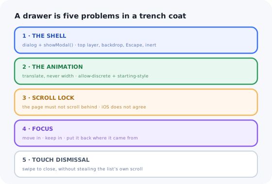
A drawer, a side sheet, a slide-over, a bottom sheet, is the panel that comes in from an edge and covers part of the page. Filters on a listing screen, a details pane next to a table, a navigation menu on mobile, a comment thread beside a document.
It usually starts as a div with position: fixed, a
transform and a boolean. That version ships, and then the reports arrive: the page
scrolls behind it on iOS, Tab walks straight out into the content underneath,
Escape does nothing, the open animation janks on mobile, and swiping it away also swipes
the list inside it.
Almost none of that is drawer-specific. It is modal-surface work that a drawer inherits and that the platform now does better than hand-written code. This guide builds one in React in five layers, and then lists what stays hard once the component is done.
Key Takeaways
- A drawer is a dialog wearing a different animation. Use
<dialog>and get the top layer, backdrop, Escape and inert content for free. - Animate
translate, neverwidthorright. One is composited; the other relayouts the page every frame. - Scroll locking is where iOS bites.
overflow: hiddenon the body is not enough on the platform where it matters most. - Non-modal drawers still need focus discipline, and if it dims the page, it is modal, so say so.
- Swipe-to-dismiss must lose to the content's own scroll, or the list inside becomes unusable.
- A UI drawer is not a help panel. Same rectangle, entirely different content lifecycle.
Drawer, Modal, Popover: What a Drawer Actually Is
A drawer is not a fourth kind of thing. It is one of the other two, chosen by a single question: can the user still work with the page behind it?
| Modal drawer | Non-modal drawer | Popover | |
|---|---|---|---|
| Typical use | Mobile nav, filters, a form | Details pane beside a table, comments | A menu attached to a button |
| Page behind | Dimmed and inert | Fully usable, often resized | Fully usable |
| Focus | Moves in and is trapped | Moves in, not trapped | May move in, not trapped |
| Escape | Closes it | Closes it | Closes it |
| Build with | dialog.showModal() |
dialog.show(), or plain markup in the layout |
popover, see the React popover guide |
Pick one and commit. The failure mode is a drawer that dims the page like a modal but leaves it focusable like a sidebar: sighted users see a blocked interface while keyboard users tab into content they cannot see. That is not a compromise, it is two bugs.
1. The Shell: <dialog> Does More Than You Think
Most of a drawer's difficulty is modal-surface difficulty, and showModal() hands you four
of those solutions at once: the element moves to the top layer (no z-index can beat it and
no ancestor's overflow can clip it), you get a real ::backdrop,
Escape fires cancel and closes, and everything outside becomes inert,
unfocusable and hidden from assistive technology, without you managing a single attribute.
Two lines there are earned from experience. The onClose handler exists because the browser
can close the dialog without React's knowledge: press Escape and your
open prop is still true, so the next click on the trigger changes nothing and
the drawer appears dead. And the backdrop click works because a <dialog>'s backdrop
is painted by the dialog element itself, so a click that lands on the backdrop reports the dialog as its
target, which is why the panel needs to be a child element, not the dialog.
2. Animate the Transform, Not the Box
The single biggest performance mistake in a drawer is animating a property that changes layout.
Animating width, right or margin forces the browser to re-lay-out
and repaint the whole page on every frame; on a mid-range Android phone that is the difference between
a smooth slide and a slideshow. transform: translateX() is composited; the layout
never changes at all.
Three details make the difference between this working and mysteriously not.
transition-behavior: allow-discrete on display is what keeps the element
visible while it animates out; without it the drawer vanishes instantly on close.
overlay is the same trick for the top layer itself; miss it and the element leaves
the top layer immediately, so the exit animation plays underneath the page content.
@starting-style supplies the first frame for the entry, without which the browser has
nothing to animate from and simply snaps open.
Use 100dvh rather than 100vh. On mobile browsers with a collapsing address
bar, 100vh is taller than the visible viewport, which is why so many drawers hide their own
close button behind the browser chrome.
The drawer looks identical either way, on your laptop.
3. Scroll Locking, and the iOS Problem
With a modal drawer open, the page behind must not scroll. Everyone writes
document.body.style.overflow = 'hidden', and everyone then discovers it is not enough.
Two failures. First, hiding the body's scrollbar on desktop removes a scrollbar's worth of width and the
whole page shifts sideways as the drawer opens. Compensate with the measured scrollbar width. Second,
iOS Safari scrolls the page anyway once the touch reaches the end of any inner scrollable area,
the rubber-band effect, and the classic workaround (position: fixed on the body) has
the side effect of throwing away the scroll position, so closing the drawer drops the user at the top of
a long list.
Return the cleanup rather than writing a matching unlock function; then the restore cannot drift from the lock, and React's effect cleanup calls it for you. If two drawers can be open at once, that needs a counter, not a boolean, or the first one to close unlocks the page for both.
The modern escape hatch: where overscroll-behavior: contain is supported
on the scrollable content inside the drawer, it stops the scroll chain from reaching the page at all,
and removes most of the need for body gymnastics. Add it, but keep the lock for the browsers
and edge cases it does not cover.
4. Focus, Escape and the Inert Page
With showModal() most of this is handled: focus moves into the dialog, everything outside
becomes inert, and Escape closes. Three things are still yours.
-
Where focus lands. The browser focuses the first focusable element, which is often
the close button, and a screen reader user then hears "Close" with no idea what opened. Give
the panel's heading
tabindex="-1"and focus it, so the drawer announces itself. -
Where focus returns. The dialog returns focus to the previously focused element, but
only if that element still exists. Open a drawer from a row that the drawer's own action then deletes
and focus falls to
<body>. Capture the trigger on open and, on close, focus it or a sensible fallback such as the list container. -
Naming. A dialog with no accessible name is announced as just "dialog". Point
aria-labelledbyat the heading, or give itaria-label.
For a non-modal drawer (show() rather than showModal(), or a
panel that is simply part of the layout) you get none of the free behaviour. There is no
backdrop, nothing is inert, and Escape is yours to wire. That is correct: the user is meant
to keep working with the page. What you still owe them is a focus order that matches the visual order
and an obvious way back out.
5. Swipe to Dismiss Without Stealing the Scroll
On touch, users expect to push a drawer away. The naive implementation (track
touchmove, translate by the delta, close past a threshold) makes the drawer's own
contents unscrollable, because every vertical drag inside a bottom sheet is read as a dismissal.
The rule that fixes it: the content's scroll wins, and the gesture only starts when the content cannot scroll any further in that direction. Decide the axis once, at the start of the gesture, and do not revisit it.
Then close on either distance or velocity (a fast flick that travelled 60 pixels is a dismissal, a slow drag to 100 is not) and animate back to zero when it is not. Keep the threshold generous: a drawer that snaps back because the user was 4 pixels short feels broken in a way that is hard to articulate and easy to hate.
Whatever you do here, the swipe is an enhancement, never the only exit. A visible close button and Escape must always work, because a gesture is invisible, undiscoverable and unavailable to anyone using a keyboard or a switch device.
What Stays Hard After It Works
Nested overlays
A select or a confirm dialog opened from inside the drawer creates a second top-layer element.
Escape now has two listeners and closes both at once. The dialog's own
cancel event, with preventDefault() on the outer one, is more reliable
than a document-level key handler.
Routing
On mobile the back button should close the drawer, not leave the page. That means the open state
belongs in the URL, a search param or a route, which then has to stay in sync with the
<dialog>'s own open state, in both directions.
SSR and hydration
showModal() does not exist on the server and throws on an unmounted node. Render closed,
call it in an effect, and never derive the initial markup from a state that only the client knows.
Testing
jsdom implements <dialog> only partially: the top layer, ::backdrop
and inert are not there. Unit-test the open/close reducer, and put dismissal, focus and gesture
behaviour in a real-browser test.
A UI Drawer Is Not an In-App Help Panel
Once the component exists, the next request is predictable: "can we slide in a panel with the getting started guide, the docs search and the changelog?" It is the same rectangle. It is a completely different thing to own.

Same panel, different problem: everything in here is content somebody edits without a deploy.
| UI drawer (what you just built) | In-app help panel | |
|---|---|---|
| Contents | Product UI: filters, details, a form | Content: articles, videos, checklists, announcements |
| Who edits it | A developer, in a release | Support and product, continuously |
| Audience | Everyone, identically | Segmented by plan, role, and what they have done |
| State | Open or closed | Per-user read, dismissed and completed, persisted |
| Measured by | Nothing, it is plumbing | Ticket deflection and adoption per item |
The drawer is genuinely the easy half. The half that consumes a roadmap is content management, segmentation, per-user state and the analytics that tell you whether any of it worked, which is in-app support territory, not component work, and the honest framing of the build-versus-buy question.
Keep the component. Skip the content pipeline.
Kompassify lets product and support teams put guides, checklists, announcements and tours inside a React app without shipping a release for every copy change, targeted by segment, with adoption data on each one. Free up to 100 monthly active users, plans from $129/month, GDPR-compliant and EU-hosted.
Start for free →Build It, or Configure It?
Build the component
- Filters, detail panes, mobile navigation, editing forms.
- Anything a designer specified and a developer maintains.
- Anything that must use your tokens and work offline.
Configure the content
- Help articles, onboarding checklists, release announcements.
- Anything targeted at a segment rather than everyone.
- Anything you need read and completion rates for.
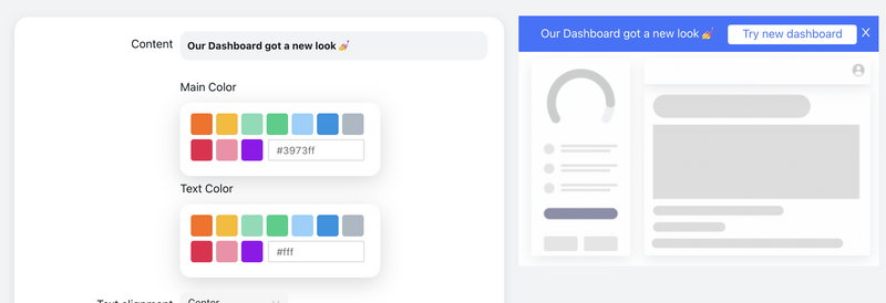
When the panel’s contents are edited here rather than in a pull request, it stopped being a component.
A Pre-Ship Checklist
- Modal or non-modal is a deliberate choice, and the dimming matches it.
- Built on
<dialog>;onClosewrites back into React state. - Animates
translateonly, withallow-discreteand@starting-styleso both directions animate. - Sized with
dvh, notvh. - Scroll lock restores the exact scroll position, and compensates for the scrollbar width.
overscroll-behavior: containon the drawer's scrollable content.- Focus lands on the heading, not the close button, and returns to a real element on close.
- The dialog has an accessible name.
- Swipe-to-dismiss defers to inner scrolling and is never the only way out.
- The mobile back button closes it rather than leaving the page.
- Transitions respect
prefers-reduced-motion.
The One-Sentence Version
Build a React drawer as a <dialog> so the platform gives you the top layer, the
backdrop, Escape and an inert page; animate translate and nothing else; lock
the scroll in a way that survives iOS and restores the position; land focus on the heading and return
it somewhere real; let the content's scroll beat your gesture, and recognise that the moment the
panel is full of content rather than UI, you have started building a help centre.
Related reading: building a modal in React for the shared surface underneath, what a modal is for when to use one at all, and mobile app onboarding if the drawer is the first thing a new user sees.
Frequently Asked Questions
How do you build a drawer in React?
Build it on the dialog element rather than a fixed-position div. Calling showModal() moves the element to the browser's top layer, so no z-index can beat it and no ancestor's overflow can clip it, and it brings a real ::backdrop, Escape-to-close, and an inert page behind. Drive it from React with an effect that calls showModal() or close() when your open prop changes, guarding both directions so the calls do not loop, and handle the dialog's own onClose event because the browser can close it without React knowing. Animate the panel with translate, never width or right, using transition-behavior: allow-discrete and a @starting-style rule so both the open and close animations play. Then add a scroll lock, deliberate focus placement, and optionally swipe-to-dismiss.
What is the difference between a drawer, a modal and a popover?
A drawer is not a third kind of component; it is a modal or a non-modal panel that happens to slide in from an edge. The question that decides which is whether the user can still work with the page behind it. A modal drawer, mobile navigation, a filter sheet, a form, dims the page, makes it inert, and traps focus, so it is built with dialog.showModal(). A non-modal drawer, a details pane beside a table, a comment thread, leaves the page fully usable and does not trap focus, so it is dialog.show() or simply part of the layout. A popover is smaller, attached to a specific trigger, and never blocks anything. The failure mode to avoid is a drawer that dims the page like a modal but leaves it focusable like a sidebar: sighted users see a blocked interface while keyboard users tab into content they cannot see.
Why does my React drawer animation stutter on mobile?
Almost always because you are animating a property that changes layout. Animating width, right or margin forces the browser to re-run layout and paint for the entire page on every frame, including whatever list is sitting behind the drawer; on a mid-range Android phone that is the difference between a smooth slide and a slideshow. Animate transform: translateX() instead, which is composited and skips layout and paint entirely. Two other causes are worth checking: without transition-behavior: allow-discrete on display and overlay, the close animation is skipped because the element leaves the top layer immediately, and without a @starting-style rule the open animation has no first frame to animate from and simply snaps.
How do you stop the page scrolling behind a drawer on iOS?
Setting overflow: hidden on the body is not enough on iOS Safari, which keeps rubber-banding the page once a touch reaches the end of any inner scrollable area. The reliable lock is position: fixed on the body with top set to the negative of the current scroll position, so the page stays visually where it was, plus a right padding equal to the scrollbar width so desktop layouts do not jump sideways. The important half is the unlock: restore the styles and scroll back to the saved position, or closing the drawer drops the user at the top of a long list. Return that restore function as the effect's cleanup rather than writing a separate unlock, so the two cannot drift apart, and use a counter rather than a boolean if two drawers can be open at once. Where it is supported, overscroll-behavior: contain on the drawer's scrollable content prevents the scroll chain from reaching the page in the first place.
How do you add swipe-to-dismiss without breaking scrolling inside the drawer?
Decide the gesture's axis once, at the start of the touch, and never revisit it. Wait until the finger has moved about eight pixels, then compare the horizontal and vertical deltas and check whether the drawer's scrollable content is already at its edge in that direction. If the movement is mostly along the drawer's dismissal axis, or the content cannot scroll further that way, treat the whole gesture as a drag; otherwise treat it as a scroll and do not touch it for the rest of the gesture. Close on either distance or velocity, so a fast flick counts even if it travelled a short way, and animate back to zero when it does not qualify. Keep the swipe as an enhancement: a visible close button and Escape must always work, because a gesture is invisible to anyone using a keyboard or a switch device.
What is the difference between a UI drawer and an in-app help panel?
A UI drawer holds product interface: filters, a details pane, a form. It is written by a developer, changes in a release, and shows the same thing to everyone. An in-app help panel holds content: articles, videos, onboarding checklists, release announcements. It is edited continuously by support and product people rather than developers, it is targeted by plan, role and what the user has already done, it needs per-user read, dismissed and completed state that persists across sessions, and it is judged on ticket deflection and adoption per item. The drawer is the easy half. Content management, segmentation, per-user state and the analytics are what consume a roadmap, which is why teams usually configure that layer in a dedicated tool rather than shipping it through the front-end release cycle.